Foodways Bakery
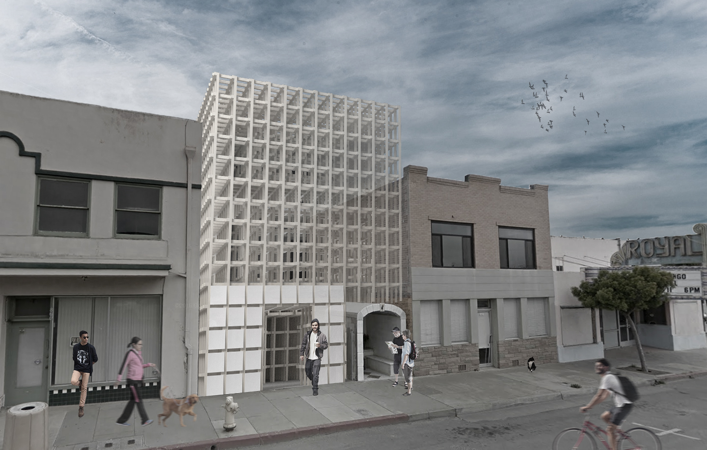
Fall quarter of my second year studying architecture at Cal Poly, I designed a bakery and community center in Guadalupe, CA. The design is inspired by a slice of ciabatta bread and my process included a loooot of model making! It was such a fun quarter and I learned so much.
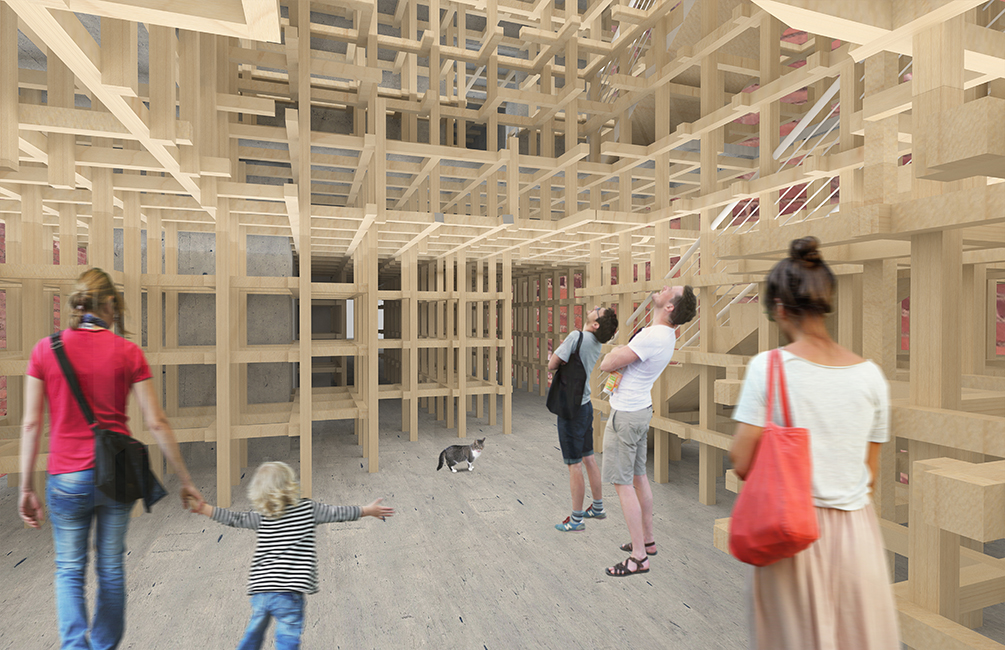 When you enter the building, through the ceramic “crust” facade of the building, you enter the lobby which has a skylight up to the top of the building. The exposed Kengo Kuma-esque wooden structure mimics the texture of the air bubbles in a slice of bread.
The first floor has the lobby, bakery storefront, and a sitting space. In a detached building behind the main building, there is a gallery space and a wheat field behind that in the long, narrow site. The second floor of the main building is the bakery and the third floor is an apartment for the caretaker.
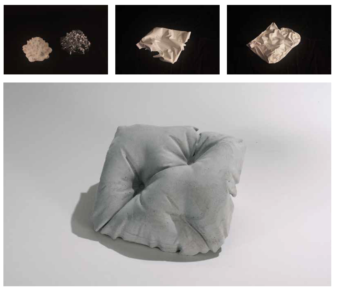
Above are study models of the facade materiality. I started (top left) by vacuum forming a romanesco cauliflower (a unique vegetable with a natural fractal pattern) and then casting it in Rockite. While interesting, it didn’t work as a facade tile. Next, I cast plastic bags in plaster which created very interesting geometries but wasn’t as square as I wanted. Finally, after being inspired by a project at Cal Poly’s annual Vellum furniture show, I created a fabric cast, pillow-like Rockite model. It’s not the perfect solution, I wish it was more square and had gentler curves but it’s what I ended up with.
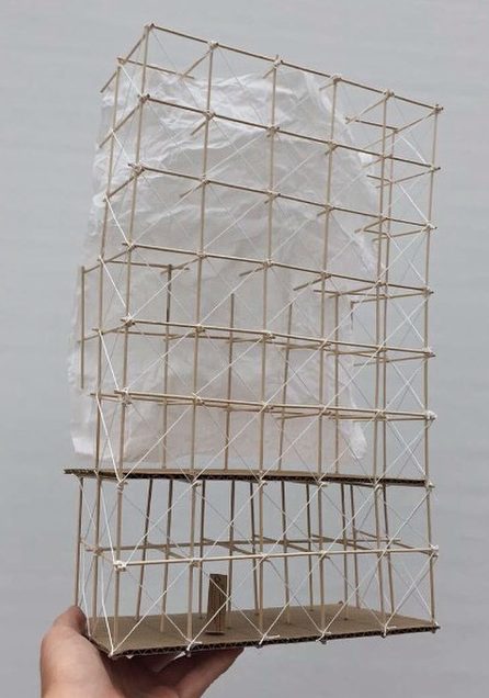
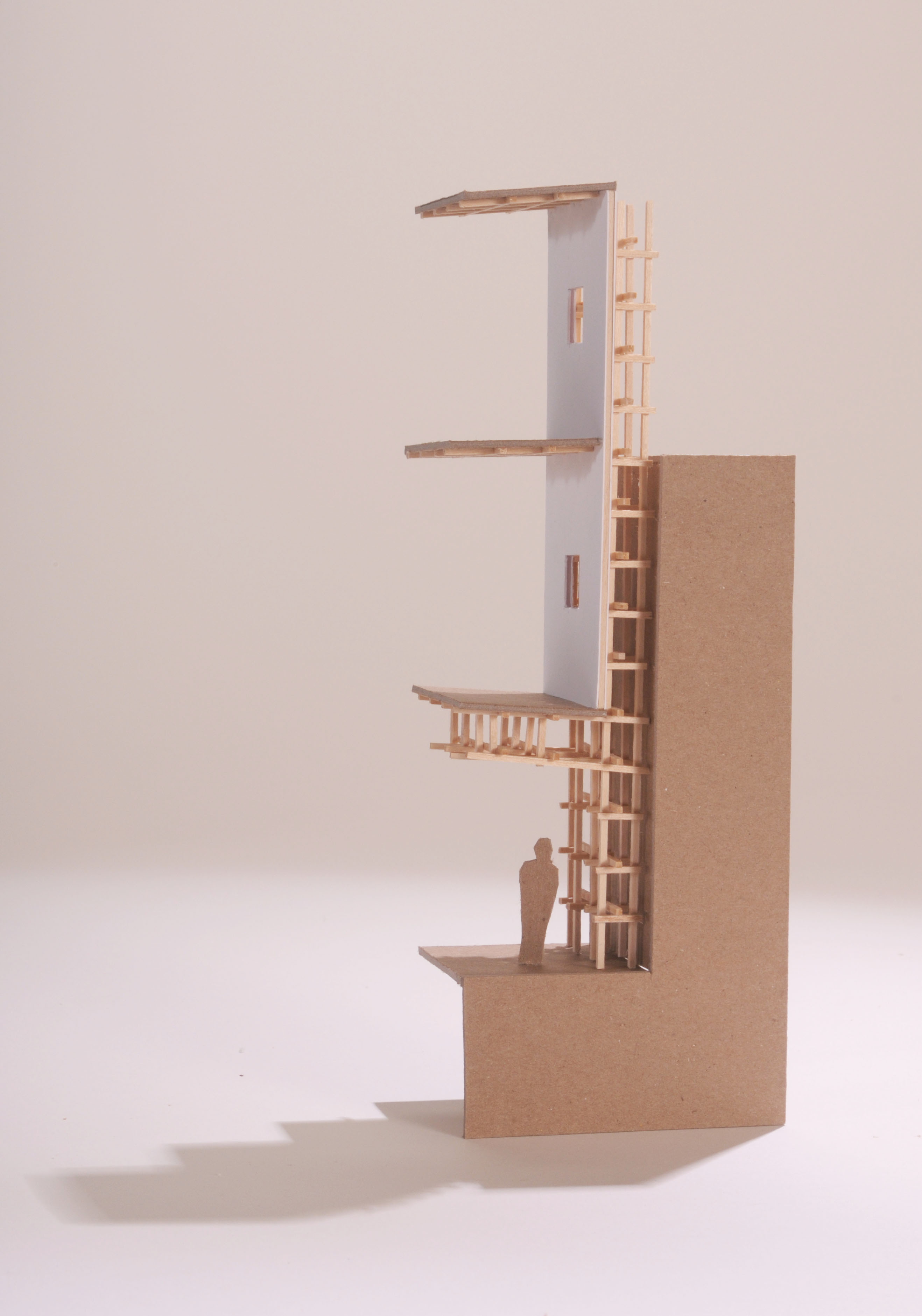
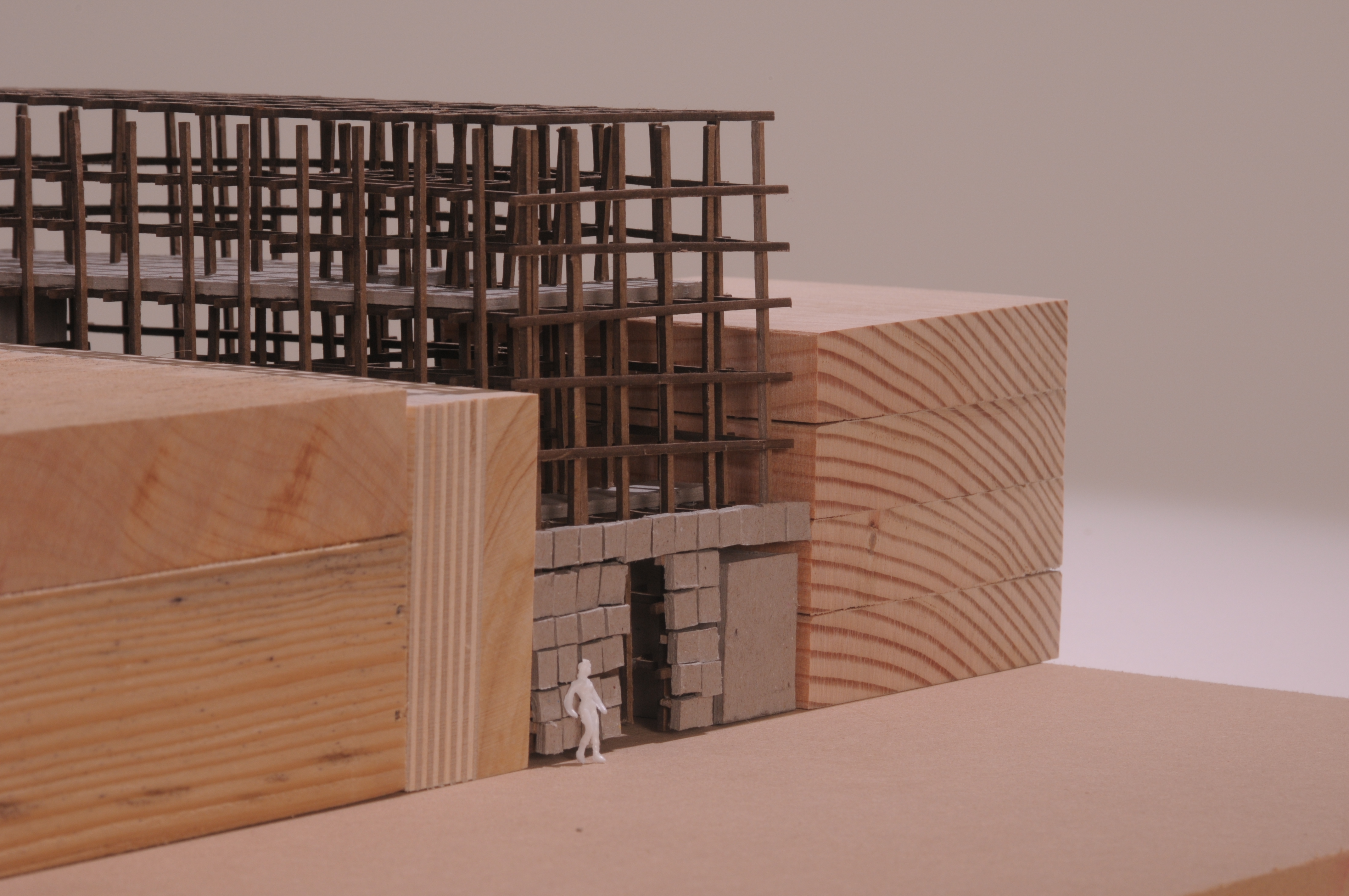
The details of the wooden grid were important to me in this project. The early study model on the left shows how fabric could be used to enclose organic volumes of space within the rectangular grid. The later study model on the right shows a light shaft between the neighboring building and the proposed upper floors that lets light into the ground floor.
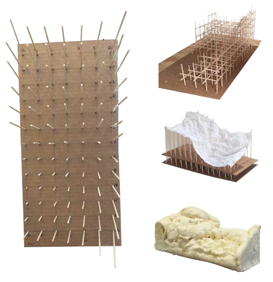
As another geometric investigation, we each mapped a surface on our bodies. I mapped the curve of my hip. I modeled it a variety of ways, with sticks, fabric, and foam, and then modeled it in Rhino (below).
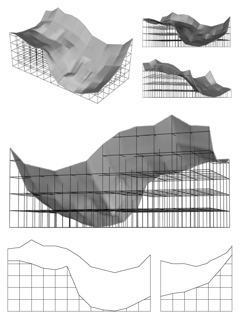
This geometry was used to create the voids in the lobby, sitting area, and gallery spaces. Yes, it is arbitrary to use the geometry of my hip as the form for spaces in a bakery, but it was an interesting challenge and you have to start somewhere.
If walls could dream… they’d dream of fresh baked ciabatta!
