Oakland Library
The fall quarter of my third year, I decided to take a studio that focuses on massing and designing in section. Our program was to design a library in Oakland, California. After the Less Shape, More Geometry warm-up project, we took a similar approach to the massing of our library project, using simple shapes to create more complex, geometric, site-responsive building masses.
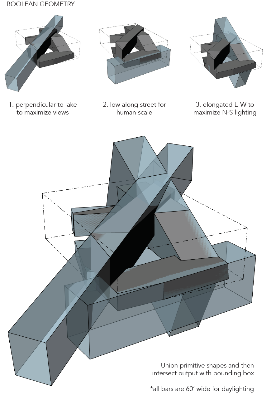
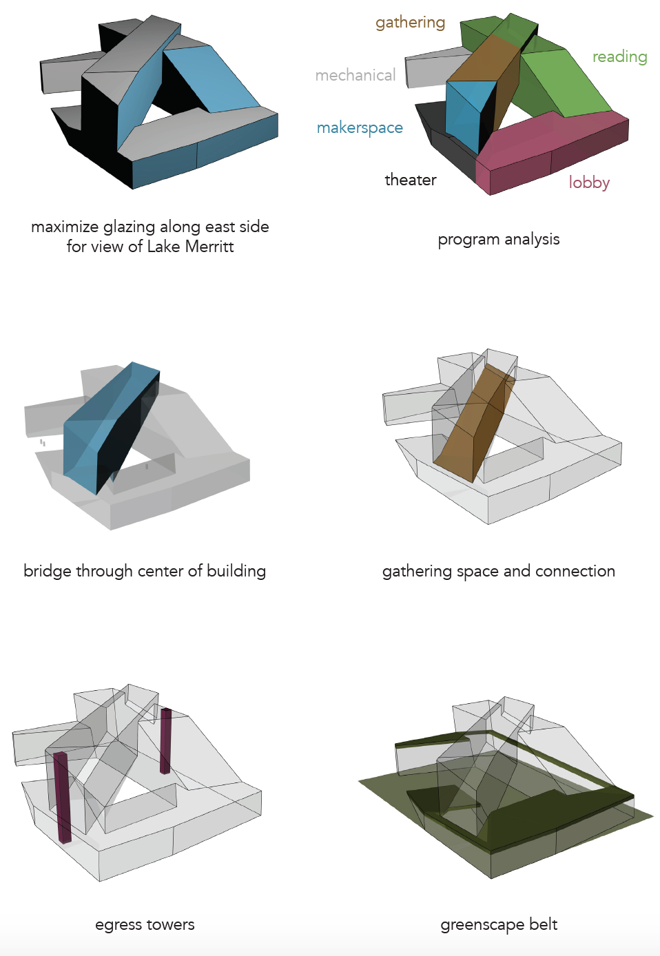
I chose this form because it responds to the views of Lake Merritt on the site as well as incorporating the “bridge” idea from my Less Shape, More Geometry project.
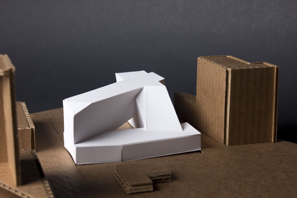
The form seems to settle in to the site, higher on the corners where there are taller buildings and lower on the front corner where there is a small, historic building and a park across the street with Lake Merritt just past the park.
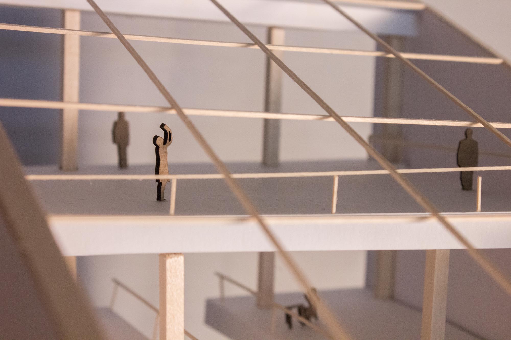
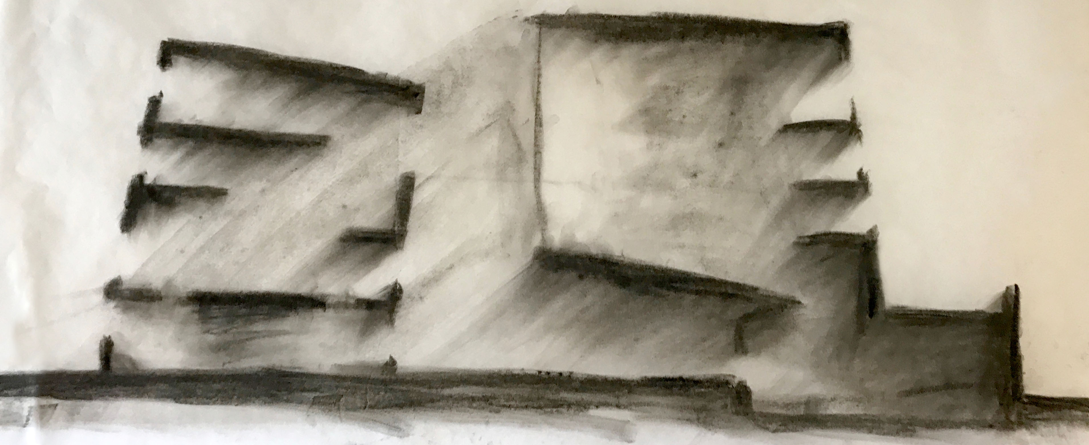
Another important quality of the library is the lighting and mood of different rooms. The section drawing below shows a variety of reading rooms with different lighting qualities.
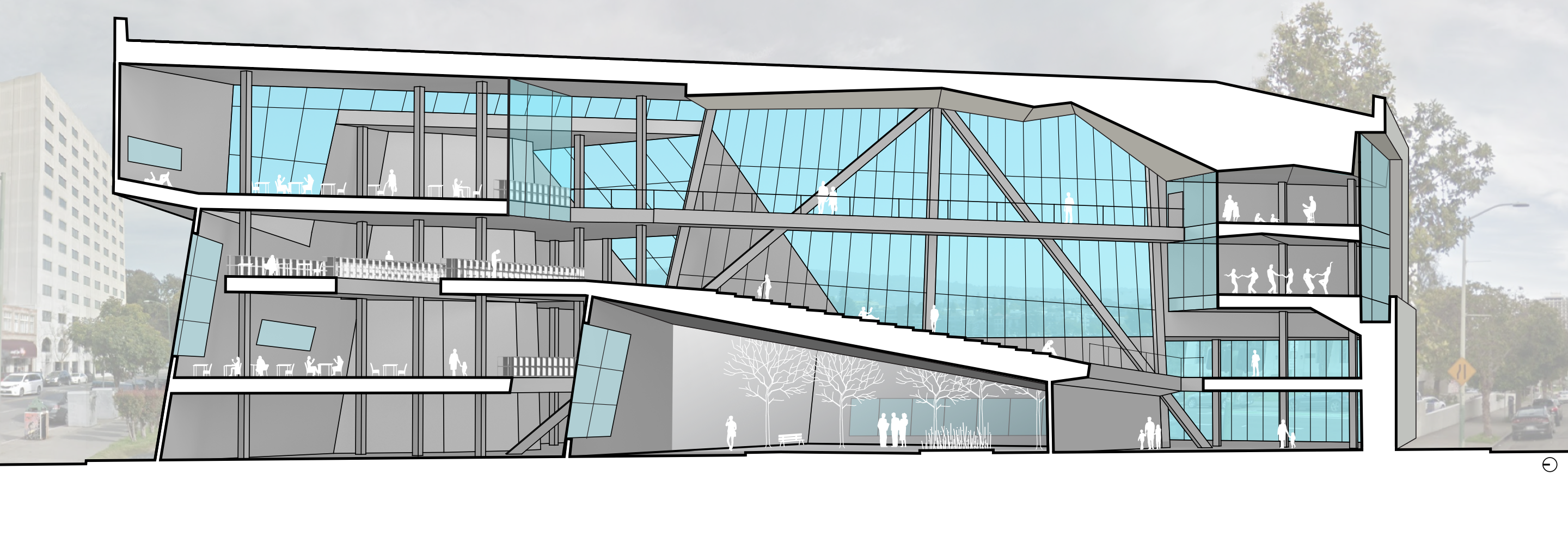
The finished version of the section drawing, below, shows the bridge space in the center of the building, an open space for community events or casual interactions. The bridge connects the book stacks on the left side of the building with the community arts spaces on the right side of the building. All of the spaces have expansive views of Lake Merritt and plenty of glass.
If walls could dream… they’d dream of site-responsive building massing.
