Category Archives for My SLO Summer

Meet the RA: Braelyn

Hello everyone!

I had a fun first weekend in San Luis. On Saturday we went downtown to sketch and on Sunday we went to the beach! We’ve barely been here for a whole week, but it already feels like family. I’d like to share with you a little more about my RA, Braelyn. She attended the workshop when she was in high school and is going to be a fourth year architecture student this upcoming year, studying in Florence. (At Cal Poly, the majority of architecture students either go abroad or do an internship their fourth year.)

In high school, Braelyn was interested in lots of different subjects. Her parents are both builders and her mom suggested she look into architecture, but she wasn’t sure it would be a good fit for her. Finding Cal Poly’s Summer Career Workshopwas a perfectly spontaneous event for Braelyn. Although the workshop was full when she found it, she was able to stay at her grandparents’ house and attend as a commuter. She made lots of good friends and fell in love with studio, especially the ability to sit down and just focus on a project. Her favorite project was the string music project because it’s very immersive.

Although the workshop showed her interest in architecture, she wasn’t completely sure it was the right path for her. She applied to lots of design schools but felt that Cal Poly’s philosophy of hands-on building fit her personality the best. Cal Poly offers a couple minors in the College of Architecture and Environmental Design (architectural engineering, city & regional planning, construction management, sustainable environment, …) and many other minors in other colleges. Braelyn doesn’t have an official minor, but she works in the digital fabrication lab and is really interested in materials. She describes San Luis Obispo as a small town with friendly people and lots of things to do outdoors. It’s halfway between San Francisco and Los Angeles so it’s easy to get to big city events but you don’t feel overwhelmed by living in a huge city all the time.

She sees herself getting licensed or going to grad school after she graduates but she’d rather design components or materials than be an architect. Her favorite architectural firms are UN Studio and Olson Kundig because they both experiment a lot. She would advise future architectural students to not be afraid of making mistakes.

Downtown Sketches

Saturday morning we went to downtown San Luis Obispo. Mark talked about how climate can influence architecture and how cities grow through history. We were given a list of things to sketch (building facades, street lamps, store windows, people on benches, etc.) and went in small groups to explore the town.
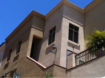
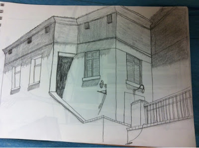
After getting a nice refreshing frozen yogurt, I sat down to draw this building. I love the angles of the roof and the stairwell.


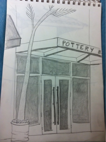
Then I drew a doorway at Pottery Barn. I like the pattern of the overhang although the perspective isn’t perfect.


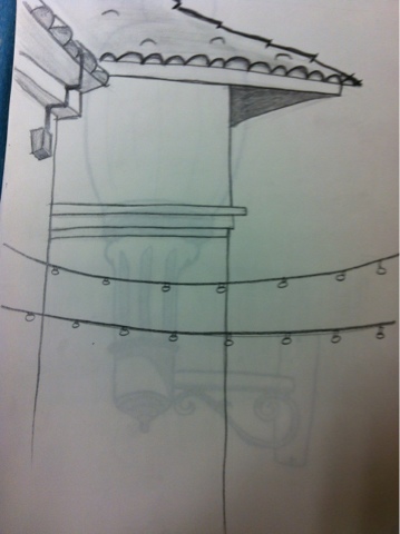
Next I drew another roof corner that had some hanging lights in front of it.


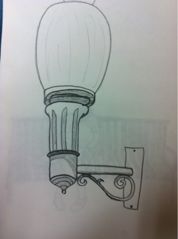
Next I drew a light with intricate metalwork.


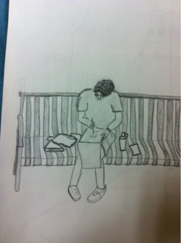
And then I drew one of my group members sitting on a bench.


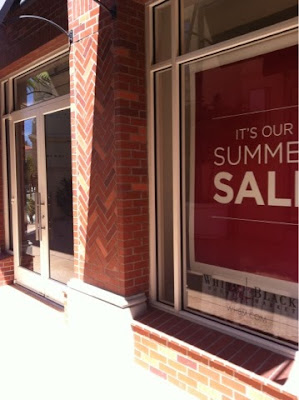
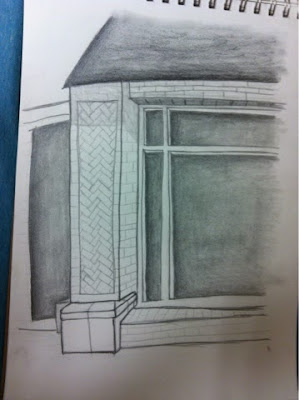
And last but not least, another store front with cool herringbone pattern brickwork.

Can’t wait to go sketch back in my home town!

Photo and Light Projects

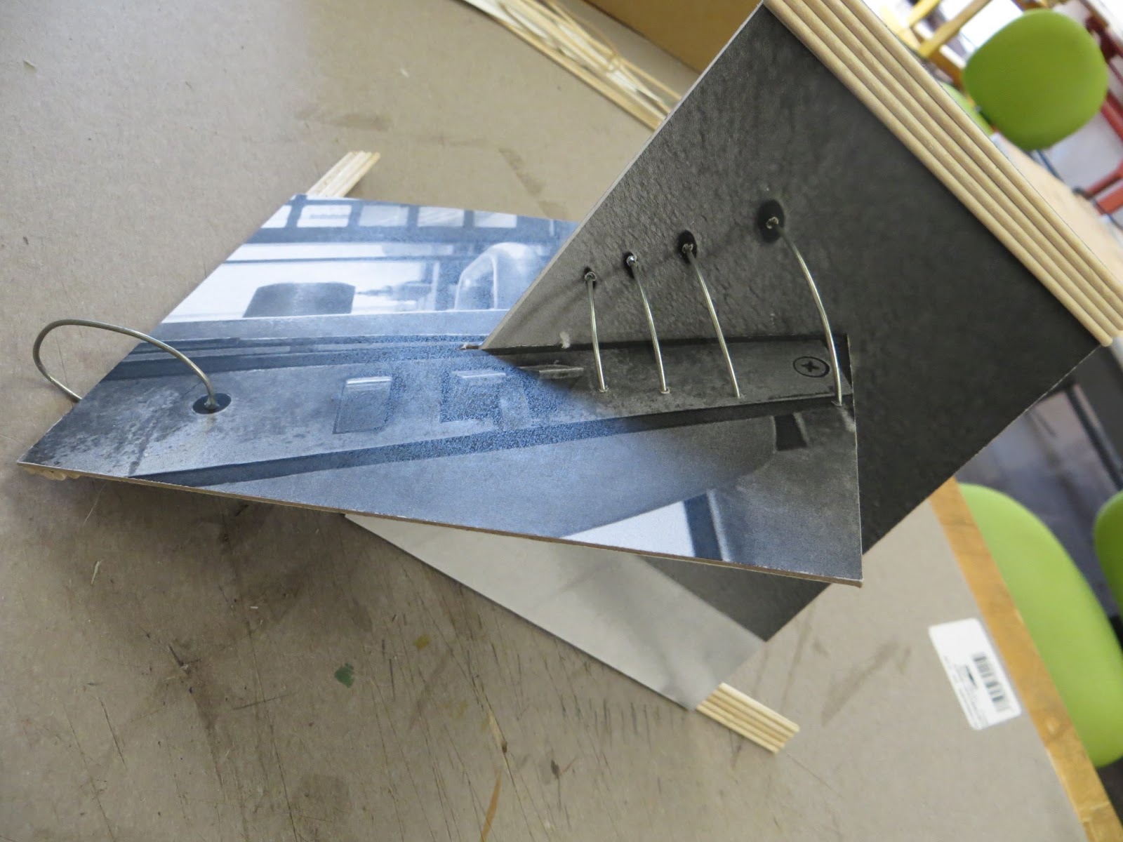
After our photo safari on Friday, we printed out two of our pictures and mounted them on cardstock. Then we made 3D structures focusing on the planes and lines of the photos.
I used spiraling wire to unite the planes of my photos and to accentuate the dots in one of the photos. I also used wood strips to move your eye around the piece just like the lines of the other photo help move your eye around.
Today our project was to make a light box that was the “inverse” of our photo project.
I started by making a tube out of white paper with a rectangle at the end. I colored one side red so the color would reflect off the other side and up the tube. The color scheme of brown and red contrasts with the photo projects’ color scheme of black and grey.
Then I played around with stacking strips of cardboard sideways to replicate the texture of the wood strips in my photo design. I also like the ability to see light through the cardboard wall.
Finally, I cut curves out of the sides of the cardboard to resemble the metal spiral in my photo project.
And here they are together!

Motivation Monday: Passion

Good morning everyone!
We made it through the first week and that fearless creativity sure did help! Now that we’re settled in, we can start following the path to our dreams of being architects.
So let’s jump out of bed and start on our journey to the career that we all love so much.


This post is part of a series nicknamed My SLO Summer. It’s about my time at Cal Poly’s Summer Architecture Career Workshop, a four week hands-on experience about what it’s like to study architecture. You can see the entire series here.

Watercolor Lesson

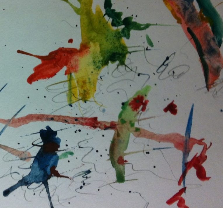
Today we had a watercolor lesson! Yay! I’ve been wanting to learn how to do watercolor for a while now so hopefully this’ll help me get into playing more with it because the professor’s watercolor portfolio was breathtaking. It’s definitely an asset as an architect to be able to create handmade renderings of buildings, especially in such a beautiful medium as watercolor.

First we played with washes and gradients, then with random effects such as splashing, blowing, dripping, and mixing.

We started to experiment with these techniques in a sketch of a structure with some hills behind it.


Shading Lesson

Yesterday our drawing lesson was on shading. We played with value and texture in art and architecture.


Our homework was to add shading to a drawing we had already done. I chose the drawing of my dorm room.

Photo Safari

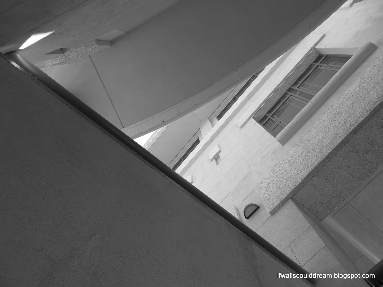
We had a guest professor today and he talked to us about photographing architecture by focusing on details and composition. We spend a little over an hour exploring campus through the lens, hunting for a good angle.


And to finish off the safari…
Just kidding!!

Suspended Music Project

Yesterday we worked on a project in pairs to make something inspired by the rhythm and emotion of music.
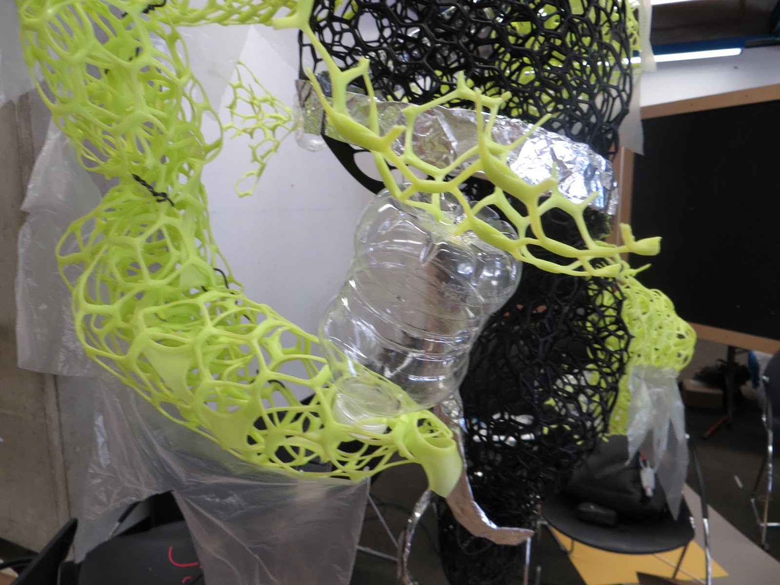
My partner and I worked really well together which I was really happy for. We designed our piece with a central twisting black core and neon green arms reaching out of it. Between the twisted core and the stretching arms, the piece has a lot of movement to it which really makes it feel like music.
The neon arms have clear jagged plastic on the bottoms of them which move in the air, giving the piece even more motion.
At the end of each arm is a small water bottle (provided as a drink for the hot day but we used it as a material as well) with more green mesh extending out. The arms really serve to reach out and pull you in to the piece, just like music lures you in.
The center has aluminum foil spiraling around it like a vortex.
And in the very center of the black mesh is a foil circle suspended like a heart, giving the piece even more beat and personality.
“If architecture is frozen music then is music melted architecture?” -Mark

Throwback Thursday: Pink Apartment Model

Welcome to my first Throwback Thursday post!
If you aren’t already familiar, “Throwback Thursday” is a social media “tradition” to post old photos on Thursday.
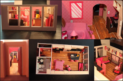
I thought it would be fitting to throw it back to my first architectural model today, my Pink Apartment!

Be sure to check out the original post for the full project description!

Looking forward to next week’s Throwback Thursday post! Which project do you think I’ll feature then?
This post is part of a series nicknamed My SLO Summer. It’s about my time at Cal Poly’s Summer Architecture Career Workshop, a four week hands-on experience about what it’s like to study architecture. You can see the entire series here.

Materials Project

Mark and the RAs loved my double cube. I think what made it so successful is how you could tell that they go together no matter where you set them yet they’re each unique and contrasting.
For today’s project, we were given a bunch of materials (cardboard, aluminum foil, string, paper clips, rubber bands, metal mesh, and uncooked spaghetti noodles) to make, well, anything!
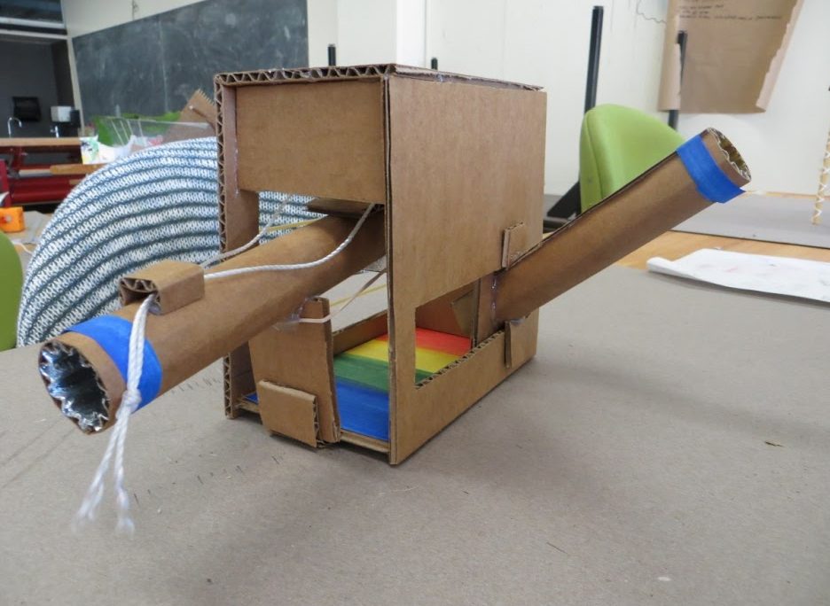
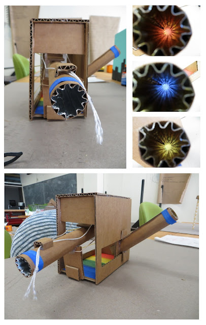
Long story short, my project uses cardboard and aluminum foil to play with light and colors.
I made two tubes out of cardboard lined with aluminum foil. The tube on the left has a flap at the end that you can open and close by pulling the string. It reflects light from the rainbow pattern on the bottom of the box through the tube. The tube on the right also reflects light from the rainbow and you can move it left and right to see the different colors.
I took a very different approach than many of my other classmates and I’m not too crazy about how the outside of the structure turned out, kind of like a big cardboard tank. But I learned a lot about developing ideas and managing my time. My peers were amazed by it but I’ll be excited to see how Mark and the RAs respond to it tomorrow morning.