Study Tour Part 4: Aalto Mania!
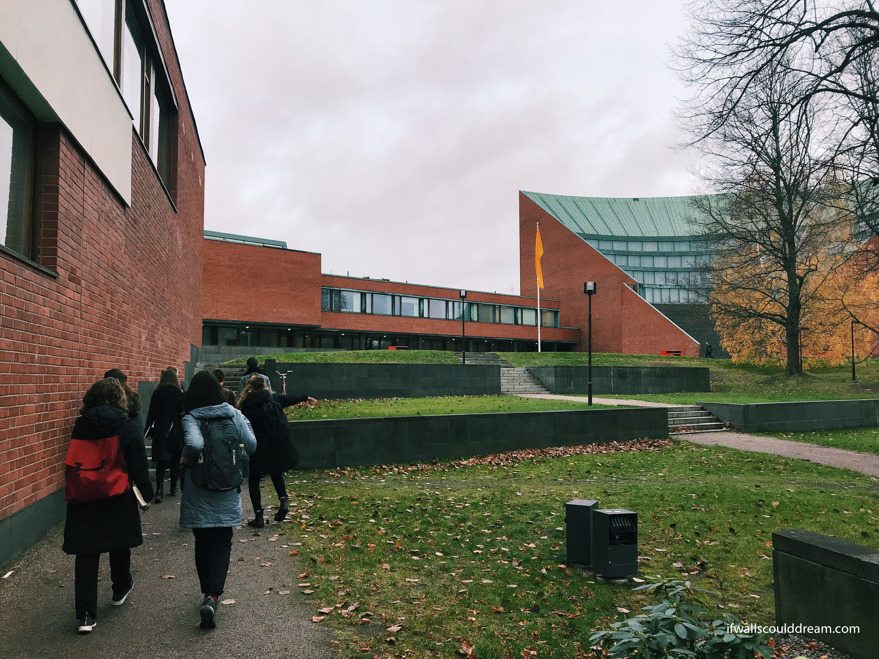
The final post about my Fall Study Tour to Sweden and Finland is all about Alvar Aalto, Finland’s most famous architect! (See part 1 here, part 2 here and part 3 here.) We had the opportunity to visit Aalto University as well as Aalto’s home and studio. It was so inspiring to see his designs for a variety of buildings and see his unique style in each one.
Aalto University
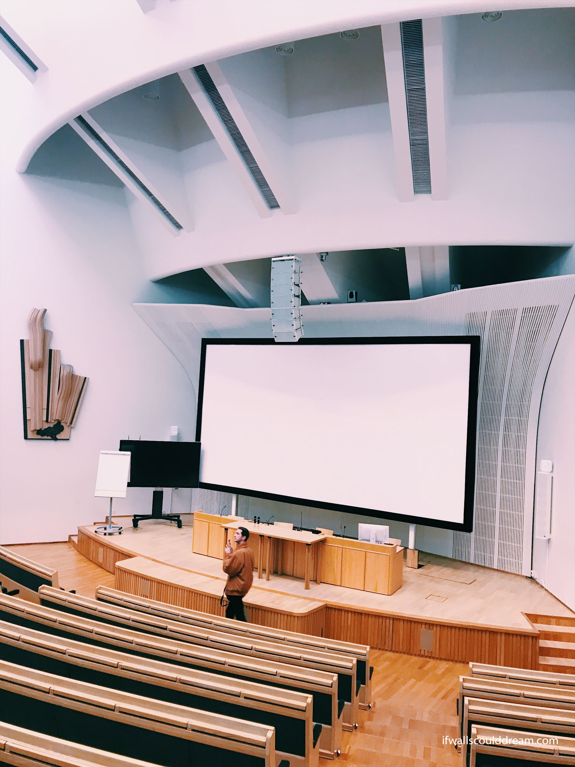
We got a tour from a student at the university and it was really interesting to hear her perspective. The highlight of the tour was visiting the auditorium Aalto designed.
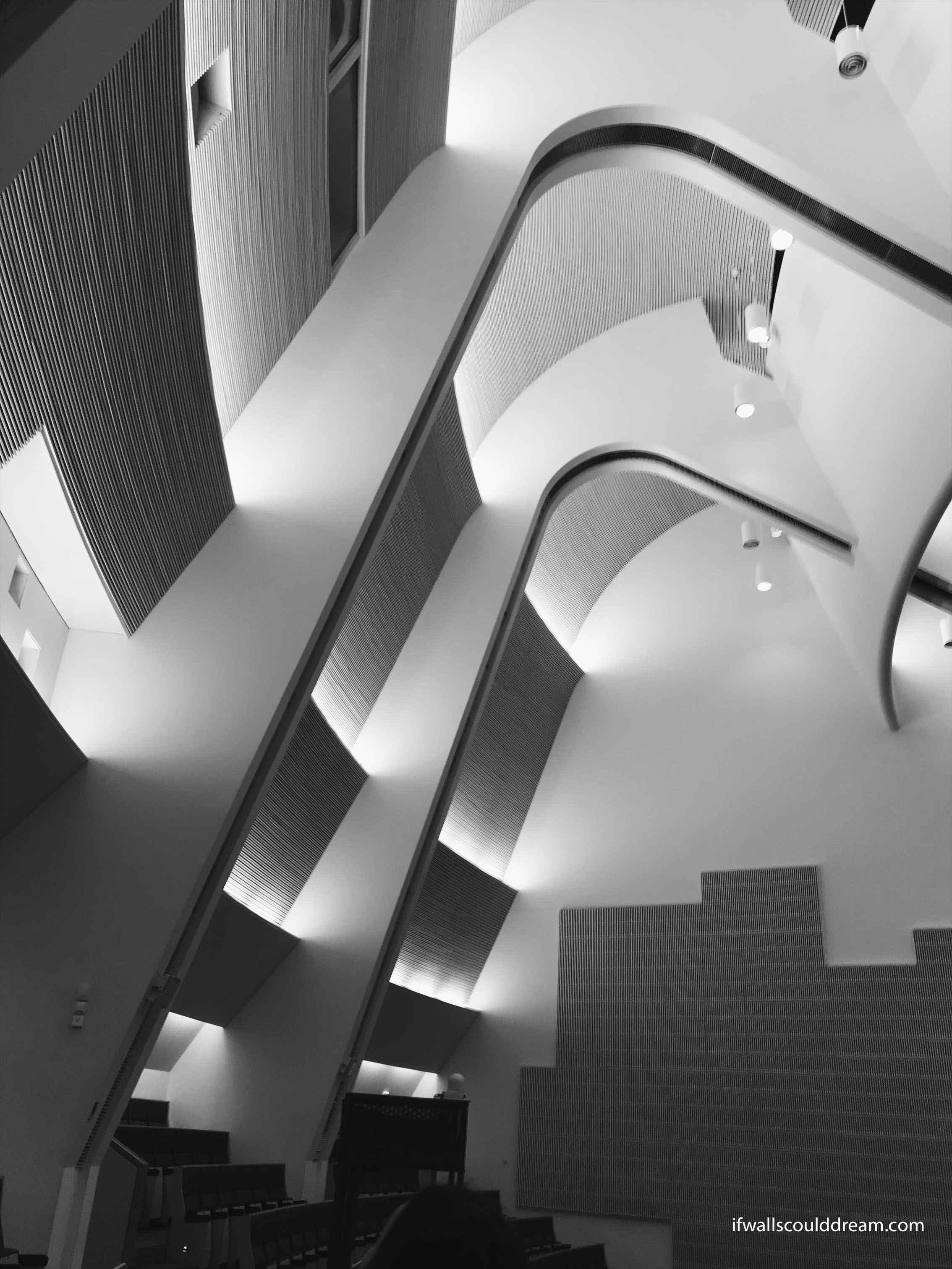
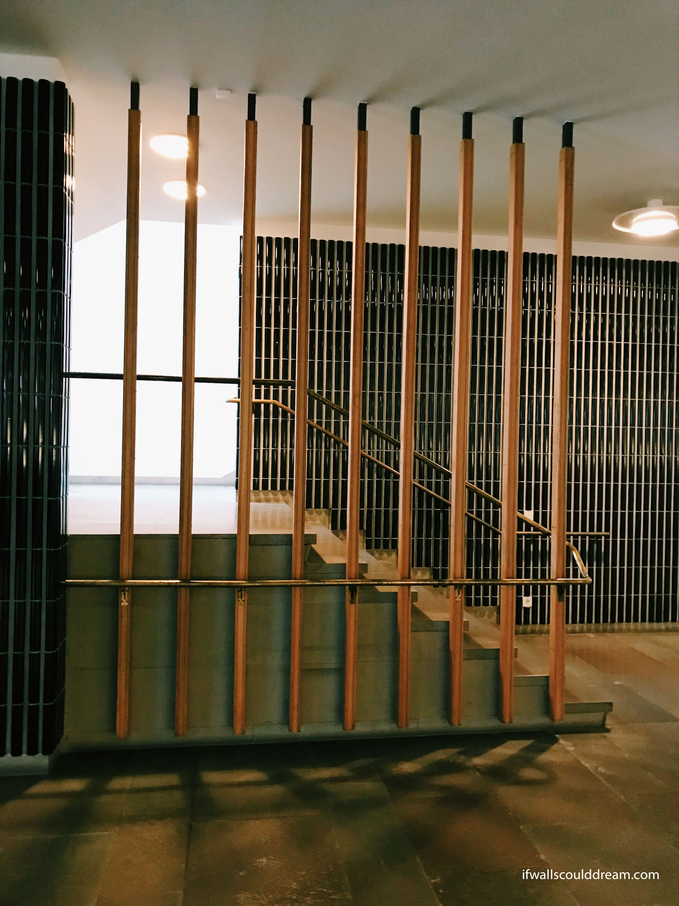
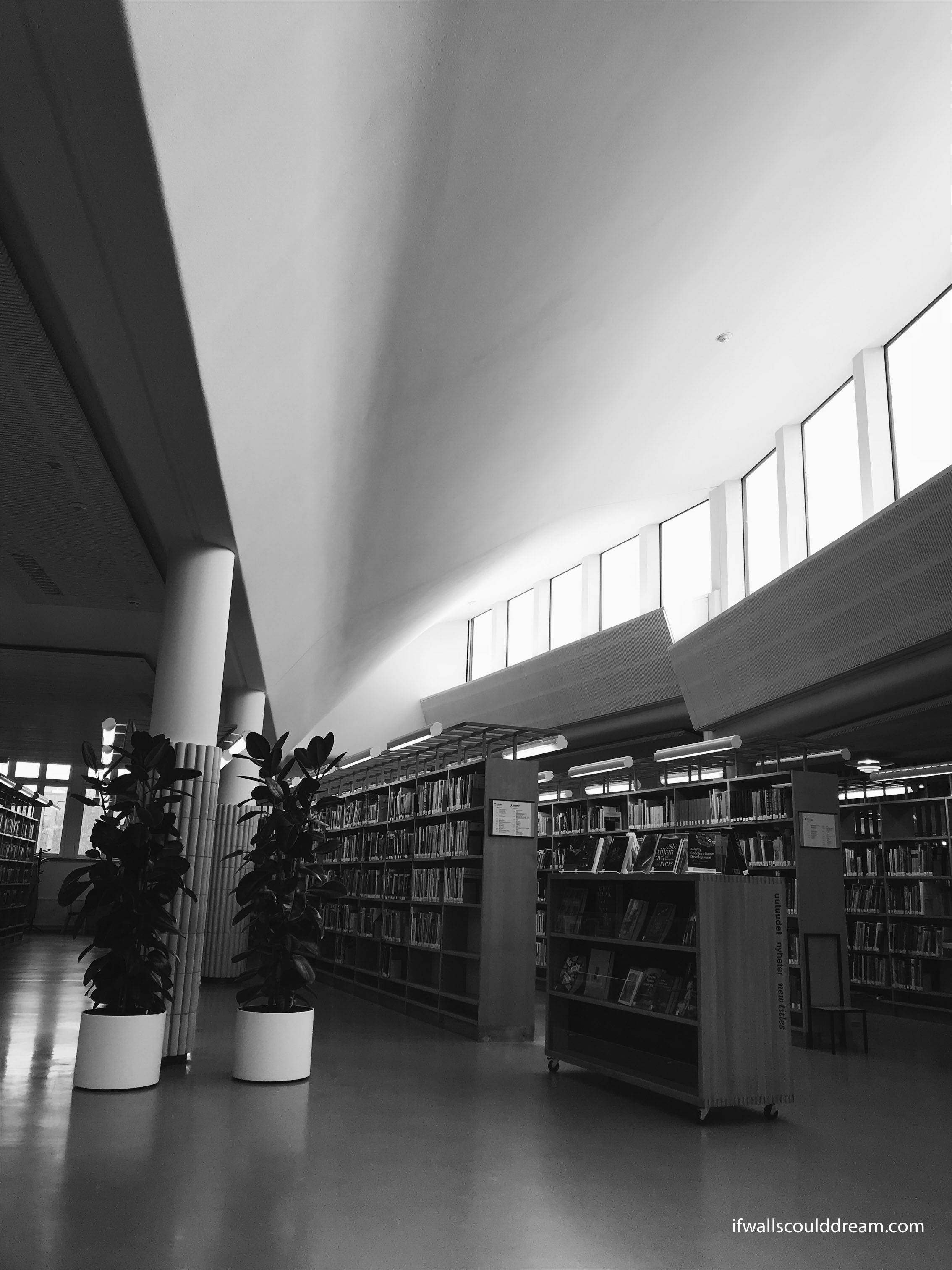
We also visited the library which Aalto designed as well. I loved this one piece of curved ceiling and how it brought light into the space.
Aalto Home and Studio
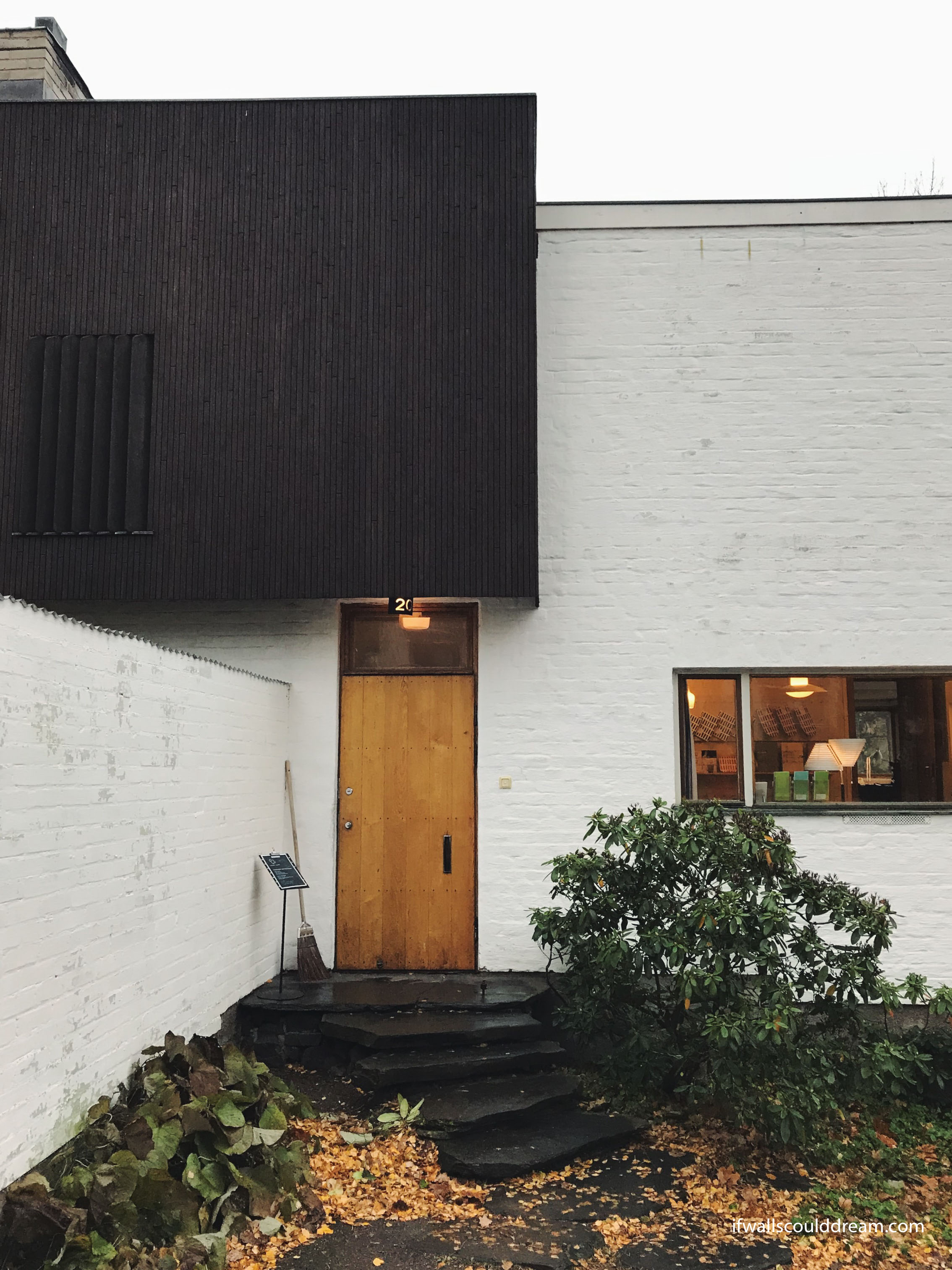
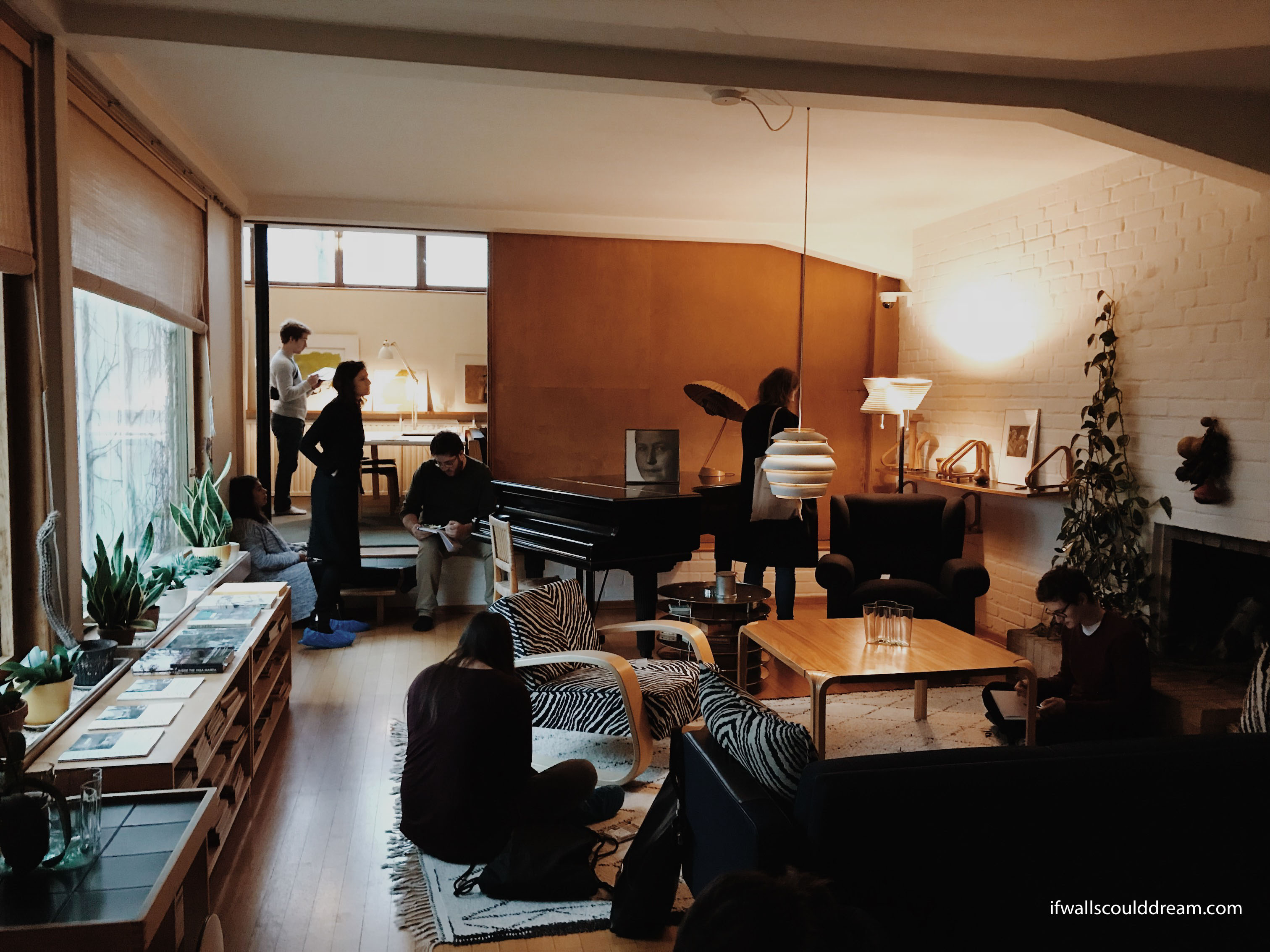
Another highlight of the trip was going to Aalto’s home and studio. It was such a treat to see a space that Aalto designed for himself exactly how he wanted it.
We all sat in his living room and sketched. I’m sure it’s not the first or last time a group of architects have sketched here!
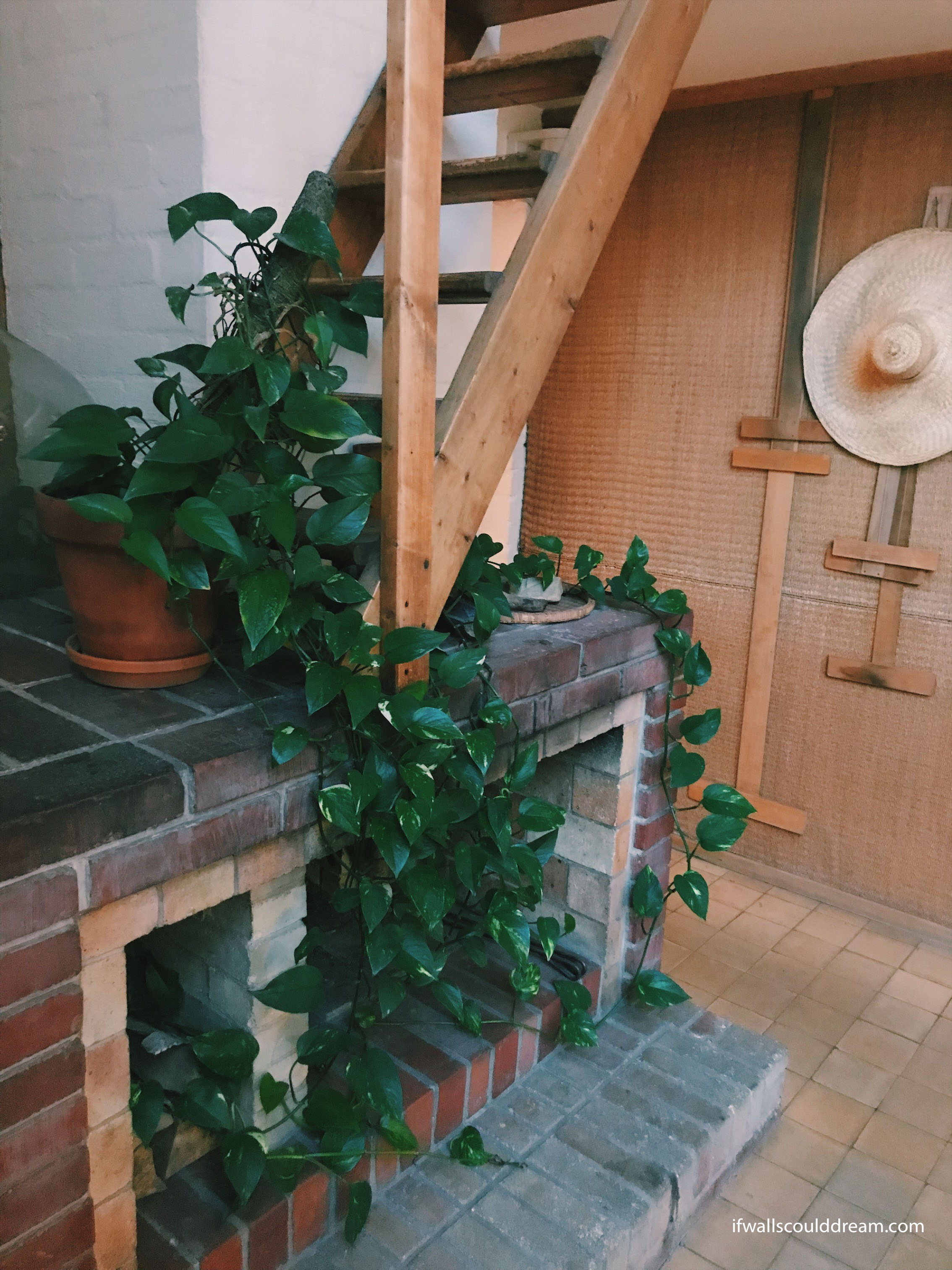
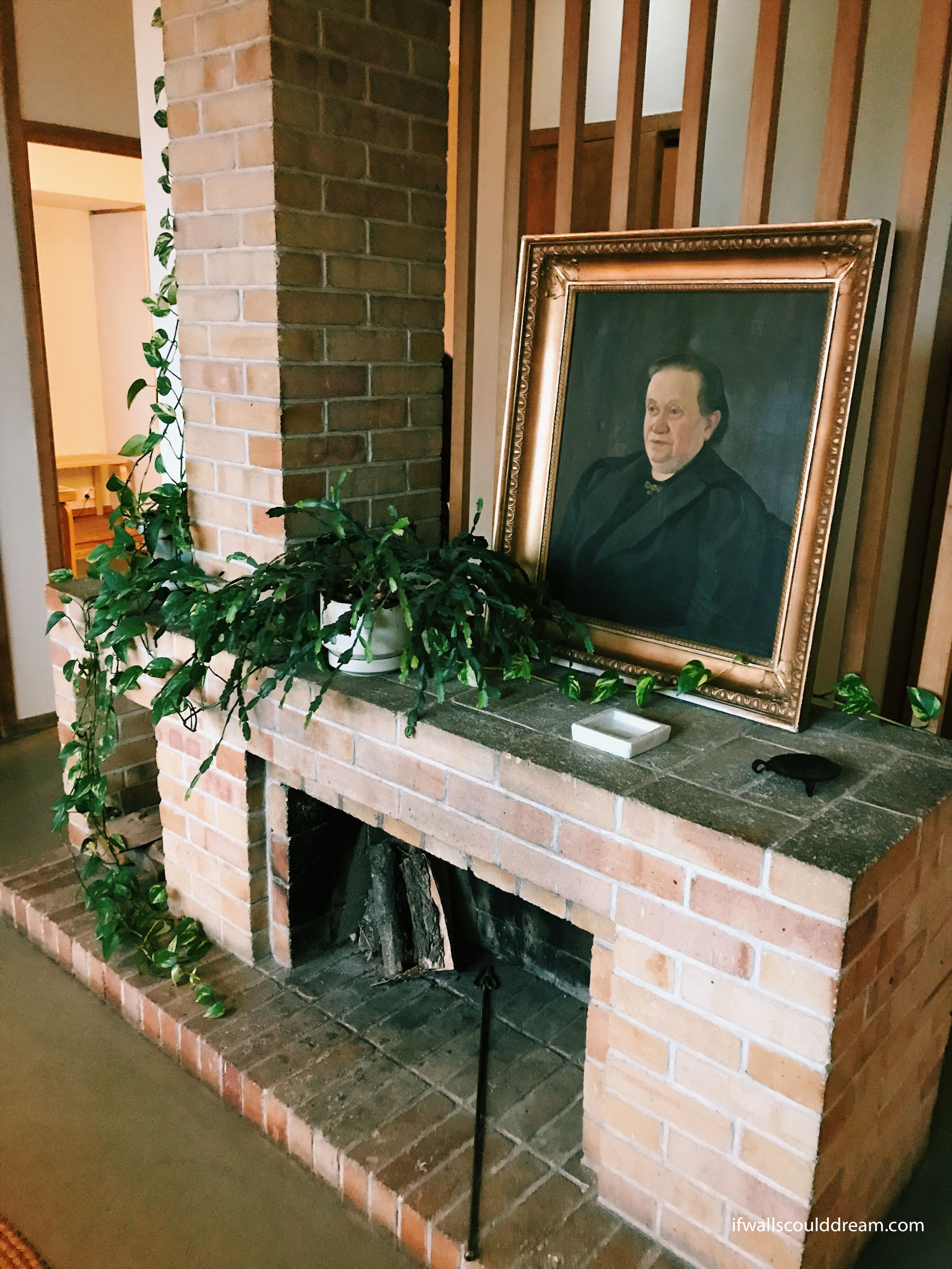
Aalto had some really beautiful fireplaces in his house.
Next, we went to the studio he built when his firm outgrew the home office.
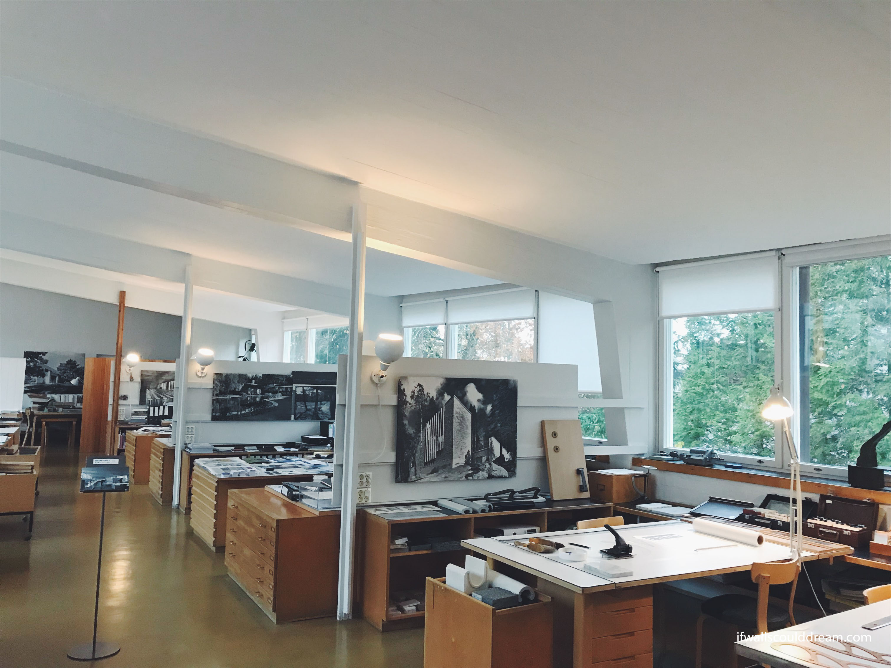
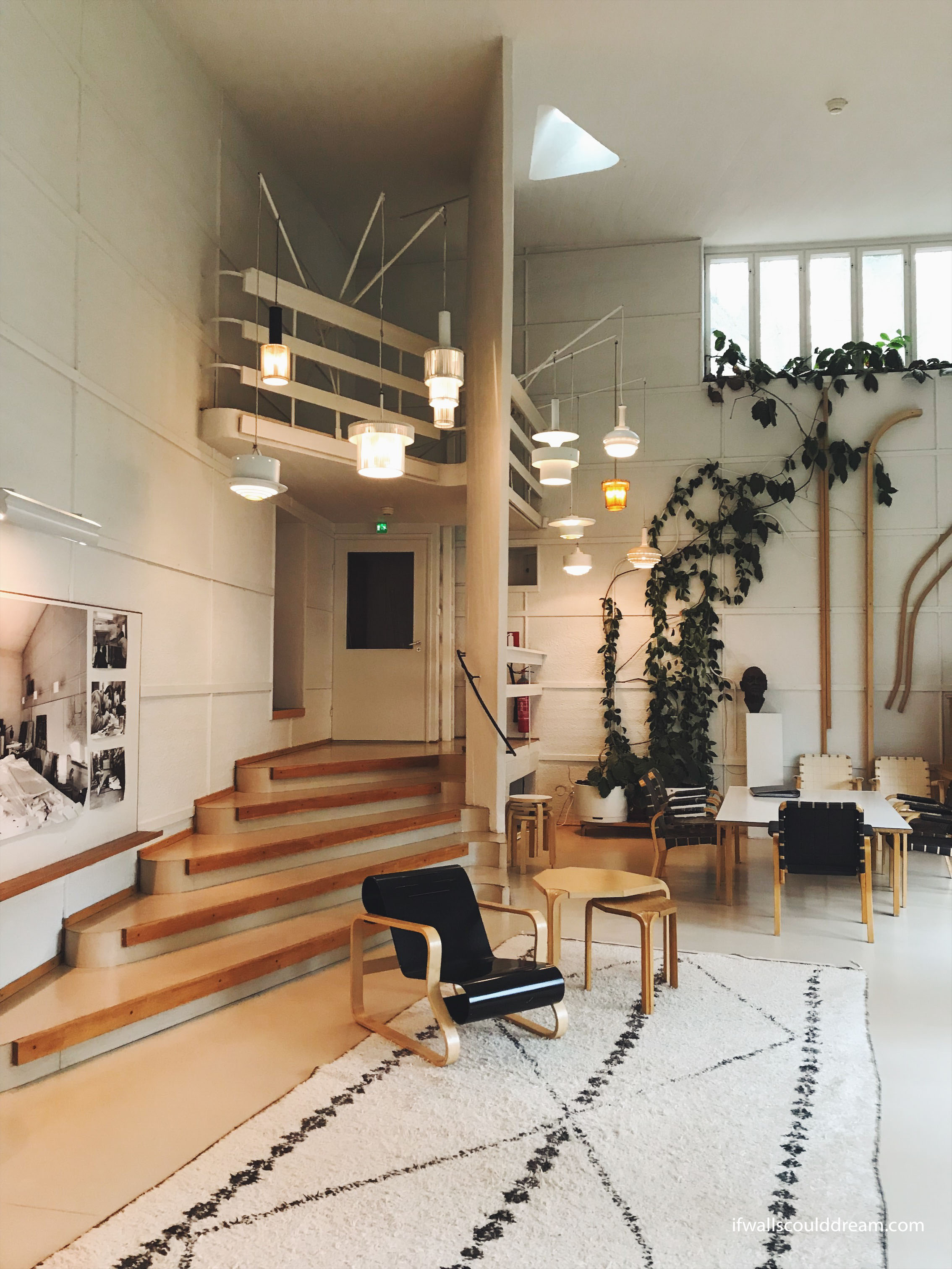
If walls could dream… they’d dream of visiting Alvar Aalto’s studio.
Study Tour Part 3: Helsinki
Next we went to Helsinki, Finland. (See part 1 here and part 2 here.) It was such a nice and walkable city and I really liked the buildings we visited. I would definitely recommend visiting Helsinki!
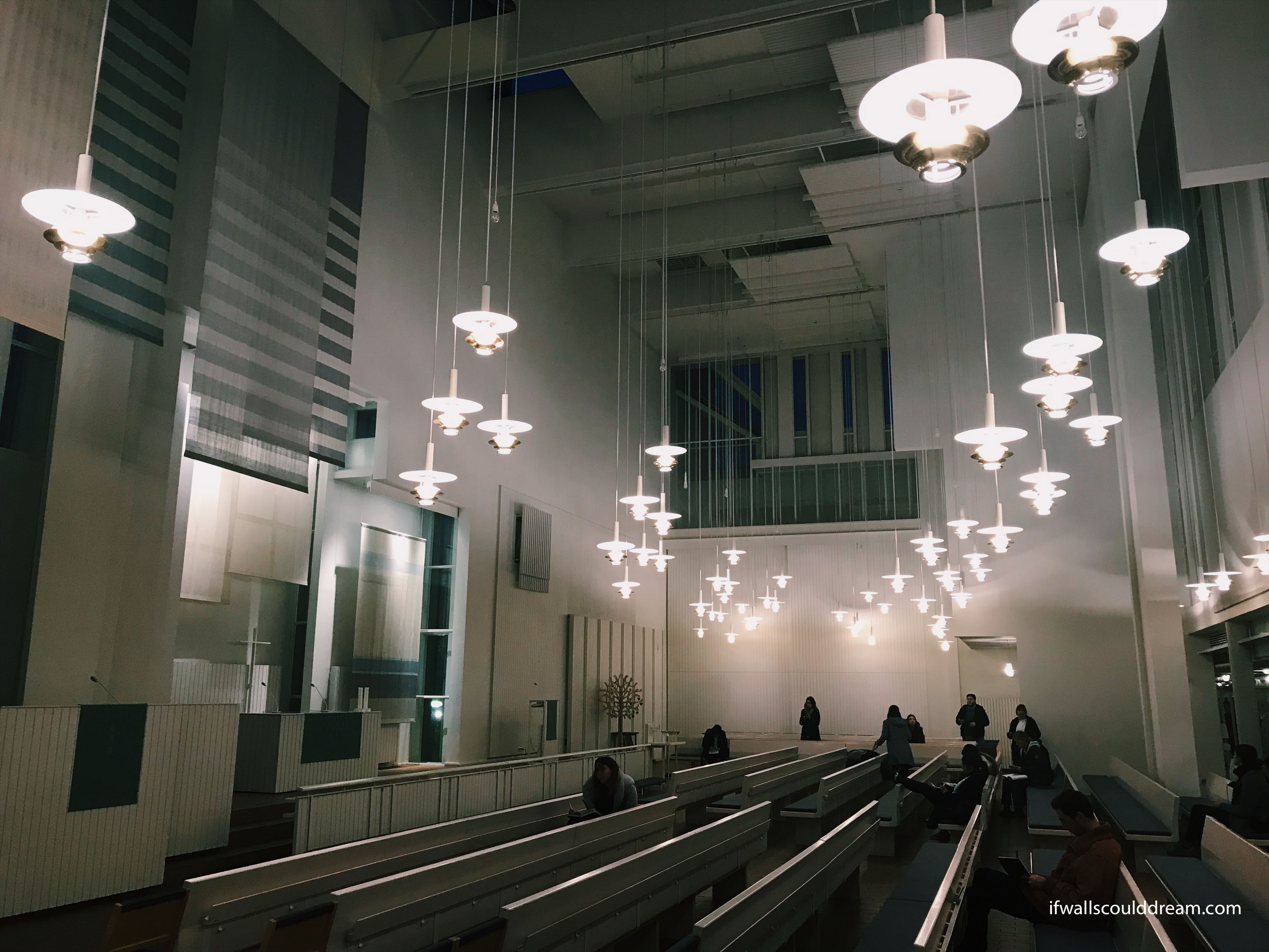
Myyrmäki Church
We went to the Myyrmäki church by Juha Leiviskä. He said that “architecture is closer to music than the visual arts” and you can definitely feel that in this church. It feels like the space is composed around you, each element having its own rhythm.
Loyly Sauna
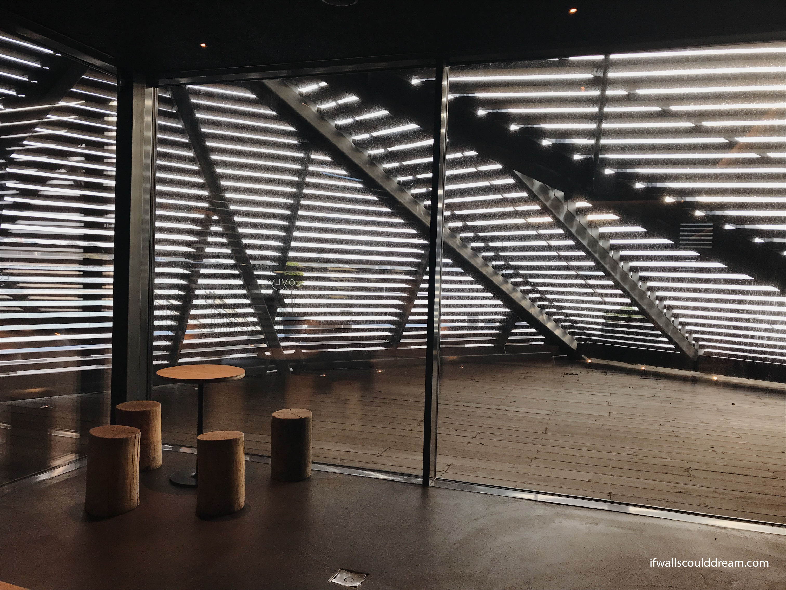
We also got to visit a Finnish sauna! It was so fun. We got a tour from the architect and then we got to go into the sauna.
Helsinki University Library
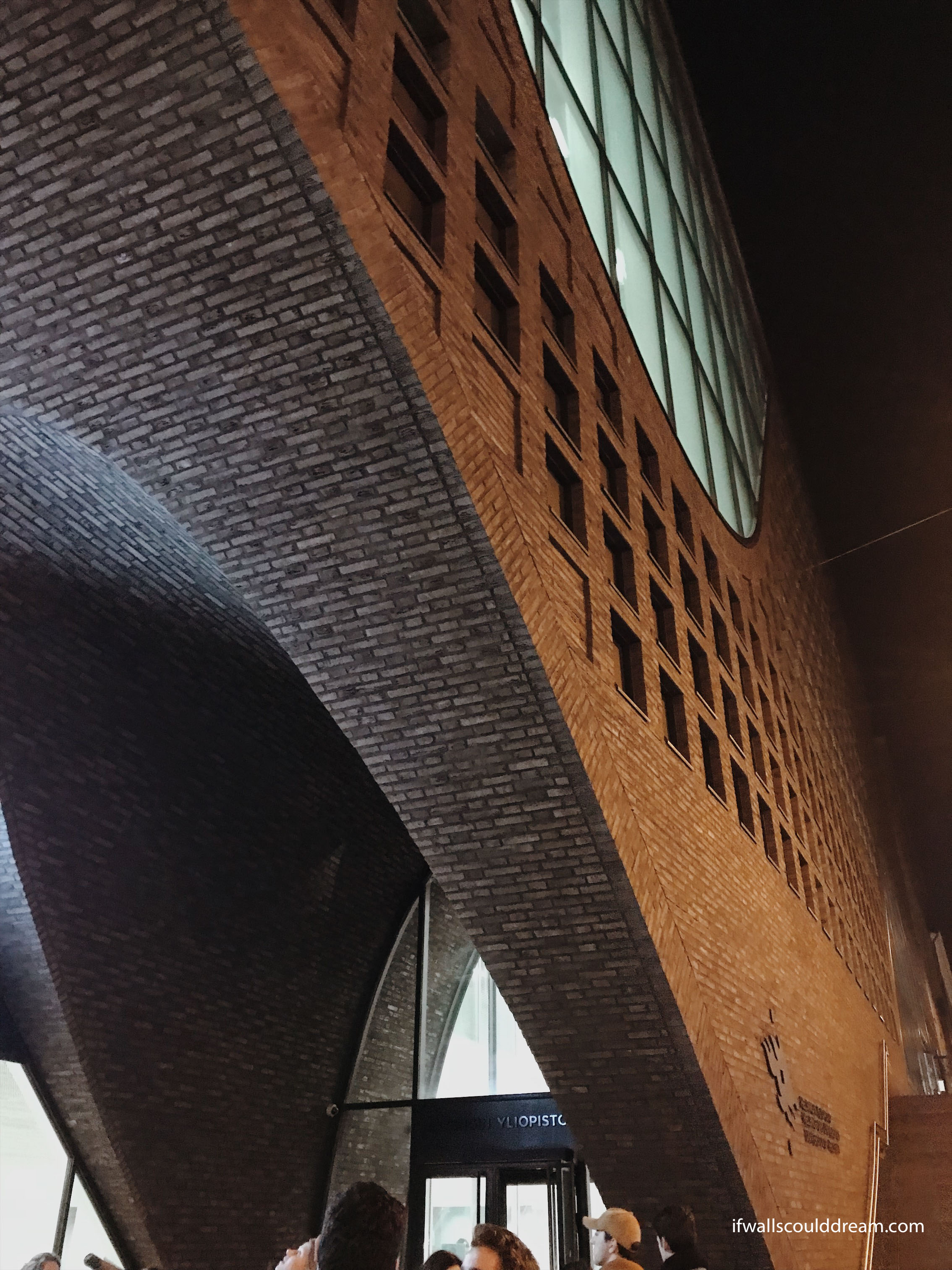
The Helsinki University Library was beautiful as well. It was built by Anttinen Oiva Architects. The building is an investigation in the interaction of square and rounded shapes. A grid of windows and bookcases is interrupted by elegantly swooping curves.
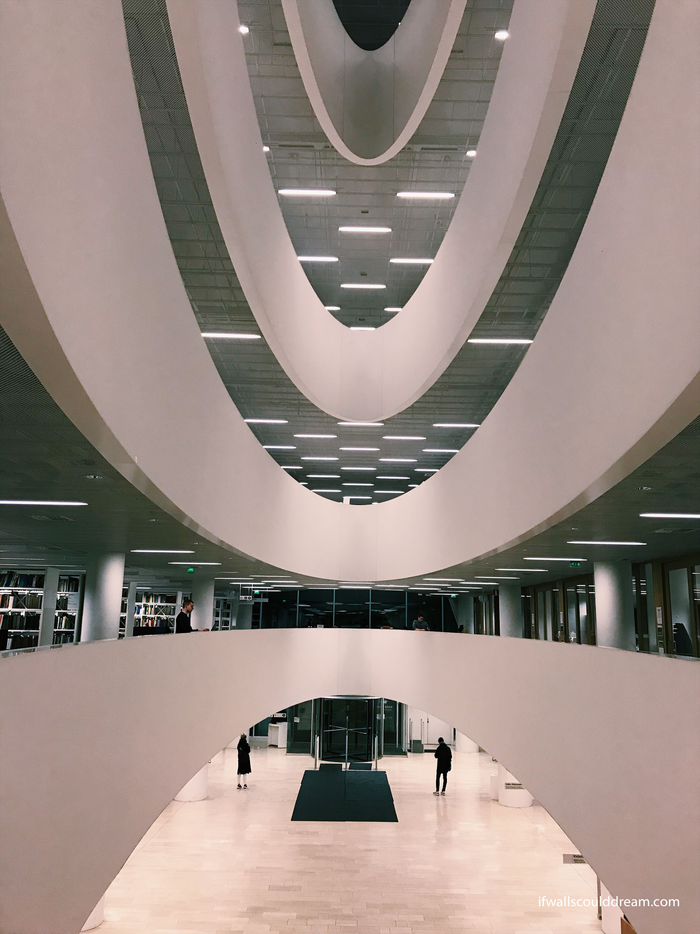
The main entry to the library is a curved atrium.
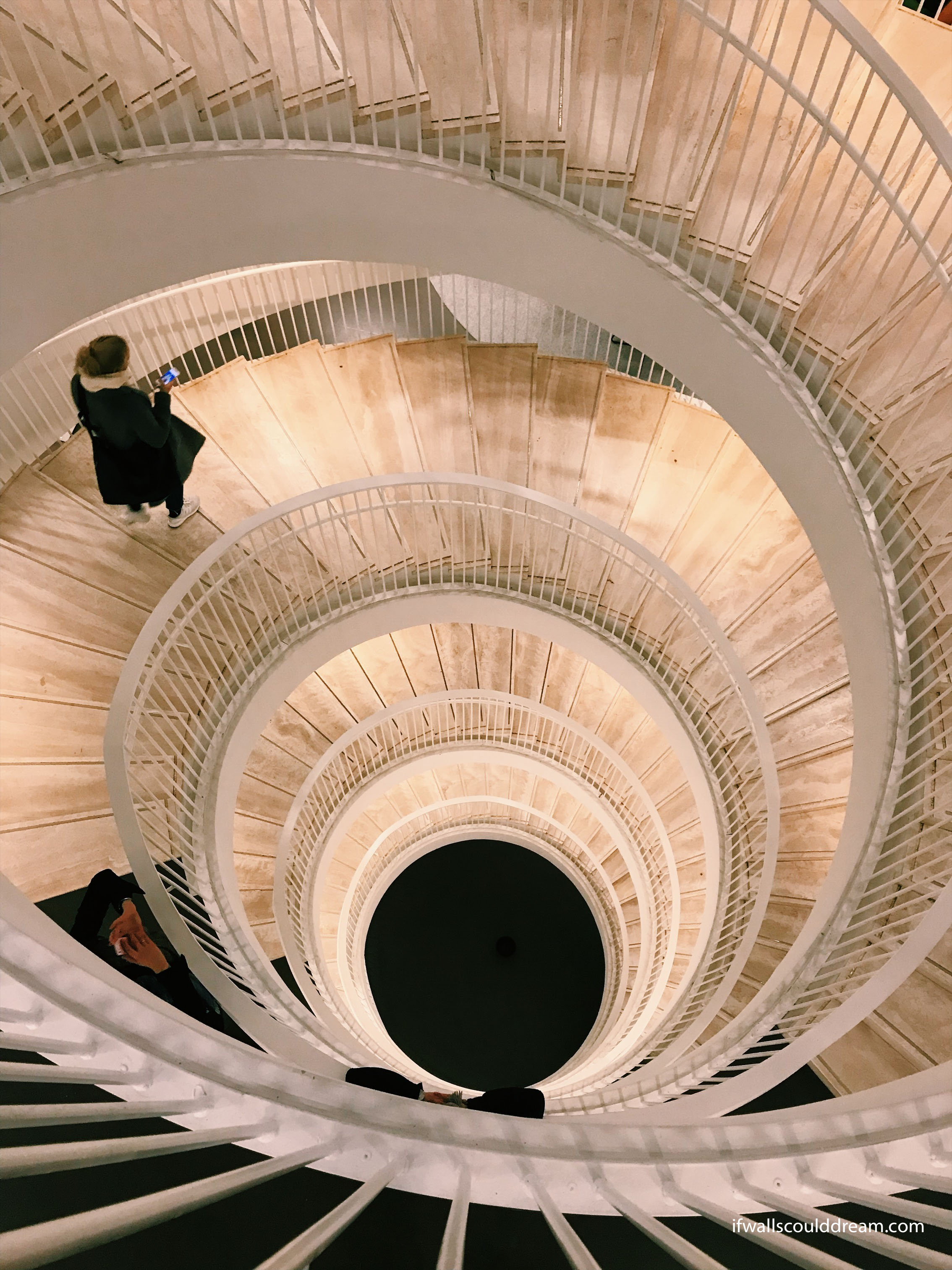
There is a beautiful circular staircase that goes through the building.
Kiasma Art Museum
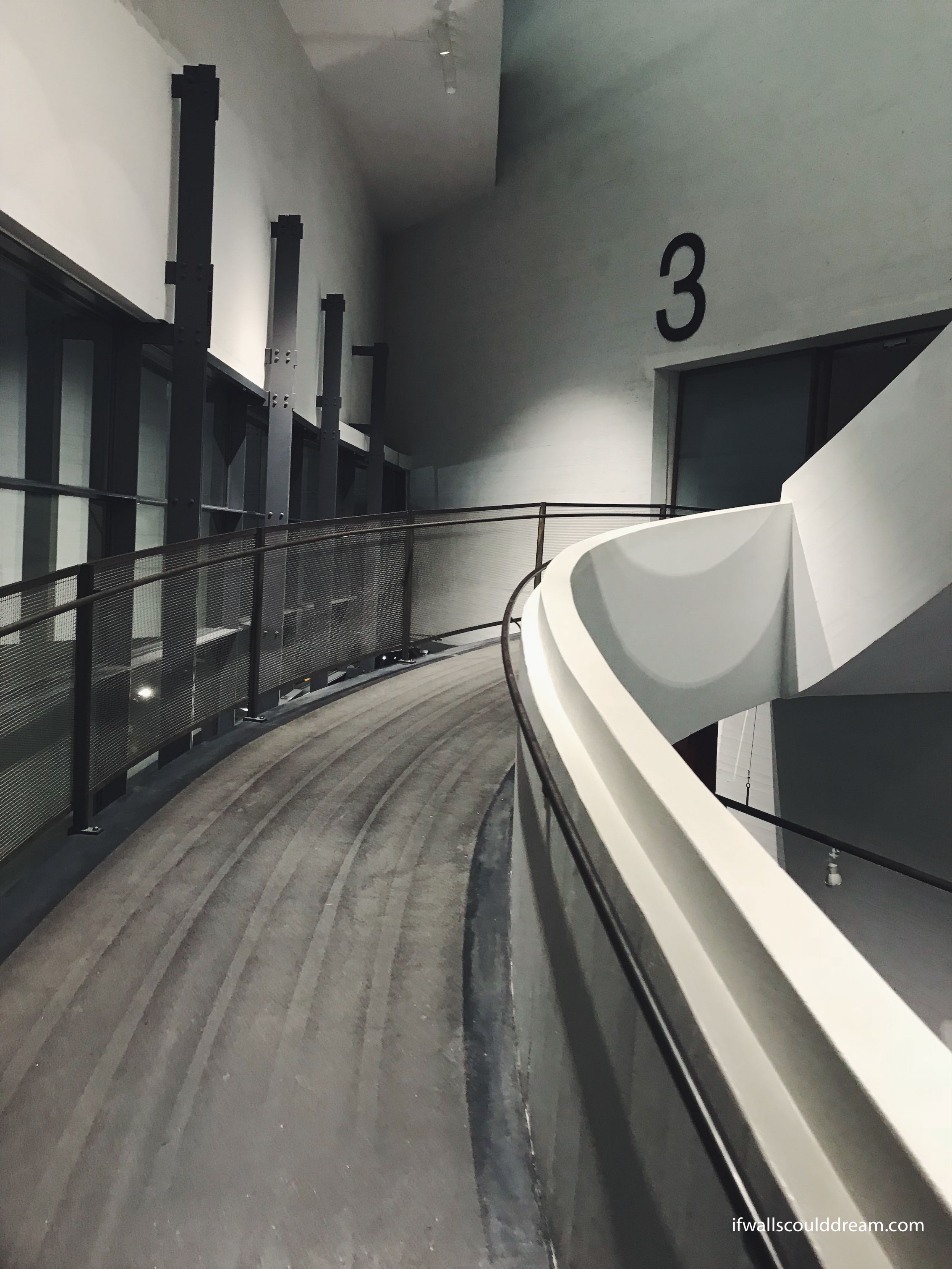
Steven Holl! One of my favorite architects. This is his Kiasma Art Museum. The circulation in this building is a series of ramps that lead you from exhibition to exhibition.
Temppeliaukion “Rock Church”
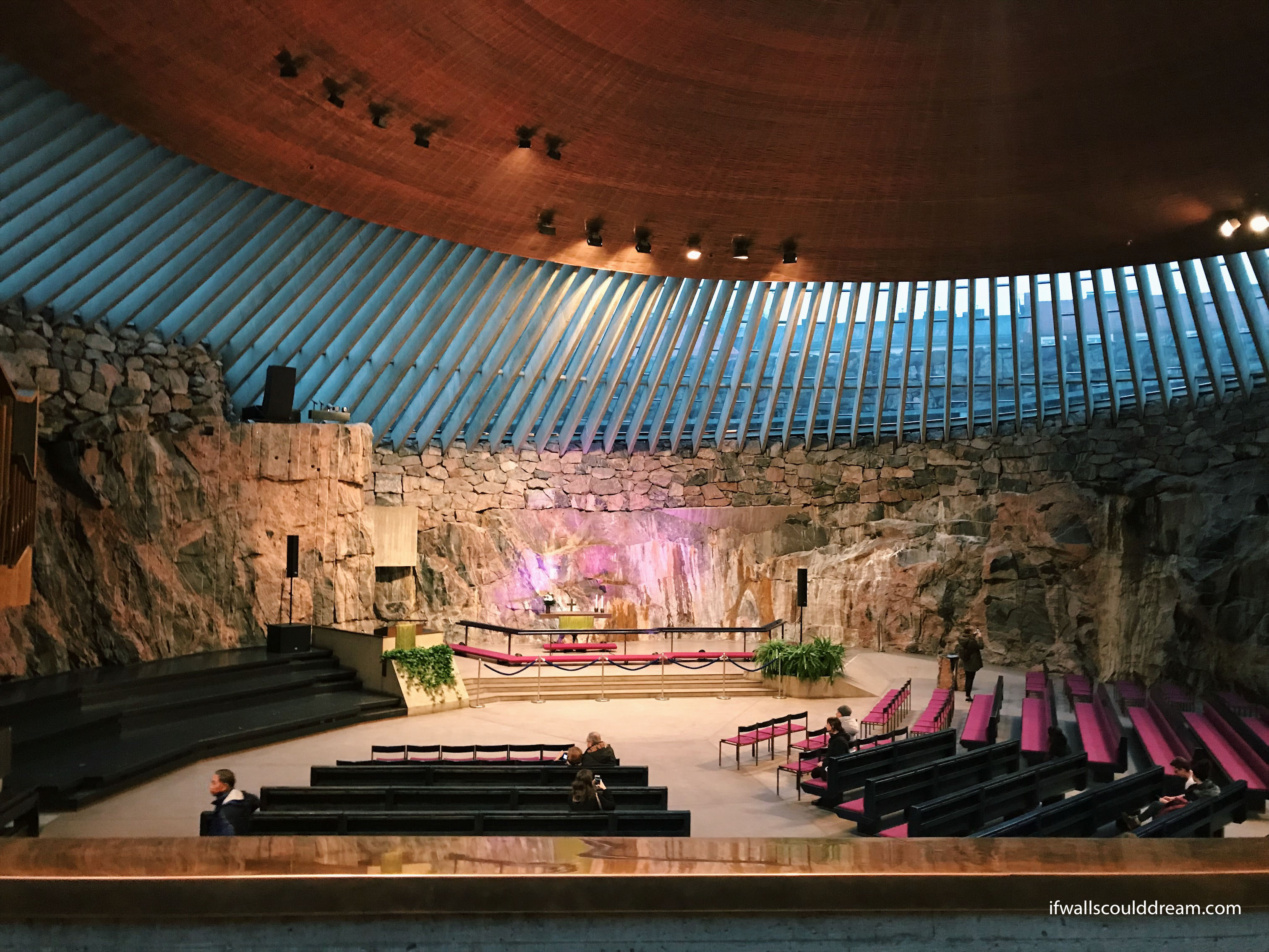
The “rock church” was carved out of bedrock and had the most incredible copper ceiling.
Aalto University
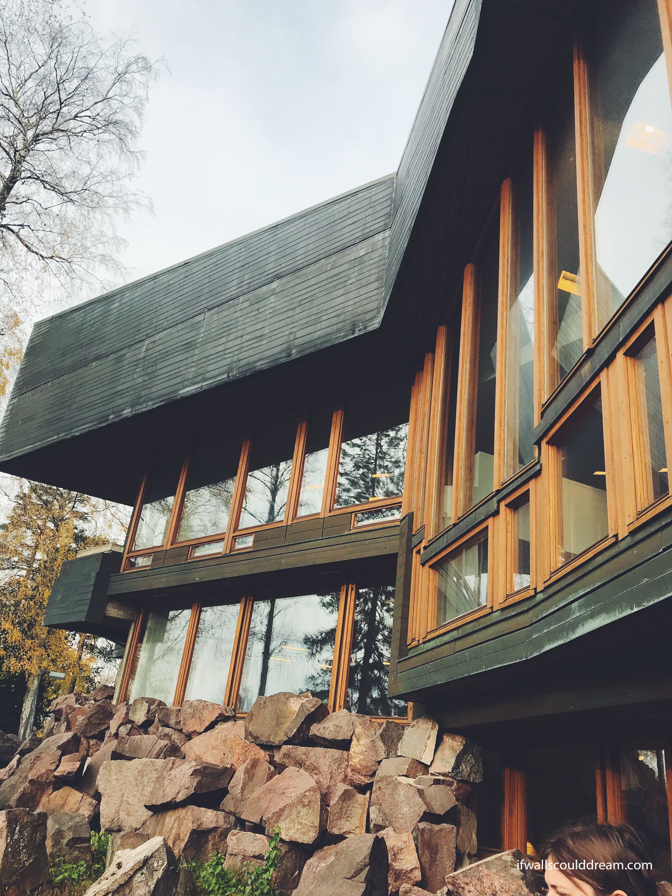
We got to tour Aalto University. Many of the buildings will be in my next post, Aalto Mania, but this building is the Dipoli university union and it was designed by Reima and Raili Pietilä. I loved the exterior of this building. It feels like a ski resort!
More Aalto buildings to come in the next post!
If walls could dream… they’d dream of visiting Helsinki.
Study Tour Part 2: Turku, Finland
The next stop on my study tour was in Turku, Finland. (See part 1 here.) We took an overnight ferry from Stockholm and it was like a mini cruise! In Turku we visited some absolutely amazing buildings.
St. Henry’s Ecumenical Art Chapel
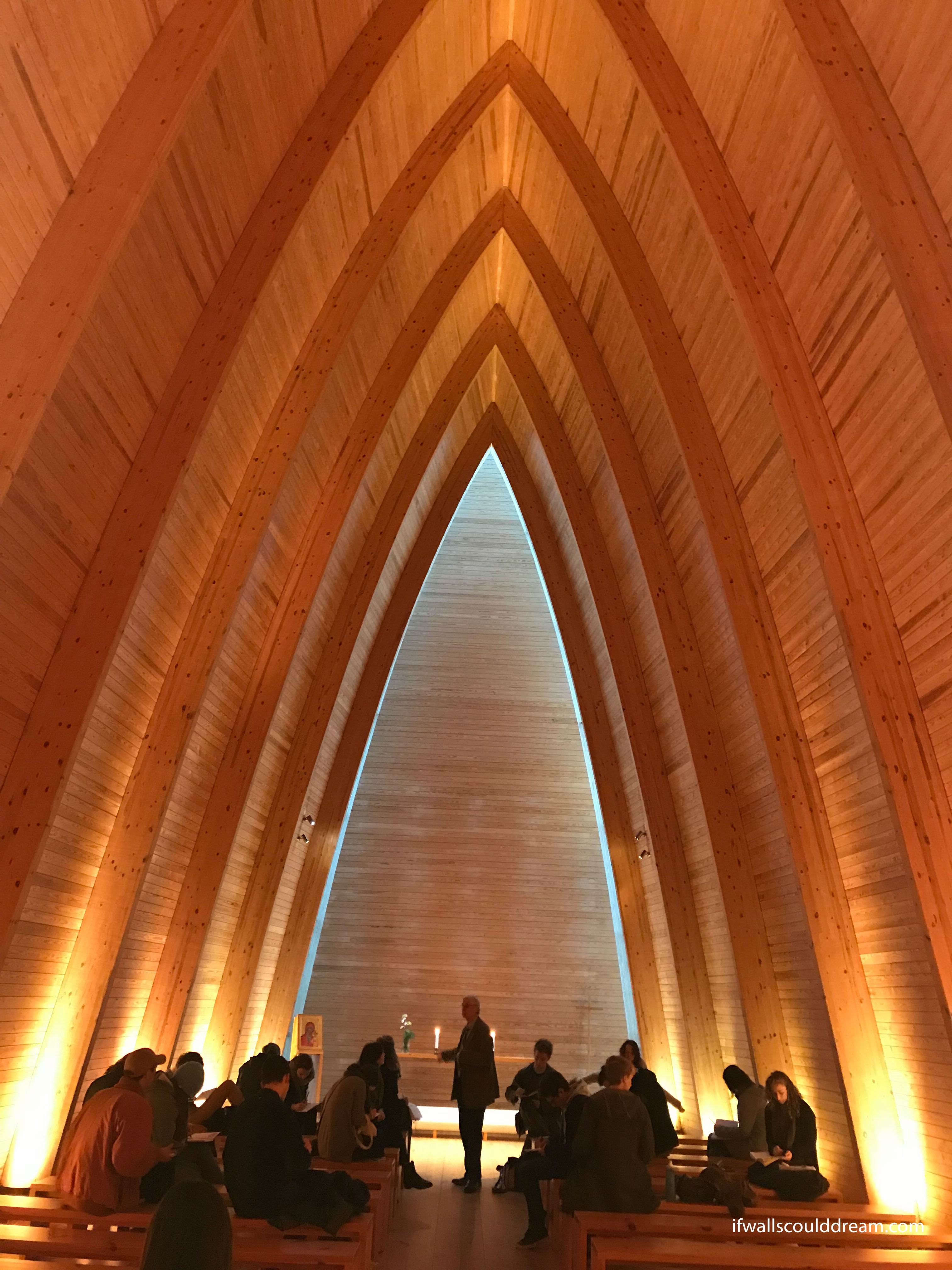
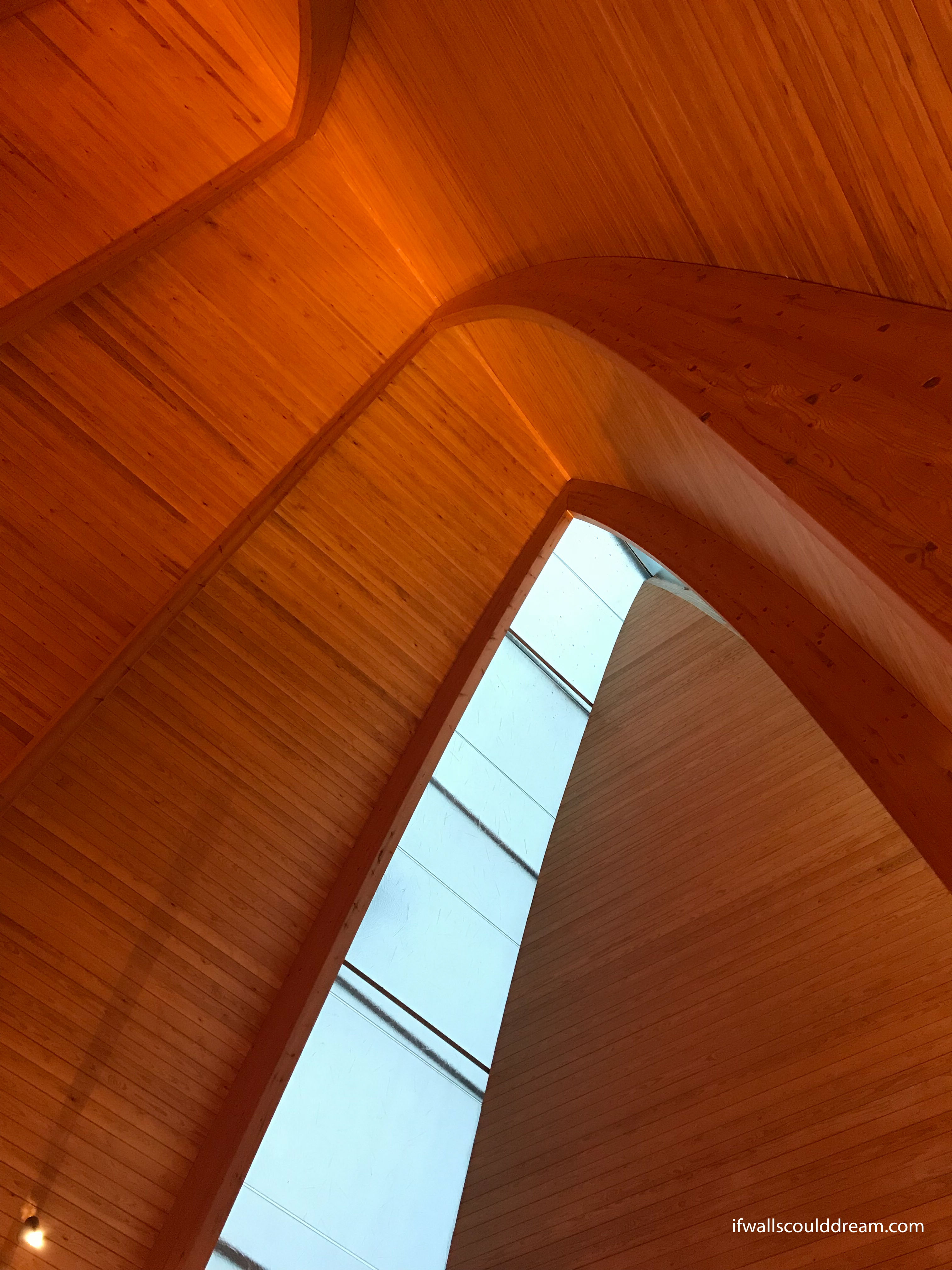
We arrived here early in the morning, sleepy-eyed, but we were treated to a beautiful wooden chapel. Like a boat rising out of the sea, this slightly curved space had a wonderful quality. To top it all off, a girl in my class played the piano for us there and it was the most incredible experience to be in a beautiful place with beautiful music. Definitely a highlight of the trip.
Chapel of the Holy Cross
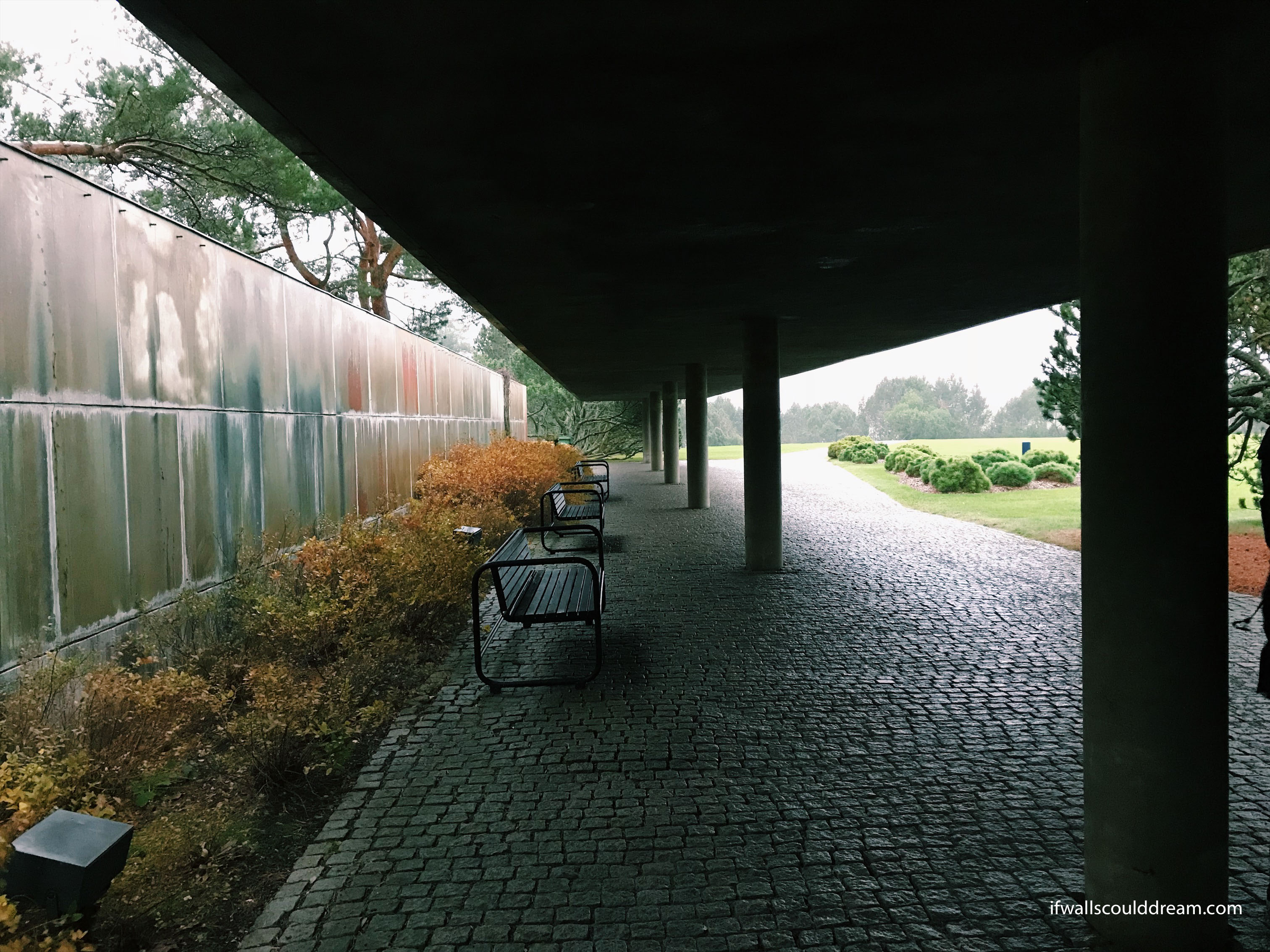
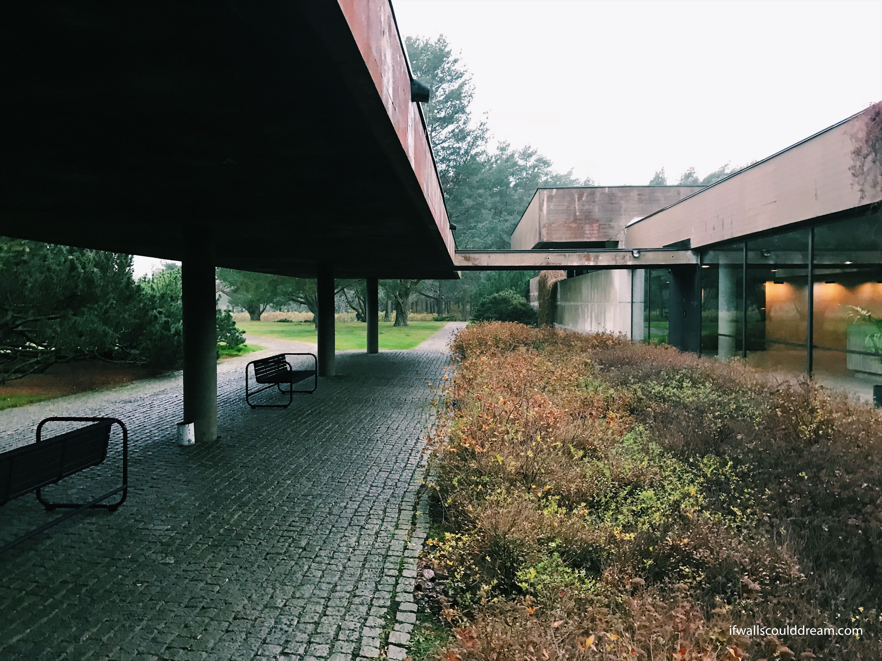
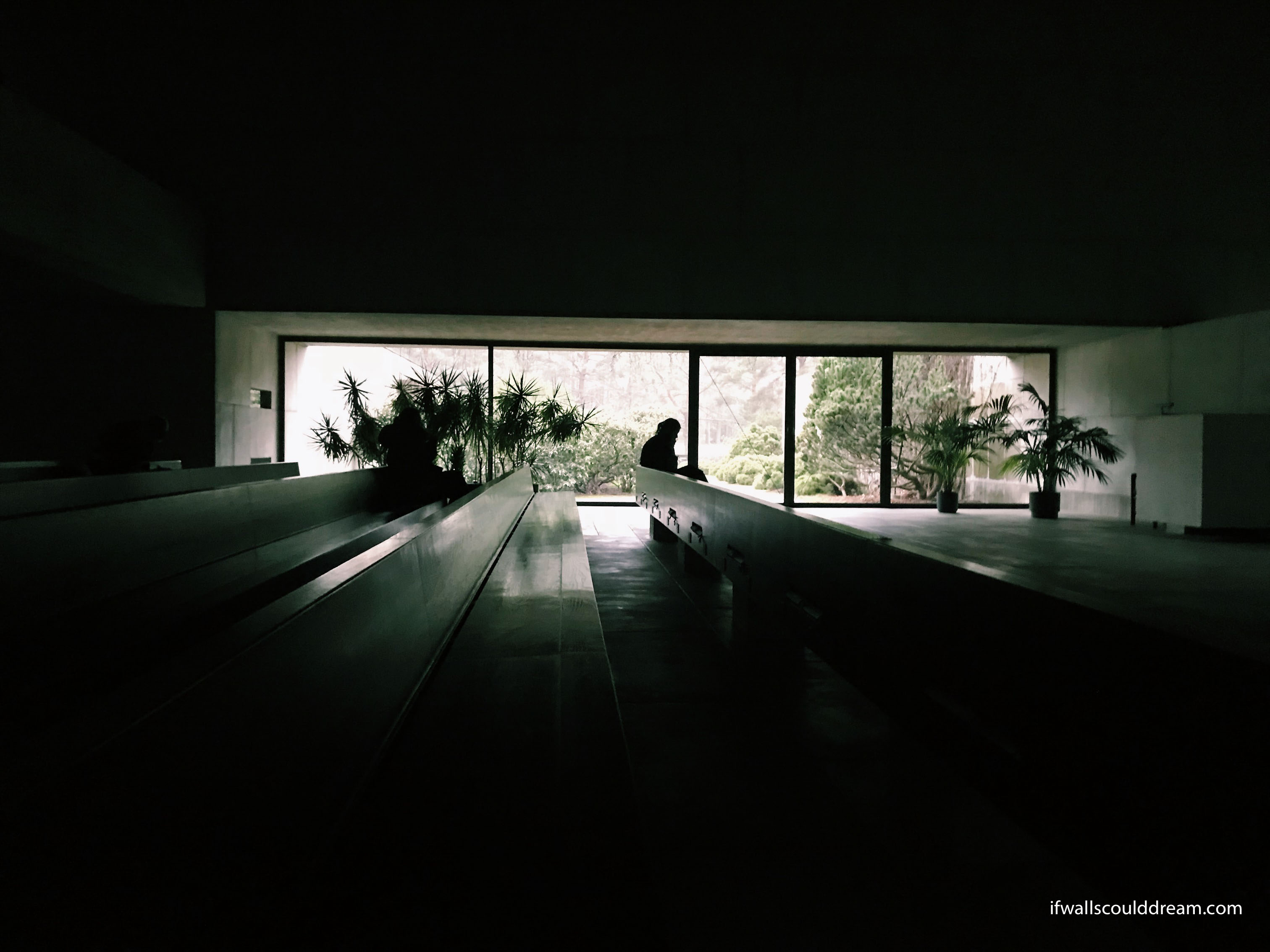
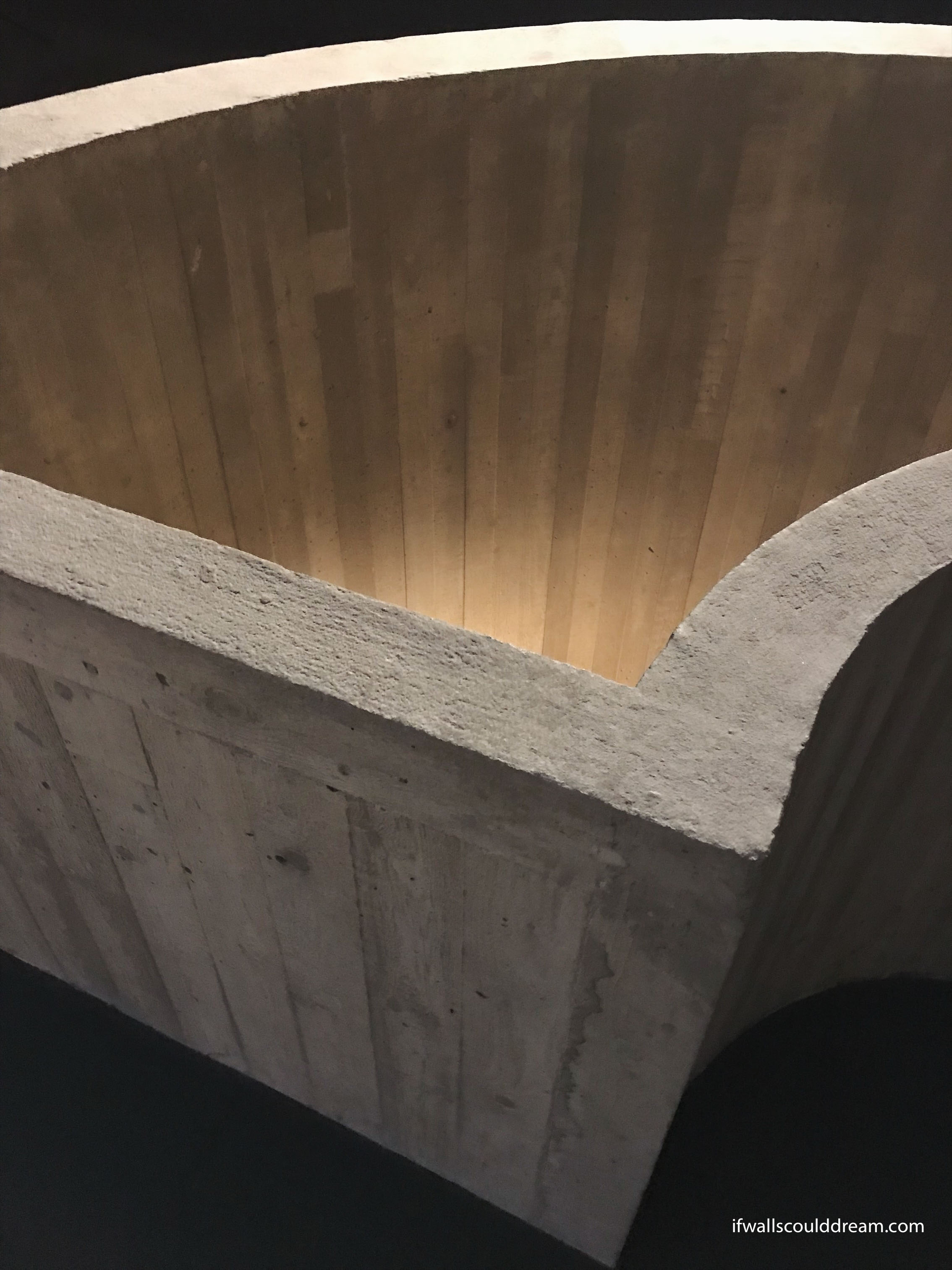
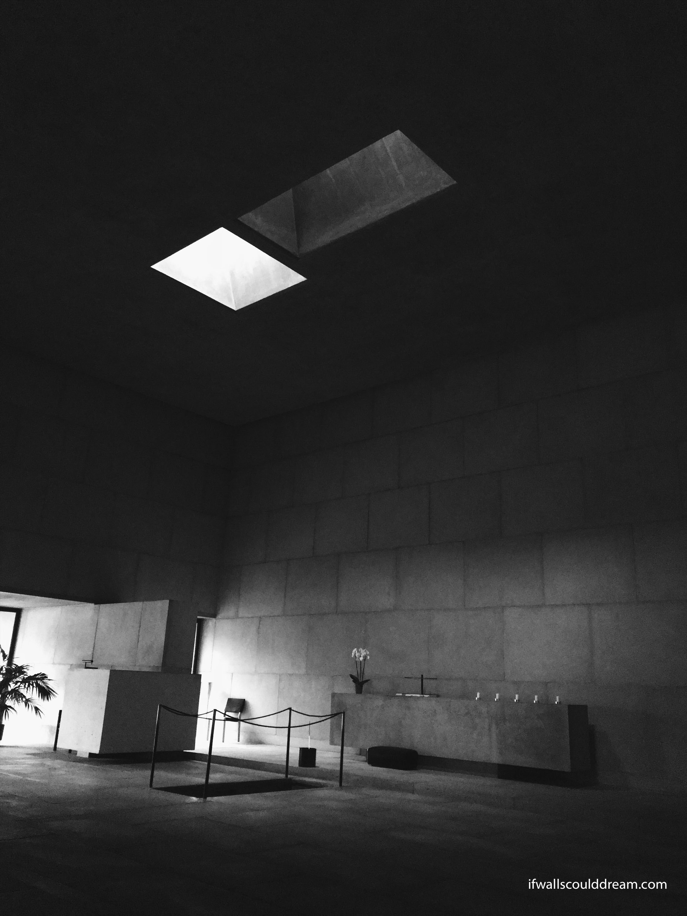
After the piano music at the art chapel, I didn’t think this day could get much better, but it did! The Chapel of the Holy Cross quickly became one of my favorite buildings ever. I didn’t know anything about it before we arrived, but the quiet, somber spaces and the honest use of materials captured my heart. It’s the type of building you never want to leave. I felt so comfortable here, even though it’s a funeral chapel. You can really tell that the architect cared about every little detail of the design.
Paimio Sanatorium
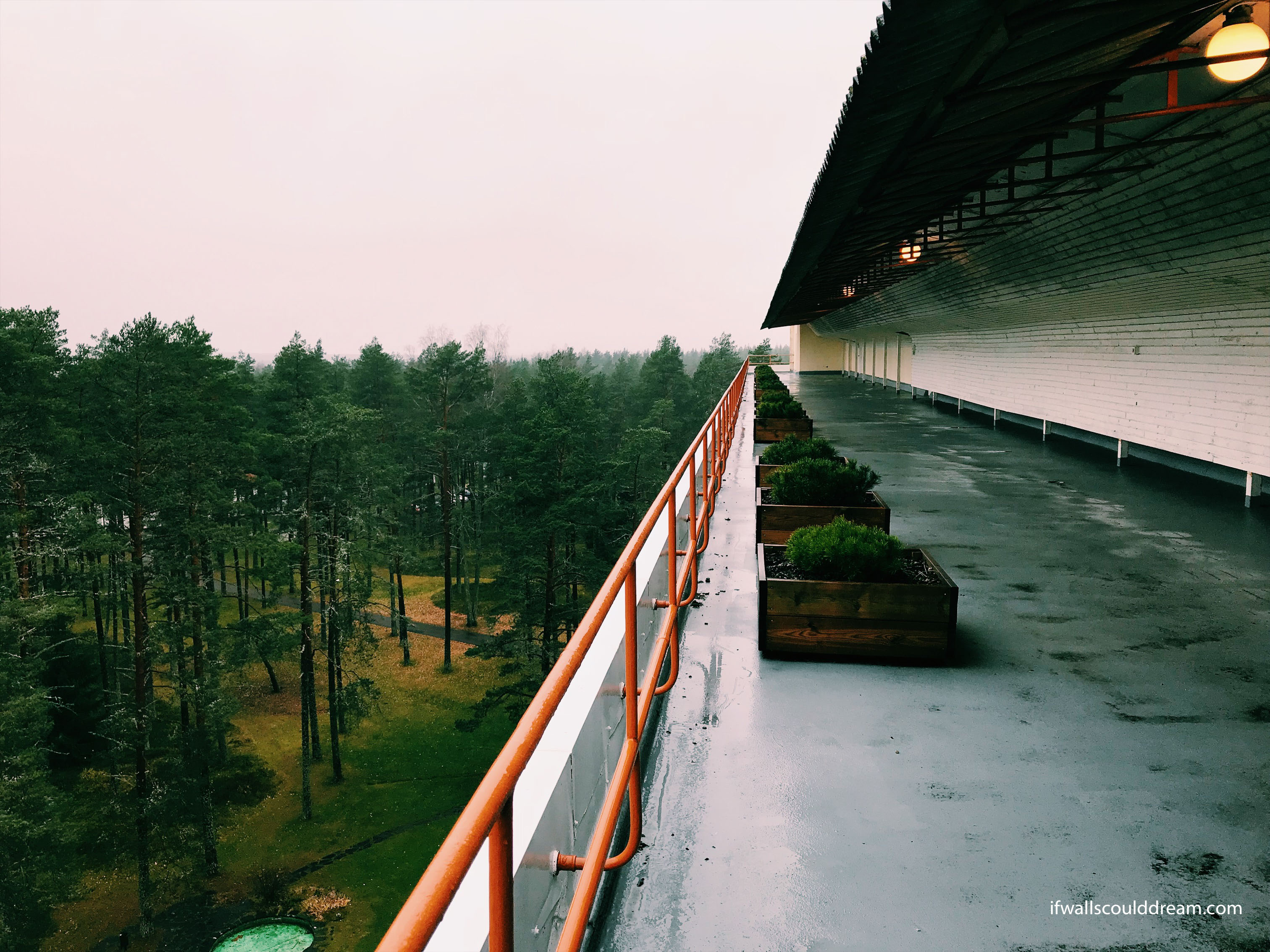
And last but not least, an architecture history classic, the Paimio Sanitarium by Alvar Aalto! Our first Aalto of the trip. This sanitarium was built for tuberculosis patients to heal by getting fresh air out in nature.

If walls could dream… they’d dream of having their breath taken away by beautiful chapels in Finland.
Study Tour Part 1: Stockholm, Sweden
For my long study tour with DIS, I went to Sweden and Finland. I traveled with an architecture professor, a DIS intern, and a group of 21 architecture and urban design students. It was such a fun group of people and we got to see so many amazing buildings. We started by taking the train from Copenhagen to Stockholm and we saw some snow on the way! It was magical.
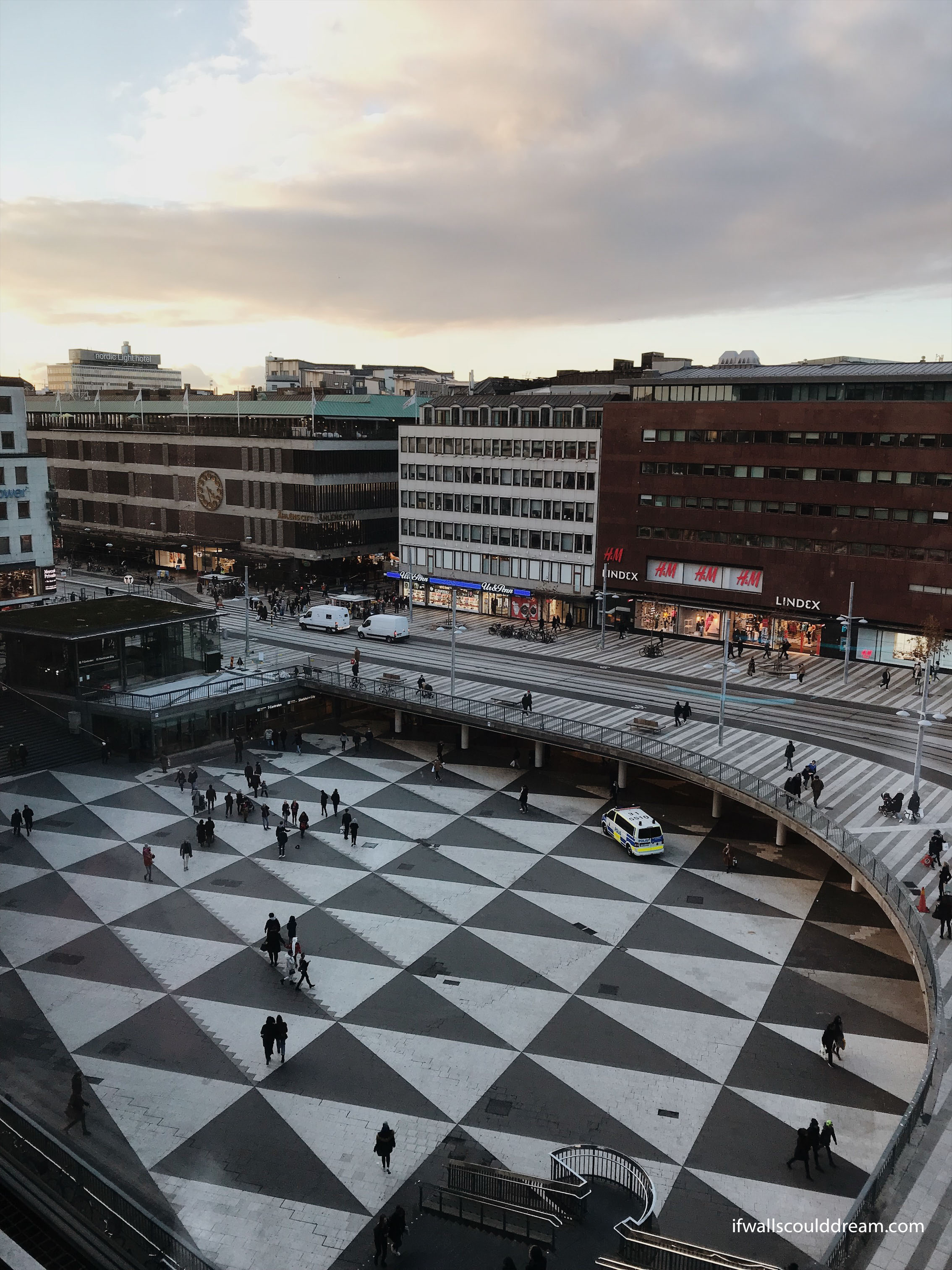
When we arrived in Stockholm, we went to the Culture House, which is a theater, library, cafe, gallery, event space, and whatever else you can imagine all wrapped up into one and set on the main plaza of the town. What a fun place for people watching.
Hammarby Sjöstad
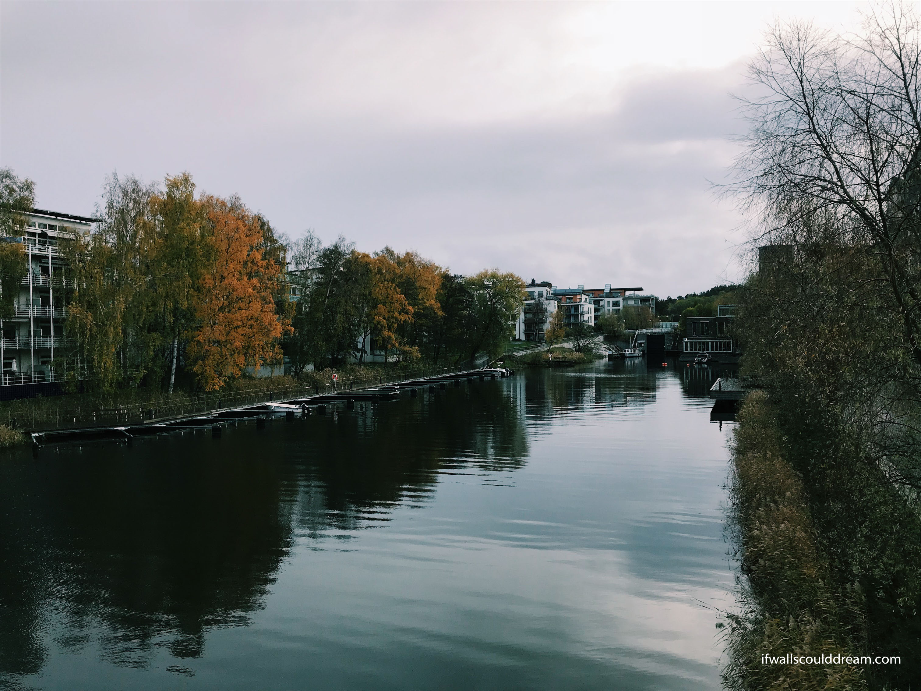
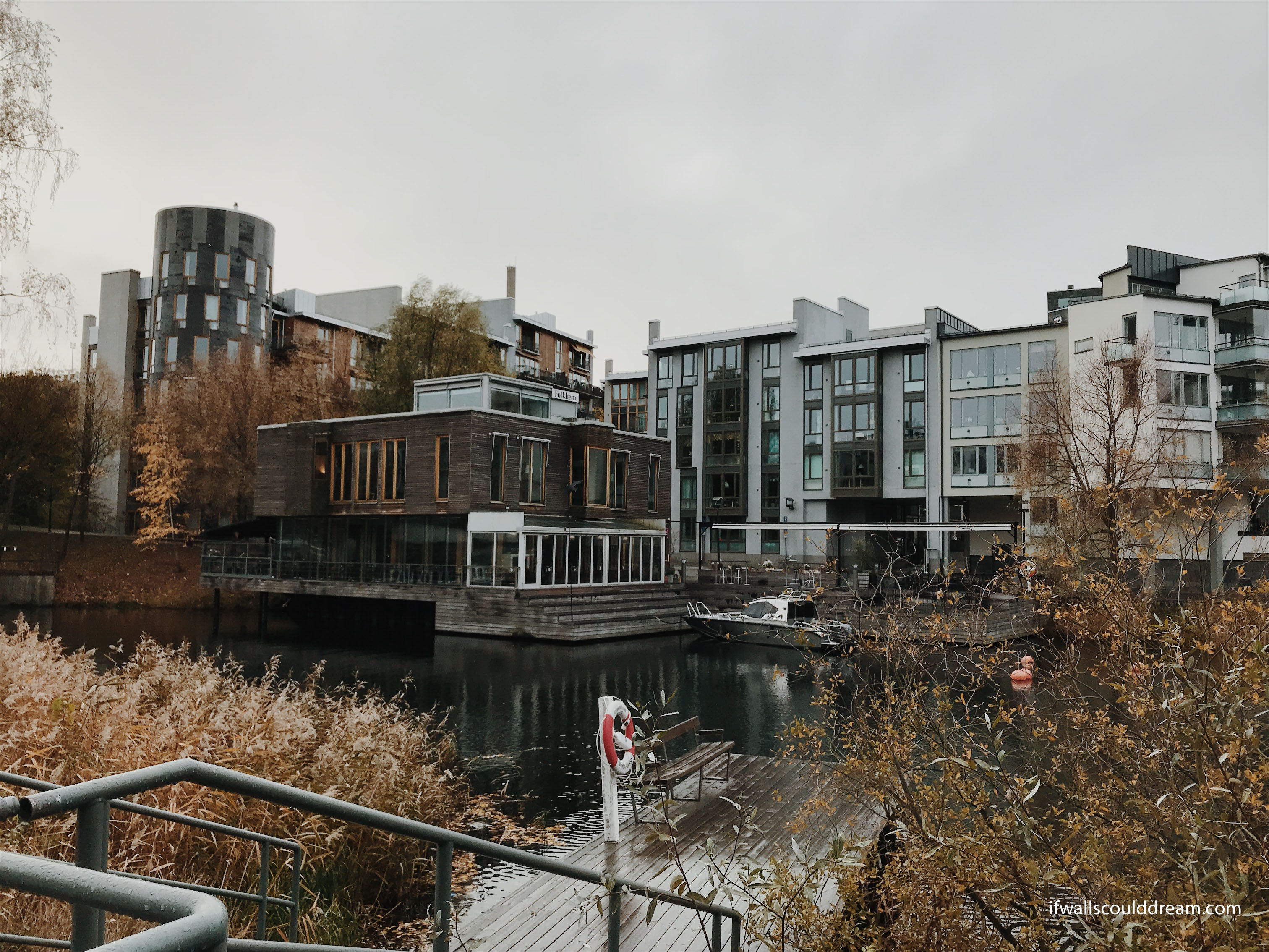
We also got to visit Hammarby Sjöstad, a sustainable urban development along a canal. It was originally designed for Stockholm’s bid for the Olympics and it integrates sustainable infrastructure into the planning of the city. It focuses on the flows of energy, water, and waste.
Stockholm Public Library
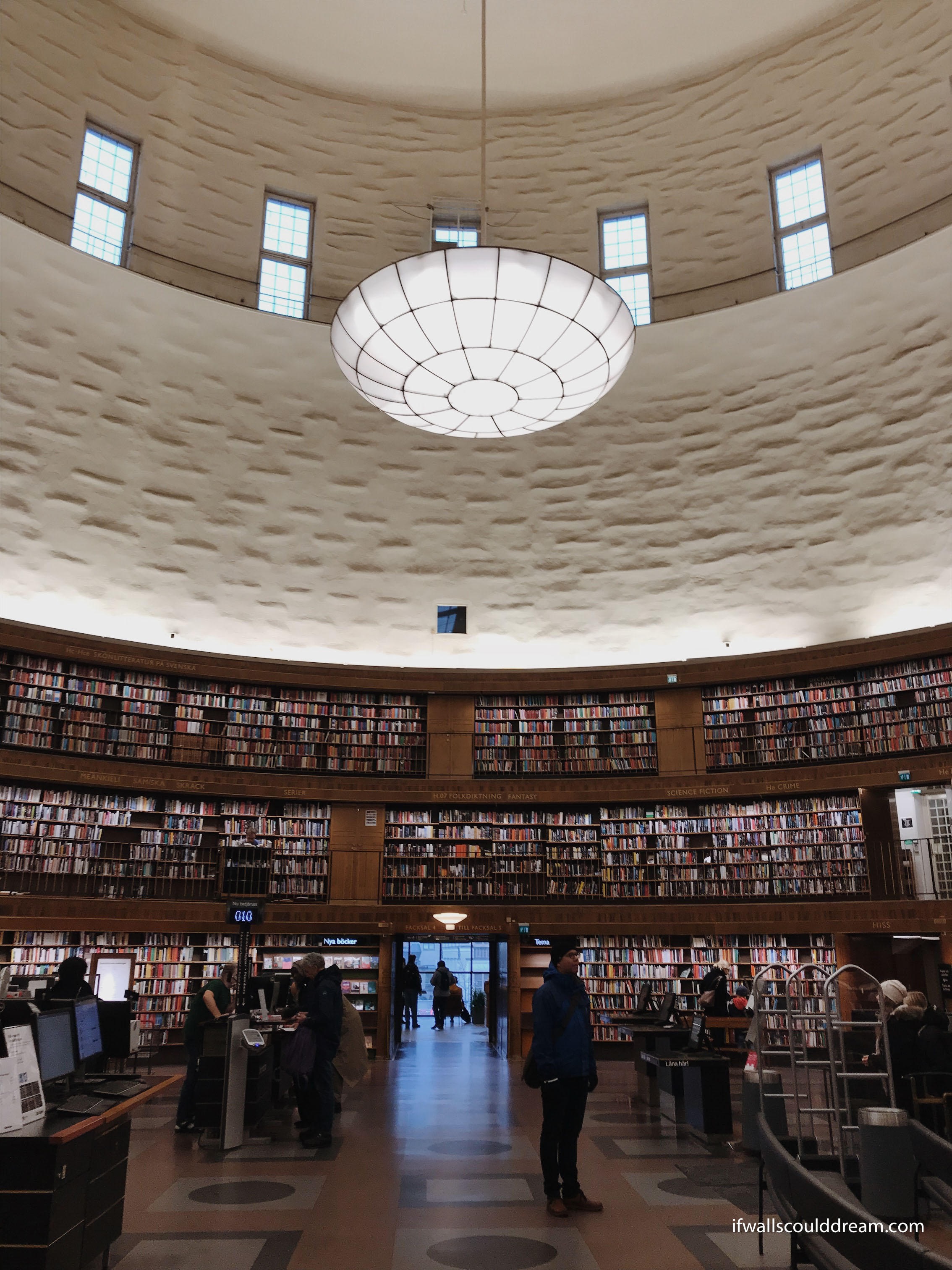
The Stockholm Library was designed by Gunnar Asplund. The central reading room is a cylinder with three floors of bookshelves. It was an impressive place and well loved by the locals. The space between the central reading room and the surrounding square building creates unique little private reading spaces and offices. Originally, there were classrooms on the upper floors of the library for continuing education.
Woodland Cemetery
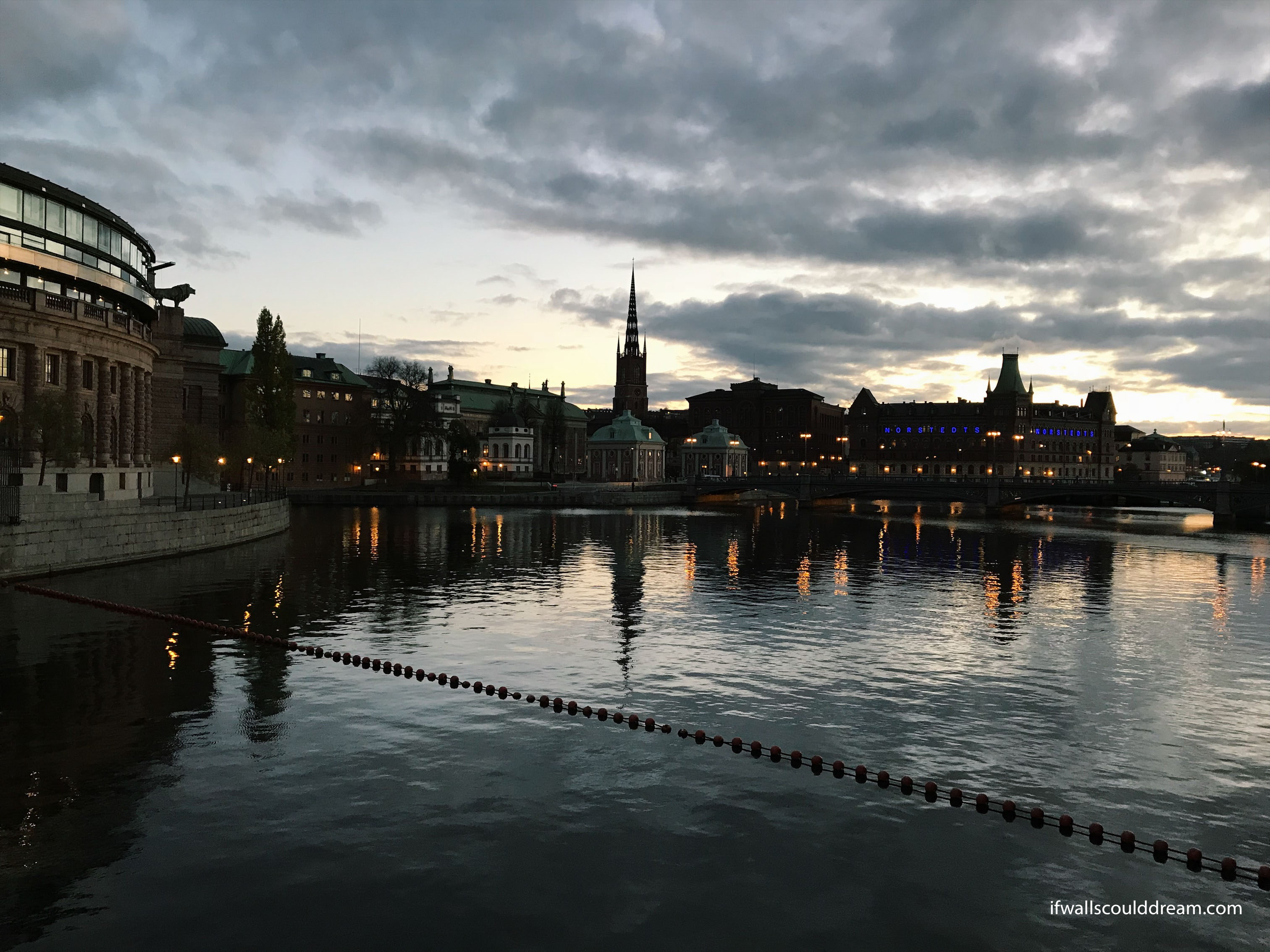
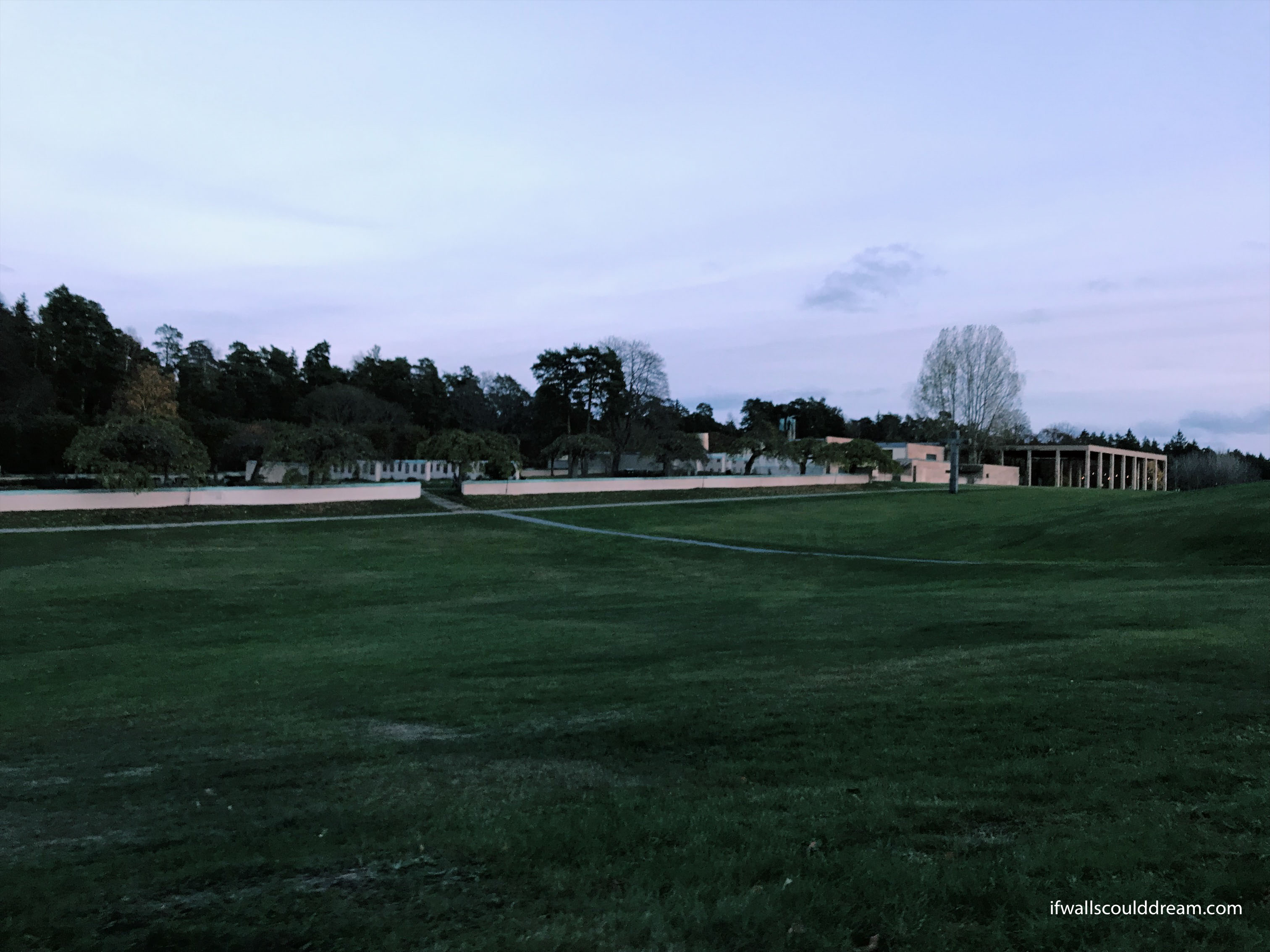
We finished up our tour of Stockholm with a sunset visit to Woodland Cemetery. Gunnar Asplund designed this along with Sigurd Lewerentz. The cemetery was built among the most beautiful pine forrest and it smelled like Christmas, something you wouldn’t expect from a cemetery. We toured three chapels on the grounds and as the sun set it got darker, and colder, and creepier. How fitting for Halloween-Eve.
If walls could dream… they’d dream of Gunnar Asplund.
Salling Rooftop
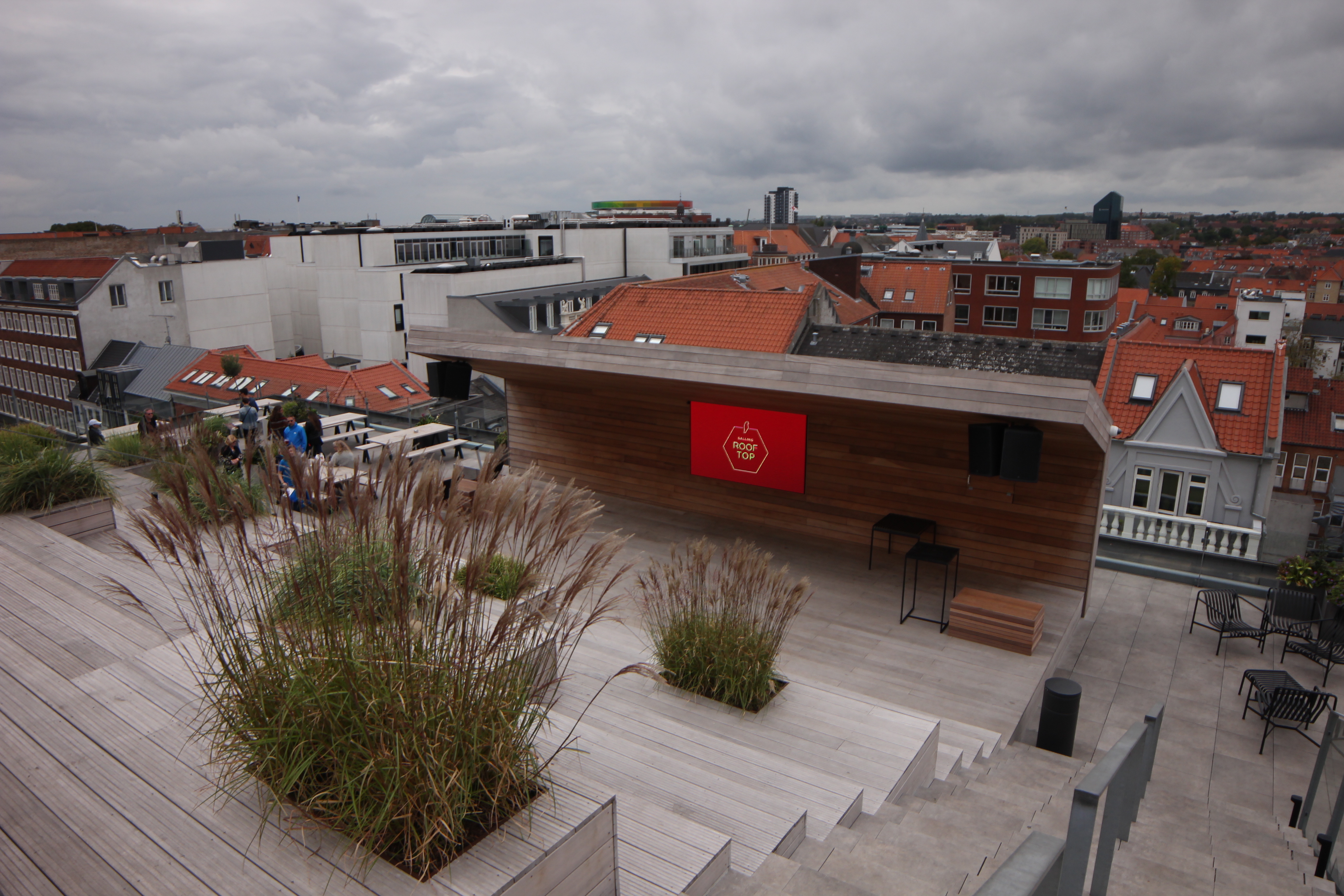
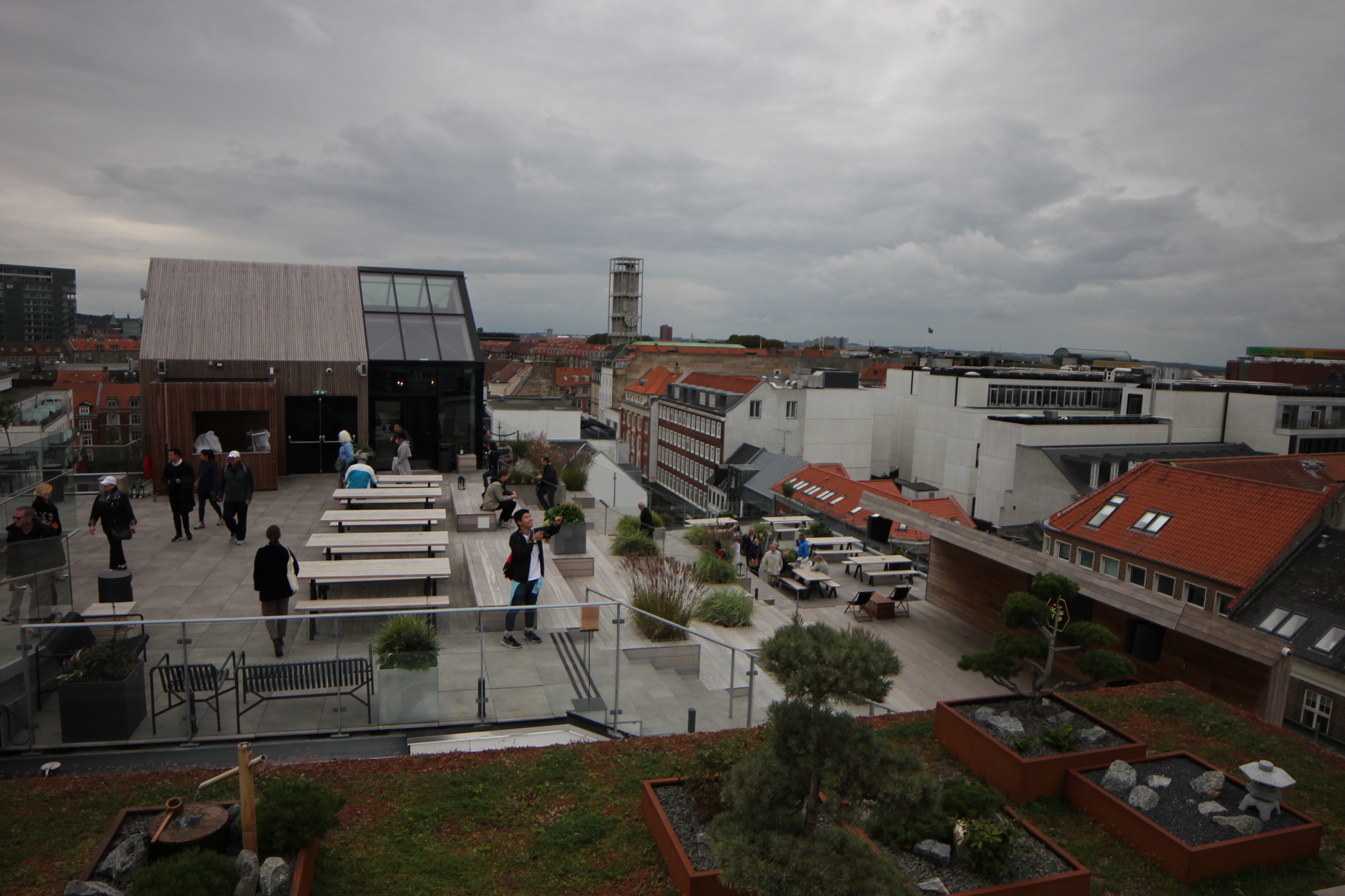
I also checked out the Salling Rooftop in Aarhus. It’s a rooftop event space on top of a mall. They have a cafe and an auditorium and a lookout platform high above the street with a glass floor!

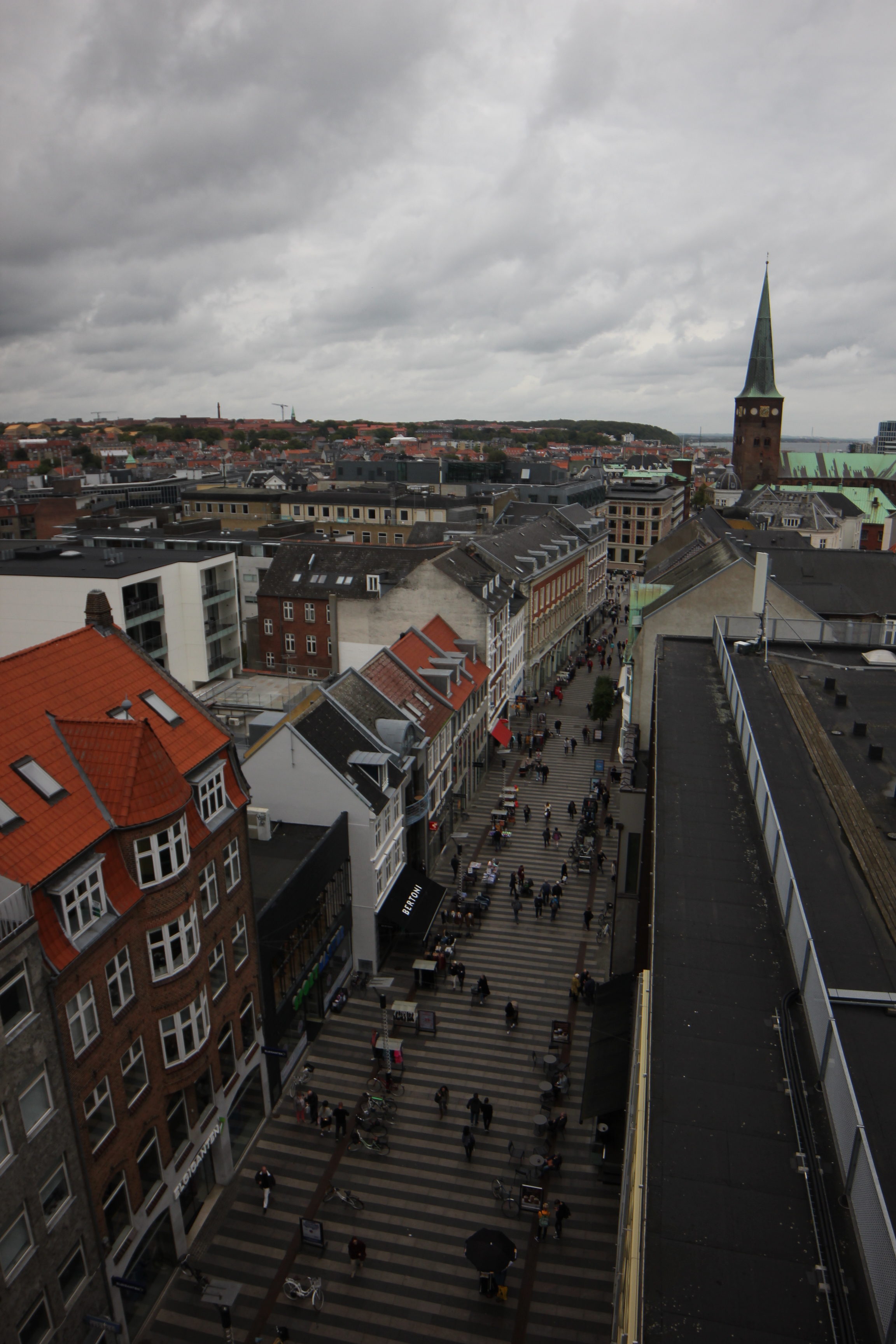
If walls could dream… they’d dream of standing 7 stories above Aarhus with only a little bit of glass under your feet!
Lunch in Aarhus
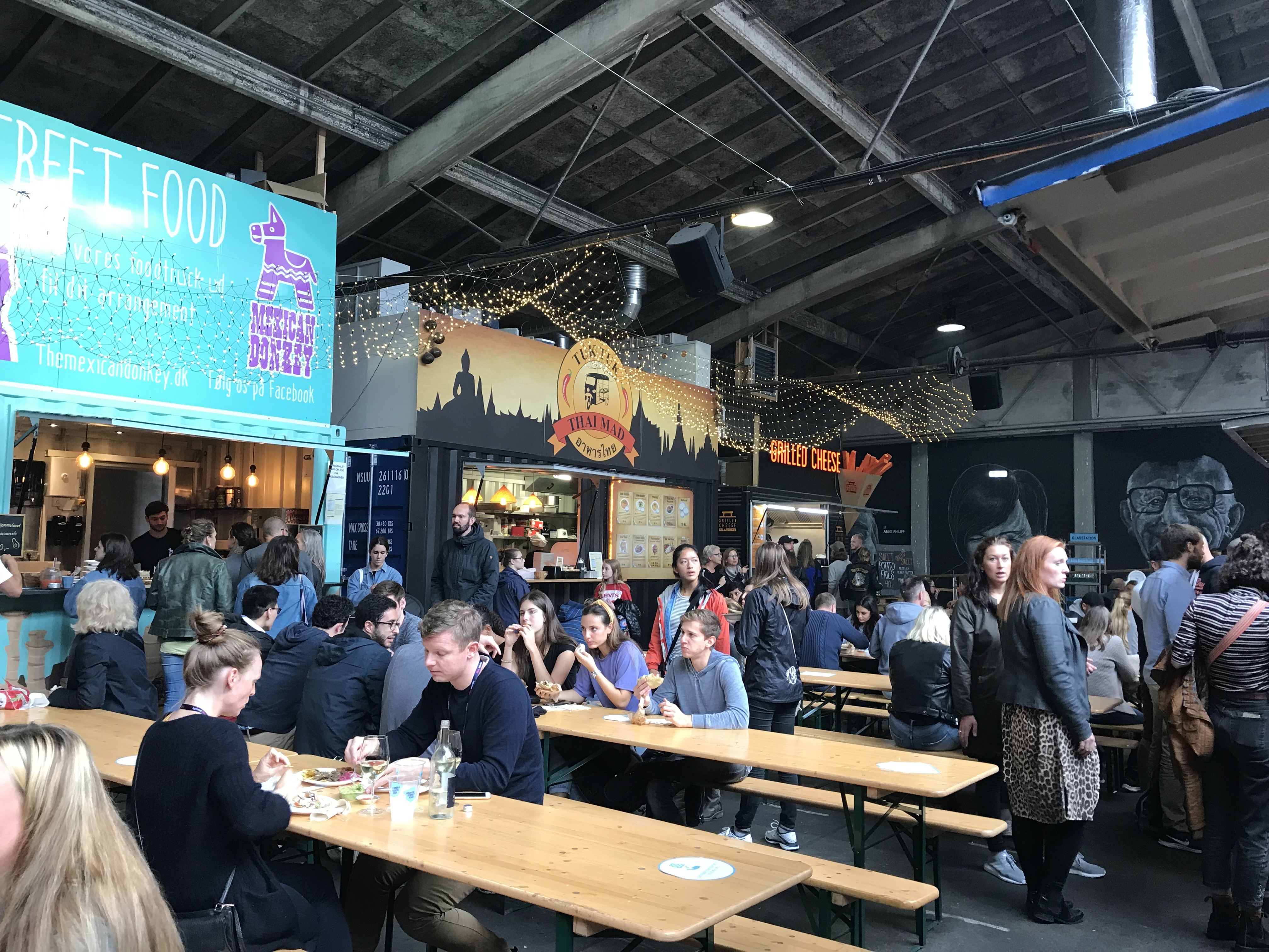
For our lunch break, we got pasta at a food truck style eating place and then we explored Dokk1, the public library. It’s so cool and incorporates public space with reading spaces and modern technology, it even has parking elevators!
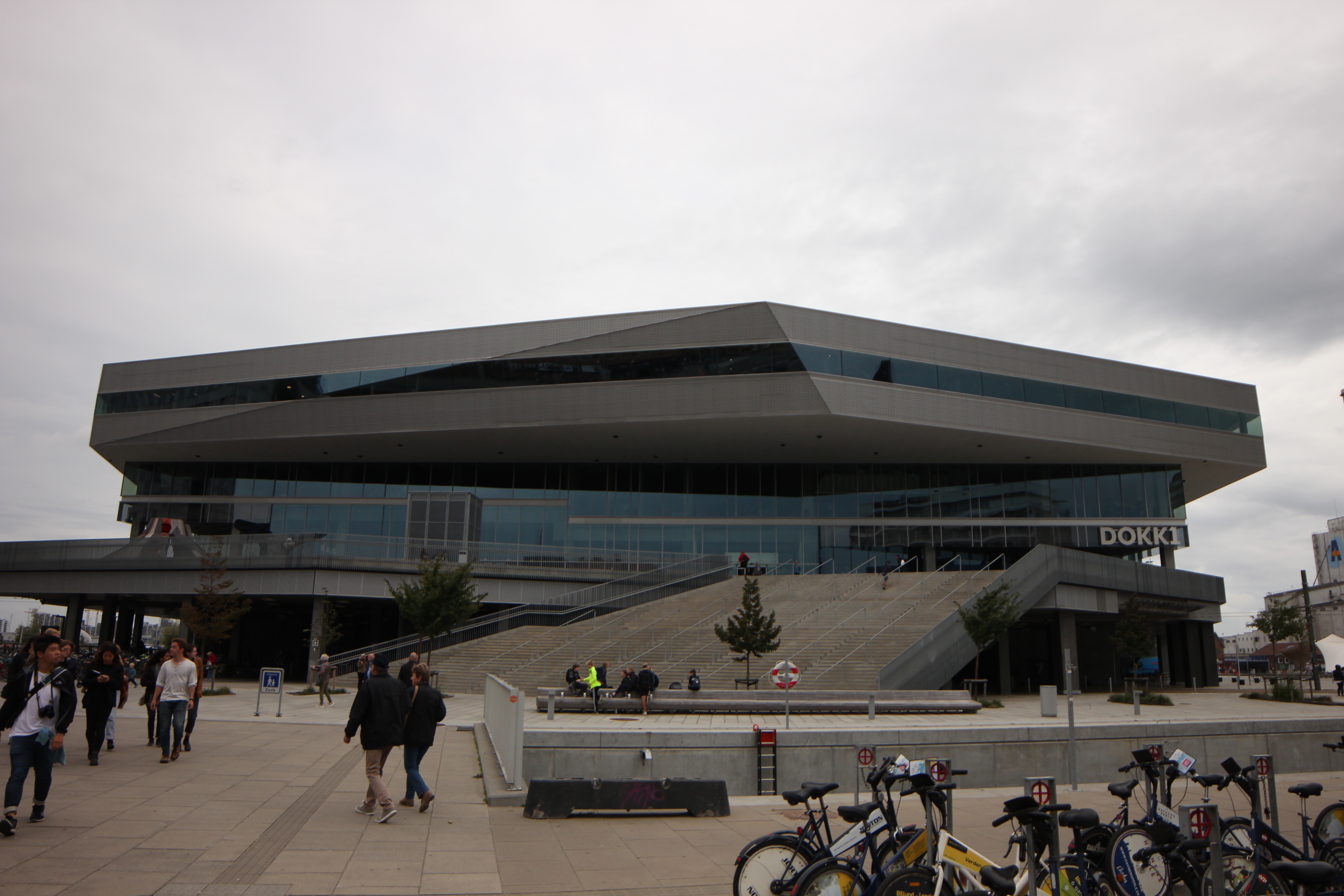
Dokk1 was designed by Schmidt Hammer Lassen Architects and it is Scandinavia’s largest public library. You enter the building on the second (“first” in European terms, that’s a whole blog post of its own…)
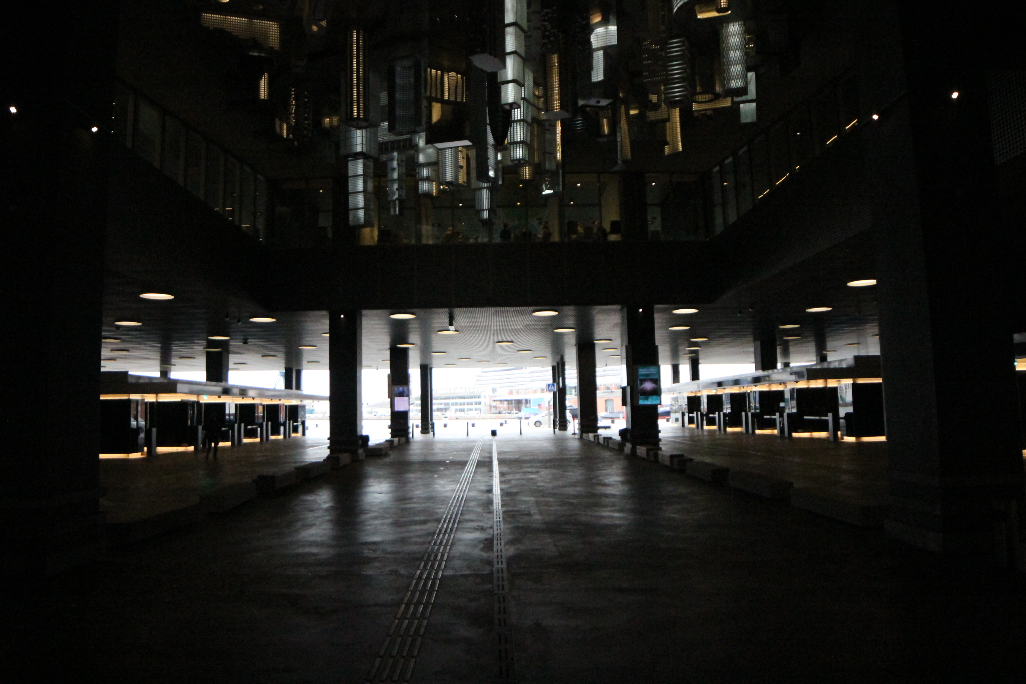
The ground floor of the library has the entrances to the parking elevators and an upside-down cityscape sculpture above.
If walls could dream… they’d dream of parking elevators!
Aarhus Radhus
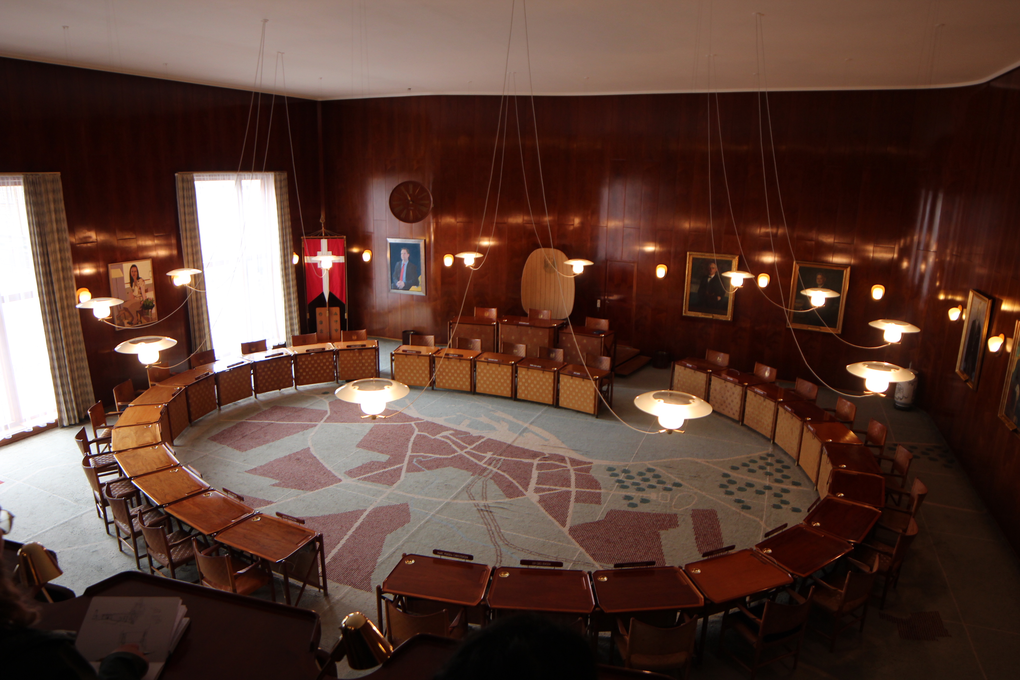
We visited the Aarhus Radhus (City Hall) by Arne Jacobsen and Erik Moller. They designed everything for this building, even down to the door handles and fonts.
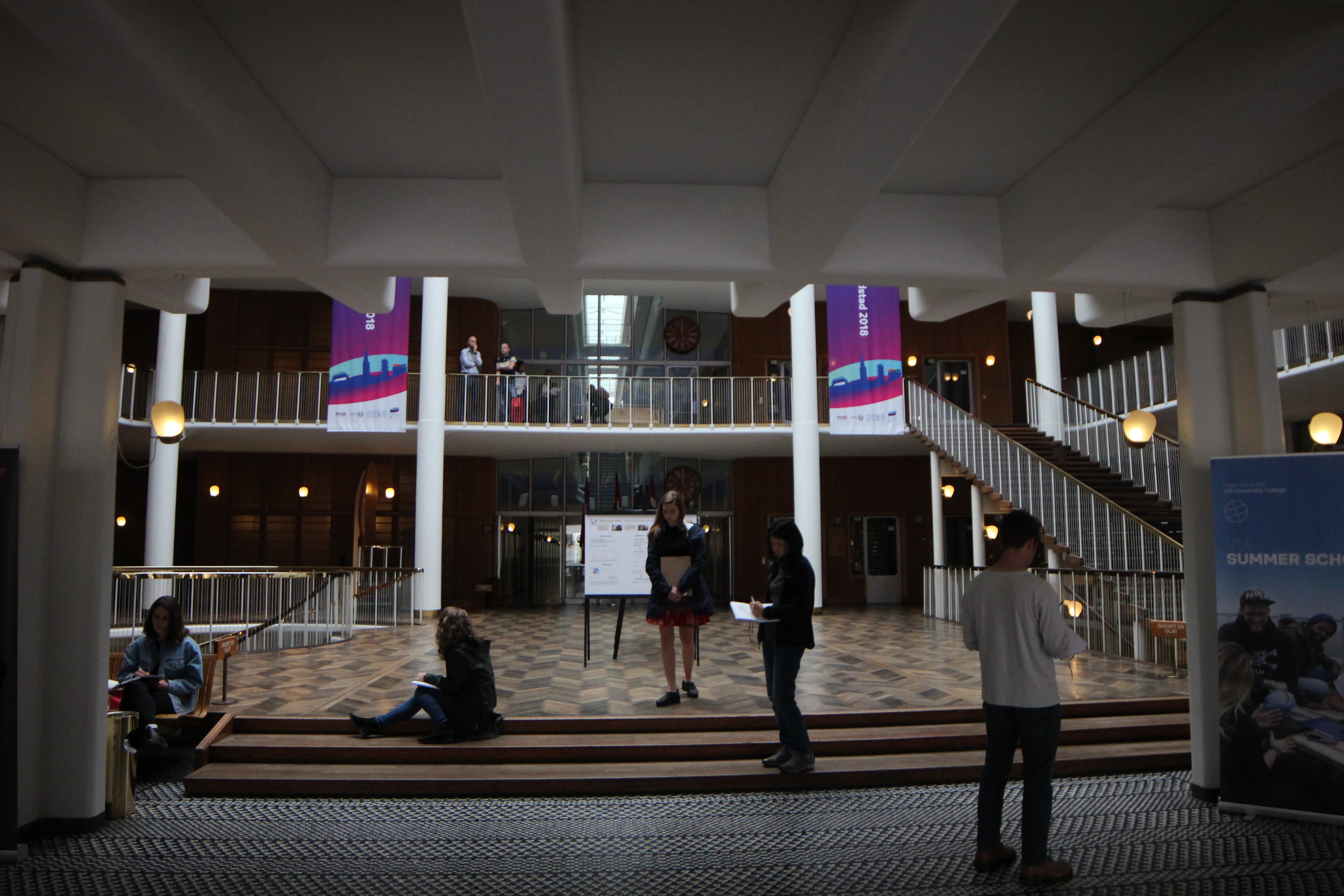
You enter the courthouse under a thick, fluffy, waffle slab. Then, it opens up into a central atrium wrapped in light railings and staircases. The coat check is below the atrium down a circular staircase. The wooden floor was so beautiful!
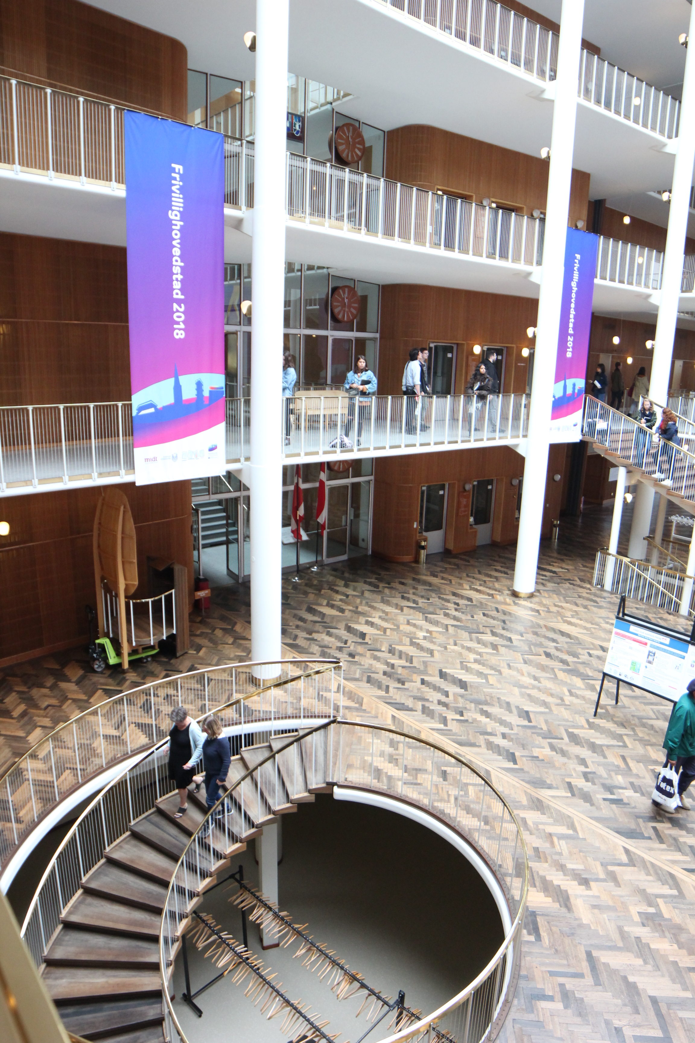
If walls could dream… they’d dream of going to court here.
Aarhus Crematorium Chapel
We visited the Aarhus Crematorium Chapel by Henning Larsen.
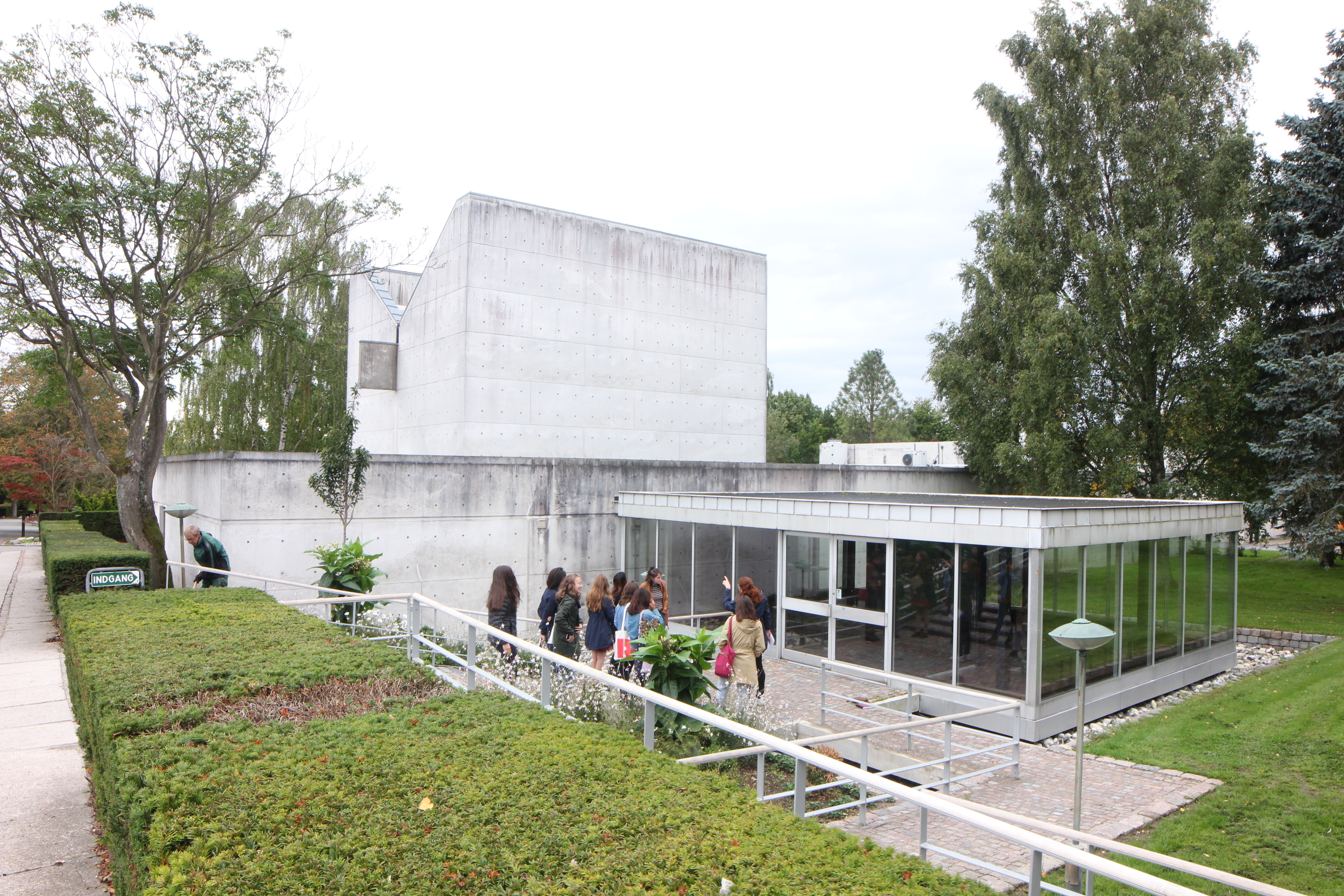
The building was all made of a light colored concrete and the entry was through a glass box on the side of the chapel.

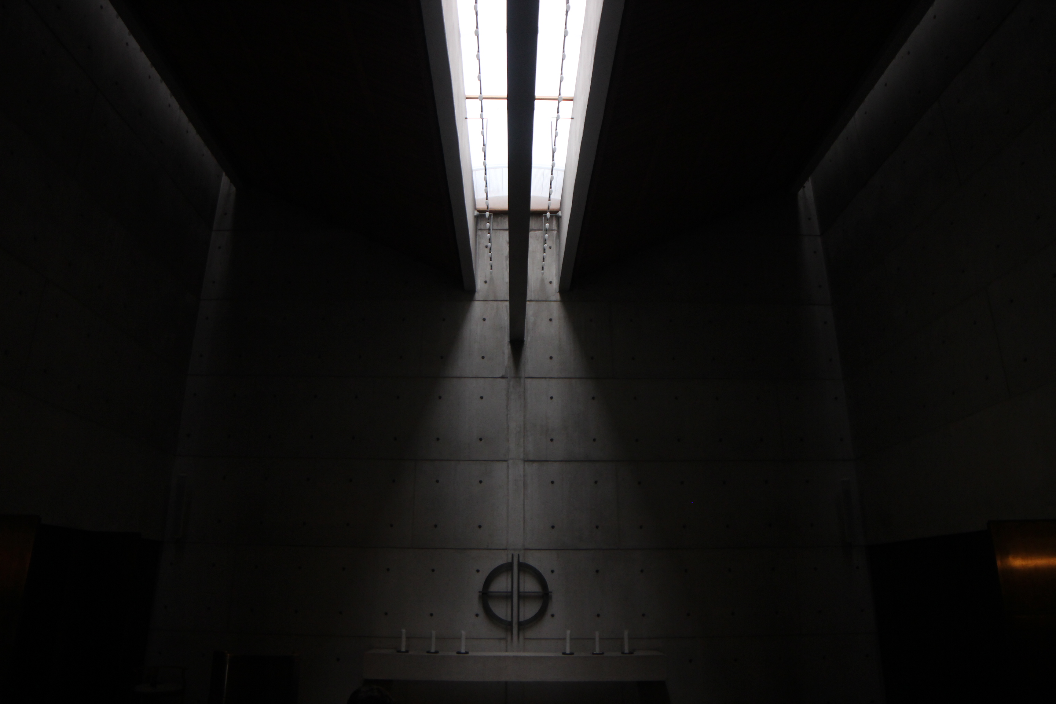
The main chapel space had a beautiful skylight in the center which created a moody, dim atmosphere of mourning and reflection while also referencing the idea of hope and light from above.
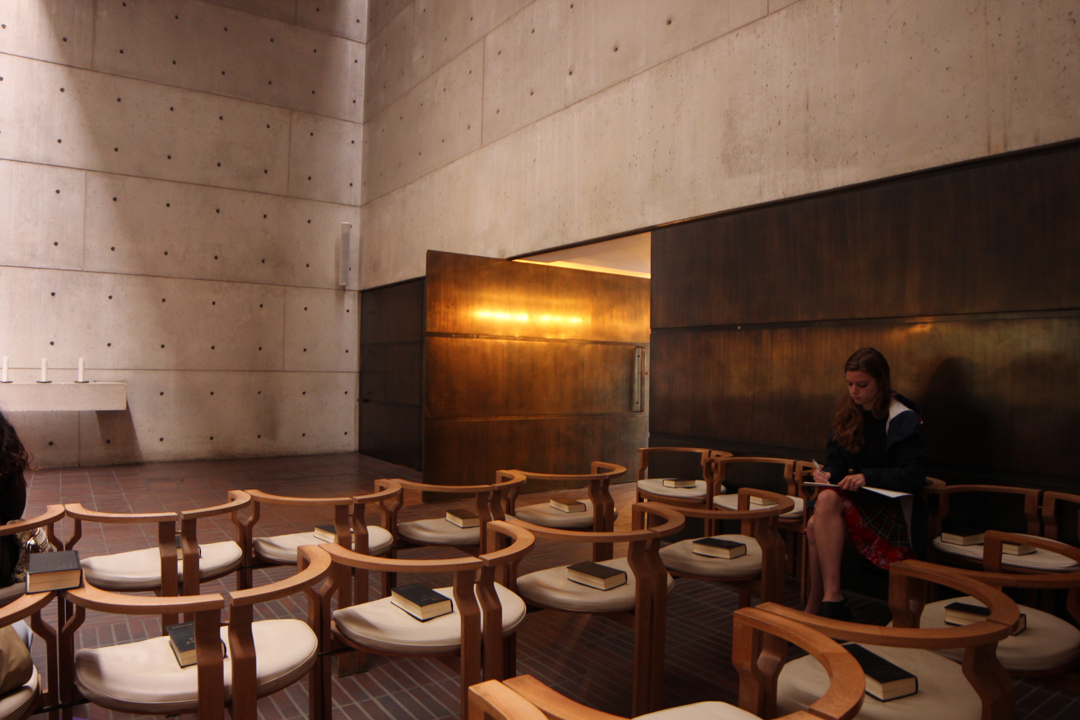
The door was a rich, warm, metal and the chairs were delicate semi-circles.
If walls could dream… they’d dream of standing under this skylight forever.
SDU Learning Center
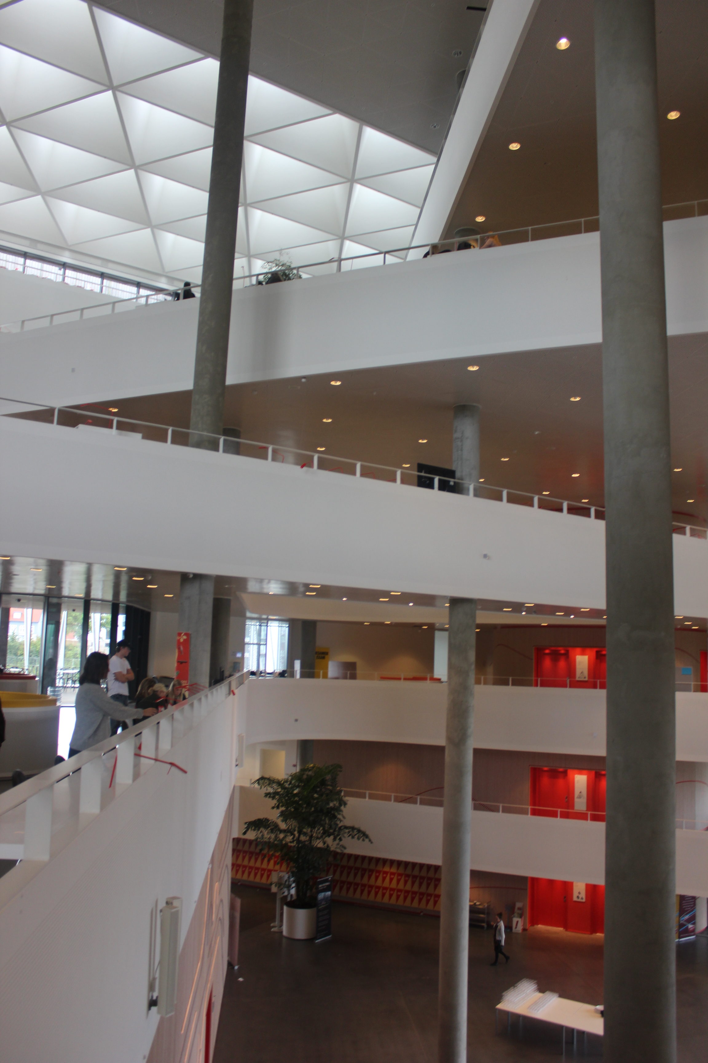
We got to tour Southern Denmark University’s Campus Learning Center by Henning Larsen Architects. This triangular shaped building provides study space, auditoriums, offices, and more for SDU.
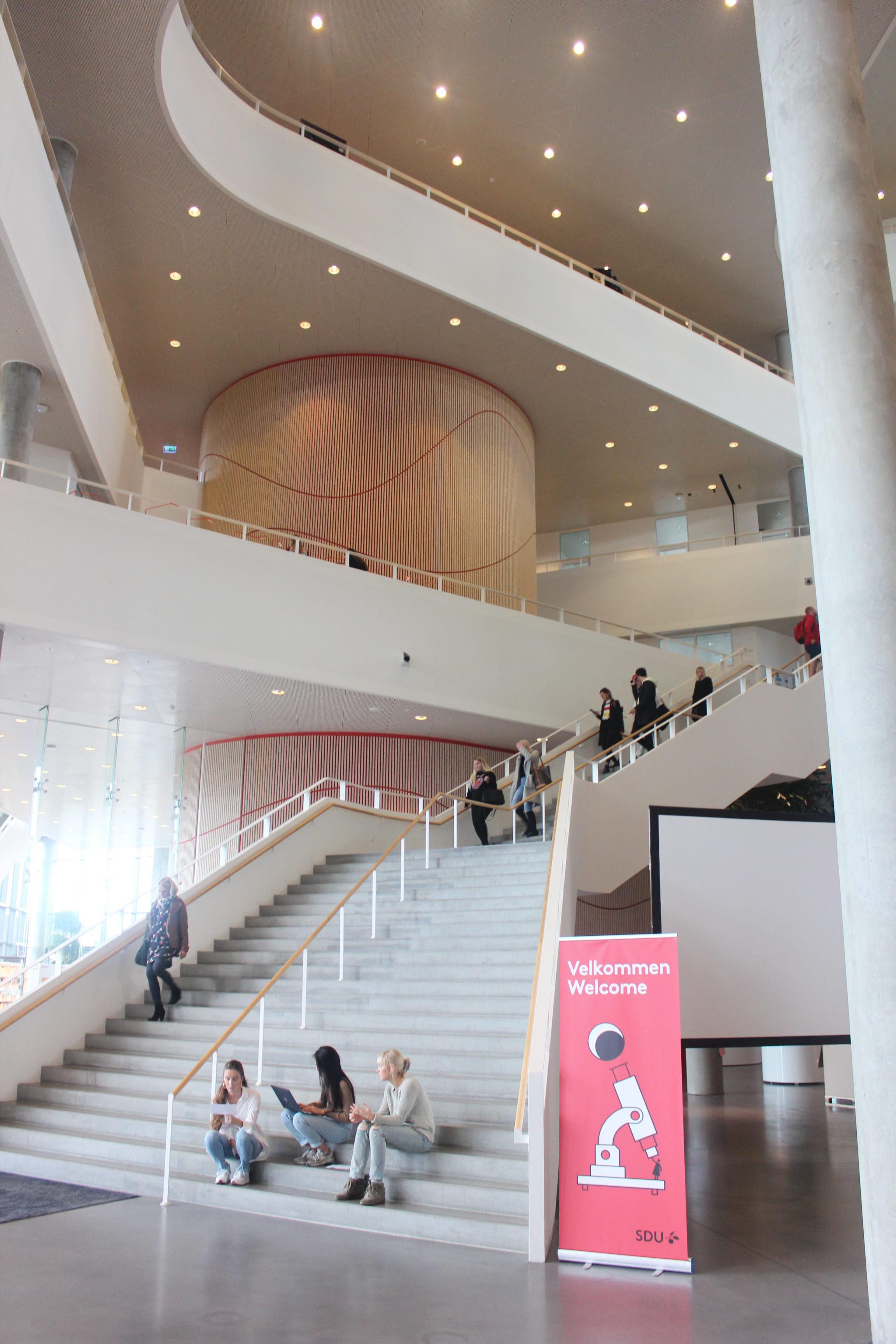
Bathrooms and fire stairs are located in three red cylinders near each point of the triangle.
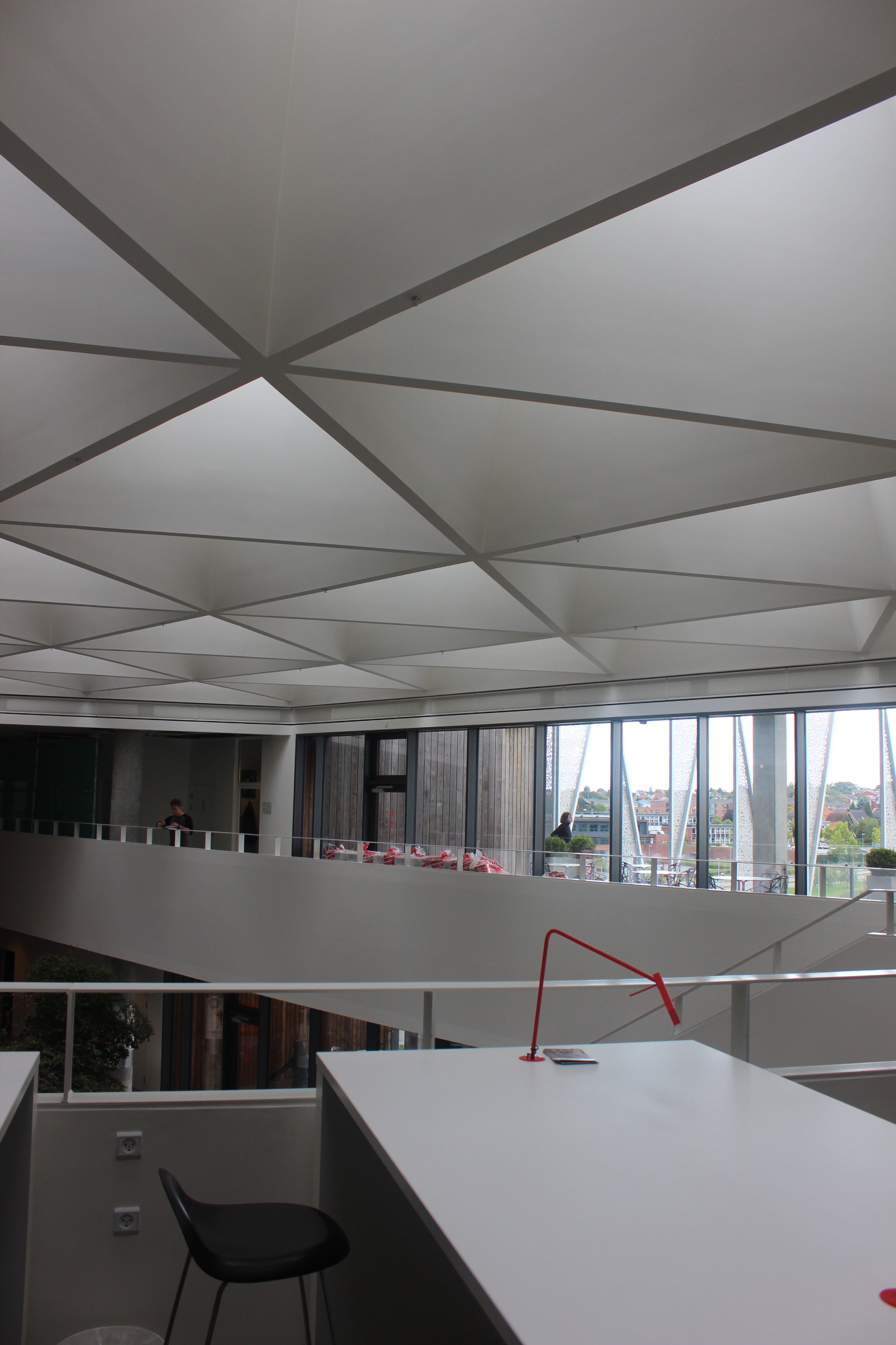
The ceiling has triangular skylights and there are patios throughout the building where students can study outside on a nice day.
If walls could dream… they’d dream of triangular buildings.
Koldinghus Museum
We visited the Koldinghus Museum which was an old castle that had fallen apart and was rebuilt into a museum. The architect expressed which parts of the building were new with wooden siding on the exterior and a light wood structure on the interior that seems to float inside of the brick ruins.
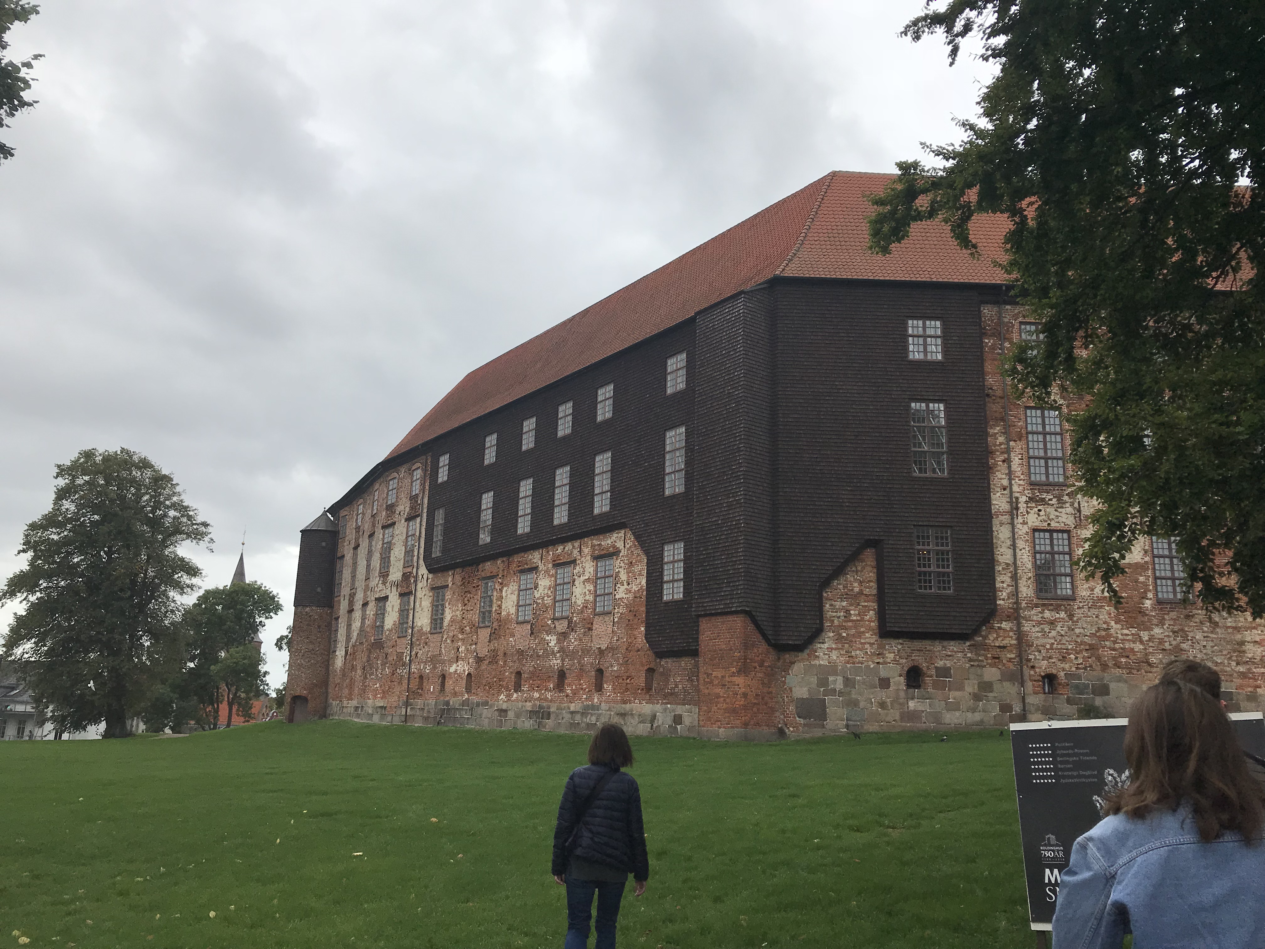
The exterior of the Koldinghus Museum.
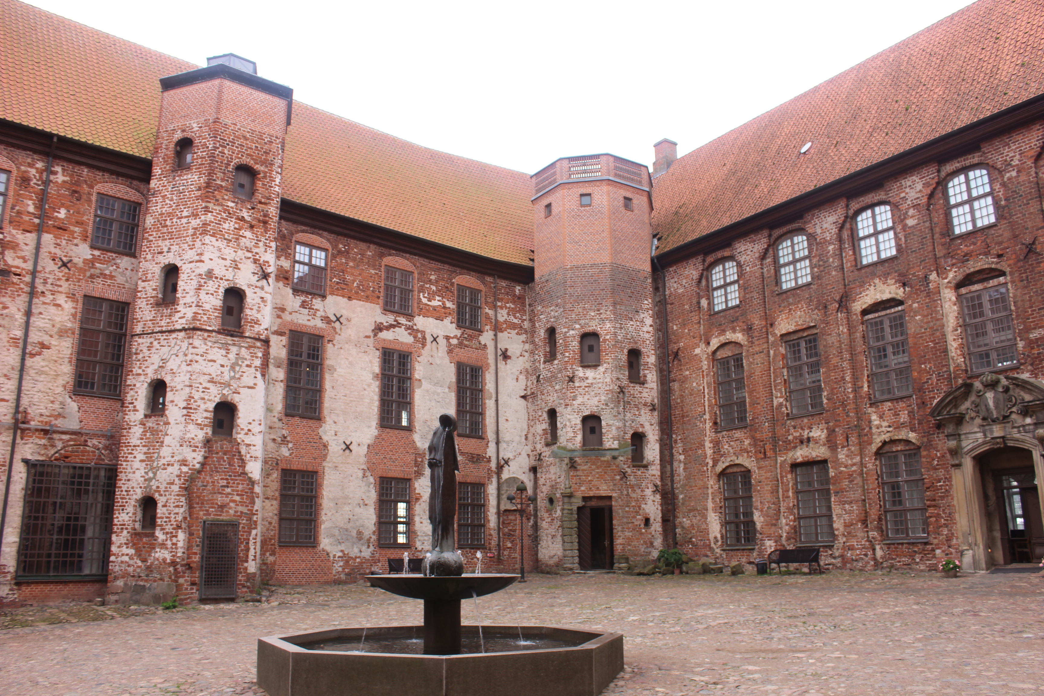 The courtyard in the center of the museum.
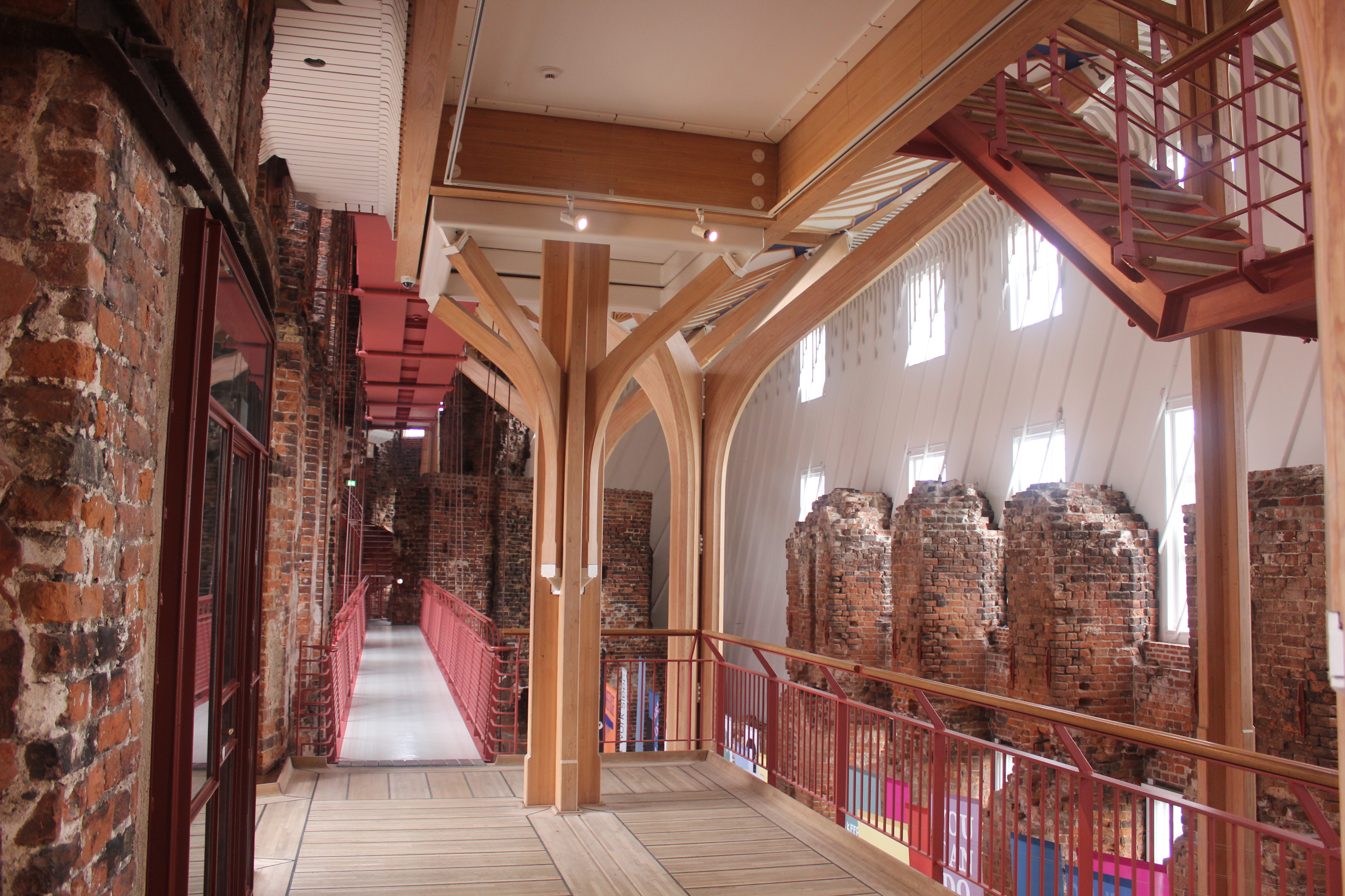
Inside the museum the structure seems to float around the brick ruins.
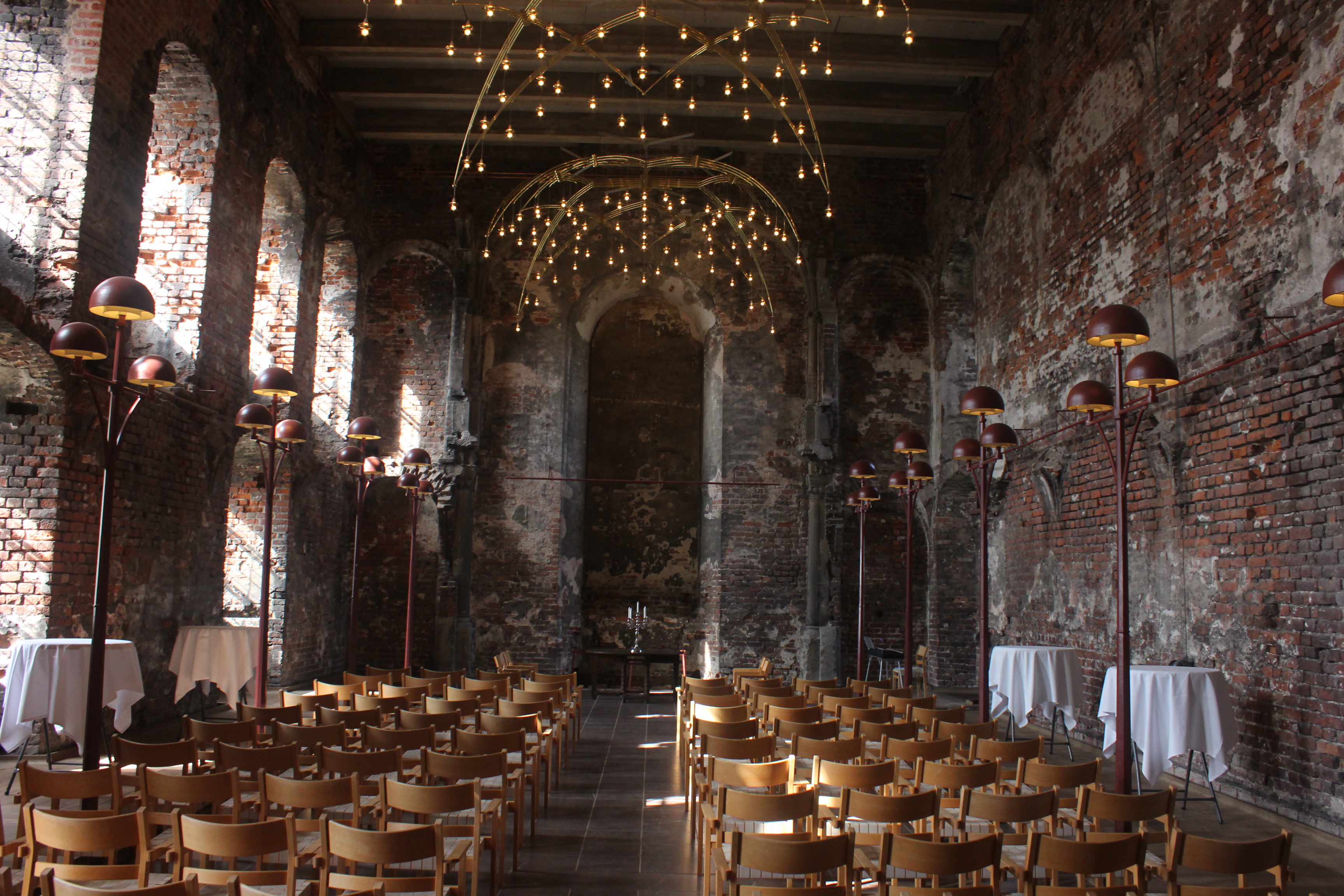
The original chapel had incredible lighting.
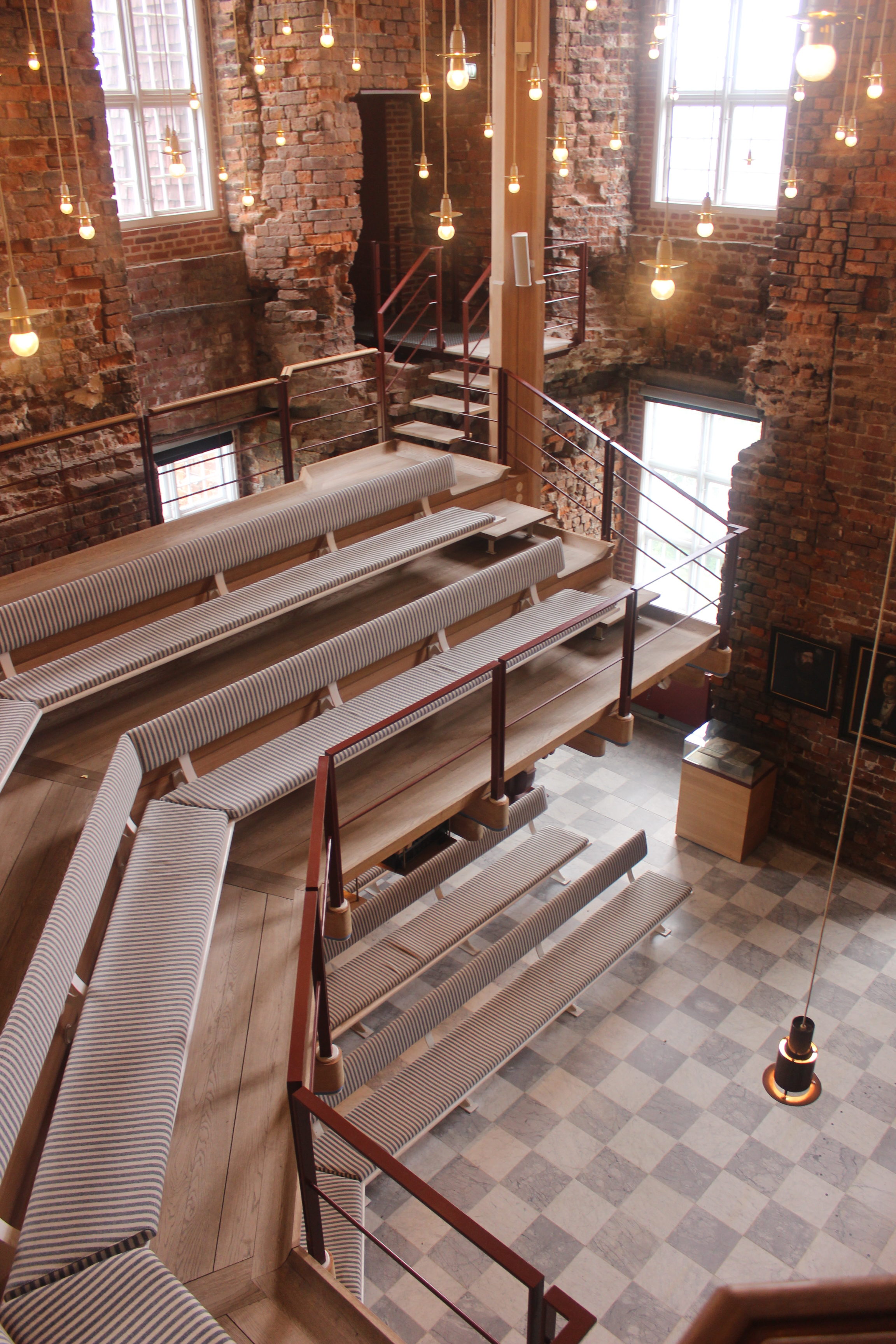
A smaller secondary chapel had a floating mezzanine and hanging lights.
If walls could dream… they’d dream of old castles turning into museums.
