Contrast
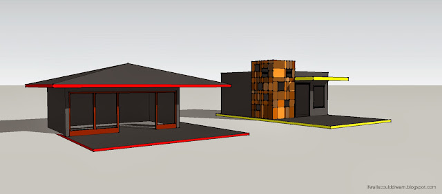
Playing around with SketchUp earlier today, I came up with these two contrasting structures.
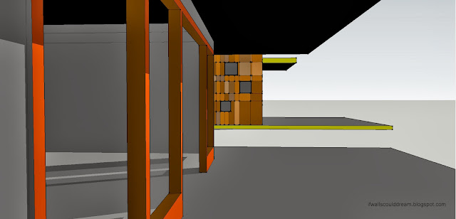
The red house is very angular and horizontal, with a dramatic roof and open front wall.
The yellow house, on the other hand is more geometric and vertical, with a rectangular cube of colorful tiles and windows.
I love how visual SketchUp is to work in, and how easy it is to create a space, and then another one right next door, and be able to move and modify them however you can imagine. I’ll definitely be playing more with it in the future!
If walls could dream… they’d dream of playing with space.


