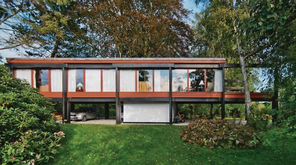
Middelboe House by Jorn Utzon
For a nice change of pace after Design Village, our next project this quarter was a research project about a house. I was assigned the Middelboe House by Jorn Utzon. Having dreamt about researching something famous like the Fisher House or the Robie House, I was a little disappointed at first by this obscure Nordic home.
However, as I researched this house I started to fall in love with it. Utzon is best known for being the architect of the Sydney Opera House (below left) and has done some remarkable work throughout his career. In this house, he really experimented with materiality and structure in a modernist grid. The columns and large glass walls are reminiscent of Mies’ Farnsworth House (below right).
Our assignment was to diagram every aspect of the house – structure, program, circulation, etc. – in order to understand it and then we presented our research to our class.
I started by looking at the program (the arrangement of the different living spaces) of the house. The diagram above simply labels each room in the house. The first floor plan is on the center left and the second floor plan is on the center right and the four elevations are arranged around them. (You can click on the diagram to see it larger and zoom in.)
This diagram color codes the outdoor, living, bedroom, and bathroom zones in the house.
And then this one gives a 3D view of the three main zones of the house: outdoor, sleeping, and living, and how they fit into each other like a puzzle.
Next, I analyzed the structure of the house. Utzon highlighted structure in his design, color coding it himself. The black elements are concrete beams and the red is the secondary wooden structure. The house was inspired by Asian construction techniques and relies on gravity instead of nails and screws to hold the house up.
This section diagram shows that black and red structure that Utzon displayed so proudly in his house.
This diagram builds on the black and red structure to categorize all of the walls in the house.
This next set of diagrams illustrates the house’s relationship to its site. It is located next to a canal in Denmark which provides a beautiful view but also a privacy concern. Utzon addressed this concern by moving the bedrooms to the back of the house, away from the river to give them privacy. He also sited the house in between the two large trees on the property for shade and added privacy.
The circulation through the house is all focused through the central stairwell and then up into the living spaces. This was my favorite diagram to make and I’m really proud of the way it turned out.
Finally, I made a collage diagram of what it would be like to be inside my house (see Mies’ collages for inspiration). I used the Rhino model I had made to get the linework for the interior perspective and then added the landscape through the windows. I chose to leave the interior white to focus on the view and the shapes that the structure makes with the windows – even though they are all rectangular openings, the perspective and the added beams create dynamic trapezoids.
All in all, this project was a good change of pace and a good way to connect the dots between a very abstract yet personal experience of a dwelling with Design Village and the more conventional yet still architecturally advanced ideas of what a house is to famous architects.
If walls could dream… they’d dream of being in a famous architect’s masterpiece.


