Simple

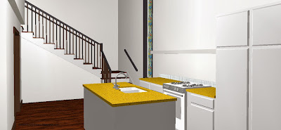
Making a great home simple, this one-bed one-bath house has lots of living space in just over 1000 square feet.
You enter the house into a great room perfect for entertaining.

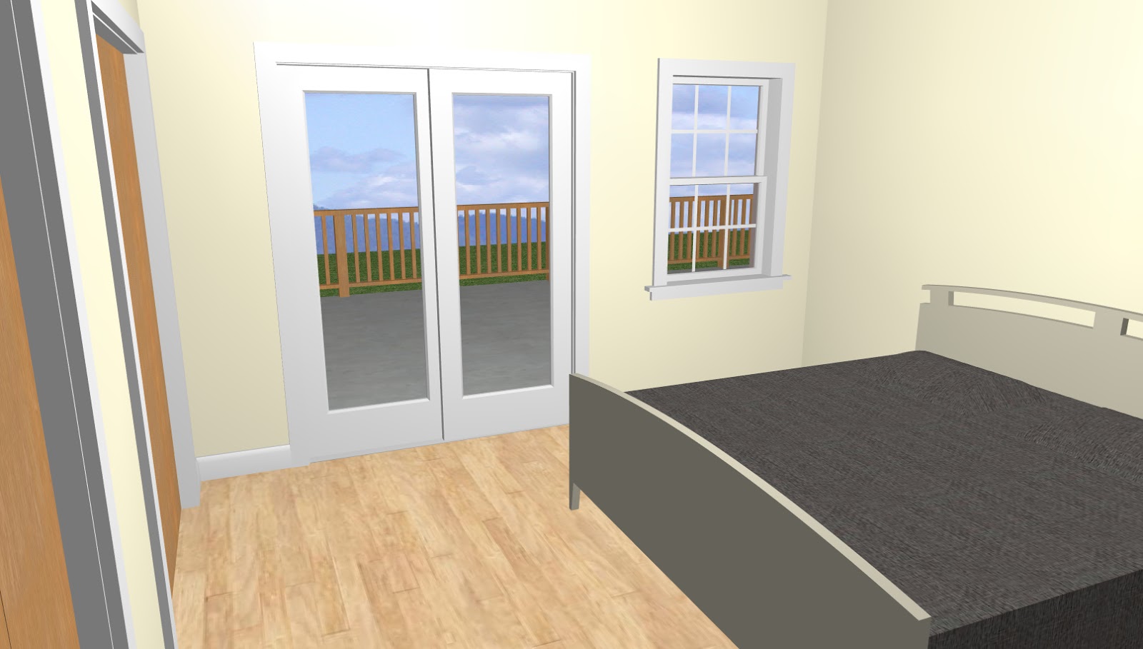
The kitchen is large and the living room has walls of windows on all three sides. There is a large deck in the back with sliding glass doors from the kitchen and the master bedroom.

Off a small hallway is the master suite complete with his and hers closets. Also off the hallway is a large bathroom, a laundry room, and the one car garage.

If walls could dream… they’d dream of beautiful houses made simple!

Modular

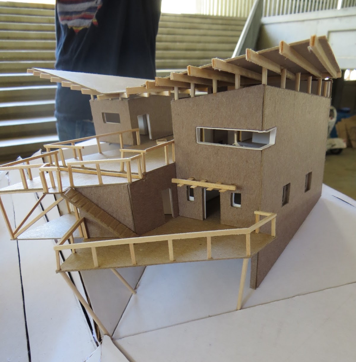
A small modern home that utilizes the spaces between different built modules as extra rooms.


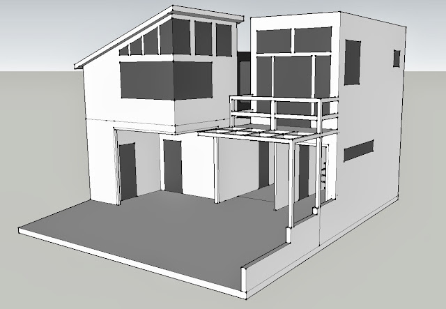
I just recently found this sketch. I had been inspired by toy building blocks and the modules they create and had wondered what it’d be like to design a structure out of toy blocks and then turn that shape into a house. Well I never got past this sketch, but when I found it again I was re-inspired,


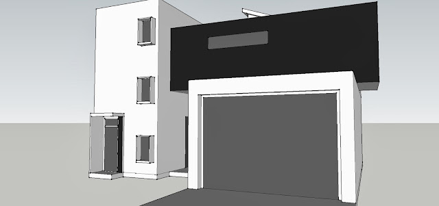
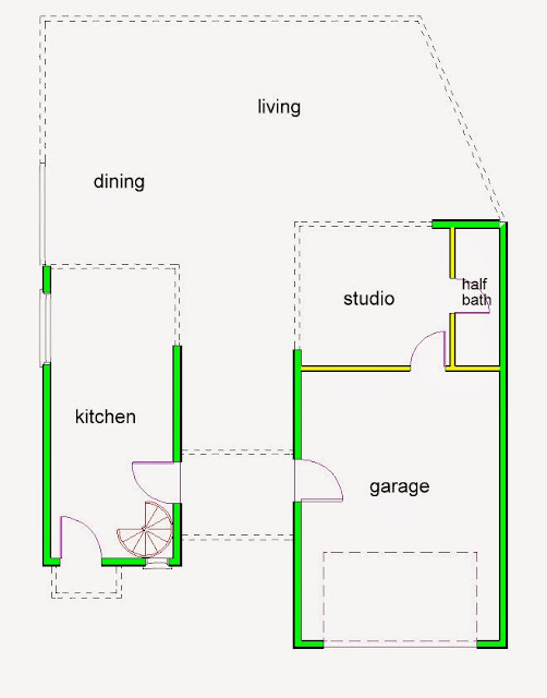
so I modeled it in SketchUp first to get the shapes right, and then I made the floorplan from that.


The first floor contains all of the “public” spaces; the kitchen, dining, and living rooms along with a studio and half bath and the garage. It’s a fairly small house at just over 1,000sqft.


This house would be in a mild climate since the back of the house opens up to the outdoors almost completely, although there would be folding doors to close the house at night or in bad weather. The main living and dining rooms are outside. The back wall also faces south, so the sun would rise from the kitchen-side of the house, warming up the bedrooms and the studio, and set on the studio-side, providing great sunset views from almost every room.


In the kitchen, there is a spiral staircase to the second floor.


The second floor contains the “private” spaces; two bedrooms and two bathrooms along with a laundry room. The guest bedroom can also serve as an office.

If walls could dream… they’d dream of toy blocks inspiring a modern home.

Anti-Pilotis House

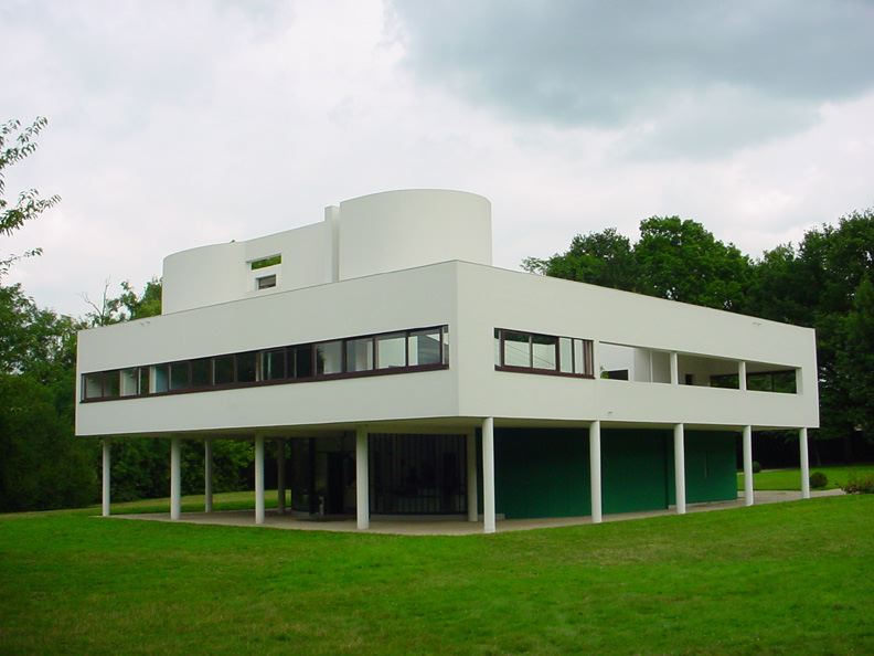
Le Corbusier’s Villa Savoye, a perfect example of pilotis

During his career, the French architect Le Corbusier came up with five points of architecture that dictated his architectural technique, one of which was the use of pilotis, making his buildings seem like they’re floating above the ground as well as allowing for a more open concept in the first floor of the building.

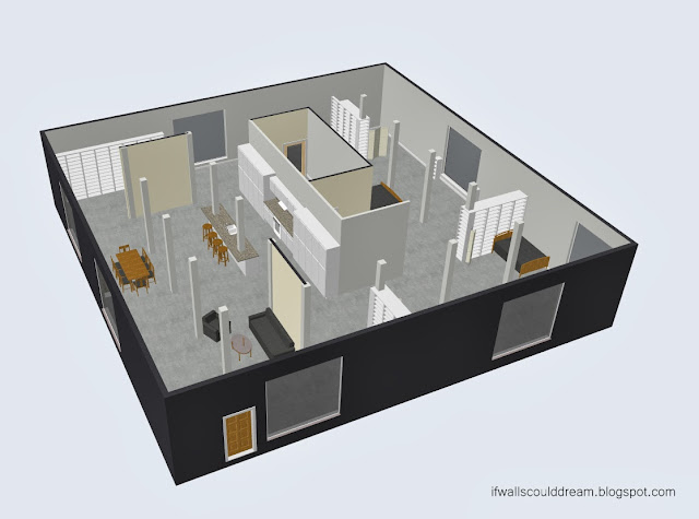
Flipping this idea inside out, however, and putting all the supporting columns back inside the building makes for an interesting challenge.

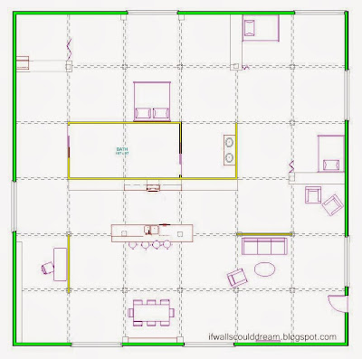
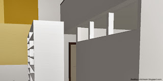
I created a 10′ wide grid in the house and then worked to use as few walls as possible to create a livable and interesting space.

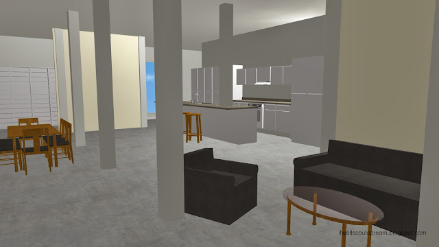
The columns not only help to make the space look much taller, but provide a sense of rhythm throughout the house.

And then you can just repeat this basic house shape again and again,

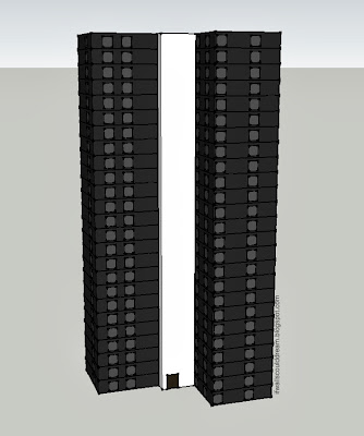
stacking them up in urban towers
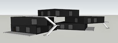
 or in modular suburban configurations.

Until you have a whole city!
It’s important to know the rules but it’s maybe even more important to know how and when to break them, and that knowledge only comes through experimentation, through taking the old norms, understanding them, and then running in the exact opposite direction just to see where that will take you.

If walls could dream… they’d do just the opposite and stay up all night.

Contrast

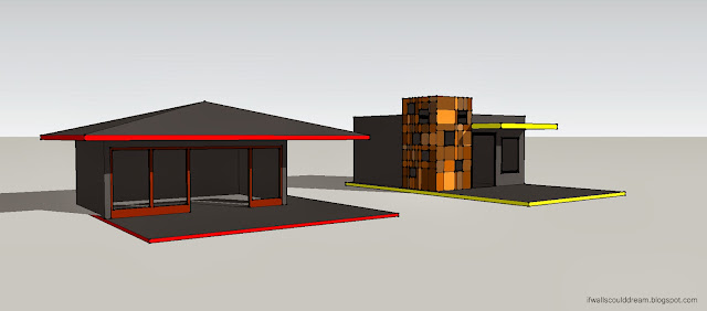
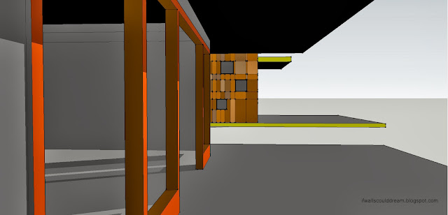
Playing around with SketchUp earlier today, I came up with these two contrasting structures.

The red house is very angular and horizontal, with a dramatic roof and open front wall.

The yellow house, on the other hand is more geometric and vertical, with a rectangular cube of colorful tiles and windows.
I love how visual SketchUp is to work in, and how easy it is to create a space, and then another one right next door, and be able to move and modify them however you can imagine. I’ll definitely be playing more with it in the future!

If walls could dream… they’d dream of playing with space.

Details

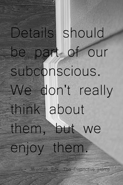
I’ve been really interested in how details in architecture affect our experience of it, ever since writing my TED Talk, and when I happened upon this quote from Jeremiah Eck’s The Distinctive Home it was just too perfect not to share! The photo in the background is one I took a couple days ago with my new camera, looking down a wall at detailed molding and textured wooden floors. Photography is a great way to notice and highlight details that you might miss otherwise.

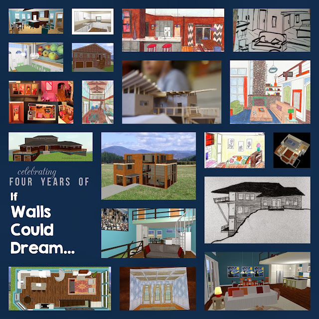
If Walls Could Dream is Four!

It seems like just yesterday I was starting this blog, yet it’s already been four years! I couldn’t be happier with how my career in architecture has grown in that time, especially this past year with Cal Poly’s Summer Career Workshop, the start-up of IWCD’s Facebook page, and my talk at TEDxYouth@GrassValley. 


Thanks for all your support and keep visiting to see what this next year will bring! 

And, as always, keep dreaming!!

My TED Talk: Personal, Timeless, Everywhere

The wait’s over! The video of my TED talk is finally up!

Photos by Cassie Triplett and Isaac Cook

I spoke at TEDxYouth@GrassValley a few weeks ago on the topic of architecture and how it influences our lives.

I used the ideas of it being personal, timeless, and everywhere to guide my talk. I also shared some principles of design that help us understand architecture, and then introduced the idea of great design disappearing and just letting life happen.

So what are you waiting for?!? Go watch the video!!

Architecture is…

I’ve been blogging about architecture for almost four years now, and asked a lot of walls why they’re dreaming, but I haven’t really stopped to ask myself why architecture is so important to us as a society. I think it boils down to three main points; that architecture is personal, timeless, and everywhere.

Architecture creates unique and memorable experiences for us all. We all live in a house, in architecture. And it has a huge effect on our lives. It serves as the background, the setting, where life takes place. Architecture is unique to every one of us, but it’s universal to everyone. It creates community.

Architecture connects us to our past and will propel us into our future. Styles may change over time. By understanding these styles, we get to know life in that time period a little more. Frank Gehry once said that “Architecture should speak of its time and place, but yearn for timelessness.”

Architecture is in every place and every detail. No matter where you go in the world, in any climate and any culture, you’ll find architecture. But the success of architecture lies in its details. It’s the details (the materials, the lines, the shapes, the use of light, etc.) that make or break the experience of a building.

And to me, architecture is everything. It’s all about problem solving and critical thinking, yet it’s also creative and tangible and inspiring. It’s the perfect mix of math and engineering with art and design. It has the power to change the world. I feel so lucky that I’ve found this passion for architecture and I love to tell people about it! In fact, this Saturday I’ll be speaking about architecture and some of the principles I’ve shared above at TEDxYouth@GrassValley. Wish me luck! And I’ll keep you updated on how it goes and post the video of my talk as soon as it’s published!

Artsy Loft Inspired by a Stained Glass Window

This apartment design was inspired by a stained glass window. Usually, stained glass feels very ornate and antique, but I decided to put a modern and artsy twist on it.
 
When you first enter the apartment, you’re steered either towards the living room or towards the dining room and kitchen by a large double-sided bookcase. Large windows along the living room wall flood the space with light.


The color scheme of the space (dark floors, white walls, pops of yellow and orange) mimic the feeling of a stained glass window (light, bright, slightly European, very clean, etc.)
 
Light is important in any design, but it was especially important in this one. The master bedroom wall has openings to the living room that let some of the light from that huge wall of windows in.
 
The corner dining room has an orange horizontal stripe to counteract the massive yellow painting in the living room.

As you turn the corner towards the kitchen, you discover the inspiration for the space, the stained glass window. The point of hiding the window from immediate view is to 1. create a direct sight line from the bedroom to the window and 2. to make it a little more surprising  and dramatic. The staircase in the back leads to the artist studio above the master suite.
 

From the bed in the master suite, you can see the stained glass window.
 

And from the artist studio, you can see the entire apartment, including the stained glass window.
 
 
If walls could dream… they’d dream of stained glass windows inspiring modern loft spaces.
1 11 12 13 14 15 32