Falcon Residence

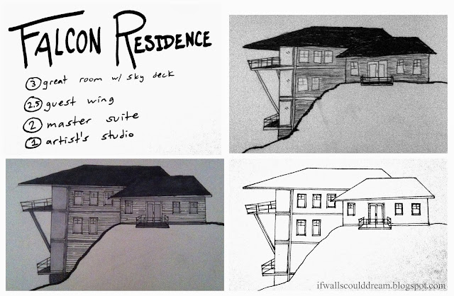
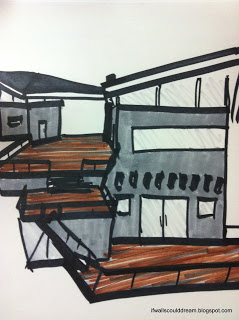
Inspired by the landscape of canyons and desert hills, I designed this house that almost looks like a bird ready to take flight from its rocky perch. The dramatic rooflines of this project help to shield the interior spaces from the hot desert sun.
 

I had sketched my idea last night (top right) and then made a more finished drawing (bottom right) this morning and colored it in with my copic markers (bottom left.) I envision the top floor to be a warm great room with expansive views of the landscape. There’s also a large deck off the top floor, nicknamed the sky deck because it seems to be floating in the sky. Half a level down and off to the side is a guest wing, complete with its own little porch for watching the sunrise. The middle level would be a private master suite, also with breathtaking views. And last but not least is the studio on the lowest level with lots of natural light and its own little deck.

If walls could dream… they’d dream of houses that could almost take flight!

Sculpture 1: Line, Shape, and Form

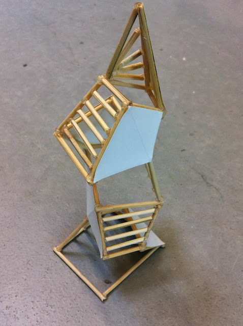
I just finished my first work for the sculpture class I’m taking. We focused on line, shape, and form in this initial project, using bamboo skewers, paper, and lots of hot glue.
 
 
I saw this first project as a time to experiment and play with the rules of design. At first, I played with interlocking hexagons, but it didn’t really amount to much.
 
I also experimented with a “looking box” idea, a plain box with layers of geometric and textural experiences inside, but that didn’t hold my attention for too long.
 
 
I finally decided that I wanted to play with form and repetition. I took the form of a cube, cut out one side, and then stretched and squished, twisted and tweaked, until it was just right. Then I built a duplicate on top of that “cube”. I used alternating horizontal and vertical sticks on one face of each of the “cubes” to define the “faces”.
 
 
After some more thought, I decided to continue playing with this piece and constructed some more levels for this structure, seemingly defying gravity, and topping it in a slender point. I also added paper to the remaining “face” on each cube.
(In case you were wondering, it’s a fairly small sculpture, about 8″ tall.)
 
These stick and paper faces help guide your eye around the piece.
 
The sticks alternate direction as you go up and culminate in a starburst design on the top triangular face.
 
 All in all, I think it was a very successful project. The use of repetition in the cube shapes and the face materials creates unity, yet the variation in size, shape, and angle of these sections gives it a playful and interesting feel.
 
 
If walls could dream… they’d be dreaming of how my next sculpture project will turn out… I know I’ll be!

Modulated Famly Home

 With over 3000 square feet and up to seven bedrooms, this house has plenty of space for the entire family. It has a modulated charm to it, with defined rooms but very open spaces, that makes it comfortable and practical for a growing family.
 
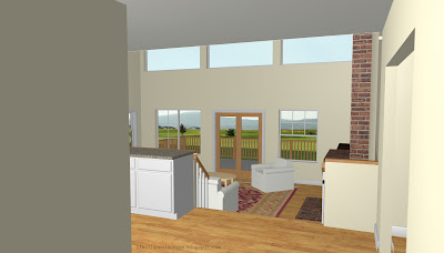
When you enter the house, you are immediately drawn into the sunken, double height living room. To your left is the staircase and the kitchen. To your right is an office and a formal dining room. Notice the large pantry off the kitchen. The kitchen is also very open to the living room.
 
 
Through the living room is a small hallway that leads to a bathroom, den or bedroom space, and the double car garage.
 
 
Moving up to the second floor, you arrive in a family room that has little openings in the wall that look out over the living room. On one side of the family room is the master suite, complete with his and hers closets and a private porch overlooking the backyard.
 
 
At the other end of the family room, and down a few steps are three more bedrooms, a large bathroom, a library area (or kids play area or workout area, whatever the family wants), and the stairwell to the studio.
 
On the third floor is the studio, private and with lots of light and great views of the backyard and surrounding land.
 
The back of the house has lots of windows and decks to take in the view.
 
 
This house’s modulated feel helps it adapt to the needs of a growing and changing family as well as give it a certain charm and personality like it was added on to over time.
 
If walls could dream… they’d dream of modulated charm.

Avocado House

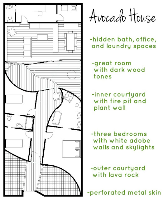
Now I’m sure that when I tell you this house is inspired by an avocado, you’ll think I’m absolutely insane. And maybe I am, but the crazy idea for this house kept me up one night and I just had to explore it. I focused on the progression of space as if you were walking into an avocado and the contrast between these different spaces; the skin, the flesh, and the pit.
 
 
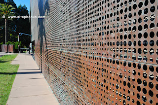
  The front perforated metal wall, the skin, is separated from the bedroom area, the flesh, by a small courtyard. The sleeping area is separated from the living area, the pit, by another larger courtyard. 


In addition to drawing the floor plan of the house, I made a quick model of it out of cardboard. The site for the house would be a small city lot surrounded by high walls, so all the light comes from interior windows and skylights.  
 
 
The front wall of the house is a perforated metal skin. It represents the skin of an avocado and provides protection and privacy from the exterior environment while still letting light through.


  The model itself is rectangular in shape and is sliced down the center so you can open it up to see the interior spaces.
 
After passing through the metal skin, you are in a small courtyard with black lava rock and concrete benches in geometric shapes. Then, you enter through a large frosted glass and wooden door into a white adobe hallway.
The bedrooms are off this hallway, two kids’ bedrooms to the left and the master suite to the right. They are lit primarily by huge skylights. The white adobe walls curve slightly, creating a very warm and cozy feeling in these spaces.
 
Back through the main hallway, it opens up to another larger courtyard. The white adobe curves away to the left and to the right is a huge living wall of plants, kind of like the photo below.
 
 
There’s also a fire pit and a bench along the wall.
 
 
On the other side of the courtyard is a dark, angled wall with lots of huge windows that enclose the great room.


I decided to place a courtyard here to help transition between the soft bedroom space and the hard living space. It also allows for more light to come in to the living space through the large windows.
 
 
Inside the great room, the furnishings are hard and dark with lots of natural woods. The ceiling arches downward toward the back of the space, giving it an intimate feeling even though it’s so large and open to the courtyard.  
 
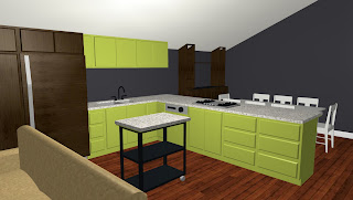
The kitchen has modern bright green cabinets and hidden appliances to make it look bigger. 
 
 
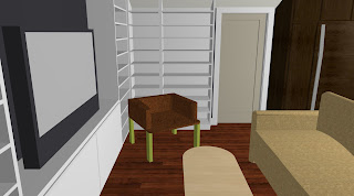
The living room has a whole wall of storage and lots of space for relaxing. 


So are you ready to move into an avocado now? Well maybe not, but I hope that you’ve been able to follow my spatial thought process in designing this house and how I’ve represented the layers of an avocado in each section of the house and then expanded the relationship between them using courtyards. When I told my grandfather about my idea for this house, he was skeptical but remarked that “you don’t need building codes to dream!”
 
If walls could dream… they’d dream of avocado houses.

Throwback Thursday: Meet the RAs

This Thursday, I’m throwing it back to just about a week ago, introducing you guys to the last two RAs from Cal Poly’s Summer Architecture Workshop, Kristin and Ryan!

Ryan was first introduced to architecture in fourth grade when he did a project on Frank Lloyd Wright. Similarly, Kristin was introduced to architecture in fifth grade when she did a project to design and build a house. They both did the workshop when they were in high school. Kristin’s favorite project in the workshop was a playground area she designed. Ryan said the workshop was his first taste of what being an architect really was. And he obviously loved it, because he’s going into his fourth year here at Cal Poly and will be studying abroad in Copenhagen. Kristin is going into her fifth and final year here at Cal Poly and will be working on her thesis project all year. They are both interested in digital fabrication. Ryan says that digital fabrication gives you an advantage when looking for a job because you’re familiar with all the newest technology. Kristin chose to be an RA for the workshop because it’s nice to watch us become “little designers,” all nervous at the beginning and doing amazing work by the end. She loves being in studio with us and wants to be a TA once she graduates. The family environment with the staff is really nice too. She often tells us that she’s practicing her parenting skills on us. Ryan had such a good experience in the workshop when he was in high school, that he felt almost obligated to help other students discover their passion for architecture and see how much fun it is to study at Cal Poly. And he definitely does, always playing games and making everyone laugh. He also loves to go hiking and take landscape photography in his free time. Because there are so many things you can do in architecture, Ryan advises future students to find what you really enjoy and dive into that. Kristin’s advice to future architectural students would be to follow your intuition. Your professor will set rules and boundaries for your projects but it’s up to you to determine your education so find your voice and let your intuition drive your projects and choices.

Final Project

I can hardly believe that it’s already been a month and that my time at Cal Poly’s Summer Architecture Career Workshop is over! But I learned so much and met so many wonderful people!
So without any further ado, here’s a full description of my final project!
We each made up clients for our house and were given a site on a large cardboard landscape. My clients are an elderly couple, moving to California to be closer to their children. The wife loves to garden and the husband loves to read and barbeque. It’s important that their space can serve many functions because they love to host large parties as well as small family gatherings.
My site is up on a hill on the far end of the landscape so it has great views with lots of privacy too.
I started by making some quick sketch models out of cardboard and hot glue.
My first model, just trying to figure out the walls and floors before I get to the interior.
Then I cut out windows and added a few more details, along with a more dramatic roof.
The room on the left is the private master suite which has warm morning light as well as sunset views. The second story on the right is the main living space and is very open to the deck. The first floor is a transitional space that can be an open entertaining space or can be closed off as a large guest bedroom for the grandkids. The multiple decks connect all the spaces and make the most of the amazing views.


Loving the high windows along the roofline and overhead trellis on the first floor.
There’s another really interesting moment under the deck with a lookout space.
Enclosed in glass, this space can easily transition as well, from an elegant gathering space to have a glass of wine, to an exciting yet safe play space for the grandkids.
The angles in the roofline and the tiered decks give the project lots of personality and help to connect it to the jagged mountains around the site.
A sketch I did of the house one night, trying to decide on colors.

The next day, we got to work on the final model, working really hard to make it look clean and finished.

I made my walls out of wooden sticks sandwiched by chipboard and white cardstock. To keep the craft clean, I used only white glue.


The roof has wood beams that extend beyond the roofline and a large wraparound window just below, framed in white paper.


This is the interior stairwell I made. There’s a large window on the second floor and light spills through the open stairwell to the first floor.


Just checking that it fits on the site!


Heading to bed late after a long day of working on it.


And then finishing up the railings bright and early in the morning. Oh the life of an architect!


The lookout space under the deck


Openings in the roof that are mimicked by the garden boxes below


And then attaching it to the site!


The eastmost wall


The entry path to the house


View through the deck to the opposite mountains.


The westmost wall


Shadows through the roof openings onto the garden


Afternoon shadows on the house

The layering of multiuse spaces in this house really help to make it cozy for two people but comfortable for a large group as well. The wife has space to garden, and the husband has space to barbeque and read. The angles and visual interest of the house work with the site to create a unique home that is perfect for the clients.

Although I’ll miss the workshop like crazy, I made so many wonderful memories and I’ll take all the lessons I’ve learned here and just keep dreaming!
Final Project Sneak Peek

Hello everyone!
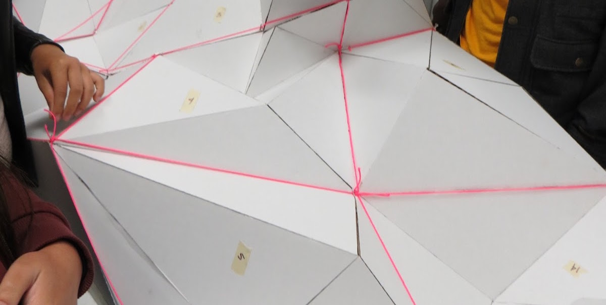
I can’t believe it’s already the end of the architecture workshop here at Cal Poly. I’ve met some wonderful people, done amazing work, and learned so much about how to think and see like an architect. Over the past couple days, we’ve been working really hard on our final projects that we’ll display at the gallery tomorrow. But for now, here’s a little hint as to what we’re doing…

Good luck trying to figure it out! Check back in soon to see the photos of my completed final project and the gallery!

Throwback Thursday: Apple Inspired Dining Room

For the last Throwback Thursday post, I’ll be reminiscing on my very first post…


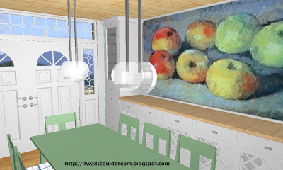
Back in 2009, I designed this dining room with the inspiration of the apple painting.

I’ve come a long way but continue to find inspiration everywhere around me.
What inspires you?

This post is part of a series nicknamed My SLO Summer. It’s about my time at Cal Poly’s Summer Architecture Career Workshop, a four week hands-on experience about what it’s like to study architecture. You can see the entire series here.

Investigating Site

On Saturday, we hiked up into Poly Canyon. In addition to seeing some of the old architecture projects up there, we did our own project that explored site. We were split up into small teams to claim a site in the canyon and then consider the wind, sun, typography, orientation, etc of that site to design a floorplan with a meditation space, bathroom, and food prep area.
The site my group chose was gently sloped with expansive views and a fair amount of privacy. It also had a really nice breeze for such a hot day.
I designed a split level floorplan with a large meditation space and cantilever deck that takes advantage of the afternoon sunlight. On one side is a small kitchen and on the other side are stacked bathroom and bedroom spaces.


Floorplan and section showing sun and breeze.


The exterior of the house from the side deck.


The interior meditation space with lofted sleeping space above.

Motivation Monday: Success

Good morning everyone!
It’s the last week of camp and I can’t believe how far we’ve all come. After pushing ourselves to be the best we can possibly be, our last “Motivation Monday” is about success:
Feeling successful in ourselves, our work, and our work ethic, let’s knock this last week out of the park!
 
 
This post is part of a series nicknamed My SLO Summer. It’s about my time at Cal Poly’s Summer Architecture Career Workshop, a four week hands-on experience about what it’s like to study architecture. You can see the entire series here.
1 12 13 14 15 16 32