Earthquake High-Rise Project

This morning, we constructed high-rises that we put on an earthquake simulating shake table in the afternoon.
We worked in pairs again and my partner and I decided to construct a four sided tower out of popsicle sticks. We used string to help hold it together and made a platform at the top to hold the weights.
When we put them all on the shake table, ours held up very well for the first half and then the base slowly started ripping apart and it tumbled over!

Sail and Truss Project

Wednesday, we had another Architectural Engineering project. The professor showed us different methods of making spans, like with trusses or suspension, and then we divided into pairs and got to work! Our instructions were just to make something that spanned three stairs so that a ball could be rolled through on the middle stair. My partner and I were really interested in sails and suspension, so we sketched out a design and made a mini model of the sail shape.
And then we constructed the full-scale one. I made the sail out of wire and cloth and my partner made the vertical truss out of drinking straws and lots of hot glue.


Our careful planning and sketching in the beginning of the project paid off because our project fit perfectly and the ball rolled right under!


Five Cube Project

On Tuesday, we started Architectural Engineering with another cube project! Given a number, 1 to 5, we had to design a set of 5 cubes with that number of cubes touching the ground. I was given 3.
 My design has three cubes staggered on the bottom and the other two staggered on the top.
At the end of the day, each studio put their cube sets together into a giant cube sculpture.


Throwback Thursday: Warm Great Room

It’s Throwback Thursday once again!

I’m throwing it back to one of my personal favorite designs this week…
 
What’s your favorite of my designs?
 

This post is part of a series nicknamed My SLO Summer. It’s about my time at Cal Poly’s Summer Architecture Career Workshop, a four week hands-on experience about what it’s like to study architecture. You can see the entire series here.

Meet the RA: Ariana

Today I have another wonderful RA to introduce you to, Ariana. She’ll be a fourth year architecture student studying in Paris next year. An artistic and highly creative person, architecture is a great fit for Ariana.

Originally from Washington, she really loves that at Cal Poly you start your degree classes right away and there are lots of hands-on projects. Her favorite thing about San Luis Obispo is how easy it is to get places or run quick errands, unlike a huge city. It’s also easy to carry huge architecture supplies around. When she was in New York, she saw students hauling their supplies down the street or on public transportation, and it’s much easier to move stuff around here. She doesn’t know yet if she’ll get her architectural license after she graduates. She’s considered getting a minor in French, Construction Management (because it’s lucrative and easy to get a job), or a certificate in Digital Fabrication but she doesn’t know what she’ll choose if any yet. She’d enjoy working as a furniture or industrial designer or an artist. She’s been looking into internships at museums, like MOMA in New York, shadowing a curator. Although she wouldn’t want to be a curator, she loves to try out new things. Even without any experience making furniture, she entered a local furniture competition and learned a lot from it even though it wasn’t her best work. I think she’s a perfect example of that fearless creativity I talked about the first week. She’s a perfect RA because she really enjoys being a mentor. Her advice for future architectural students would be to find another creative outlet. Something for yourself and not your professor or boss, just to keep your mood up. Recently, she started B&W film photography and finds it really fun and entertaining. Even as a teenager she had a wide array of interests, from marine biology to fashion design. But today, she can’t even imagine herself studying anything other than architecture.

Sun and Shade Backyard Project

Today we had another guest professor, JoAnn, introduce us to sustainable design. We focused on sun and shade in our project to design a backyard. The client wants afternoon shade on their lap pool, afternoon sun on their hot tub, and morning sun on their patio.
We used a sun peg to determine the shadows at different times of the day. The sun peg is attached to the base of the backyard model so you simply move the model around until the end of the peg’s shadow is at the desired time of day on the chart and then hold it still to see where the shadows are on the model.


It was mandatory to put a hill and trees on the left and I decided to add trees on the right too. I made the trees white to keep them from distracting from the design.
The trees made really pretty shadows as well.
I constructed a large shelter to keep the pool shaded. The cutouts give a nice view to the trees and cast interesting shadows too.


The top of the structure has a trellis to provide even more shade and shadows.
Across from the pool is the hot tub and eating area that sits up against a curving wall and a low hill.


Urban Design Project

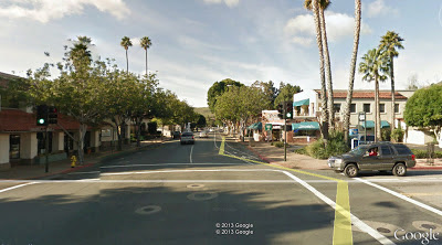
These past few days we’ve had a guest professor, Umut , teach us some basics of Urban Design. We started with a walk downtown in which Umut pointed out specific urban design details for us to notice such as the amount of trees, benches, and street lights, the presence of crosswalks (especially “bump outs,” there’s one in the picture below and they help make pedestrians more safe because the cars can see them better), the size and presentation of store fronts (how large their windows are, if they’re flat or receded, if they have an overhang or a sign, etc.), the space between stores (if there’s an alley or not), and the width of the sidewalk and the street.
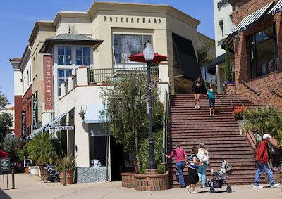
Another unique urban design element in downtown San Luis is the presence of privately owned public spaces. At first they seem like elegant, inviting, public, mini shopping malls inside a block of the street. (In fact, my group even did our downtown sketches in the privately owned Court Street mall.) But since they are privately owned, people can be asked to leave or they can be closed down at any time.


If you continue west on Higuera Street, there is an abrupt end to the pleasant downtown atmosphere.


Quaint boutiques are replaced by office buildings, houses, and even a mobile home park, the space between buildings gets larger, the road gets wider and faster, the trees get lower and almost block your view of the businesses, and the benches disappear, as does the ambiance.


So after soaking up so much information about urban design, and even watching a documentary about urban design around the world, we were given our assignment: to redesign the west end of Higuera Street to make it more walkable and inviting.
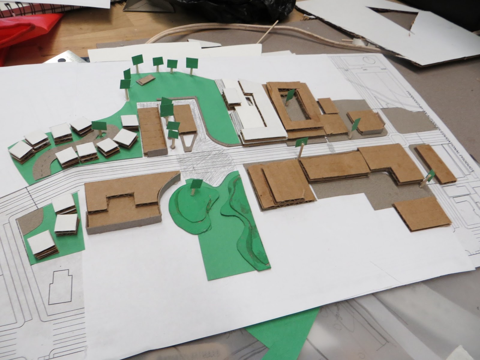
We split up into teams of three and started brainstorming. To get people to continue in to this end of downtown instead of turning back around we have to grab their attention. We decided to do this with a large park in the center of the block. To the west are some residences and to the east (towards downtown) are more shops and night life.
The park connects the road to the river with a large, inviting green space. To the left is a row of small boutique stores with trees for shade. In the middle is a restaurant with outdoor seating. On the right is a large cement bench that borders the lawn area. To the back, by the river, is a more forested area with barbeque pits, picnic tables, and a large stage.


To the right of the lawn is a large shopping center, kind of like the privately owned public spaces in downtown. It has two levels with a bowling alley as well as lots of shops and restaurants. It also has a large bank of stairs along the front for sitting on and people watching.


The middle section with the shops and restaurant is paved in cobblestone, giving it a classic feel as well as making it easy to host large community dance events on. The cobblestone continues onto the street surface as a way to slow down traffic and encourage pedestrians to continue on to the park on the other side of the street. This part of the park offers even more green space as well as small, curving hills to play on.
Right next door to the park and shopping center is a small neighborhood. We were inspired by a woonerf, a living street that gives priority to pedestrians and bicycles over cars, so we built small homes along a small cul-de-sac.
At the other end of our block, closest to downtown, we decided to continue the inviting ambiance with more traditional shops and restaurants. In addition, there are apartments and offices above the shops. To give this section of town some more vibrant night life, we added a club at the front corner with a large class corner in the front to invite people in.
We hurried to get all our ambitious ideas finished and then headed to the gallery to present our projects.
There was a wide array of different ideas and I was amazed at how much we had learned in just two short days and was blessed by having a wonderful team that worked so well together. I only wish we had more time to develop and expand upon our ideas!
 

Meet the RA: Chip

Hello everyone! I’d like to introduce you to another of my wonderful RA’s today, Chip! He’s a third year architecture major here at Cal Poly.

When Chip was little, he loved roller coasters. Although architecture and roller coaster design may not seem very similar, they have many common elements. They both focus on people’s experience in a space and interaction with their surroundings. Cal Poly is the perfect fit for Chip because it’s close to his Santa Barbara home and also has an amazing architecture program. His favorite class is Studio because of the connections you make with peers. His Studio even did a Secret Santa winter quarter! Chip is on the way to getting a minor in Sustainable Environments. He believes that it’s important to build eco-friendly and that having a minor in sustainable environments will open doors for him. However, like many other architecture students, he believes that it’s an architect’s responsibility to build sustainably. After he graduates, he wants to get licensed as an architect. His advice for future architectural students is to use the resources available to you (labs, materials, tools) in architecture school to the fullest.

Motivation Monday: Drive

Good morning everyone!
It’s sad to think that camp is halfway over, but we’ve learned a lot and make some great memories. Now’s the time to push ourselves even harder to make the most of every moment and accomplish more than we’ve ever dreamed we could before.
So what are you waiting for? Jump out of bed (carefully, as to not land on any rulers, pencils, or roommates) and let’s get to it!


This post is part of a series nicknamed My SLO Summer. It’s about my time at Cal Poly’s Summer Architecture Career Workshop, a four week hands-on experience about what it’s like to study architecture. You can see the entire series here.

Throwback Thursday: Prefab House Design

It’s Throwback Thursday number two!

Remember this?

What are you reminiscing about today?

This post is part of a series nicknamed My SLO Summer. It’s about my time at Cal Poly’s Summer Architecture Career Workshop, a four week hands-on experience about what it’s like to study architecture. You can see the entire series here.
1 13 14 15 16 17 32