Avignon

After visiting Barcelona, we went to Avignon, France. We took a bus instead of a train because it was cheaper and, honestly, it was such a fun way to go! It took longer but it felt more like a road trip. We stopped at a French rest stop on the way and got baguette sandwiches!

Avignon was such a cute little town with beautiful, historic medieval walls on the Rhone. We had fun watercoloring, exploring, and eating baguettes!

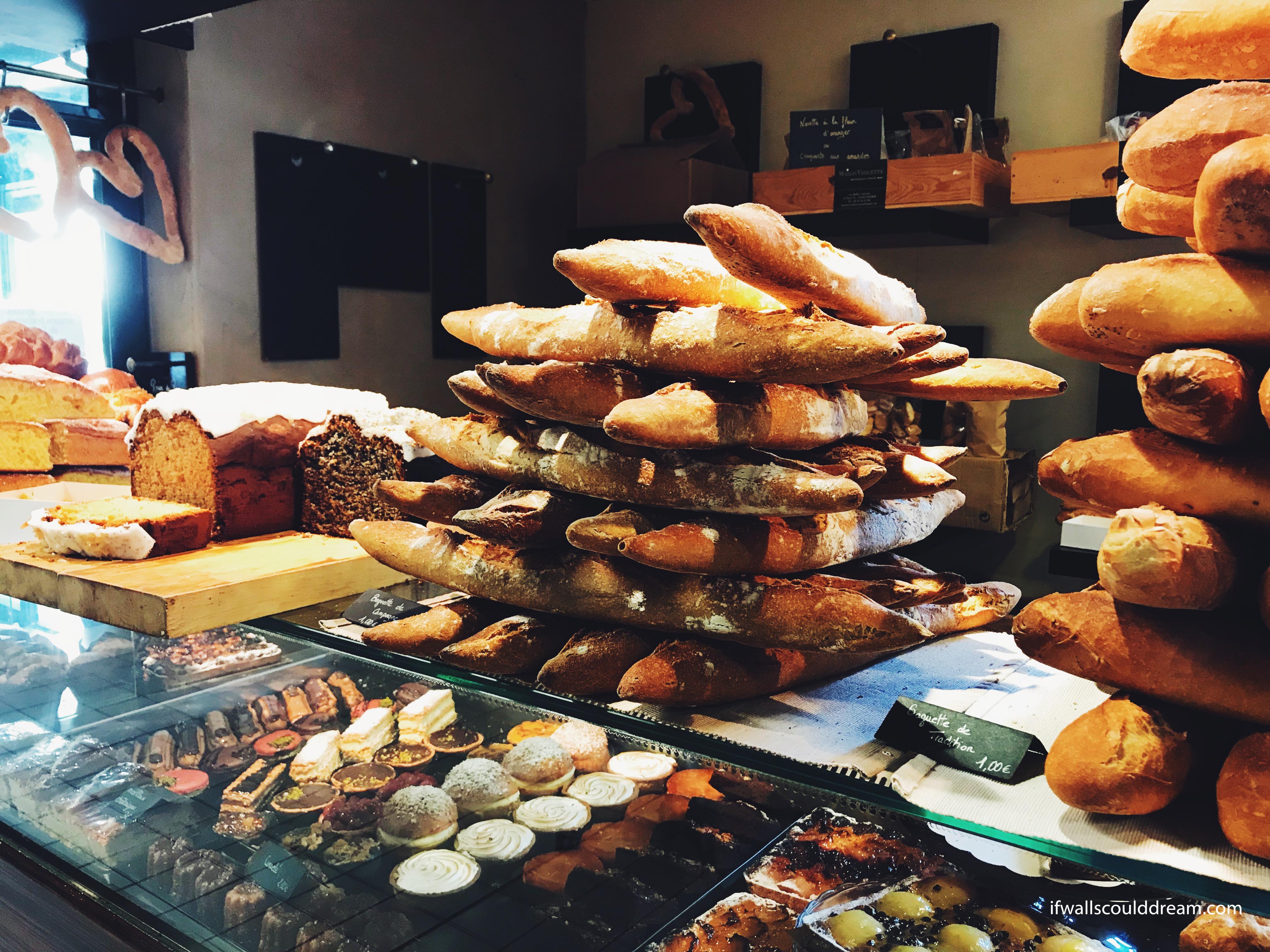
We got breakfast every morning at this indoor market by our AirBnb and they had the most delicious pastries! It was so fun to test out our memories of high school French and try to order in French.

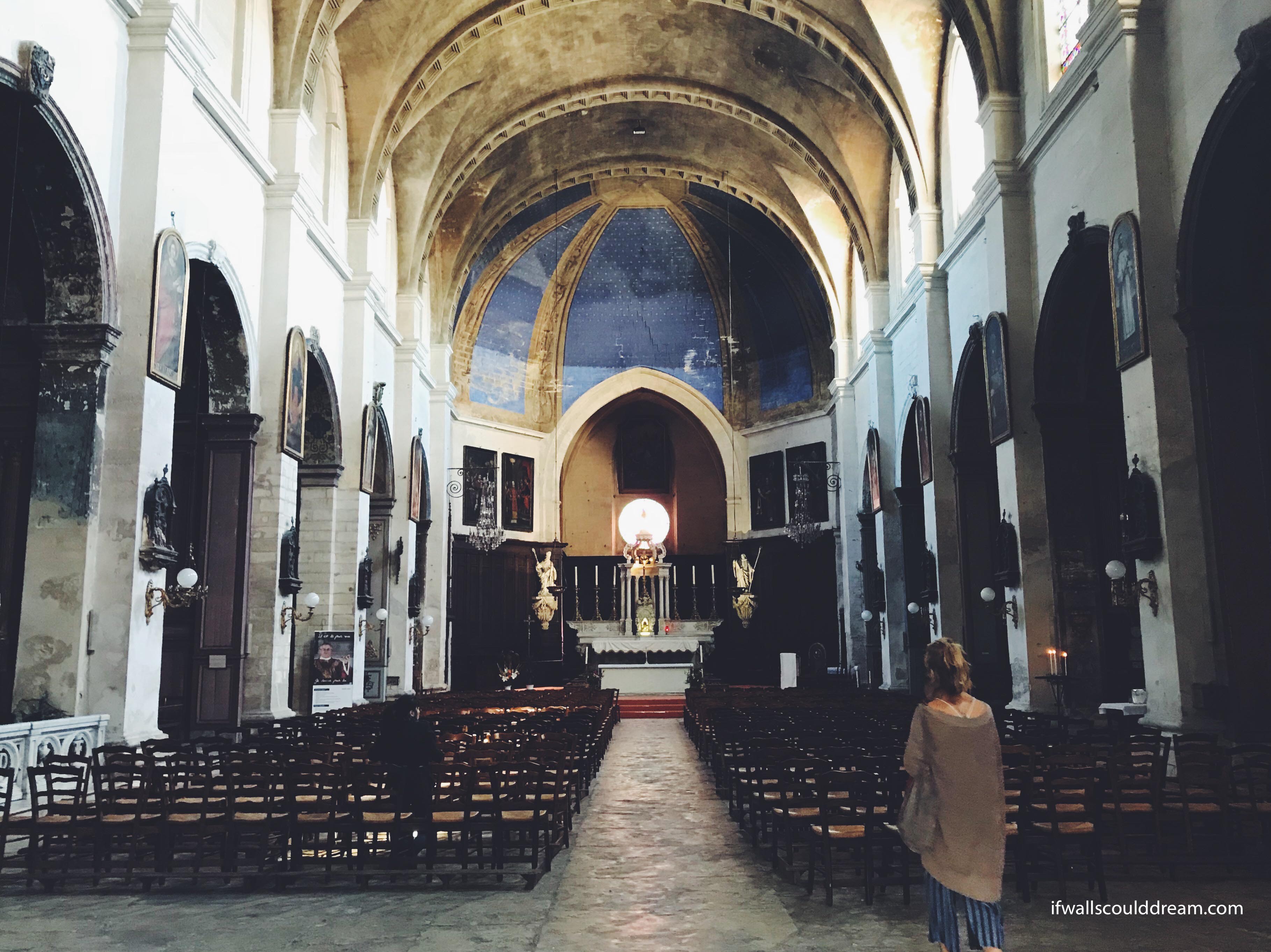
We wandered around the town, the medieval streets, and happened upon a lot of cute buildings and churches such as this one.

My favorite part of Avignon was a cat cafe we went to! I hadn’t been to a cat cafe before but it was so much fun! It’s just like a regular cafe but they have cats there you can pet!! They were so cute and friendly. I would definitely recommend anyone who isn’t allergic to cats to go to one!


If walls could dream… they’d dream of cat cafes!

Barcelona

This summer, I spent two weeks traveling with my friend Grace before going to Copenhagen to start my study abroad experience. We started in Barcelona and there were so many wonderful buildings to see! We knew we wanted to see Southern France and Barcelona was the cheapest place to fly into near there, but I’m so glad we got to spend some time there!


La Sagrada Familia

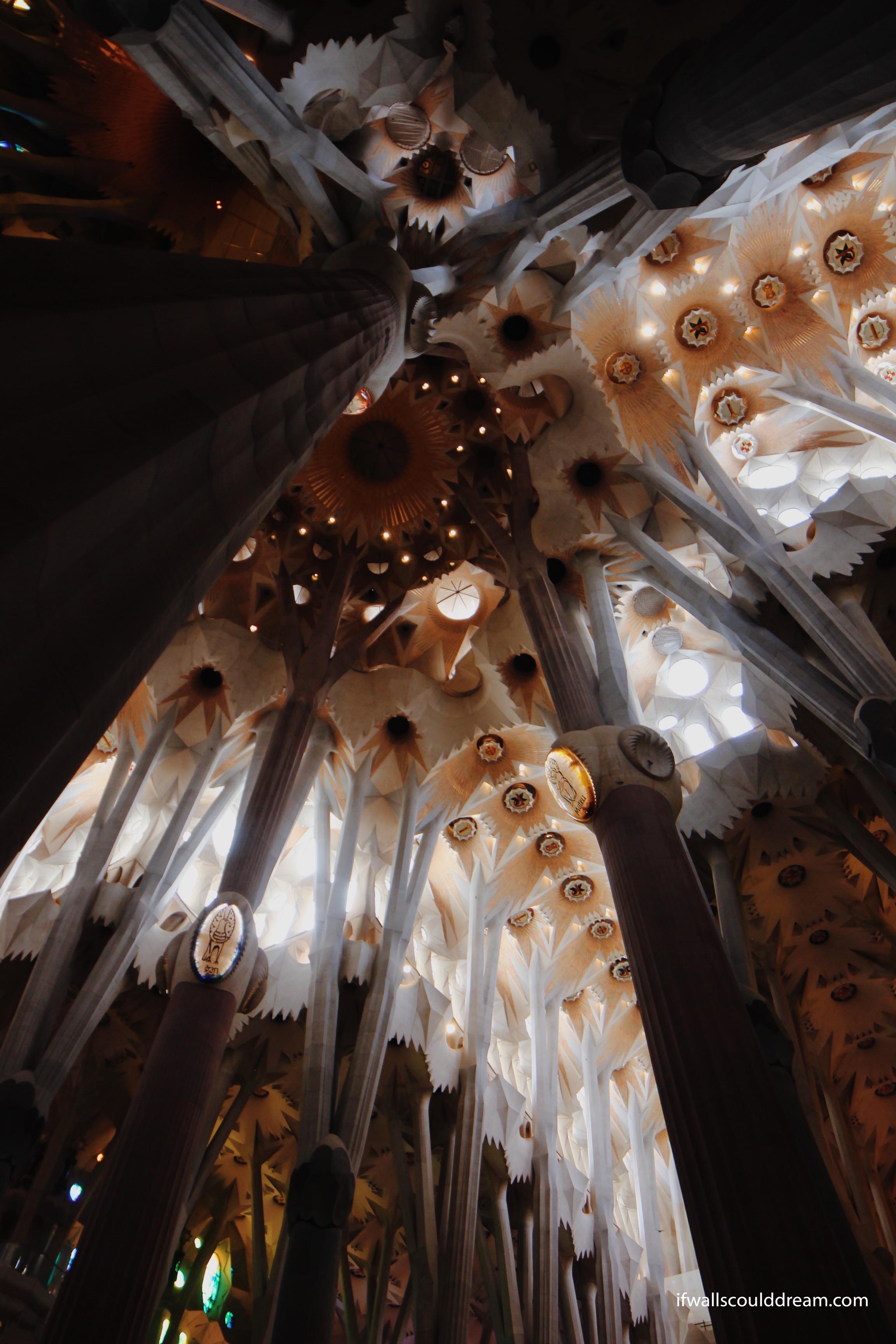
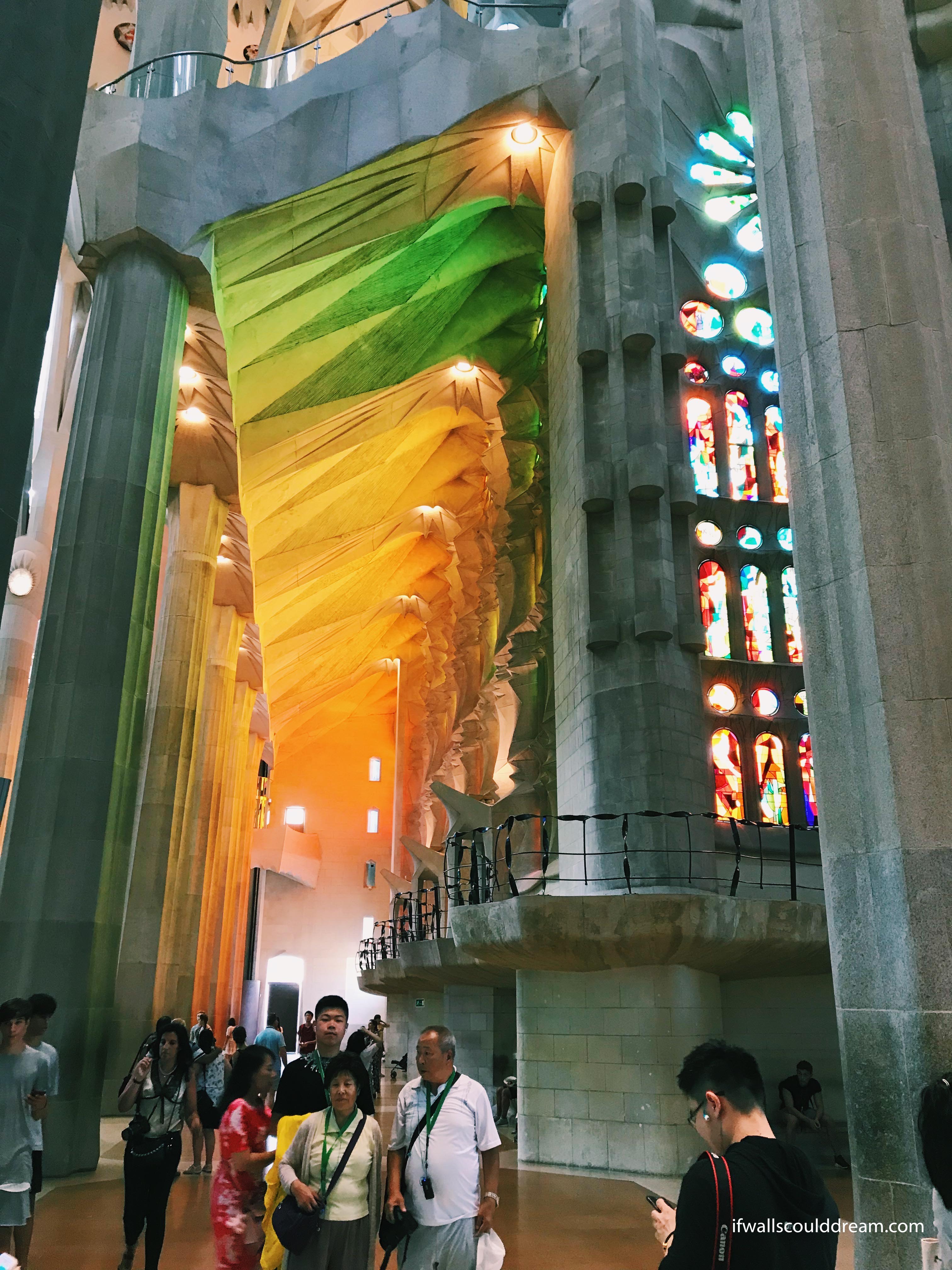
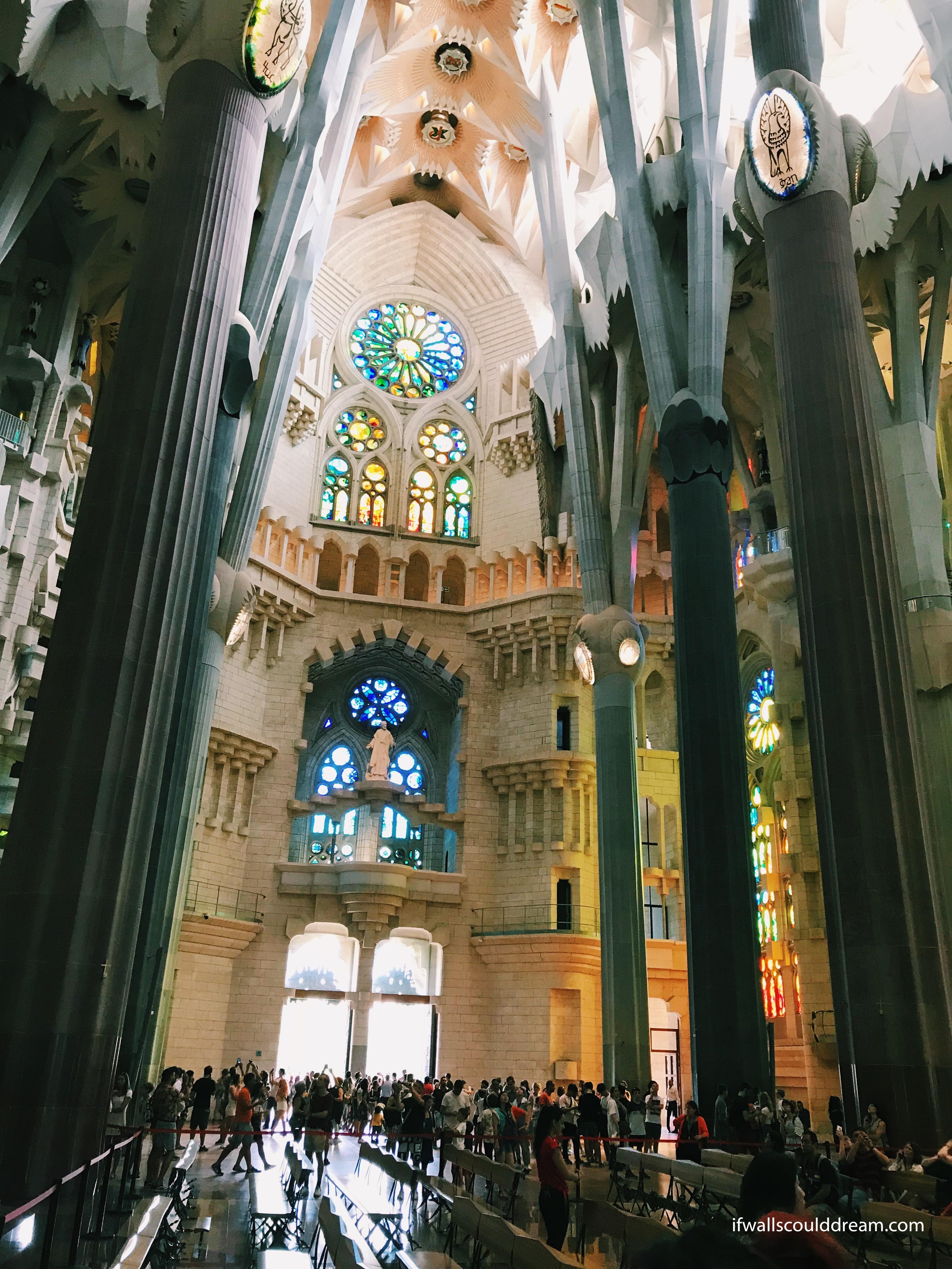
First, we went to La Sagrada Familia by Gaudi. It is cool from the outside and unlike any other church I’ve seen but the inside is what’s really breathtaking. If you visit Barcelona, you have to go inside! You’ll need to reserve a ticket online but it is well worth it (just remember to print your ticket, don’t just have it on your phone!)

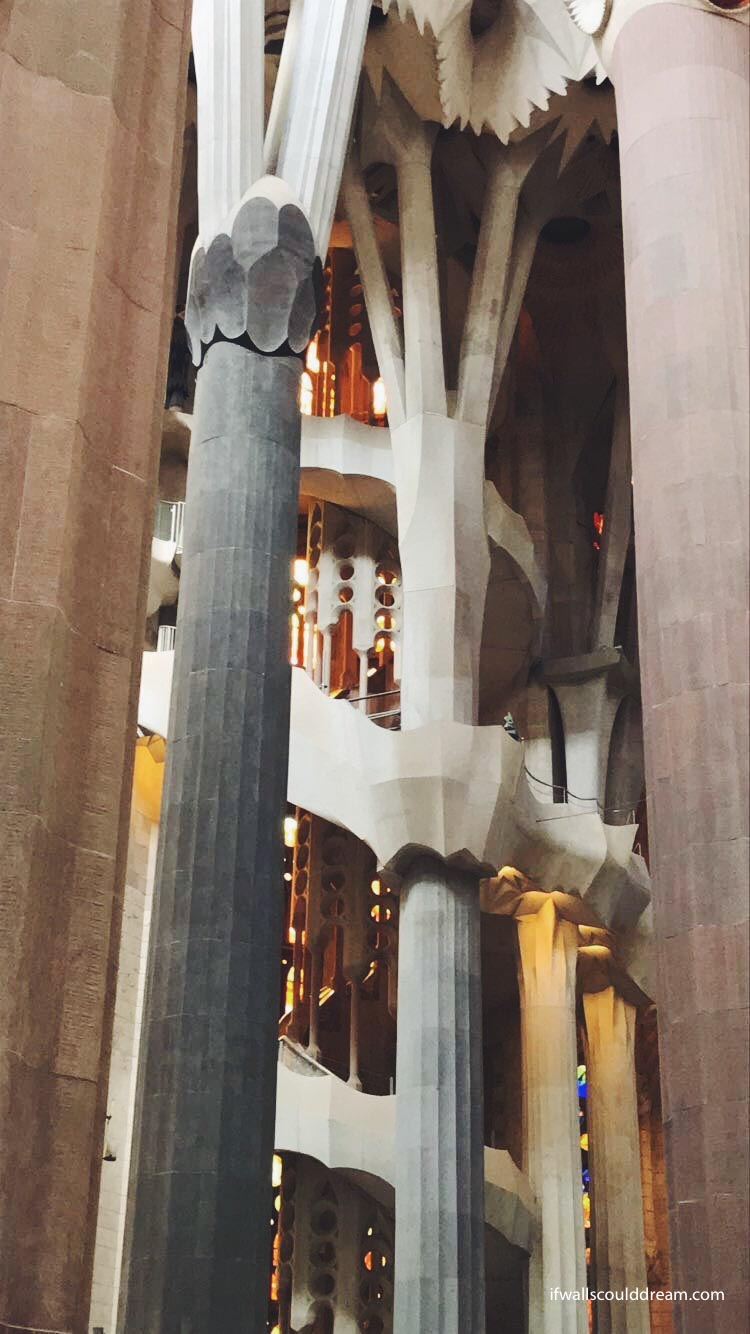
The details in this church were so incredible. I don’t know how Gaudi came up with it because it is unlike anything I’ve ever seen before. Even the way the columns branch out into smaller columns at the top.

The lighting inside the church was incredible as well. My favorite part was how the stained glass reflected on the lighter surfaces of the ceiling and columns.


All in all, this was such an amazing church, from the stained glass to the ceiling design. And if you go there, be sure to check out the schoolhouse on the property. It has an undulating roof which is beautifully built. AND there’s air conditioning!! So on an especially hot summers day, it’s a great place to hang out and plan your next stop.


We rounded out our tour of Gaudi’s work by walking by Casa Milla and Batllo, and then going to Park Guell. If you’re only in Barcelona for two days, like we were, I’m not sure if I’d recommend Park Guell. It was kind of far away on the bus and, especially because of the construction right now, there isn’t that much to see.

That night, we went to the “Magic Fountain” which is a giant water fountain that does shows to music. While we were waiting for the show to start, we got caught in a downpour and got drenched!! From now on, I’ll always carry an umbrella!


Barcelona Pavilion

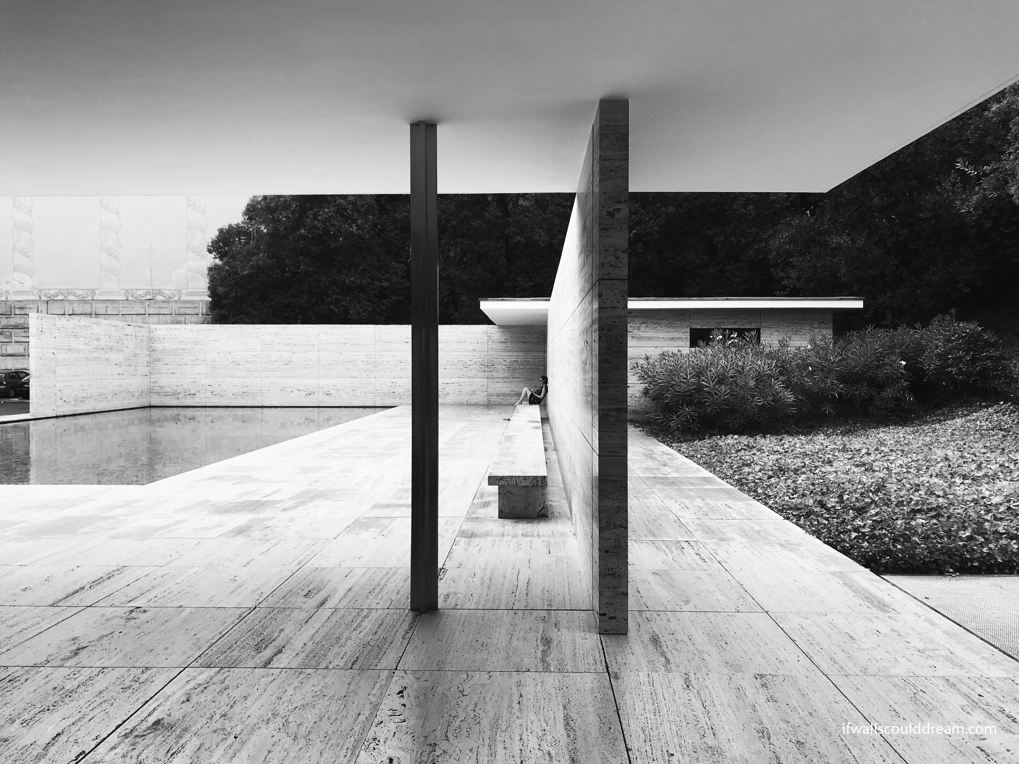
The next day, we went on a mission to find the Barcelona Pavilion and, funny enough, we had been right next to it at the Magic Fountain. It was so fun to see this building in real life after learning so much about it in architecture studio.

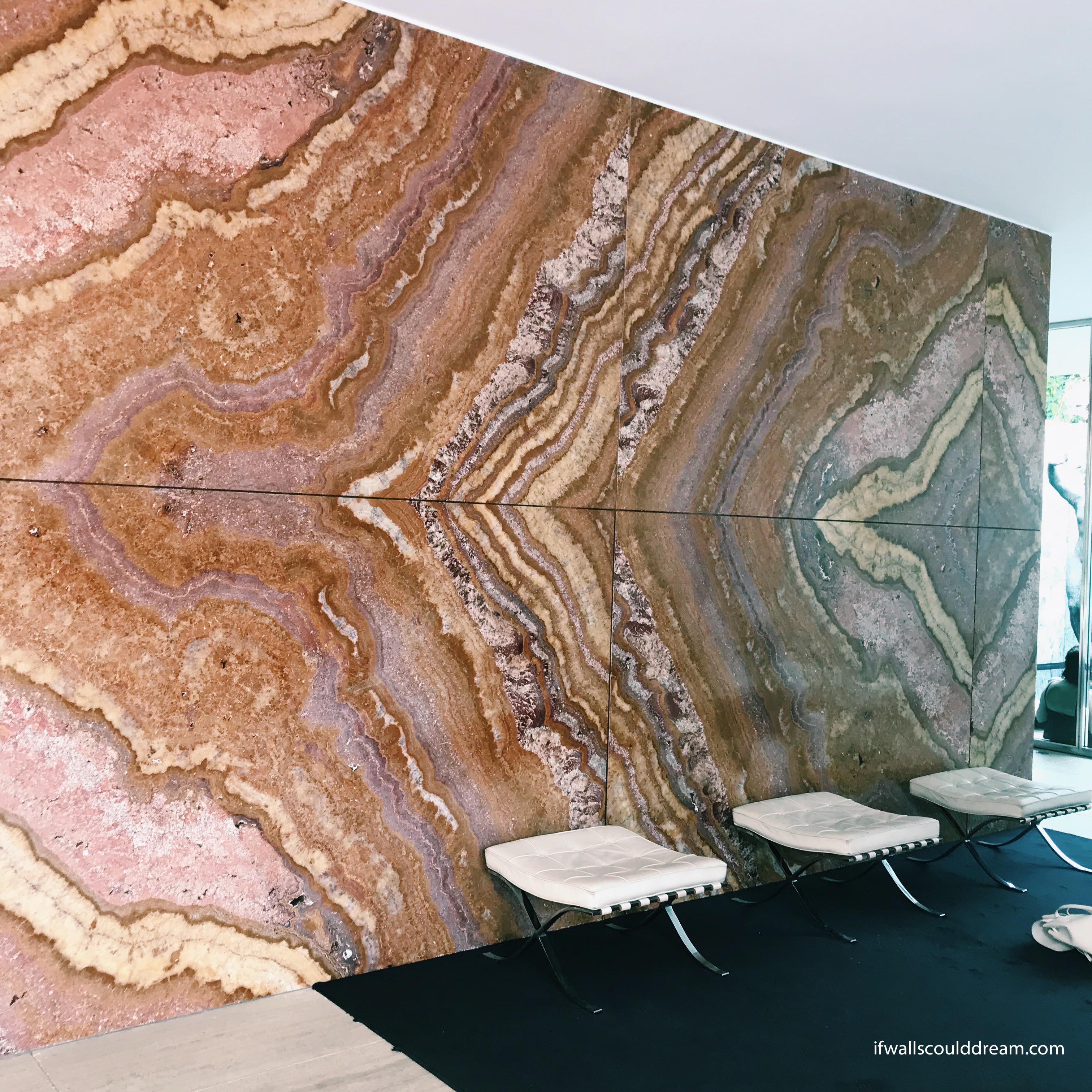
The simple form and extravagant materials were so beautiful. The house was populated by art and architecture students and their sketchbooks so we were right at home.


It was a perfect way to end our time in Barcelona and I wish we could’ve stayed in the city longer but I was really excited to visit Southern France next!


Picasso Museum

We also went to the Picasso Museum. It was in the Gothic Quarter which is a super cute, more historic neighborhood. The museum was free for students! Yay! And it was fun to see that Picasso did so many different styles of painting throughout his career. I would definitely recommend it, especially if you’re a student.


If walls could dream… they’d dream of staring at the ceiling of La Sagrada Familia all night!

Study Abroad Bucket List

Studying abroad this upcoming year, one of the things I am most excited about is seeing a bunch of famous buildings all around Europe. Here’s a countdown of the top five on my bucket list:

5. Mountain Dwelling by Bjarke Ingels, Denmark

Image result for bjarke ingels mountain house

Image: http://www.solaripedia.com/13/333/the_mountain_employs_passive_design.html

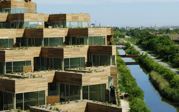
This is a BIG one, but I can’t wait to see Mountain Dwelling and all of Bjarke Ingels’ other projects in Copenhagen. I’m sure I’ll learn all about it in my studio classes. Ingels and other Scandinavian architects are a large reason why I chose to study abroad in Denmark.

4. Seona Reid Building by Steven Holl, Scotland

Image result for seona reid building

Image: https://www.archdaily.com/483381/seona-reid-building-steven-holl-architects

In the beginning of my third year, I did a research project on this building and it has been on my bucket list ever since. I love the way Holl uses light in this and all of his projects. I am excited to see this building in person and I hear Glasgow is a great city as well.

3. Notre Dame du Haut by Le Corbusier, France

Image result for notre dame du haut ronchamp

image: https://www.dezeen.com/2016/07/24/le-corbusier-notre-dame-du-haut-ronchamp-chapel-france-unesco-world-heritage-list/

Notre Dame du Haut has been on my bucket list for a long time. I remember in my high school French class, I did a report on Le Corbusier and I talked about his Notre Dame du Haut chapel. And while I’m there, I’m excited to check out Renzo Piano’s project there too!

2. Brion Cemetery by Carlo Scarpa, Italy

Related image

Image: http://www.cadememi.com/itineraries-veneto-what-to-do-villas-and-more/carlo-scarpa-noble-cement-at-the-brion-grave

The professor I had winter quarter of my first year loves Scarpa’s work and he told us a crazy story about his adventure trying to find the Brion Cemetery when he was visiting Italy. I hope I won’t get lost like he did although the odds are not in my favor seeing as I don’t speak Italian!

1. Therme Vals by Peter Zumthor, Switzerland

Image result for therme vals

Image: www.7132therme.com

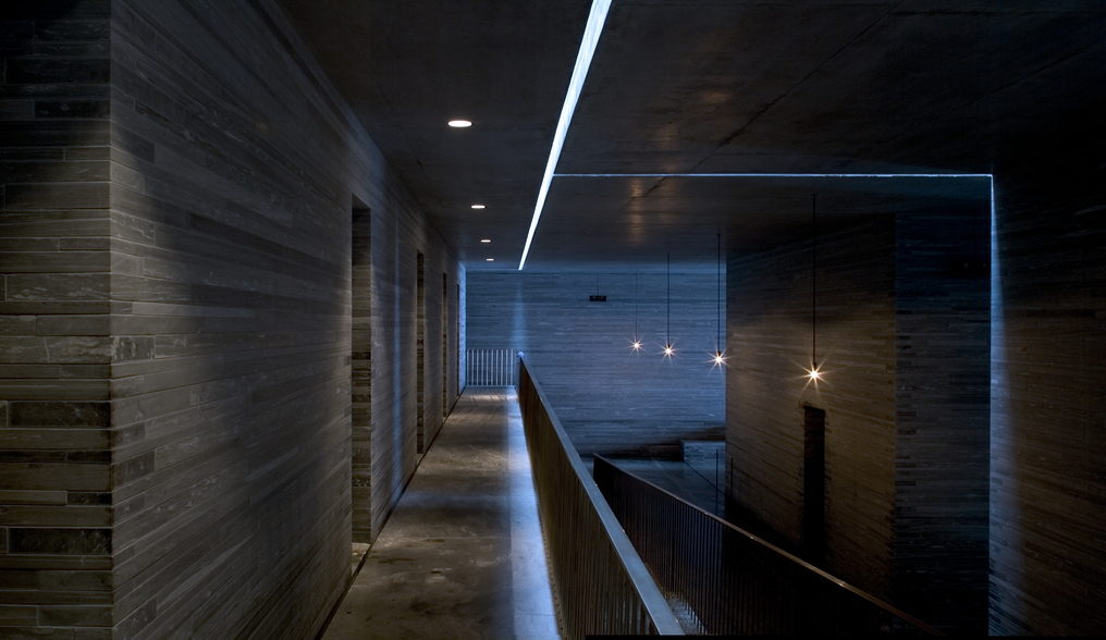
The top of my list is the Therme Vals by Peter Zumthor! This project seems so serene and the way Zumthor uses light in this project just can’t be contained in photos. I can’t wait to experience it for myself and explore the Swiss masterpiece.

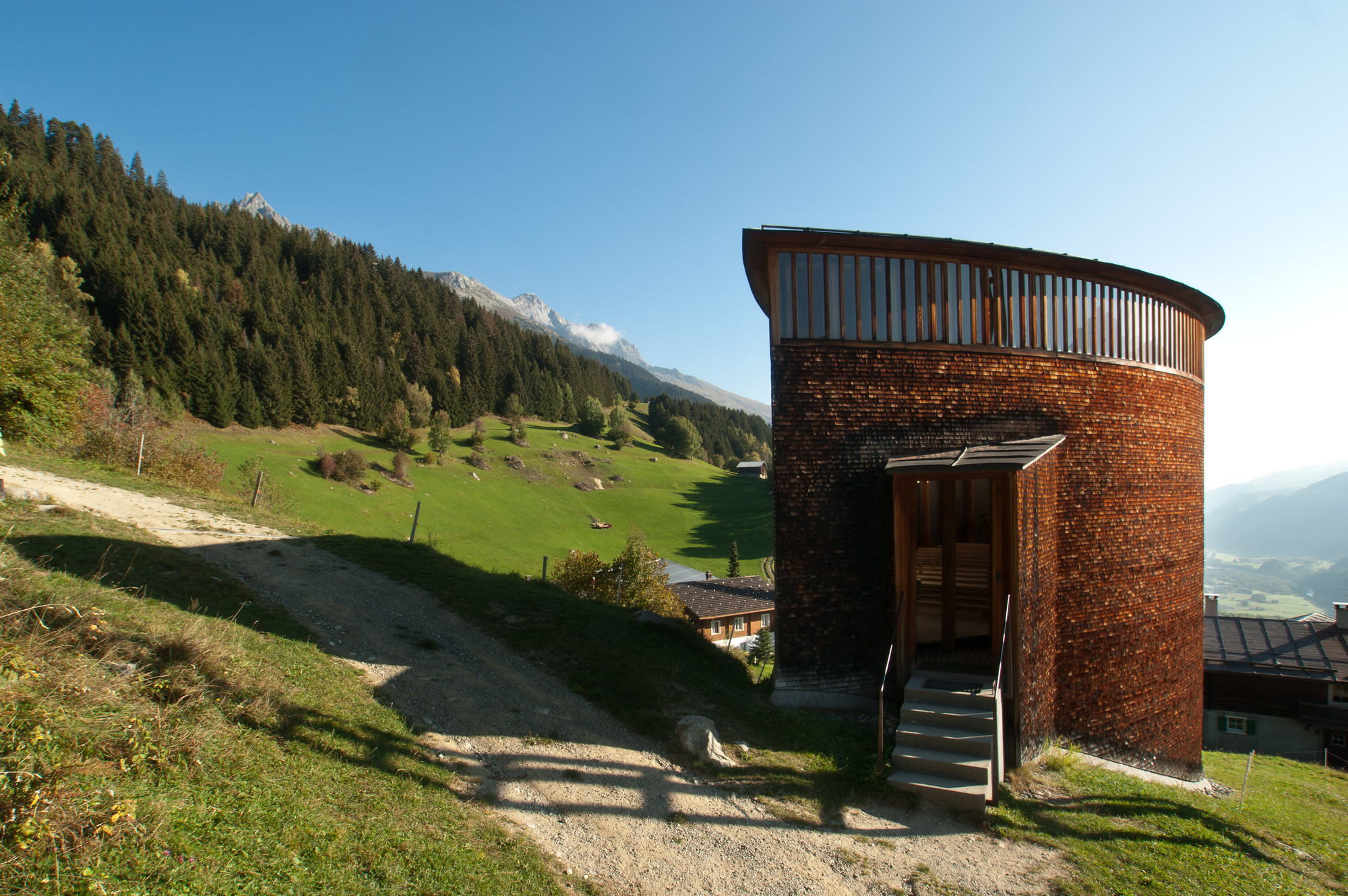
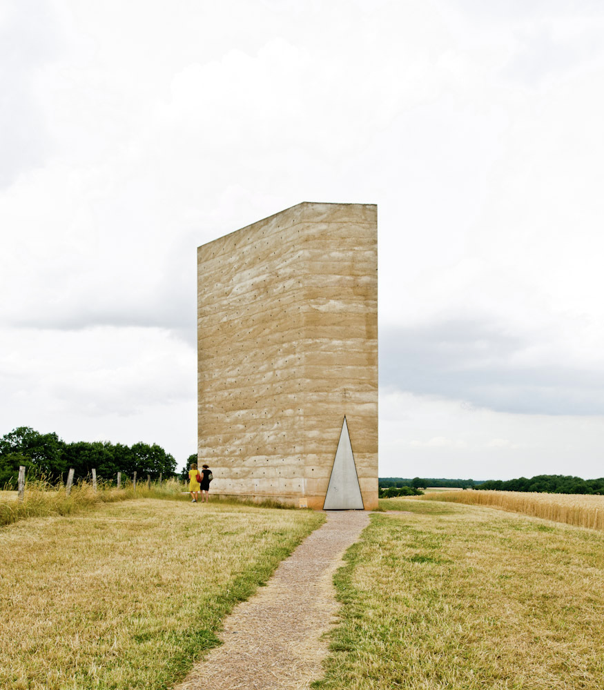
And while we’re at it, add on the Bruder Klaus Chapel, Kunsthaus Bregenz, Saint Benedict Chapel, and anything else that Zumthor has touched because it’s all gold!

If walls could dream… they’d dream of visiting all the buildings on their bucket list!

Overlapping Transparency

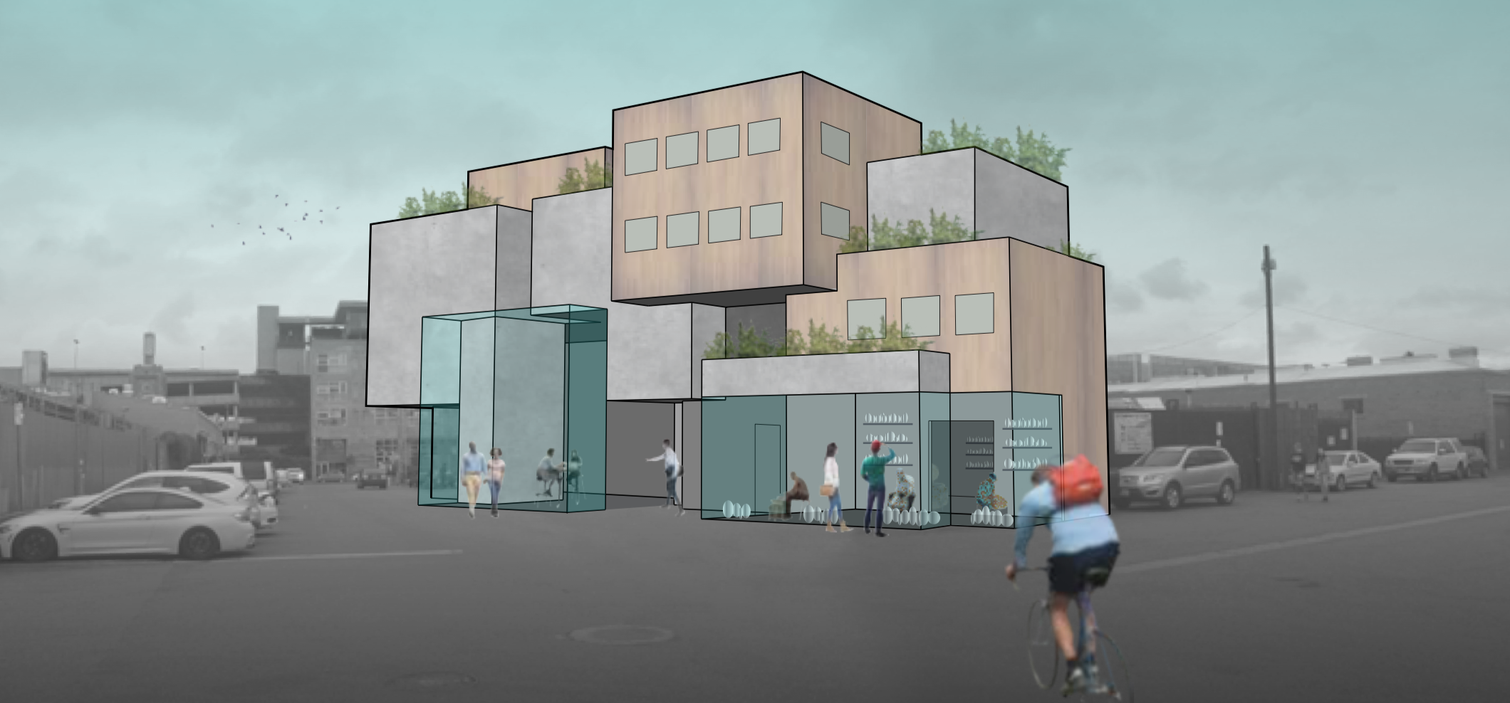
This quarter, I got to design a mixed use homeless housing project in Los Angeles. This project is based on the housing first model of the Skid Row Housing Trust (SRHT) in Los Angeles. We got to tour SRHT projects and get a feel for the Skid Row and Arts District neighborhoods of LA.

The housing first model seeks to end homelessness by giving people houses. It’s that easy. No strings attached to employment or substance abuse, you give them a house and that gives them the solid foundation to rebuild their life.

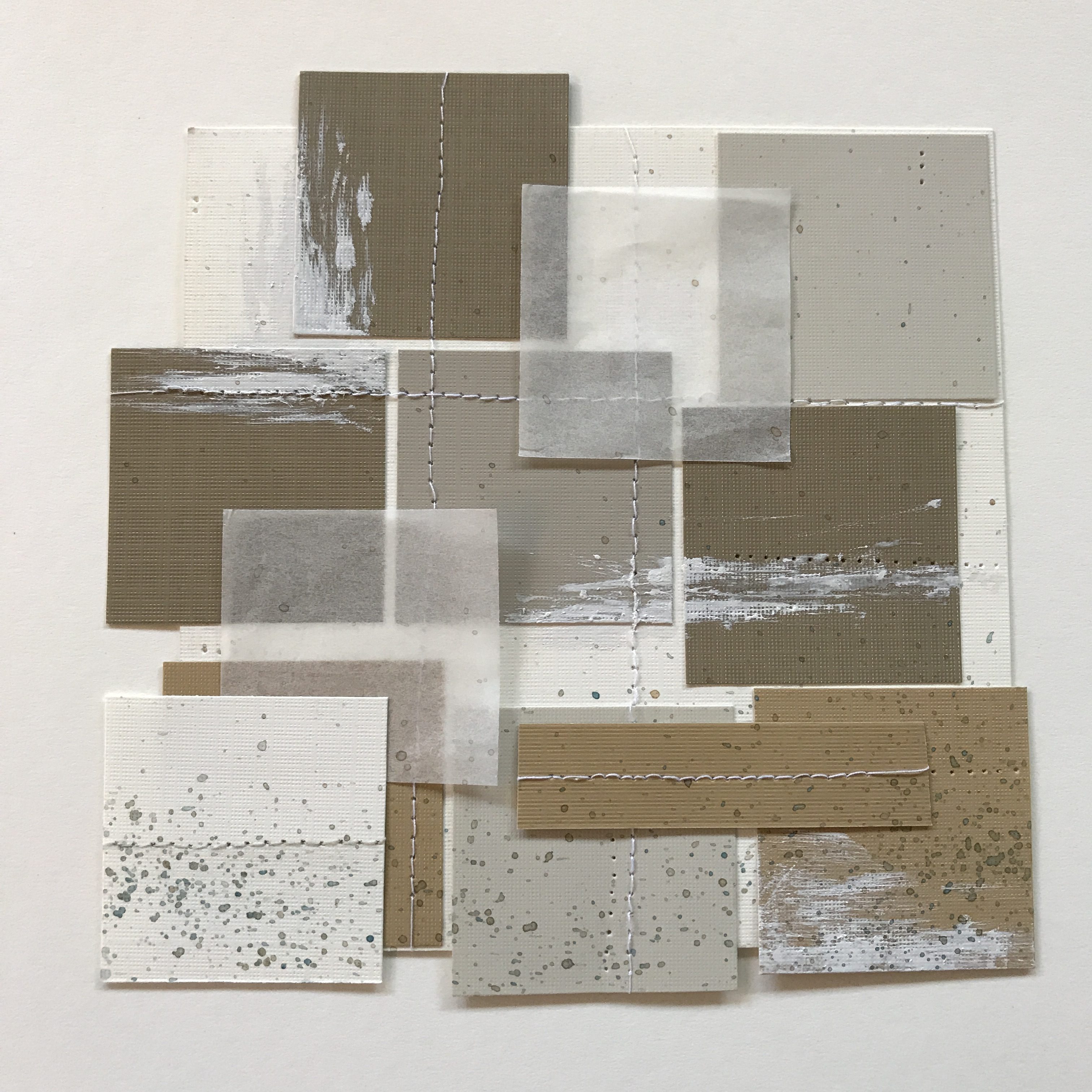
We started the quarter out by making collages and I created this piece based on the idea of stitching together various different programs to see how they can overlap and work together to create something new and better than being on their own.

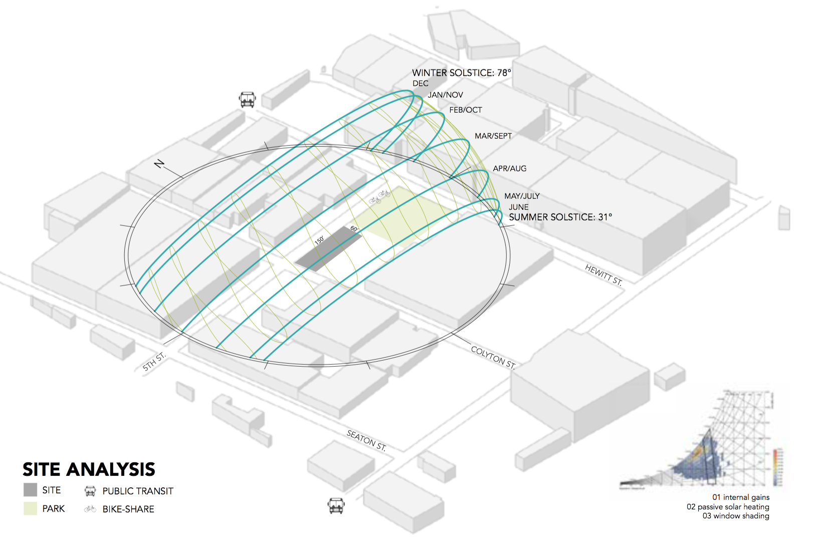
Our site, in the Arts District of Los Angeles, has access to public transportation, great southern sun exposure, and a park next door. When we visited, there were lots of great artist spaces, coffee shops, and restaurants in this area.

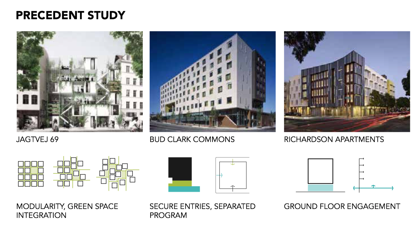
We studied precedents of mixed use homeless housing to see how other architects integrated green space, provided security, and public engagement.

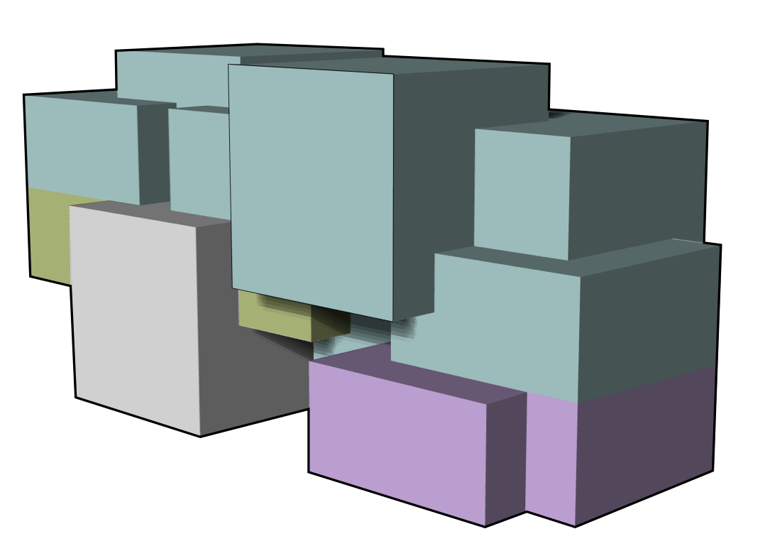
I created the massing for my building using overlapping cubes. In the diagram below, the grey is the restaurant, purple is the ceramics studio, green is the health clinic, and blue is the apartments. I like how this massing creates covered areas on the ground floor and patios on the upper floors.

In addition to a massing scheme, the idea of overlapping plays out in the program. This building is all about what happens when you combine different programs in one building. How can you build symbiotic relationships between seemingly different groups of people and functions within a building?

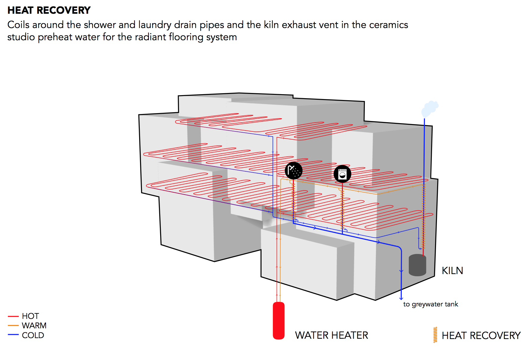
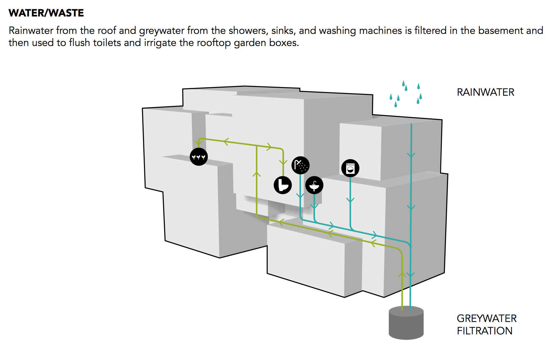
The building design includes heat recovery, using waste heat from the ceramics kiln to provide radiant floor heating in the apartments.

The building also has a water recycling system. Rainwater from the roof and grey water from the showers, sinks, and washing machines, are filtered and reused to flush toilets and irrigate planters.

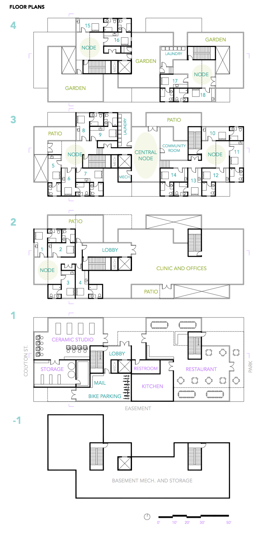
The floor plan for the building, below, shows the different programs in the building. The apartments on the upper floors each open on to a common “node” space that can be used like a shared living room. It encourages residents to get to know their neighbors, have dinner parties, and build community.

The ceramics studio on the first floor helps to connect the Art District community with the formerly homeless residents through art therapy and community events. My vision for this space is that they would have classes where community members could learn alongside residents. They could have an annual fundraising dinner and auction off pieces made by the residents.

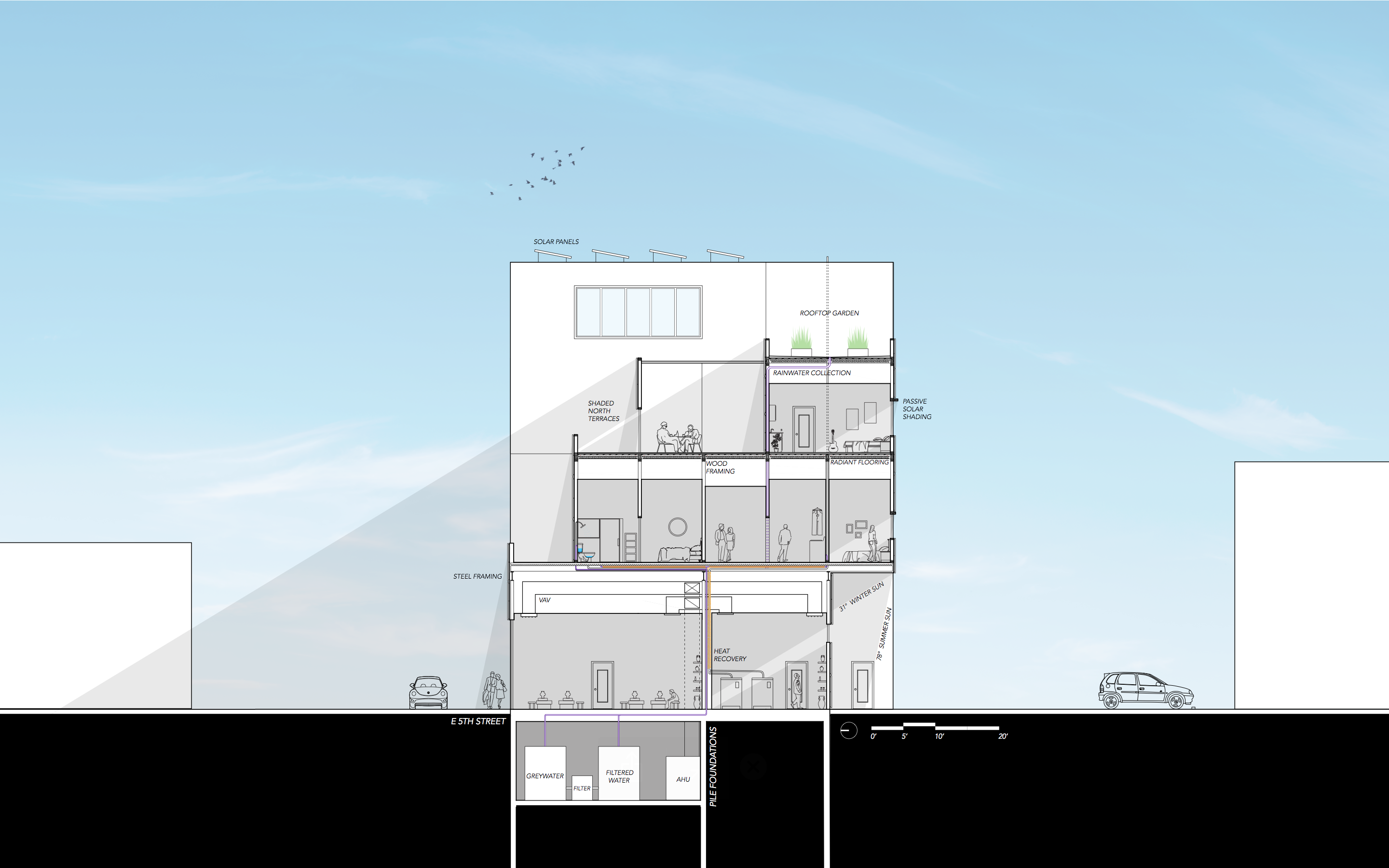
The building section, below, shows the integration of the mechanical systems as well as the passive shading and solar panels on the roof.

If walls could dream… they’d dream of giving homeless people homes.

Grasshopper Tutorial 2: Climate Analysis

In addition to being a great iterative design tool, Grasshopper for Rhino can produce beautiful climate analysis diagrams. This tutorial will walk you through creating a wind rose, psychometric chart, and a 3D sun path using Ladybug in Grasshopper. (Why all the animal names? I really really don’t know…) Grasshopper climate analysis is an easy way to add a level of professionalism and customization to your architecture projects.

If you are unfamiliar with Grasshopper, check out my basics tutorial here first.


Step 1: Install Ladybug

Ladybug is a plug-in for Grasshopper that you can download here at Food4Rhino and follow the video on their website to install it.

Step 2: Download an .epw Weather File

You’ll need a .epw weather file for the location that you want to analyze. I like using EnergyPlus to get my weather data.

Step 3: Launch Ladybug

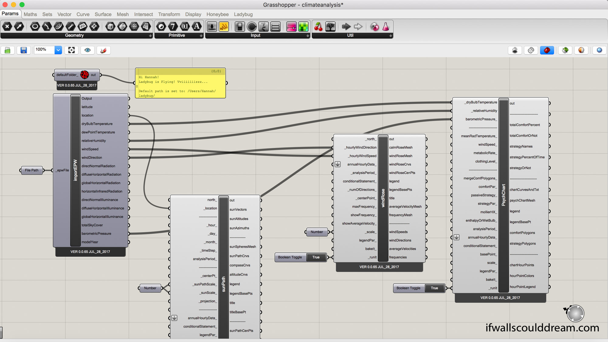
Open Grasshopper and start by double clicking in the canvas and typing “ladybug_ladybug”. If you connect a panel to it, it will give you a cute little “Ladybug is Flying! Vviiiiizzzz…” message so you know Ladybug is up and ready to go! DONT FORGET THIS because if you don’t have the “ladybug_ladybug” component, NONE of your ladybug components will work!!

Step 4: Set File Path

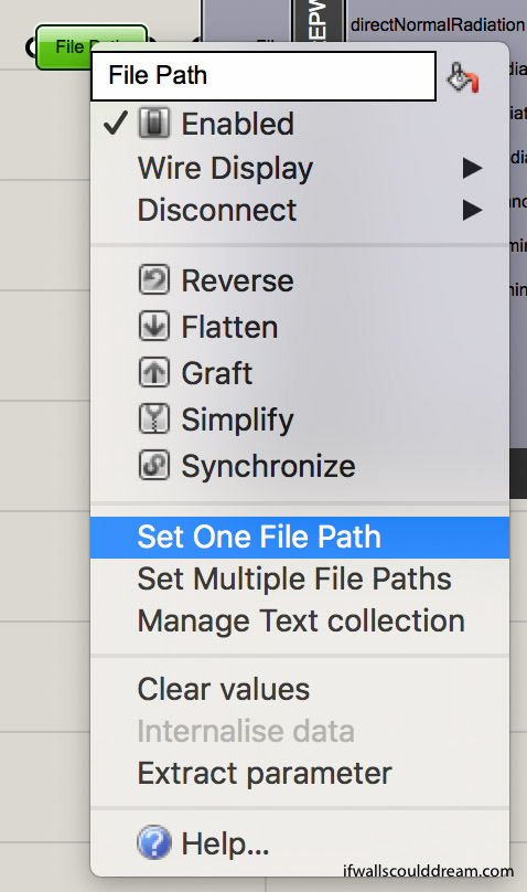
Next, add a “file path” component on the left side of your canvas. To link your .epw file, right click on the “file path” and select “set one file path” and then select the .epw file you just downloaded.


Step 5: Sun Path

Add a “ladybug_import EPW” component connected to the “file path” and then add a “ladybug_sunpath” component. All you have to connect is the “location” from “importEPW” to “sunPath”. If you want to reduce the scale of the “sunPath” you can add a “number” component and set a number less than 1.

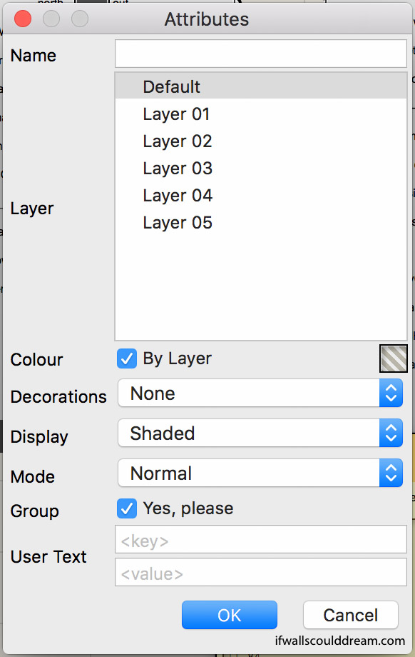
When you bake your ladybug components, I have found it useful to group them and make sure that the display is set to shaded.


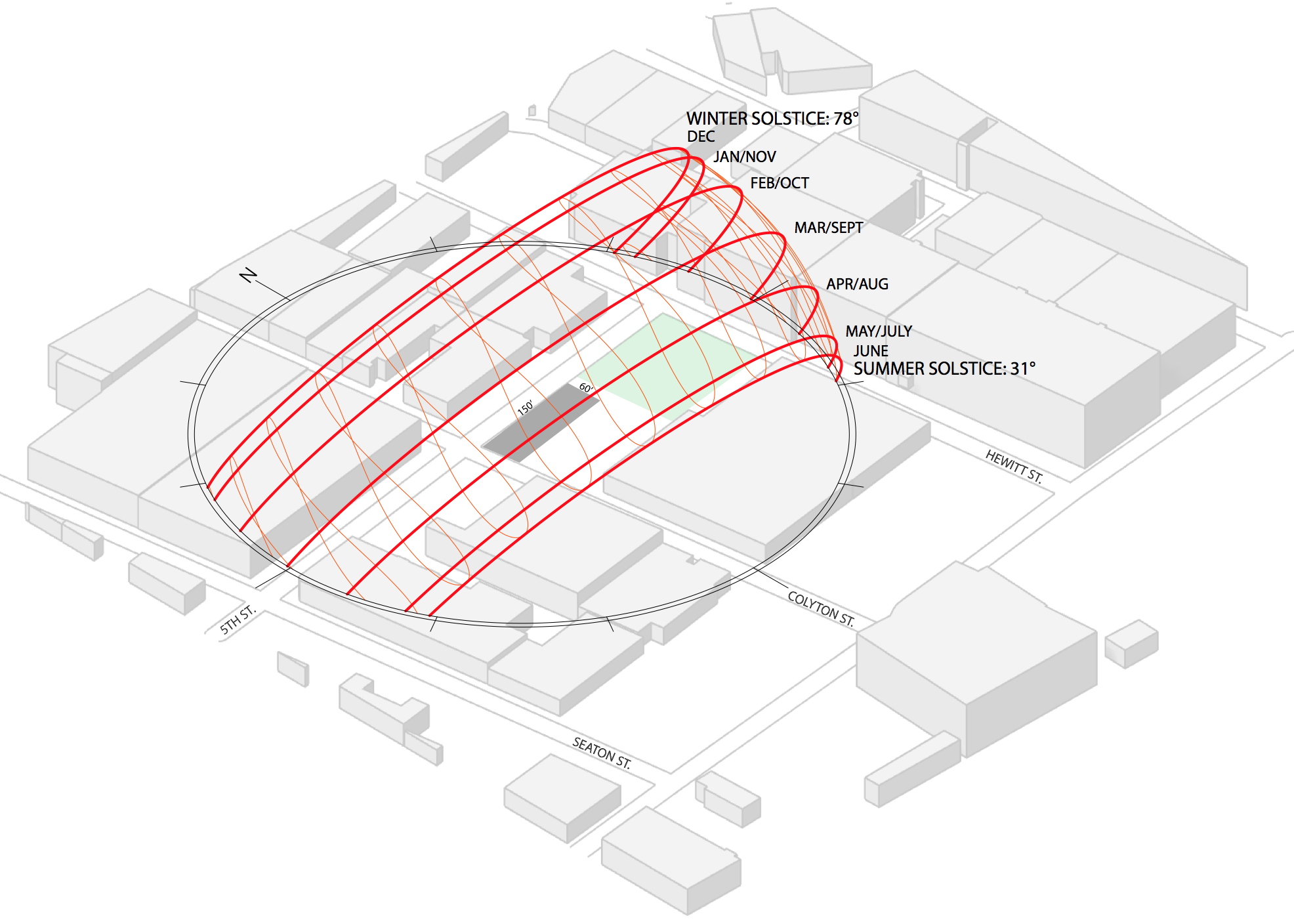
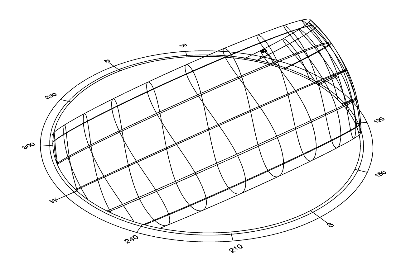
Here is what the Sun Path looks like when it’s finished:

You can add your own geometry or a render below it and put it on a site plan like this:


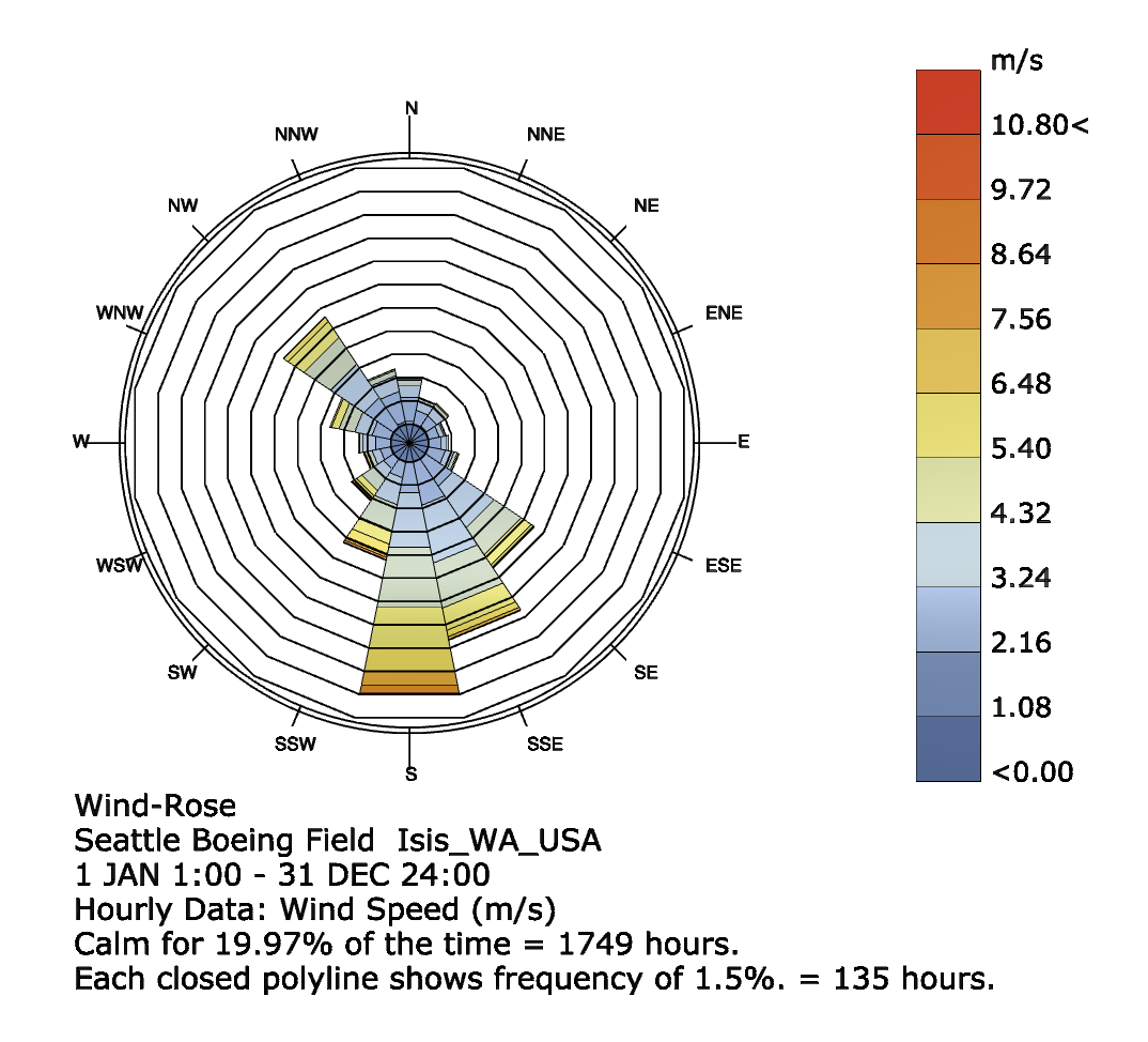
Step 6: Wind Rose

Add a “ladybug_windrose” component. Connect windSpeed and windDirection from “importEPW” to “windRose”. If you want to reduce the scale, you can add a “number” component and set a number less than 1. Add a boolean toggle to _runit and turn it to true.

This is what it will look like once you bake it:

Step 7: Psychometric Chart

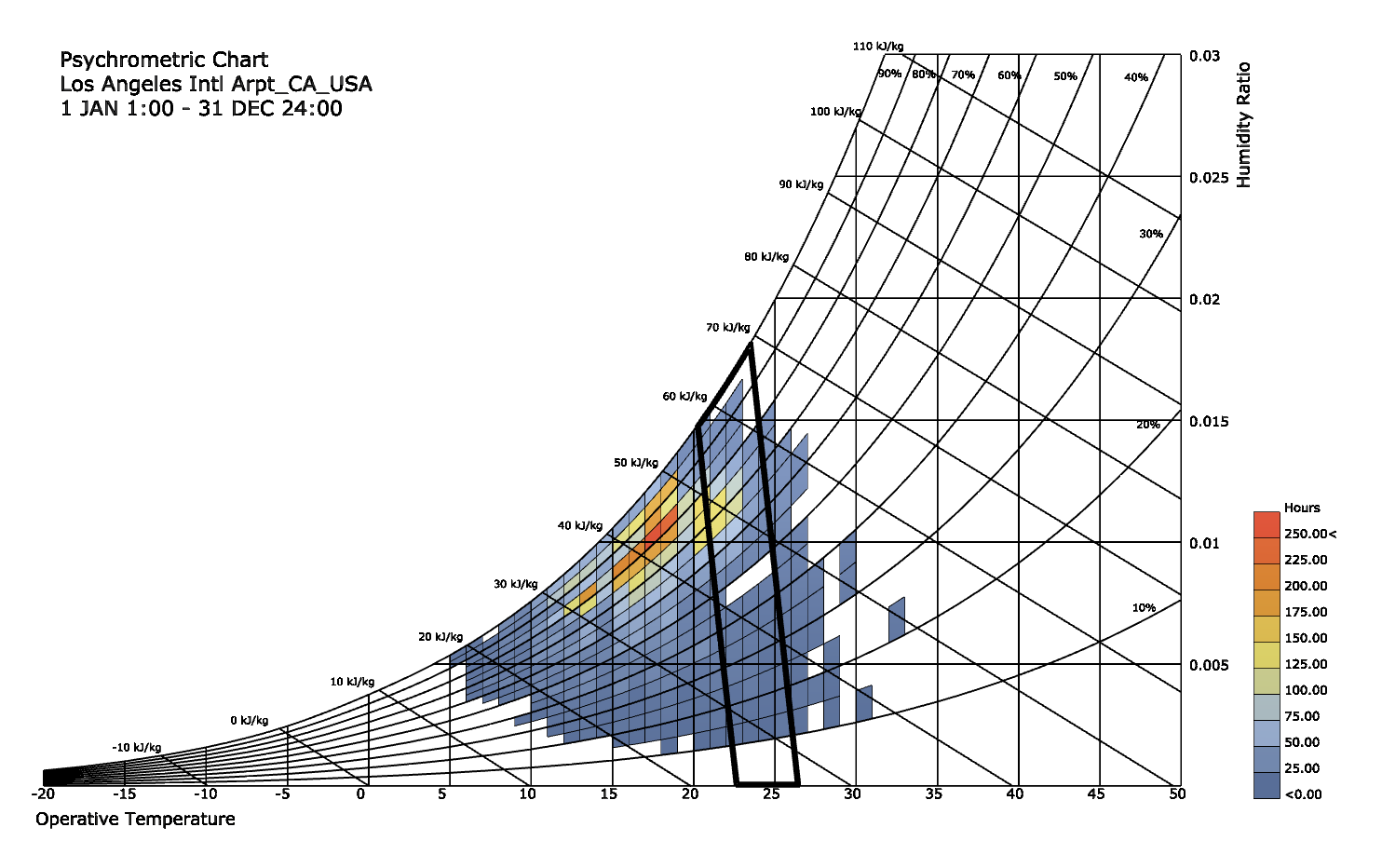
Add a “ladybug_psychChart” component. Connect dryBulbTemperature, relativeHumidity, and barometricPressure from “importEPW” to “PsychChart”. Add a boolean toggle to _runit and turn it to true.

This is what it will look like once you bake it:

If walls could dream… they’d dream of ladybugs and grasshoppers.

I MET PETER ZUMTHOR

Some teenagers fangirl over celebrities or musicians. Me? I fangirl over architects.

Peter Zumthor, the Pritzker Prize winning architect of Saint Benedict Chapel, Kunsthaus Bregenz, Bruder Klaus Field Chapel, and Therme Vals, to name a few, has been one of my favorite architects for a while.


Photos above from ArchDaily.


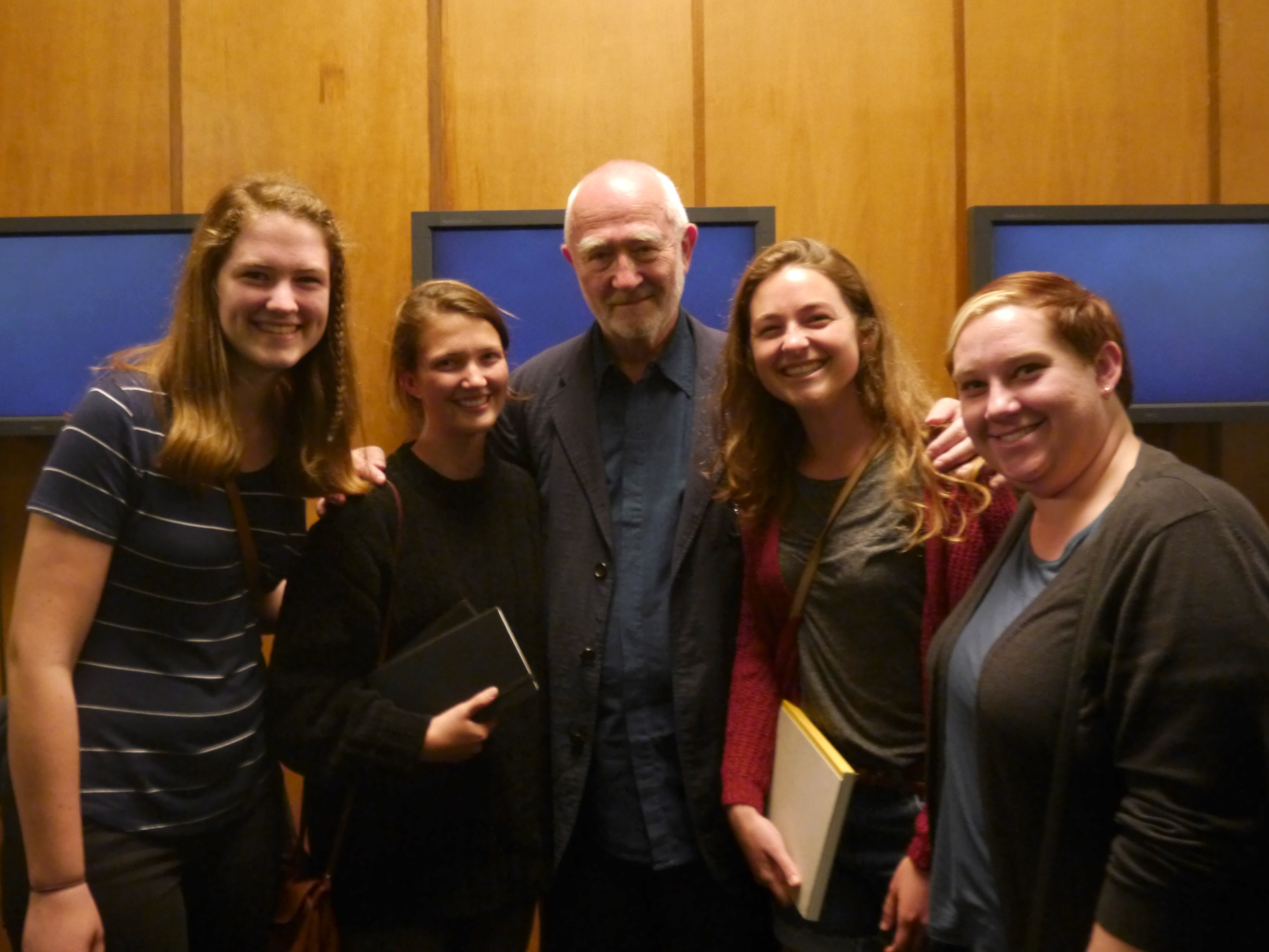
I had the incredible opportunity to attend a lecture by Peter Zumthor at LACMA about his firm’s proposed addition to the art museum. It was fascinating to hear how his vision for the lighting and materiality really drove the design process. After the lecture, my friends and I got to meet him and get a picture with him! It was a dream come true!


If walls could dream… they’d dream of meeting their favorite architects!

Oakland Library

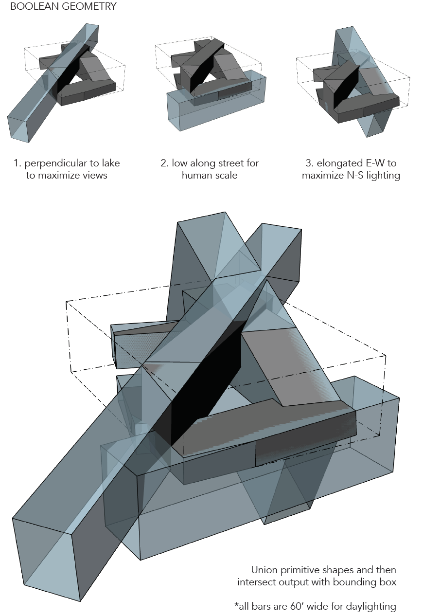
The fall quarter of my third year, I decided to take a studio that focuses on massing and designing in section. Our program was to design a library in Oakland, California. After the Less Shape, More Geometry warm-up project, we took a similar approach to the massing of our library project, using simple shapes to create more complex, geometric, site-responsive building masses.

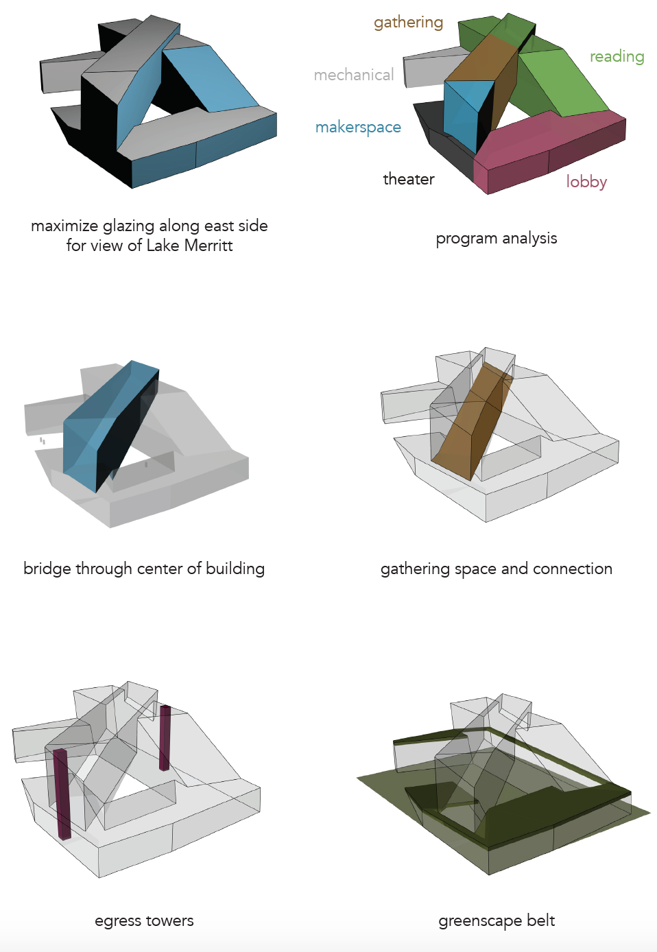
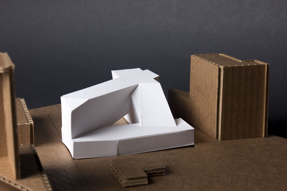
I chose this form because it responds to the views of Lake Merritt on the site as well as incorporating the “bridge” idea from my Less Shape, More Geometry project.


The form seems to settle in to the site, higher on the corners where there are taller buildings and lower on the front corner where there is a small, historic building and a park across the street with Lake Merritt just past the park.

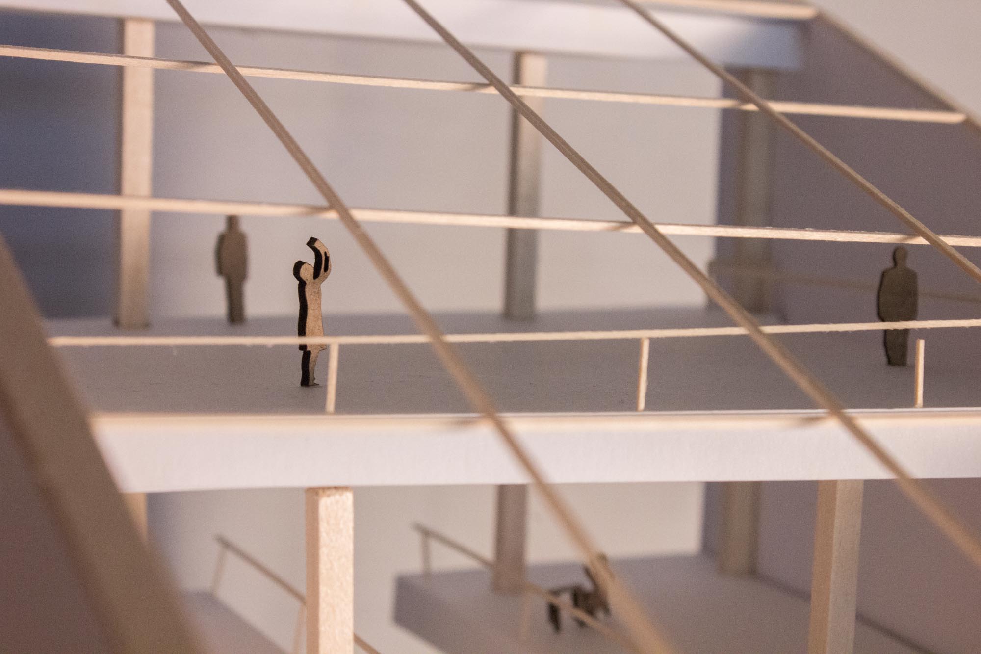
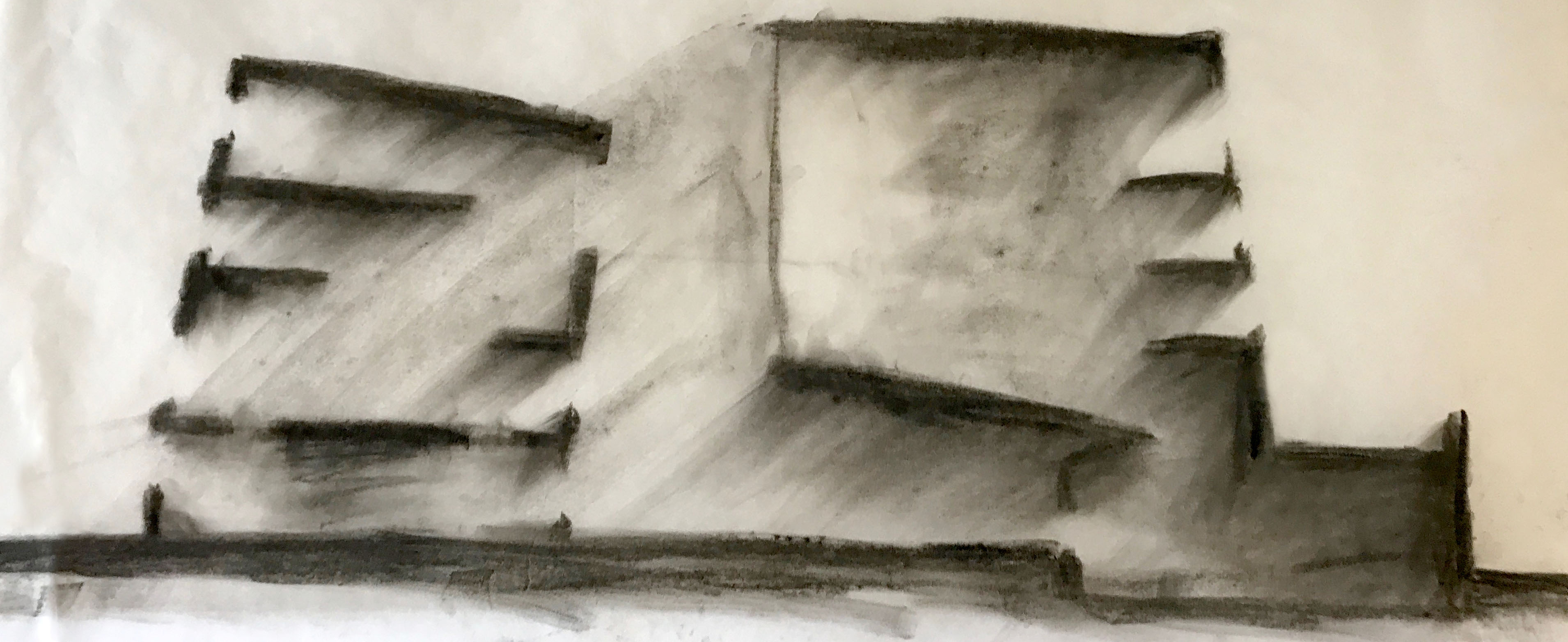
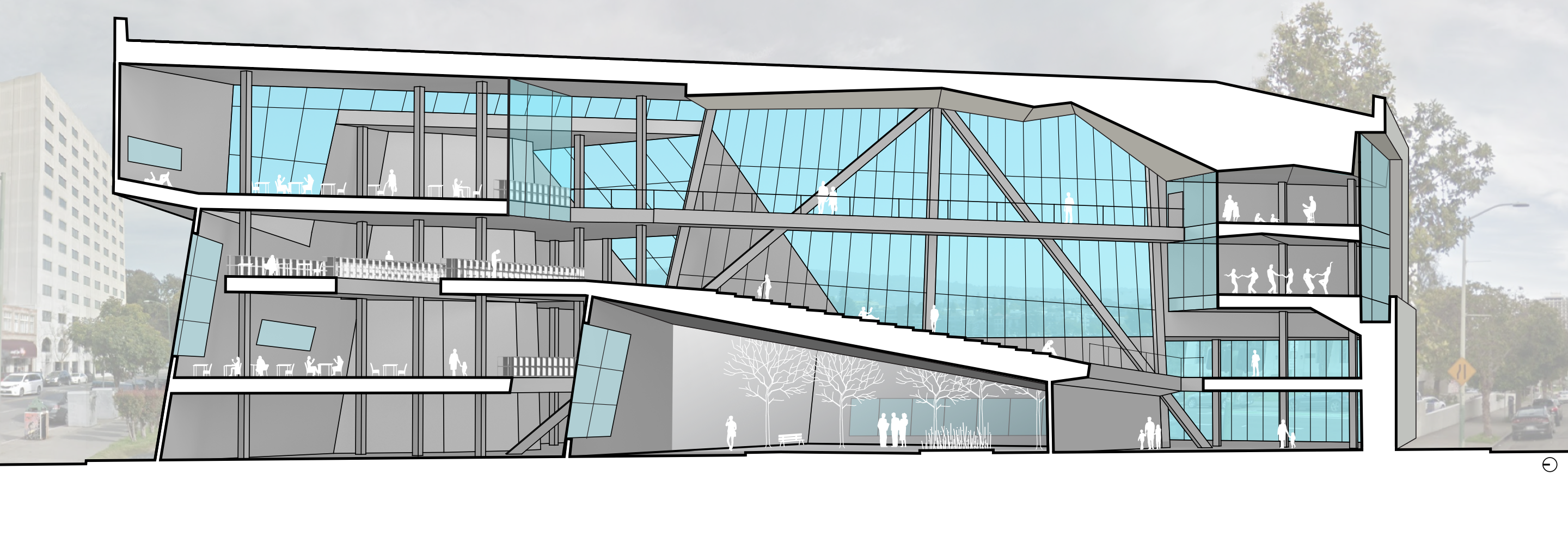
Another important quality of the library is the lighting and mood of different rooms. The section drawing below shows a variety of reading rooms with different lighting qualities.

The finished version of the section drawing, below, shows the bridge space in the center of the building, an open space for community events or casual interactions. The bridge connects the book stacks on the left side of the building with the community arts spaces on the right side of the building. All of the spaces have expansive views of Lake Merritt and plenty of glass.

If walls could dream… they’d dream of site-responsive building massing.

Grasshopper Tutorial: Basic Boolean Operations

Grasshopper is an algorithmic design tool in the 3D modeling software Rhino. (Why all the animal names? I really don’t know…) Here is a tutorial about how to get started modeling in Grasshopper.

Step One: Open Grasshopper

Type “grasshopper” into the command line in Rhino, a new window like this should pop up:
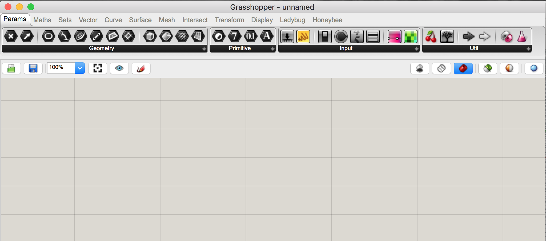
Grasshopper has lots of different tools you can use to alter the geometry you make in Rhino. Grasshopper itself doesn’t have any geometry, it’s just a way of writing unique instructions to alter your geometry in Rhino. Nothing will be saved in your Rhino file until you “bake” it, which is like exporting it from a Grasshopper preview into a Rhino geometry. Still confused? Check out the Grasshopper website, read along with my tutorials, check out this helpful tutorial, or go play with it yourself!


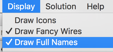
Step Two: Set Up the Display

Make sure the icons are off and the full names are on. This isn’t a major step but it’ll help you follow along the tutorial.
 

Step Three: Add Components

Double click anywhere on the canvas to get started. A search bar will pop up like this.
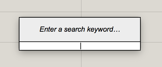
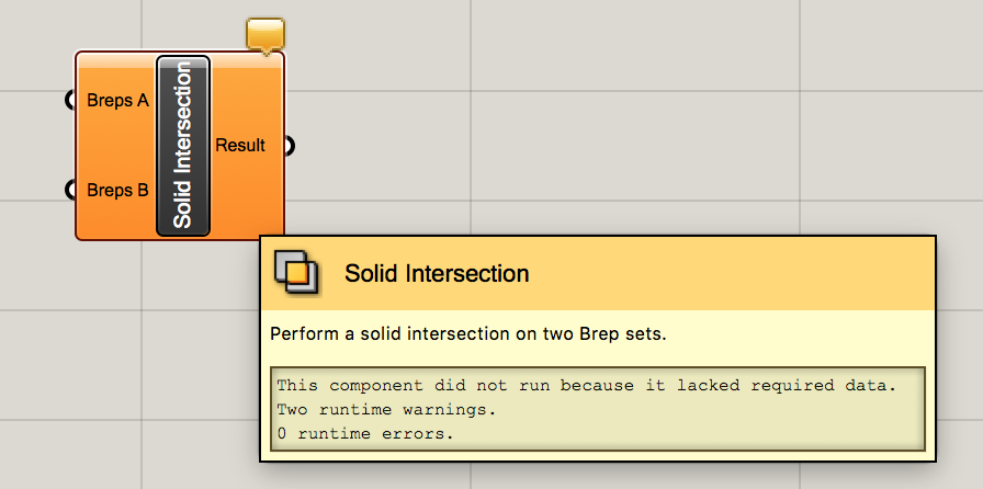
Type the name of the component you want to use into the search bar, for example I am using Solid Intersection.
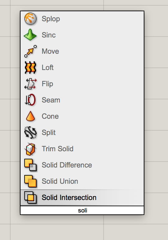
If you want more information about a component, simply hover your cursor over it. The little orange flag at the top right corner is a warning that nothing has been plugged into it yet so it is not working. This makes problem-solving a larger string of components super easy!
 

So, what’s a “brep”?

You might be wondering, what in the world is a “brep”?! Well, it’s a Boundary REPresentation, a collection of multiple trimmed surfaces. It’s what Grasshopper calls most of your basic Rhino geometry and it’s perfect for playing with boolean operations.

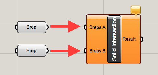
Add two breps to the canvas and “plug them in” to the breps A and B ports on the left side of the solid intersection component by clicking and dragging from the white half-circle on the right side of the brep to the white half circle on the left side of the intersection component.
 

Step Four: Link Geometry from Rhino

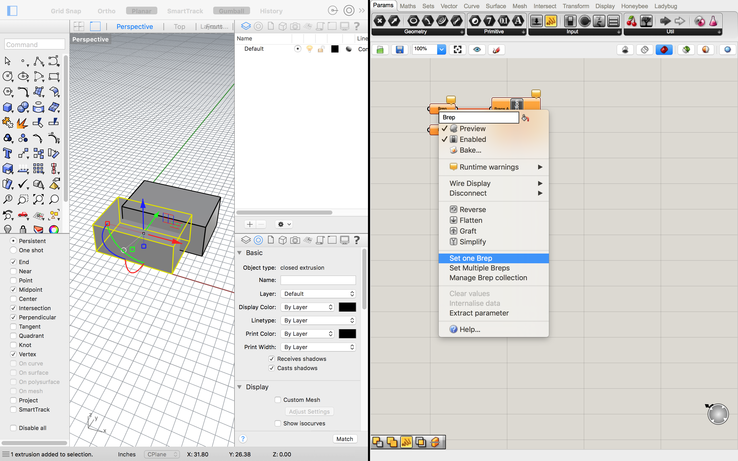
Link your geometry from Rhino to the components in Grasshopper. I am using two overlapping boxes in Rhino but this should work with any shape (as long as they are overlapping, for the intersection command). Select one of your boxes and then right click on the first brep and select “set one brep”. This should automatically link the selected geometry to that brep component. Then, select the other box in Rhino and right click on the other brep in Grasshopper and set that brep.
 

Step Five: Play!

Now is the fun part! You can play around with your shapes in Rhino until you’ve found a geometry you want to save. This makes it really easy to work iteratively and test out a lot of ideas really quickly. While we could do a boolean intersection like this in Rhino without using Grasshopper, we wouldn’t have the flexibility of making so many iterations so quickly.

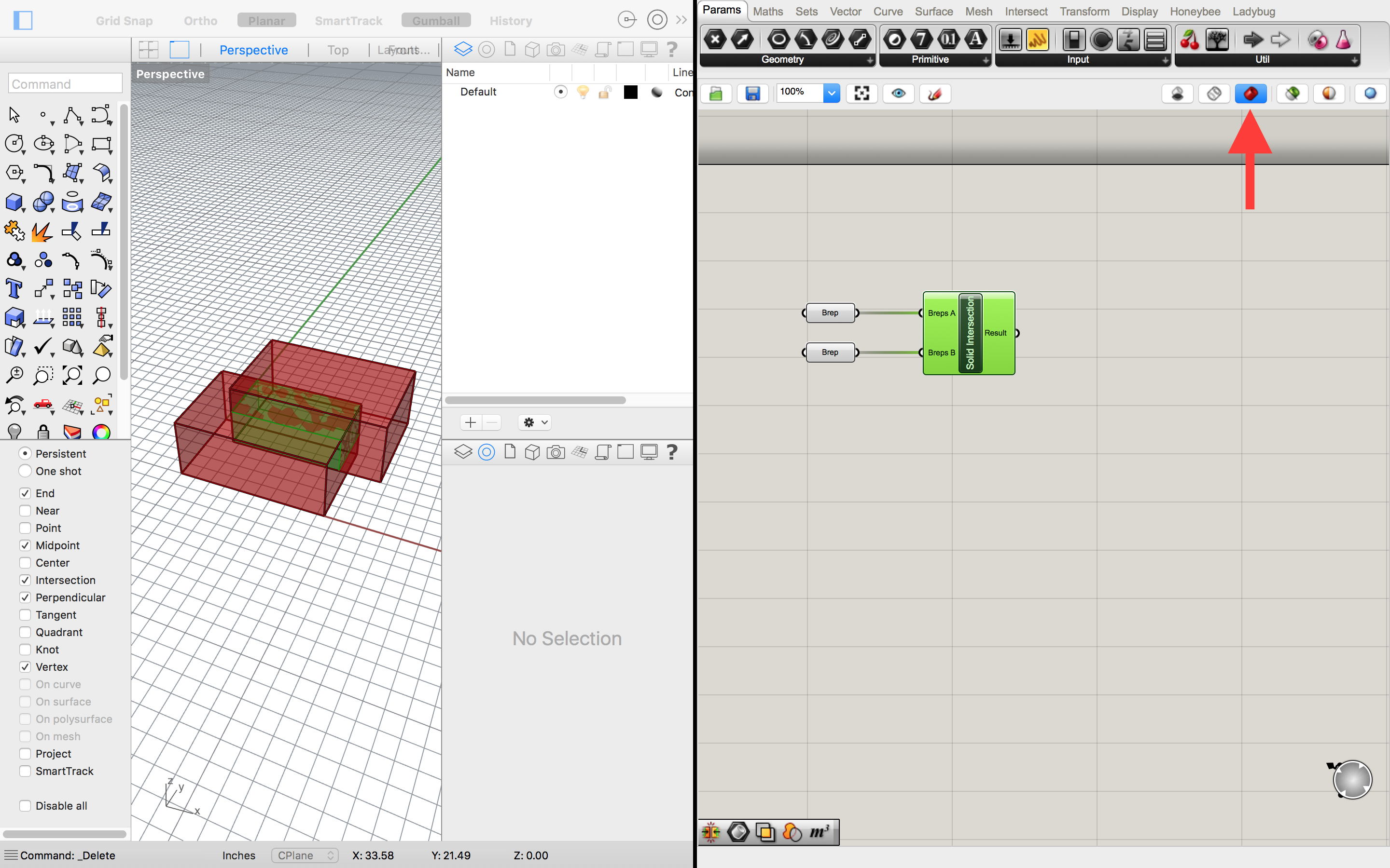
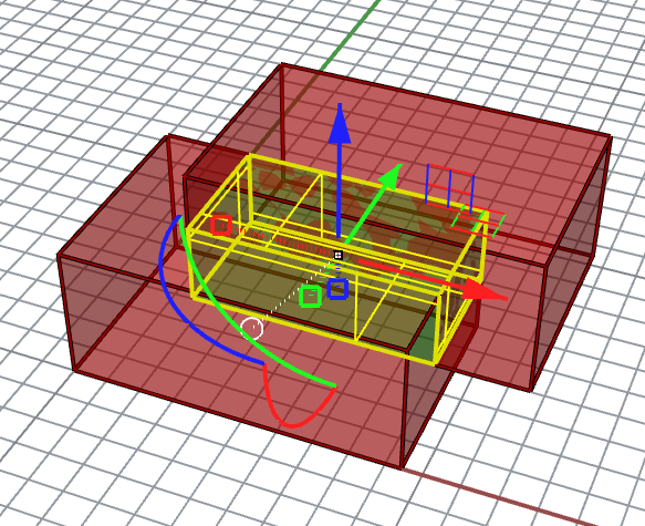
For this step, you want to make sure your Rhino view is set to WIREFRAME and you clicked the red icon on the upper left of Grasshopper, and that the final component in your train is selected. This will make your input geometry red and your Grasshopper result green! Now you can move the input shapes around in Rhino to see how that changes the output.
 

Step Six: Bake

Once you have found a result you like, the final step is to “bake” the geometry, which is like exporting it back into Rhino. Simply right click on the Solid Intersection component and select “bake.”
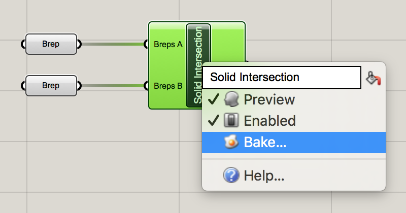
 

Now your final geometry is in Rhino and it will be saved in your Rhino file after you close Grasshopper.
 

Additional Boolean Operations

If you want to do even more with basic boolean operations, try out this simple Solid Difference operation:
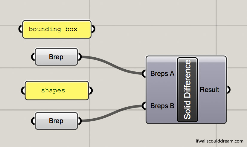
 

Want more of a challenge? Check out this Solid Union operation that calculates the percent by volume of the result as compared to the original bounding box:

This operation unions two shapes, intersects them with a bounding box, and then calculates the volume percentage (as a decimal, so this example would be 19%.


If walls could dream… they’d dream of playing with Grasshopper all day!

Seona Reid Building by Steven Holl

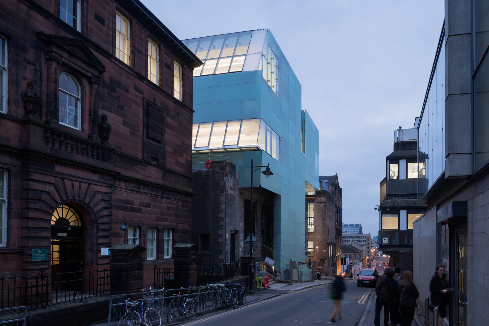
I did a research project on Steven Holl’s Glasgow School of Art Seona Reid building for school. I love how Holl uses light and watercolor to inspire his design and how it responds to the traditional buildings around it. I am excited to go visit the building when I am studying abroad. 

Image from ArchDaily

The most important thing about this building is its relationship with the Mackintosh building, a historic building also owned by the Glasgow School of Art, across the street. Holl was inspired by the Mackintosh, especially the way it brought light into the library. Sadly, the Mackintosh building has been severely damaged by two recent fires.


Watercolor by Steven Holl

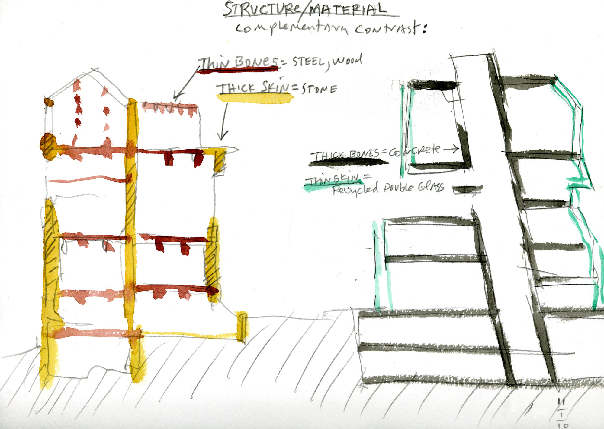
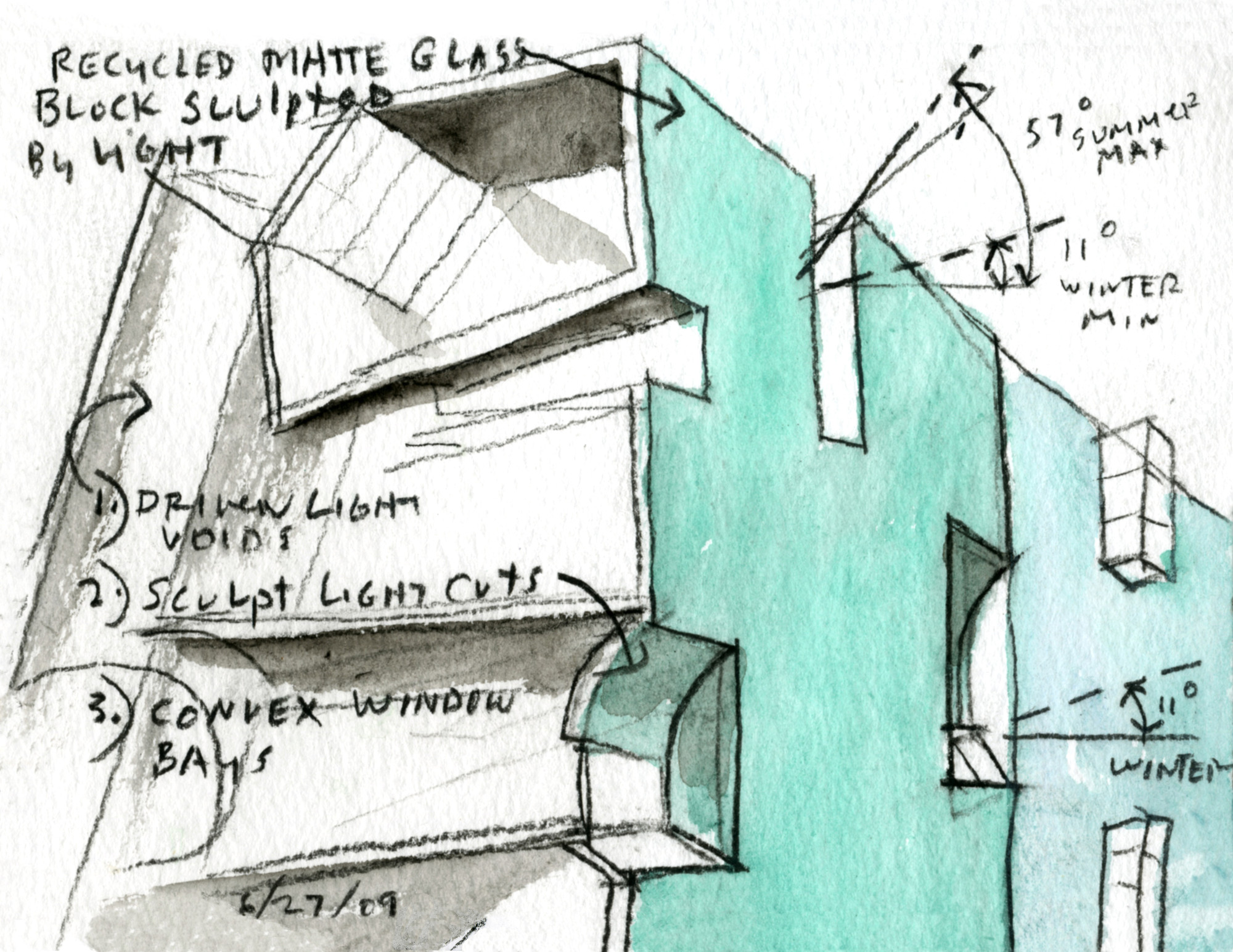
The Mackintosh building has a thick, stone skin which doesn’t allow a lot of light in. Holl wanted to contrast that in his design, using a thick concrete core to hold up a thinner skin.


Watercolor by Steven Holl

Watercolor by Steven Holl

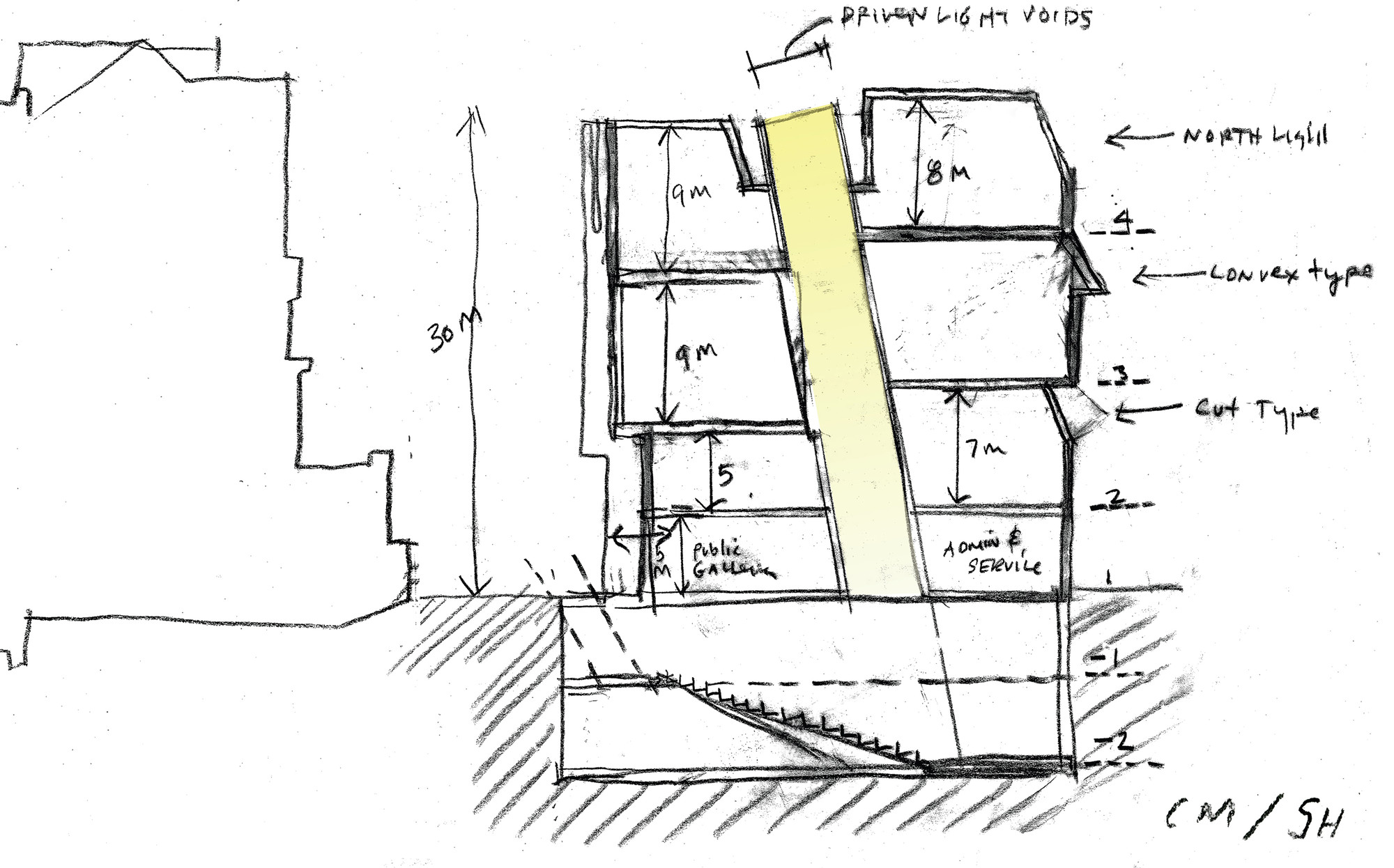
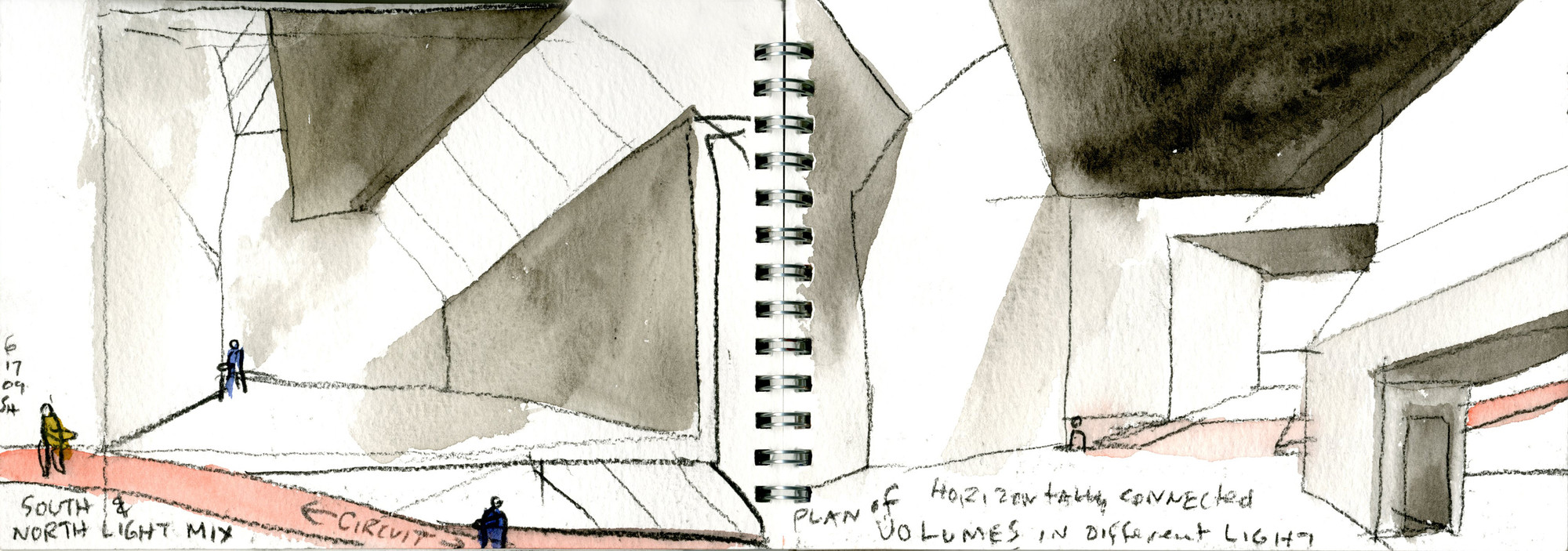
In a later sketch, Holl is thinking about the different size spaces in his building as well as different light conditions.


Image from ArchDaily

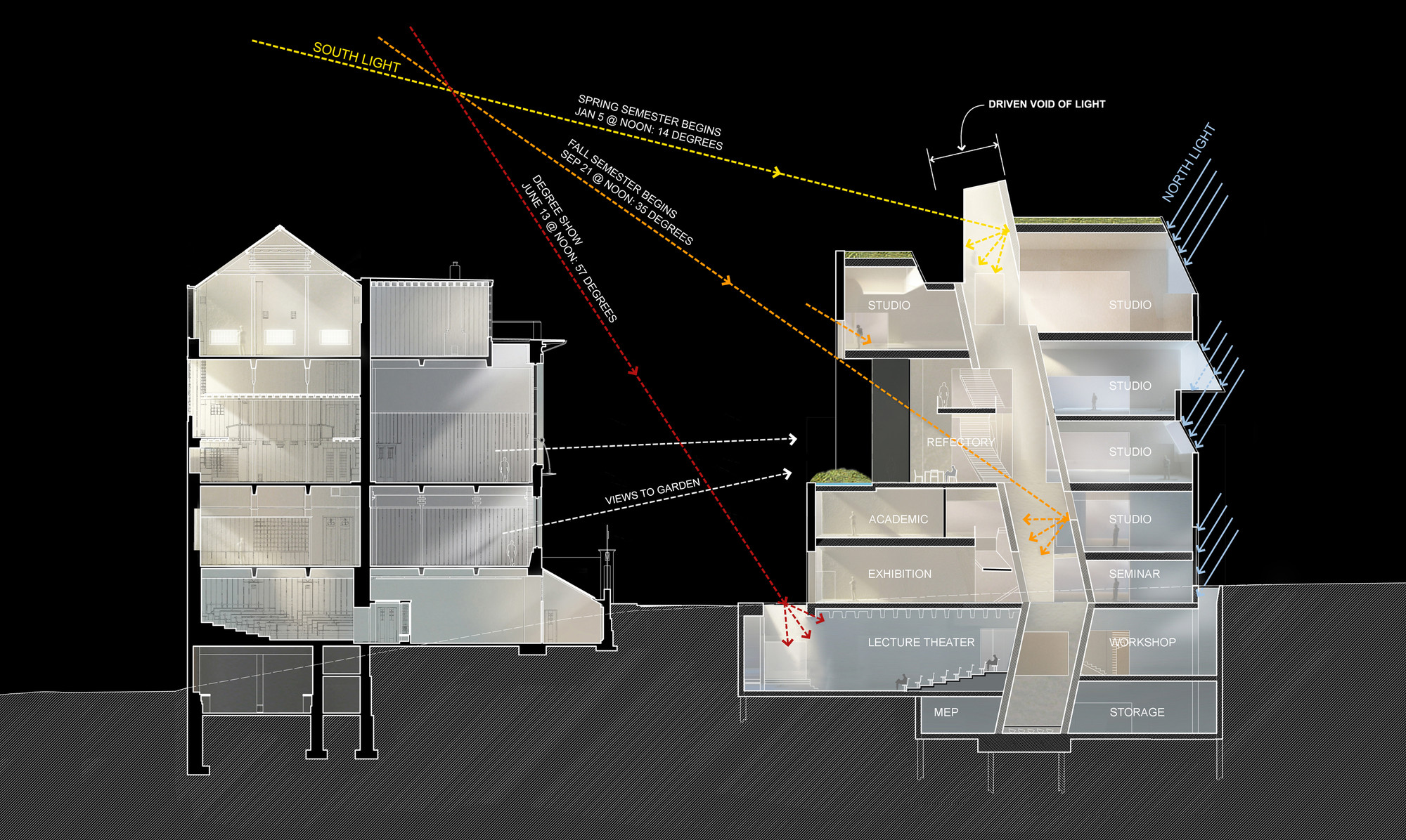
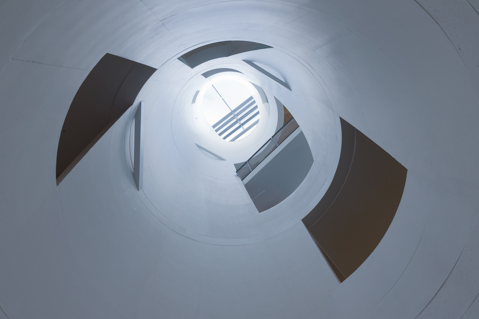
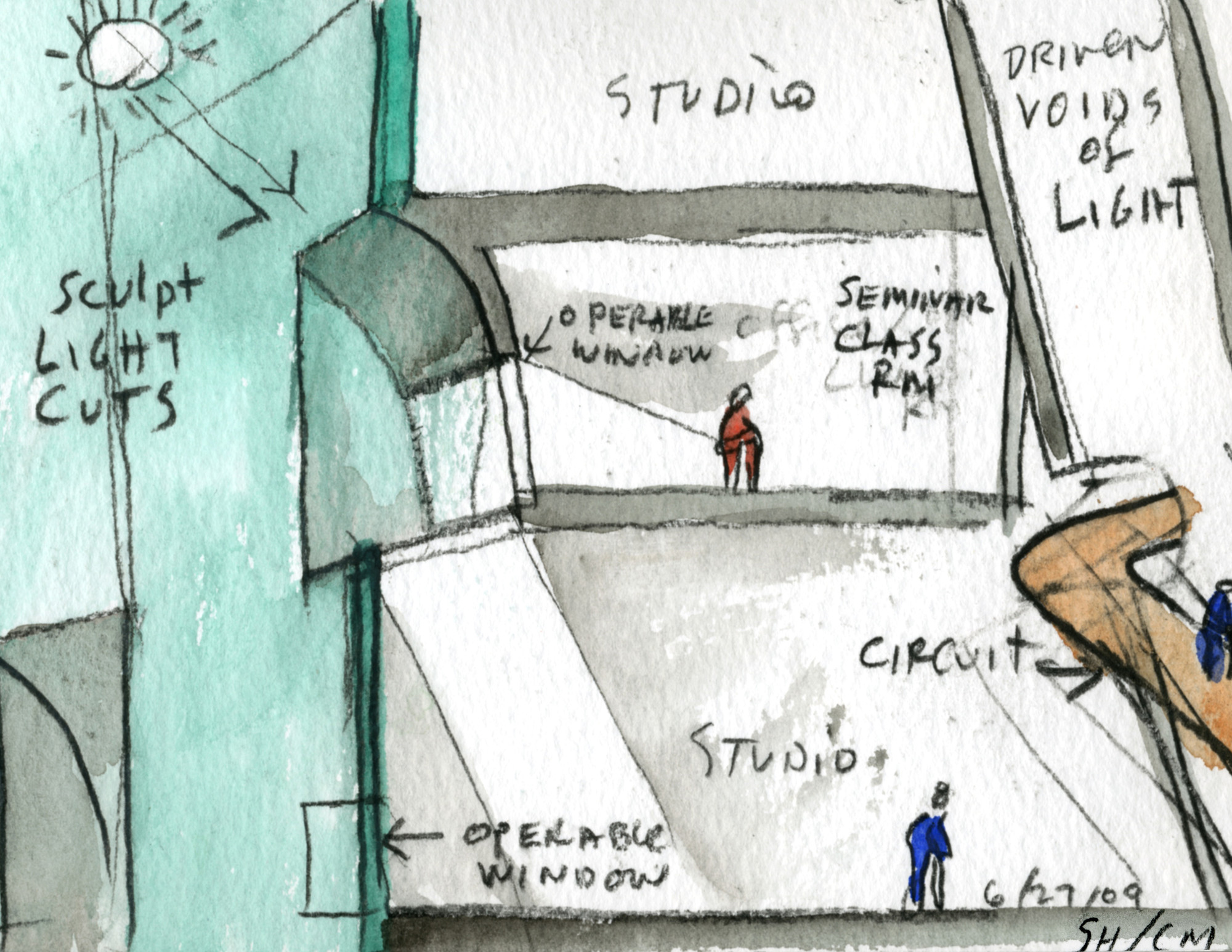
You can see in both sections above that Holl’s building has a large light tube or “driven void” as Holl likes to call it, which brings light all the way down to the basement. There are three along the length of the building. Various programs intersect the voids including studio spaces and circulation. This helps bring life to the voids and allows students to see what other students are up to.


Image from Dezeen

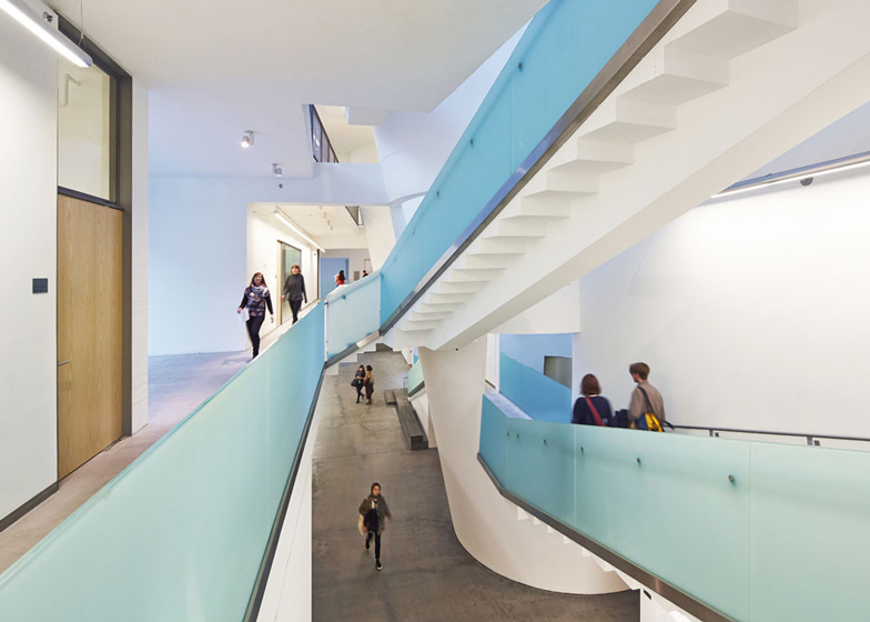
The center of the building is very open, allowing students to see friends passing by.


Image from Dezeen

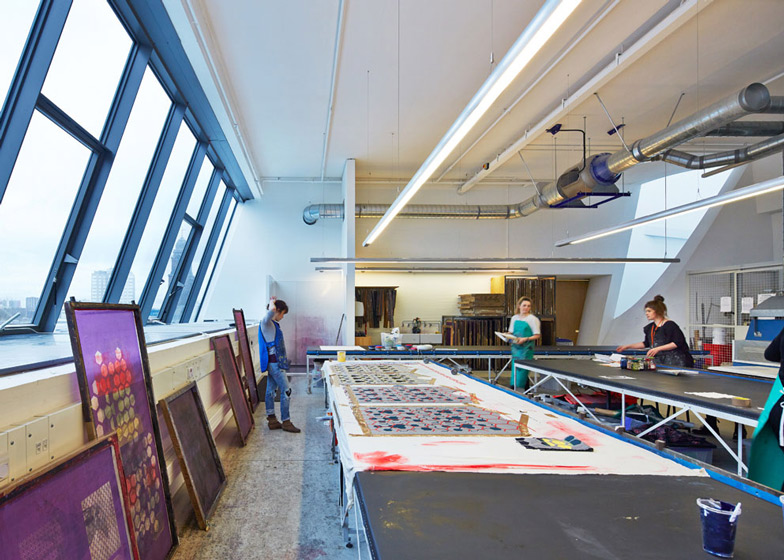
The studios all have wonderful natural light and generous ceiling heights for the art students.


Watercolor by Steven Holl

Like all of his project, Holl created beautiful watercolor sketches about his concepts. Watercolor is the perfect medium for Holl to express his ideas about the quality of light in his spaces.


Watercolor by Steven Holl

Watercolor by Steven Holl

Watercolor by Steven Holl

Watercolor by Steven Holl

After being sufficiently inspired by Steven Holl’s watercolors, my partner and I set out to make some diagrams of what we had learned about this building.


Glasgow School of Art Steven Holl diagram

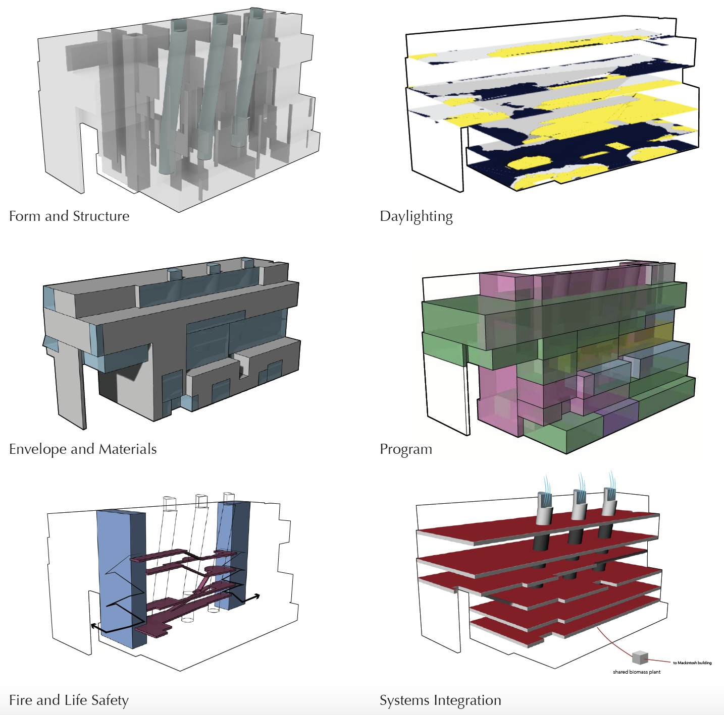
Diagrams of the Glasgow School of Art Seona Reid Building by Steven Holl

After researching the building, my partner and I created these diagrams to understand the systems in the building and their relationships to one another.


Glasgow School of Art Steven Holl diagram

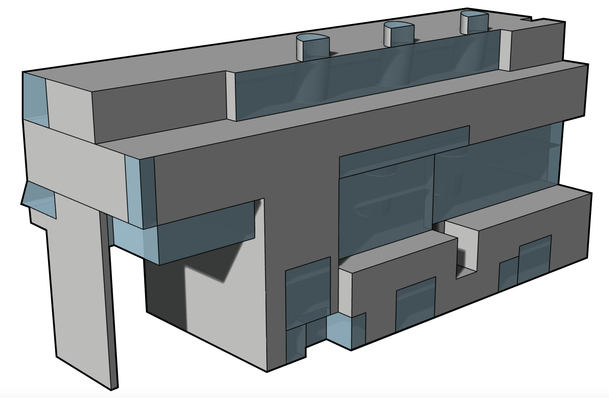
Mass/Glass diagram

During the day, the exterior of the building looks a uniform blue, almost the color of the overcast sky in Glasgow. However, at night the windows inside light up, exposing the mass/glass relationship. The fenestration is extremely thoughtful, some windows are for views of the Mackintosh, others for distinct lighting qualities.


Glasgow School of Art Steven Holl diagram

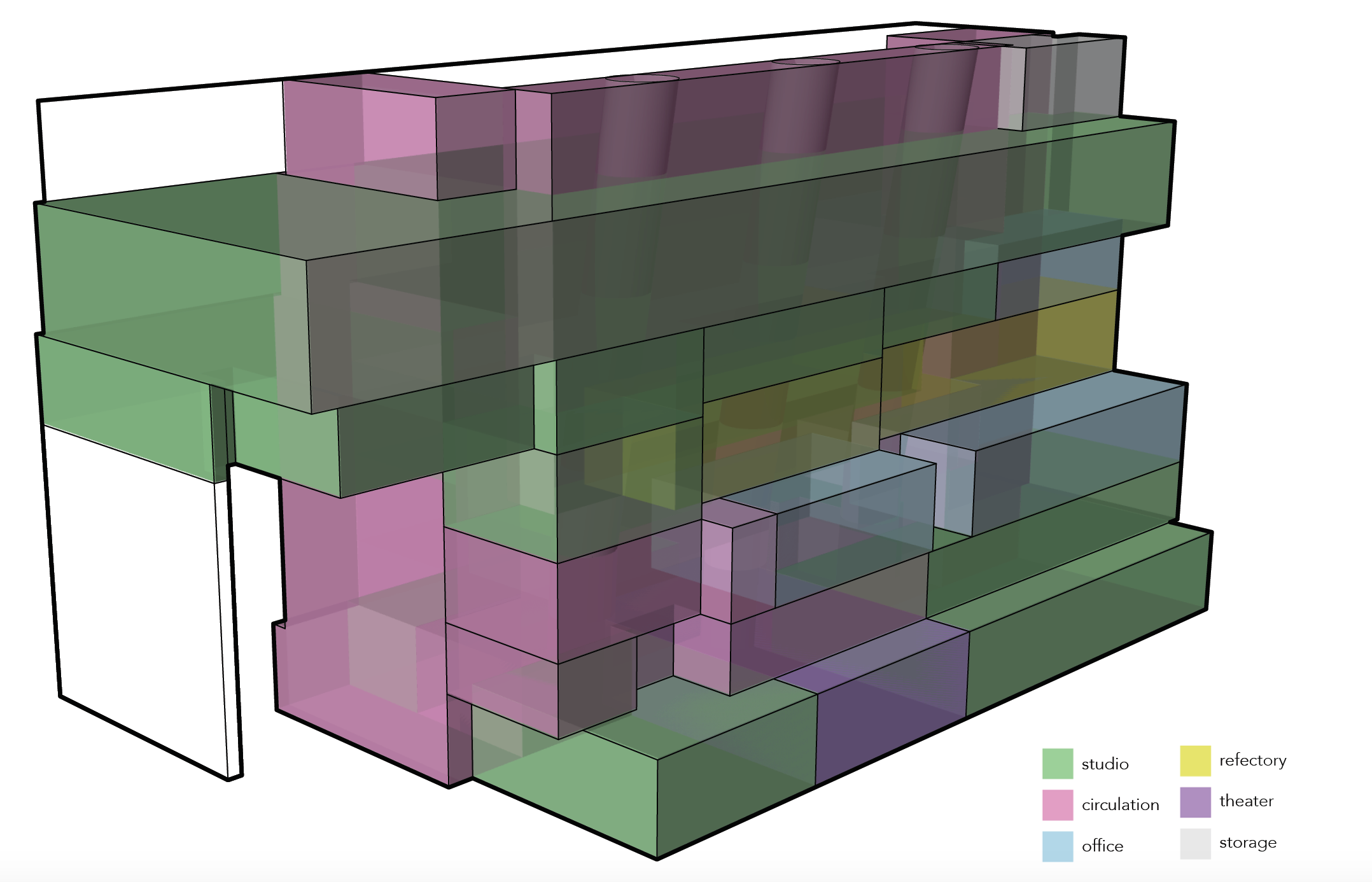
Program Diagram

The building is used primarily for studio space for the Glasgow School of Art. It also has a theater in the basement and some office spaces. The refectory on the third floor looks out at the Mackintosh building.


For more information about the Seona Reid building, check out the ArchDaily and Dezeen pages about it as well as this interview with Steven Holl Architects.


If walls could dream… they’d dream of Steven Holl’s beautiful watercolors.

Less Shape, More Geometry

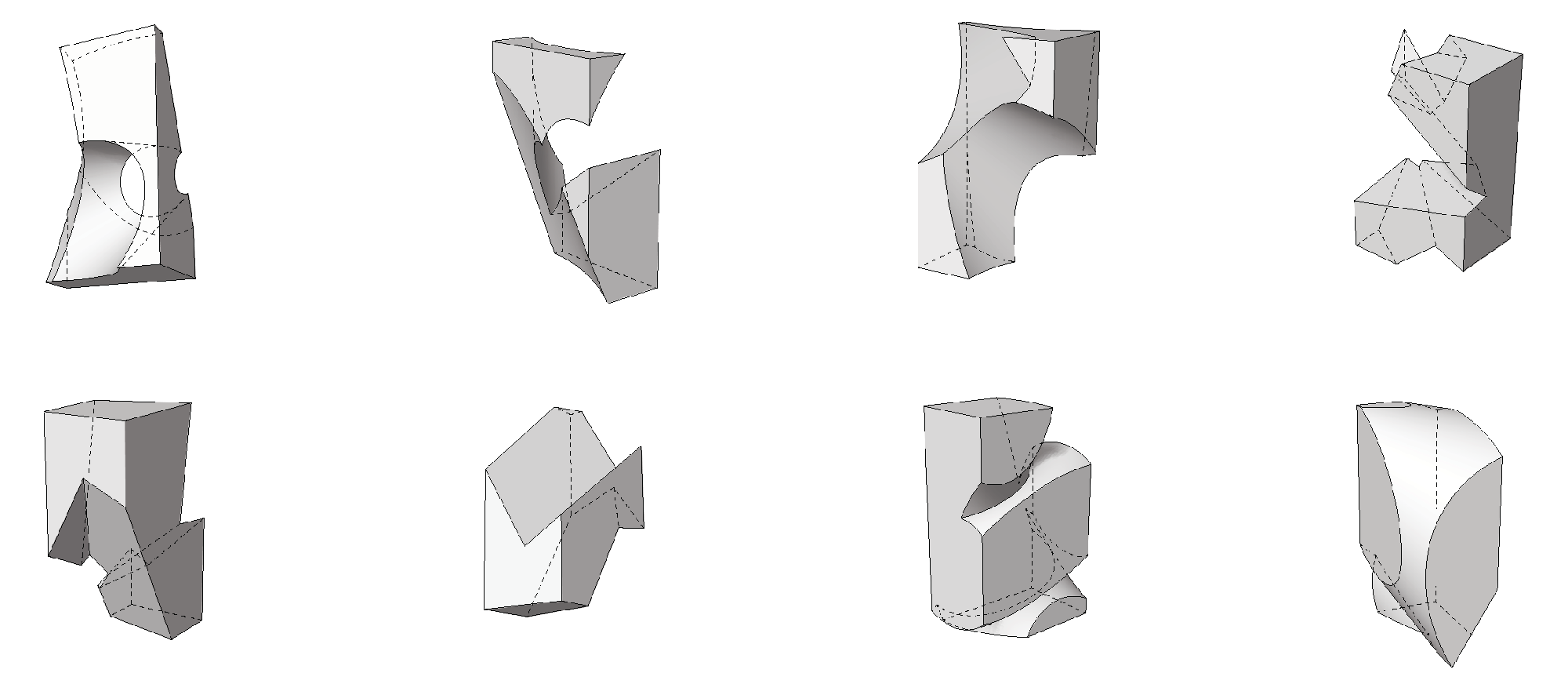
As a warm-up project my fall quarter of third year, and to introduce us to Grasshopper, an algorithmic modeling software in Rhino, my professor had us make complex geometries by adding and subtracting primitive shapes such as boxes, cones, pyramids, cylinders, and spheres. The motto for this studio was, “less shape, more geometry”!


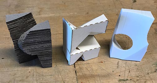
Throughout the process, I made study models by laser cutting and stacking chipboard, folding bristol, and 3d printing. It was helpful to be able to get out of the computer and see the shapes in real life.

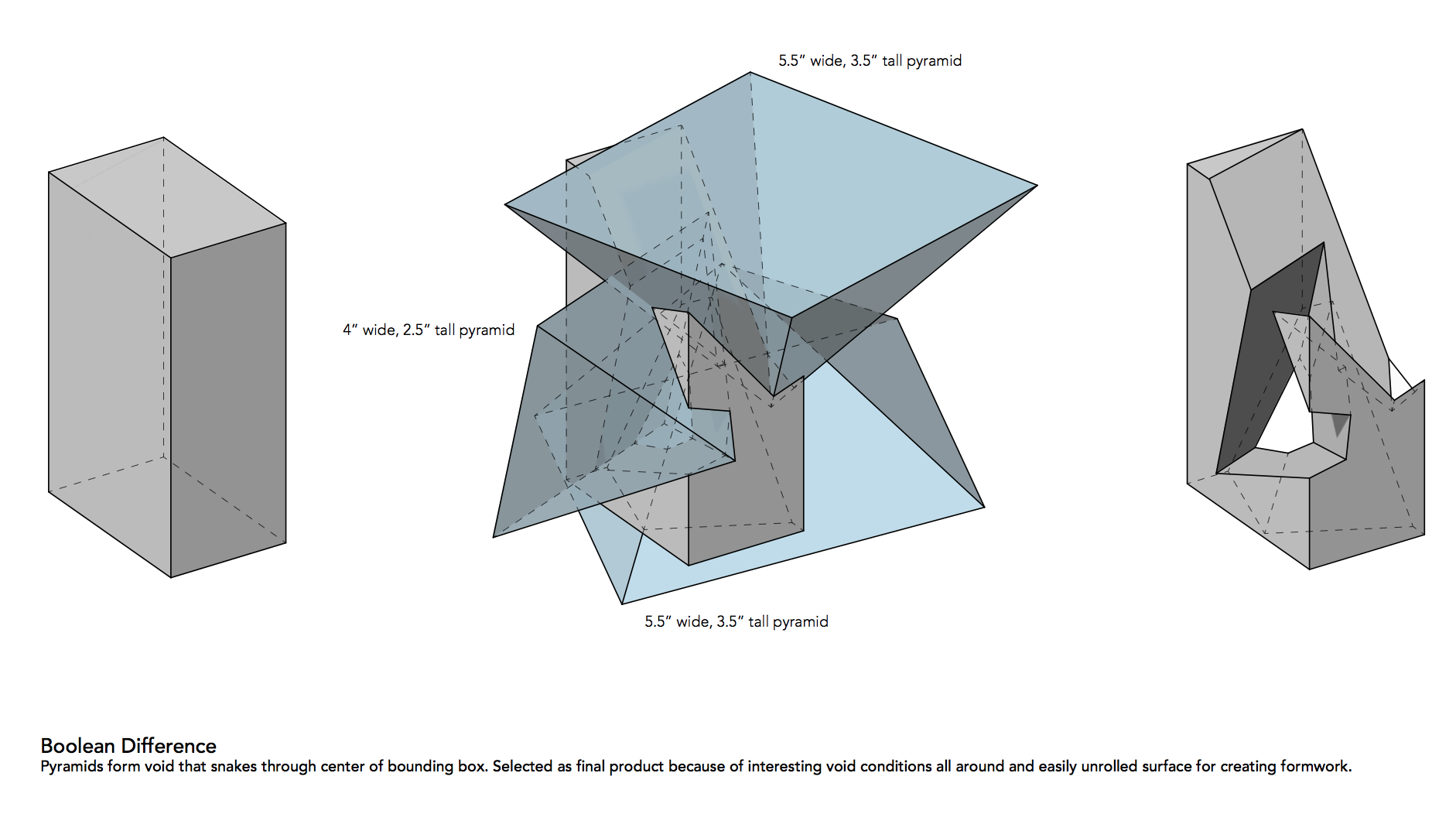
After a lot of iteration, I settled on using pyramids because they have straight sides so they are easier to build but more dynamic than boxes.


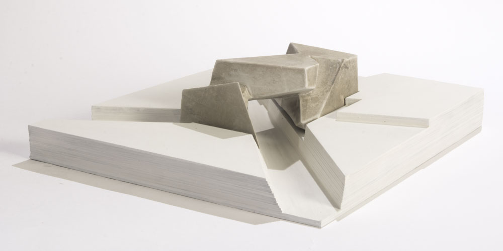
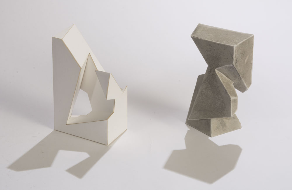
I constructed the form out of laser cut bristol. I also made the void of that form out of rockite.

The final step in the project was to create a site for one of the previous models, so I used the rockite void as my model. I took the lines from the model and cut them out of stacked chipboard. The void became a bridge.

I learned so much in this short project and I am really happy with the results.


If walls could dream… they’d dream of less shape and more geometry!
1 4 5 6 7 8 32