Study Models
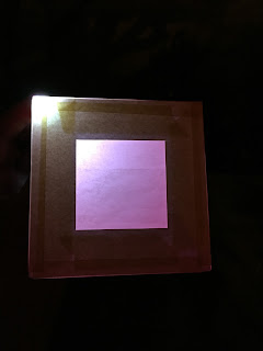
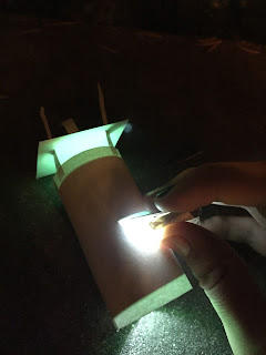
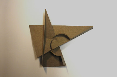
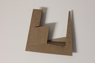
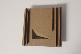
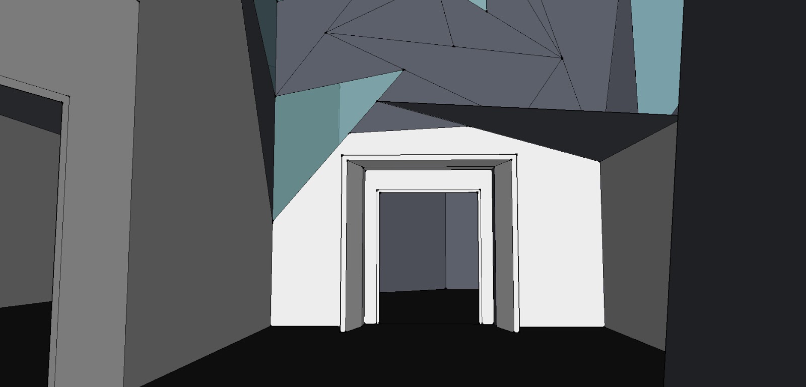
A collection of study models for my final Interpolated Void project: a full model with an LED light inside it.
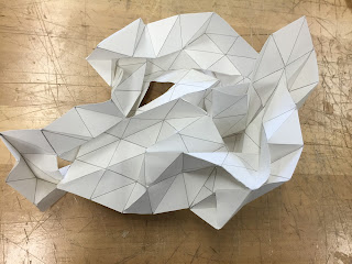
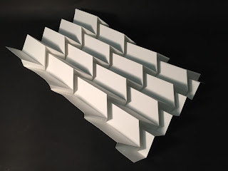
Playing with textured paper…
 |
Interpolated Void
Our second big project of the year is called interpolated void. The concept of the project is to take two photos and extend the geometry within the photos to create a new composition in, between, and around the images.
 |
| A work in progress (my first draft) |
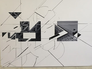 |
| My final piece |
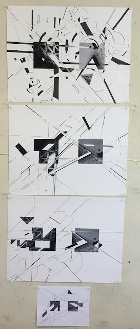 |
| Two drafts + one final + one digital |
This project was a really interesting experimentation with line weights and the way that one line reacts to another. It’s easy to think of different materials in a building reacting to each other (both physically over time and sculpturally designed) but it was a good challenge to try to put reason into the lines in a photograph. Stay tuned for the next iteration of this project when we make it 3D!
Gamespace Part 4
For the final part of the gamespace project, we created a slightly larger model that was a combination of three of our previous models. I chose to combine the triangles of the 2048 and Alto’s Adventure models with the circular path of movement from the Mario Kart model.
The triangles and circle created a really interesting series of spaces within the center of the model. It almost feels like the atrium of a science museum or concert hall or something.
To get to this final model, I made a series of quicker study models, all with the theme of triangles:
Gamespace Part 3
After finishing the models for each game, we picked our favorite 3 to redo with the added parameter that you have to build half an inch up from the starting plane and half an inch down.
The first model I redid was for 2048. I wanted to really focus on the next two moves in the game: the pieces sliding across the top and then up in the second to the left column, so I made those two pathways extend out. The other parts of the grid where the tiles are locked I pushed in at varying depths to represent that some of the tiles would be harder to move or combine than others. This turned out to be my favorite model of the set.
Next, I redid the Minecraft model. I wanted to focus on the movement of the character around this corner so I made a triangular path on the ground that wraps behind the diamond shape to a hole in the side of the model. This ended up as my least favorite model because I feel like it’s an awkward shape overall and I wasn’t sure how to combat that.
Finally, I redid the Alto’s Adventure model. I changed the perspective of the model, looking at the snowboarder’s perspective, not the player’s. The snowboarder is going down a hill and over a jump with trees to either side. I simplified that down to vertical lines extending up and a triangular shape extending inward.
Gamespace Part 2
For the second part of the Gamespace project, we made models based on our diagrams.
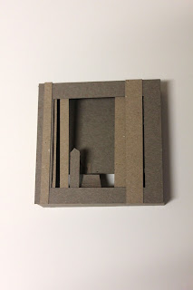
My first model is for the game Alto’s Adventure. It’s a 2D snowboarding game and in my diagrams I looked at the game from the front and top so in my model I chose to look at it from the snowboarder’s perspective of going down the hill towards the jump. I intentionally left the bottom half of the back side of the model open to emphasize the depth of the cliff. Notice the small strip of chipboard linking the tower in the foreground to the tower in the background. In the game, the snowboarder grinds on this wire to get across the cavern.
My second model is for Mari Kart. The screenshot I chose is at a curve in the road and I chose to emphasize that in my model by using the shadows of the horizontal slats to create the curved shape of the boundaries. In the center, I added a circle that can be slid along the groove like the players in the game glide around the turn.
Then, I made a model for the game 2048. This game was a challenge since it doesn’t have 3D spaces in it, just the movement of blocks from side to side so I made just that: a set of blocks where the top two can slide from side to side. I decided to add interactive elements to these two models since we are modeling games and games are, of course, meant to be played with.
My next model is for Minecraft. I used intersecting strips of chipboard woven together to create a geometric representation of the space. I wish I could’ve created some more contrast and depth in this model, but all in all I’m happy with my work.
The final model I made was for the Sims. I chose a photo of the neighborhood overall which made it challenging to model the entire space. The concept I came up with was to make each house a window into the site with its own unique shadows (accomplished by slits along the edges of the box) because in the Sims, each house is fairly separate but can have vastly different things going on inside it.
Gamespace Part 1
It’s my first project as an architecture student at Cal Poly! It still feels like a dream to be here.
The first part of the project was to make diagrams of spaces in video games (two 2D games and three 3D). We made one by hand and then, the next day, we made two in Illustrator.
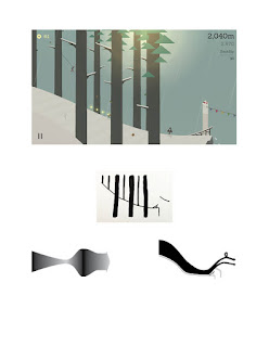
Alto’s Adventure – diagrams based on trees, overhead view, and character motion
Mario Kart – diagrams based on line, zones in the curve, and speeds around the course
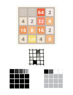
2048 – diagrams based on tile number, motion of tiles, and before/after occupation of space
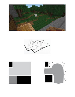
Minecraft – diagrams based on lines, materials in space, and character movement
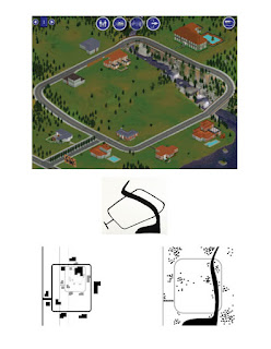 |
The Sims – diagrams based on road/river, zoom, and landscape
Drawing Class
Some of my favorite projects from my drawing class last semester:
| Breakfast still life |
| White charcoal on black paper |
| Color pastel on black paper |
| Inspiration: Jim Dine |
| Landscape |
| Fabric study |
Frog House with Blue-Gray Kitchen
A few weeks ago I sketched the frog house, named for its modular and frog-shaped floorplan with a great room in the center and two bedroom “legs” off an L-shaped hall.
Then, I modeled the house in Home Designer. (And had lots of fun with the paint color!)
As you can see, the floorplan stayed largely the same with a few minor modifications in the bathrooms.
I chose to put the bathroom in the guest bedroom “leg” off the hall instead of off the bedroom. I took the design one “leap” further and separated the sink area from the rest of the bathroom.
I chose a bold color in the kitchen as well with blue-gray cabinets and white marble countertops/backsplash and a white island with butcherblock.
Spoiler alert: I’m also modeling this house in SketchUp to have more freedom with the sculptural design. Check back in soon to see the finished model!
If walls could dream… they’d dream of animal-inspired houses coming to life!
Sketches
On the bus ride to and from a leadership camp I attended this past week, I made some sketches. The views from the bus were outstanding and an inspiration to all of the sketches in general.
In addition to being a beautiful and spacious 3 bed 2.5 bath house, the above design has a series of decks leading down to a pool area.
Inspired by train tracks on the mountainside, the Rail House is a long and small home built into the hillside with a living green roof. You enter into the living room with a small dining area and an open kitchen layered behind it. Passing through the bathroom, you come to the bedroom and the back deck. Windows along the side of the building provide ample light and beautiful views.
Experimenting with the layering of space in a retail setting, this indoor mall design uses a variety of textures and levels to create a dimensional space.
The bus stopped for a while next to a meadow, which inspired this tent-like house design.
Experimenting again with retail design, I created this downtown area. The contrasting shapes and materials as well as the incorporation of plants create an inviting atmosphere.
This house, nicknamed the Frog House for its angular shape, reminding me of a frog about to leap into the air, connects the different wings of the house (great room, kids’ room, master suite) with an airy hallway.
If walls could dream… they’d dream of sketching on the bus.
Angles Art Complex
This project, nicknamed the Angles Art Complex for obvious reasons, was inspired by the angular design style of architect Frank Gehry and artist Lawrence Argent. I also played the definition of a “roof” with triangular tiles throughout and “wall skylights” on the facade of the gallery.
I arranged the theatre and gallery around a central courtyard that is open to the front box office space.
If walls could dream… they’d dream of supporting triangular roof tiles.
