Salling Rooftop
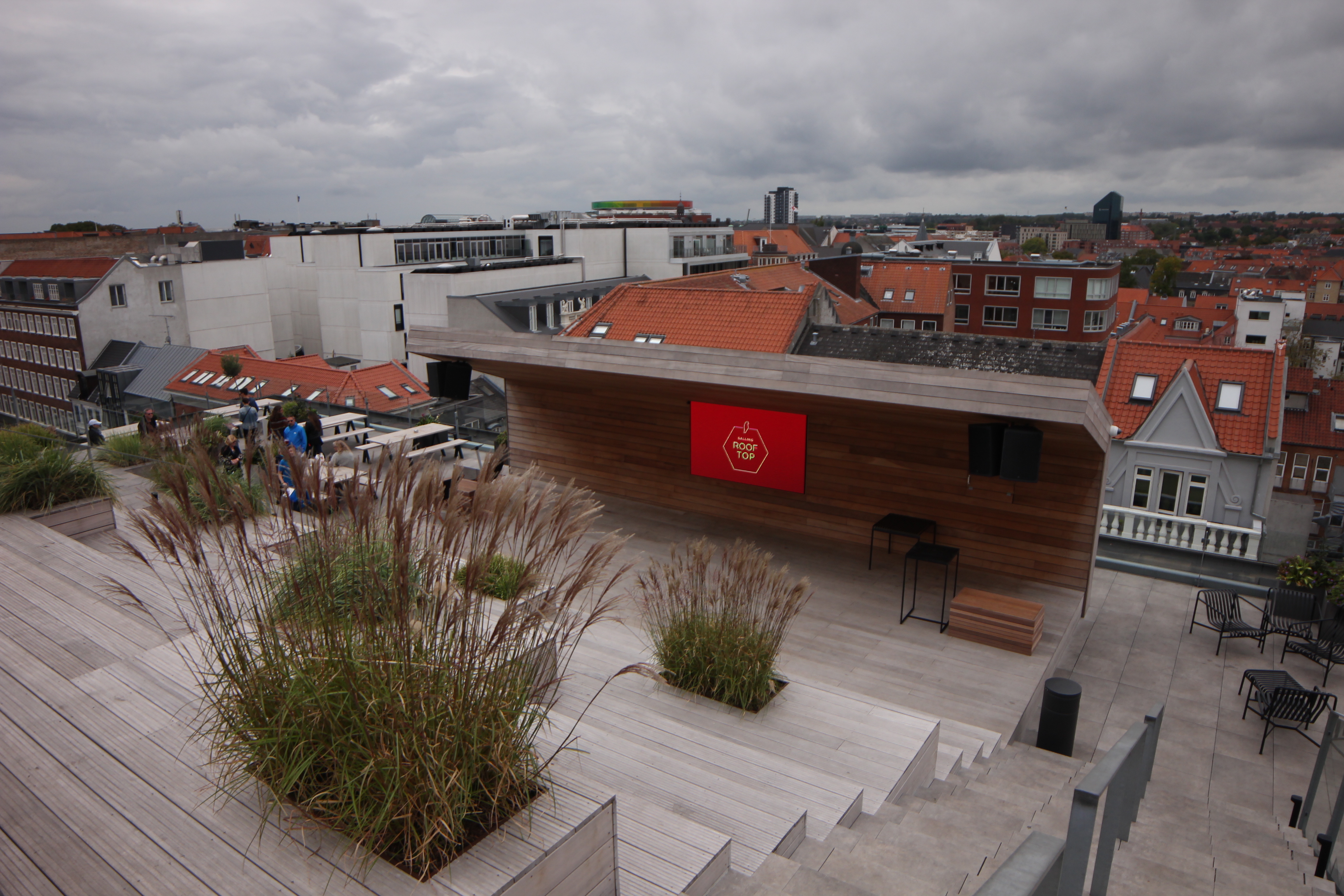
I also checked out the Salling Rooftop in Aarhus. It’s a rooftop event space on top of a mall. They have a cafe and an auditorium and a lookout platform high above the street with a glass floor!
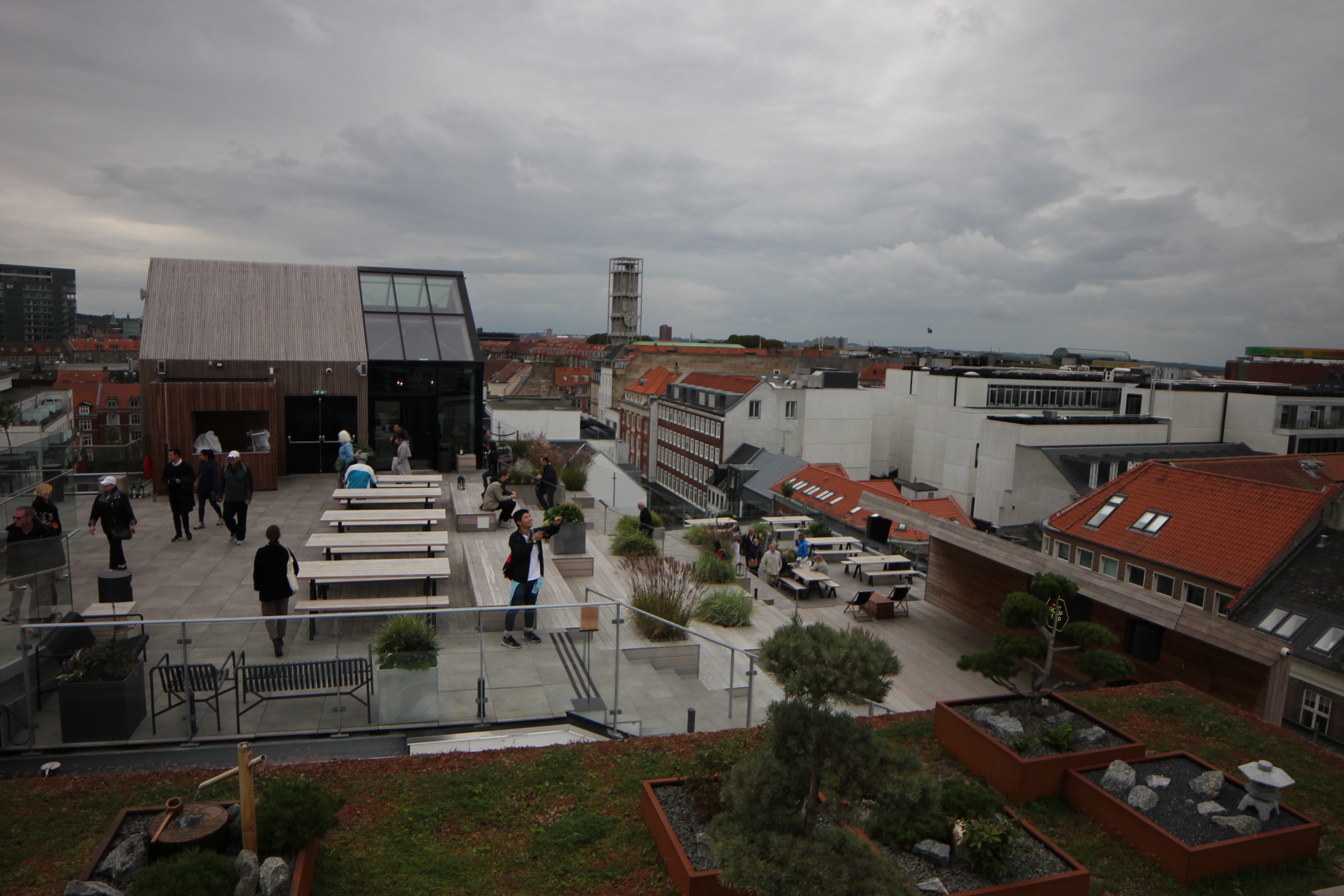

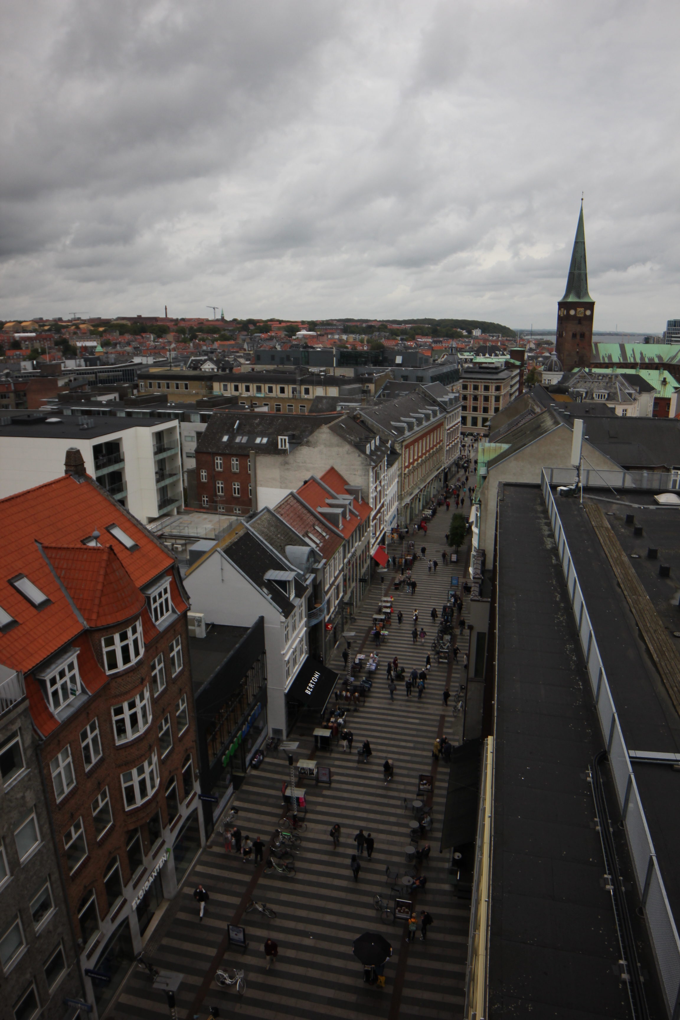
If walls could dream… they’d dream of standing 7 stories above Aarhus with only a little bit of glass under your feet!
Lunch in Aarhus
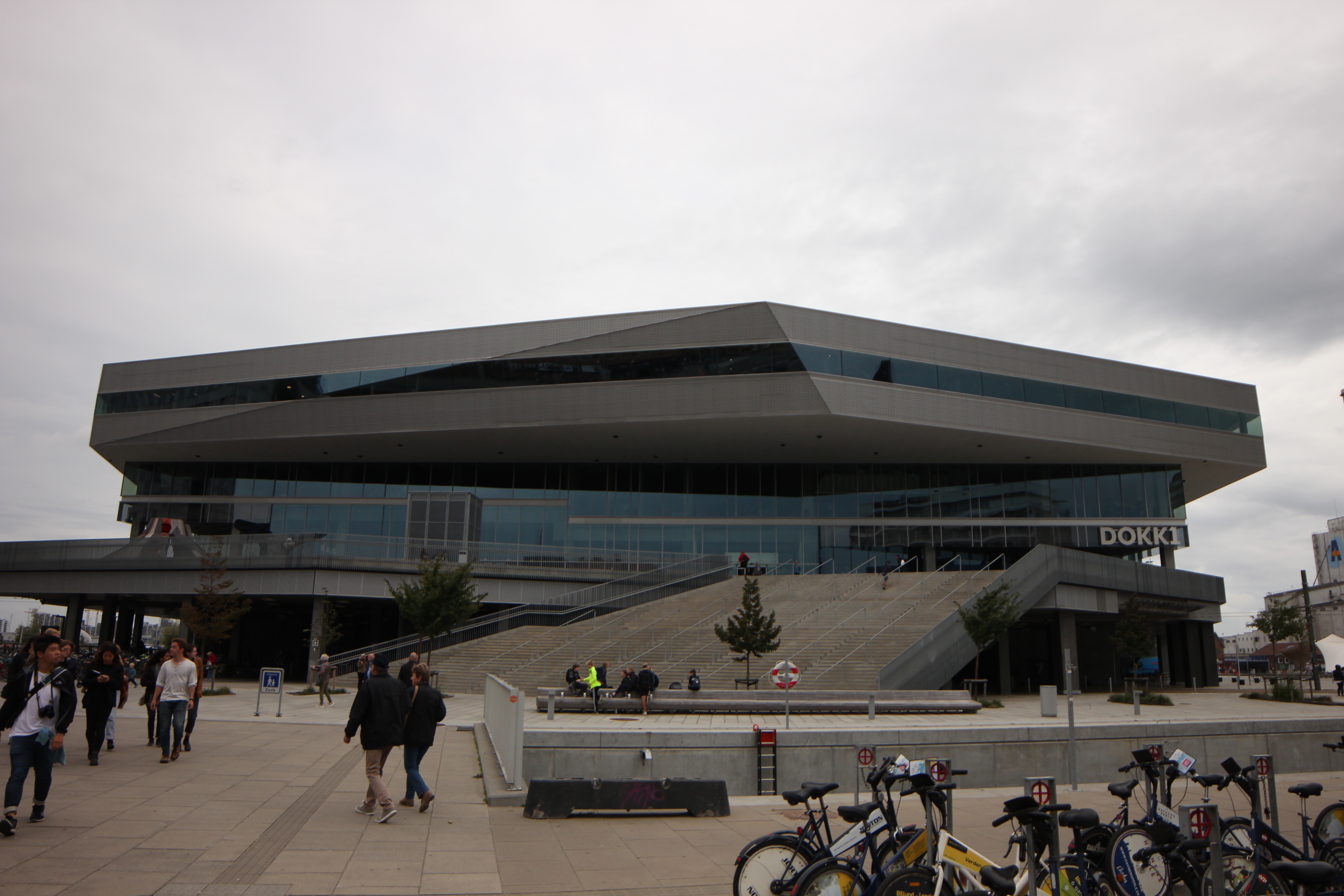
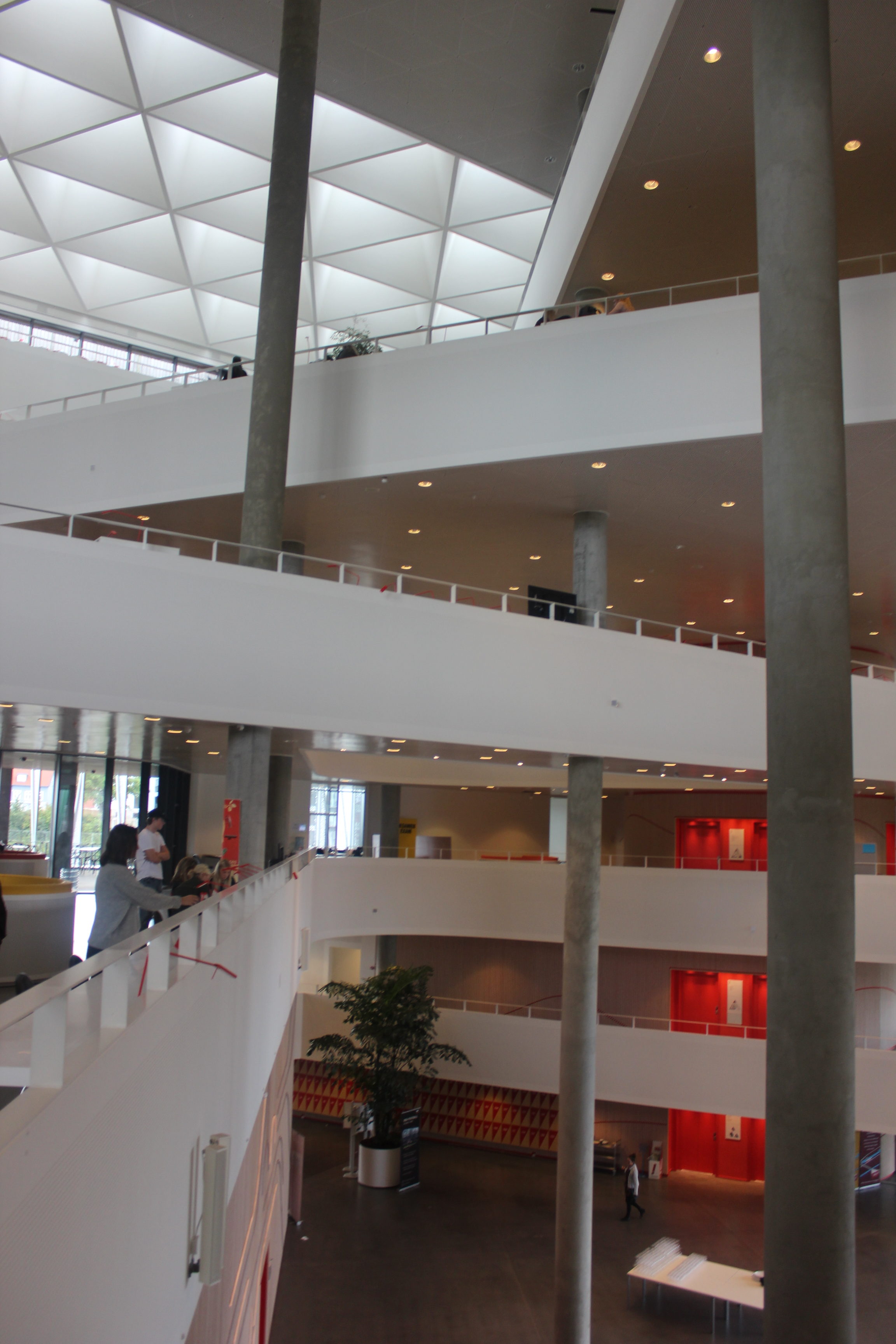
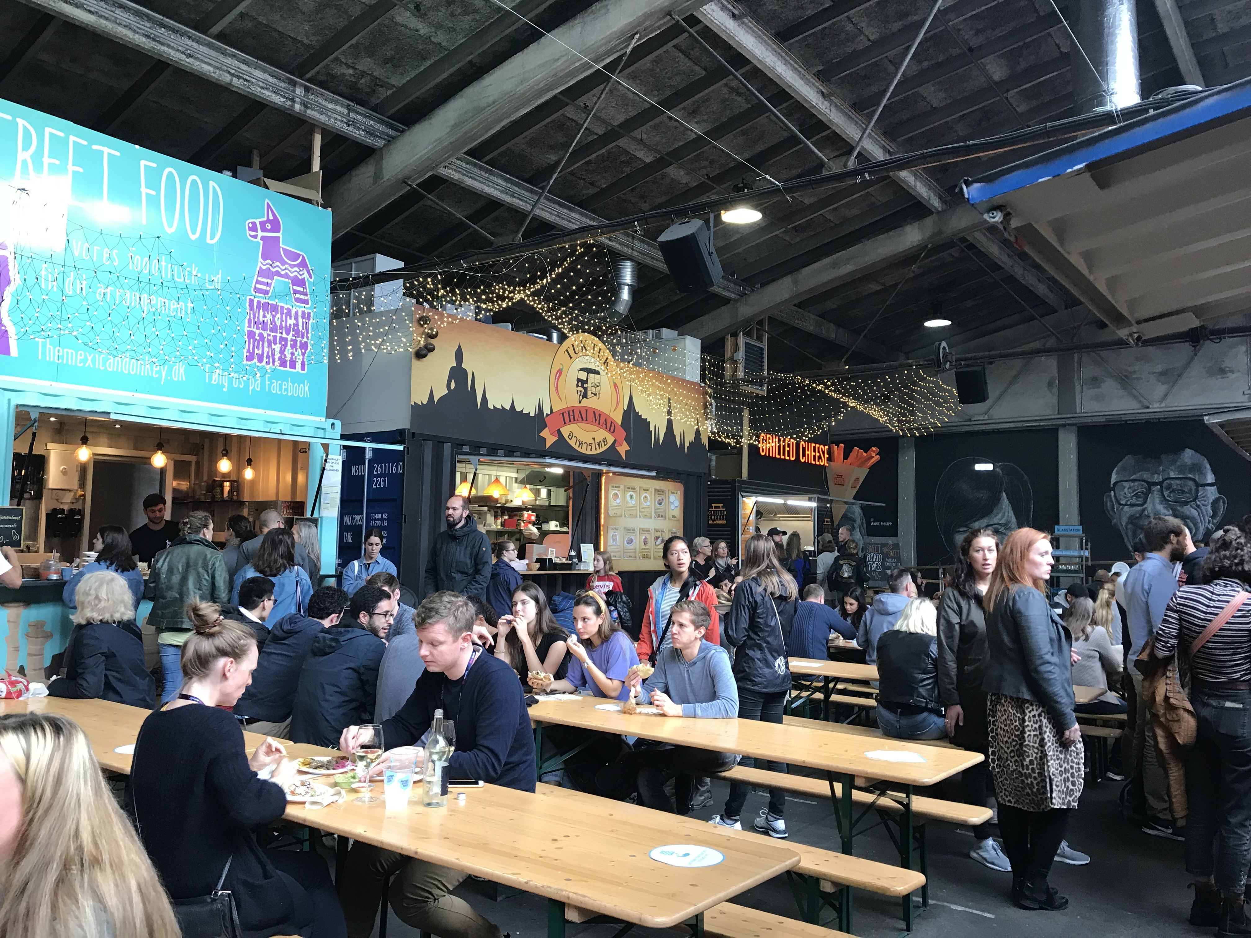
For our lunch break, we got pasta at a food truck style eating place and then we explored Dokk1, the public library. It’s so cool and incorporates public space with reading spaces and modern technology, it even has parking elevators!

Dokk1 was designed by Schmidt Hammer Lassen Architects and it is Scandinavia’s largest public library. You enter the building on the second (“first” in European terms, that’s a whole blog post of its own…)
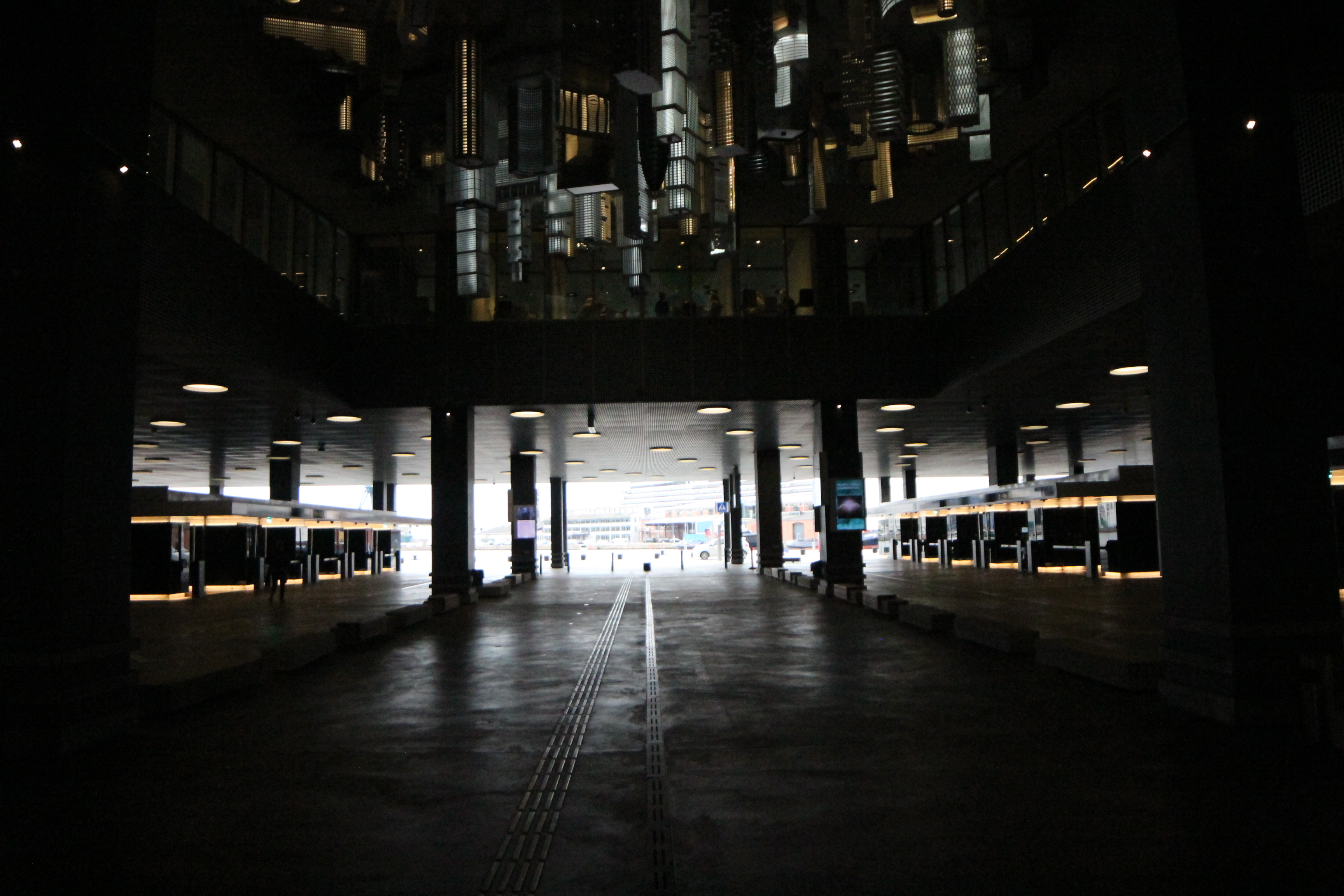
The ground floor of the library has the entrances to the parking elevators and an upside-down cityscape sculpture above.
If walls could dream… they’d dream of parking elevators!
Aarhus Radhus
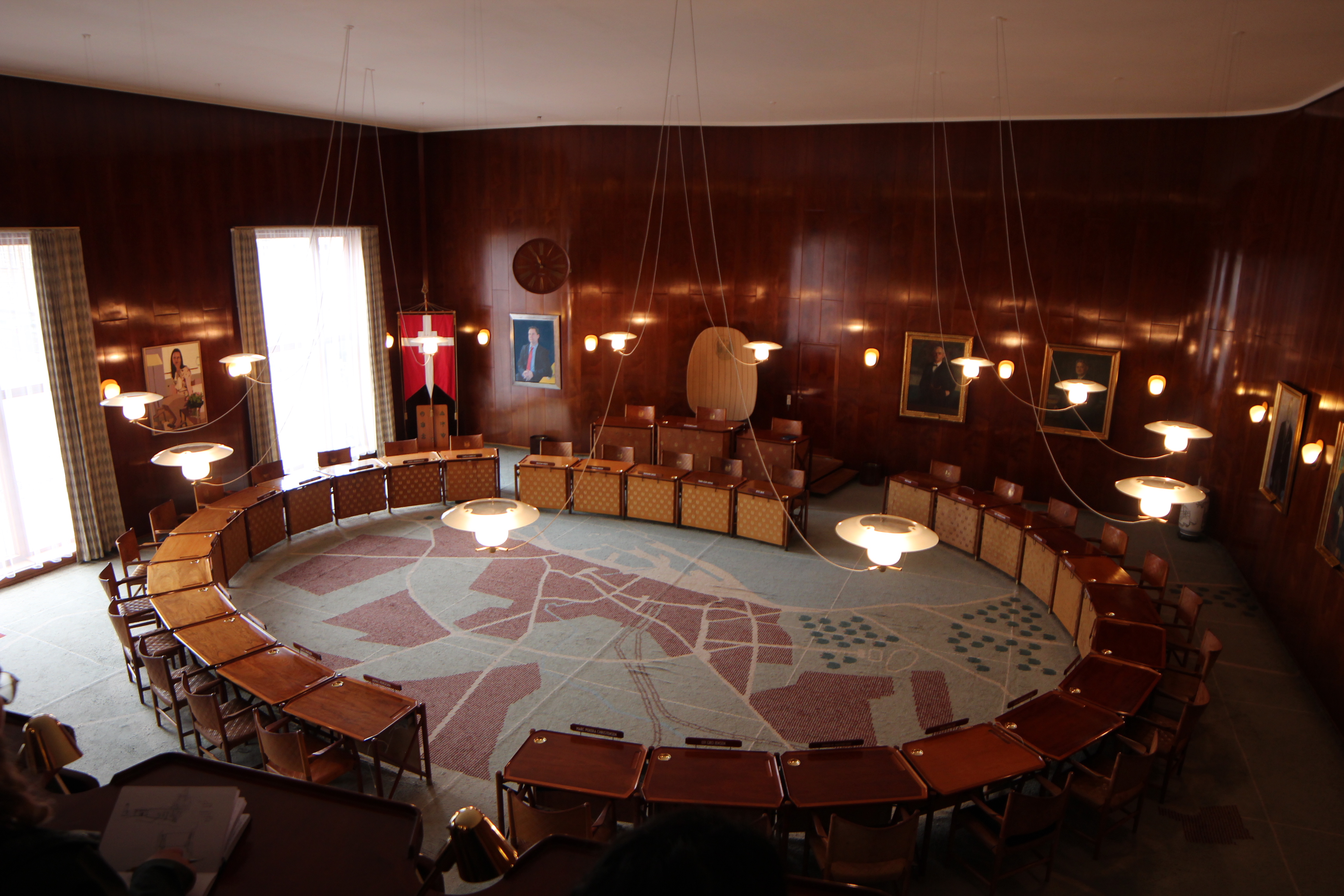
We visited the Aarhus Radhus (City Hall) by Arne Jacobsen and Erik Moller. They designed everything for this building, even down to the door handles and fonts.
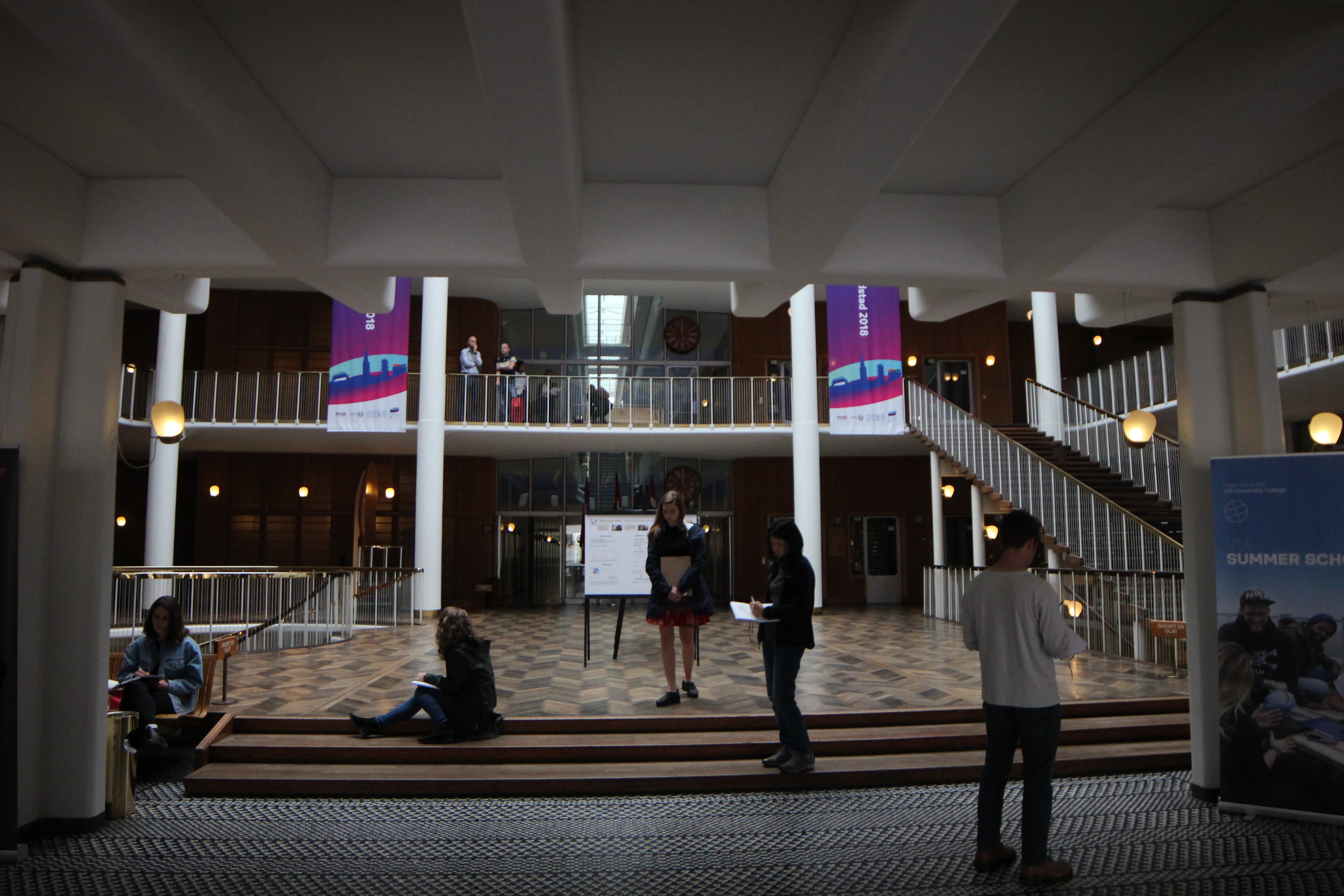
You enter the courthouse under a thick, fluffy, waffle slab. Then, it opens up into a central atrium wrapped in light railings and staircases. The coat check is below the atrium down a circular staircase. The wooden floor was so beautiful!
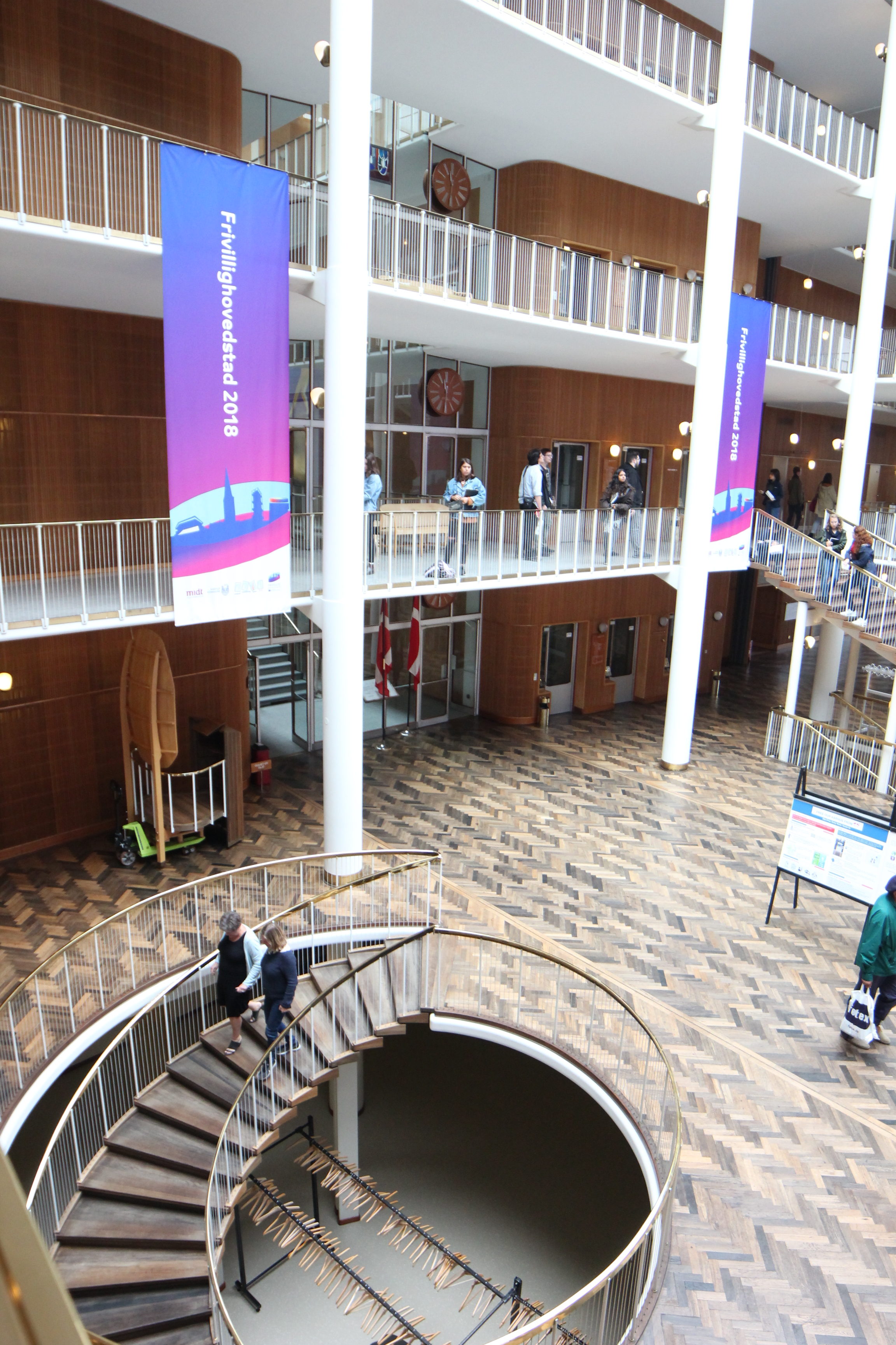
If walls could dream… they’d dream of going to court here.
Aarhus Crematorium Chapel
We visited the Aarhus Crematorium Chapel by Henning Larsen.
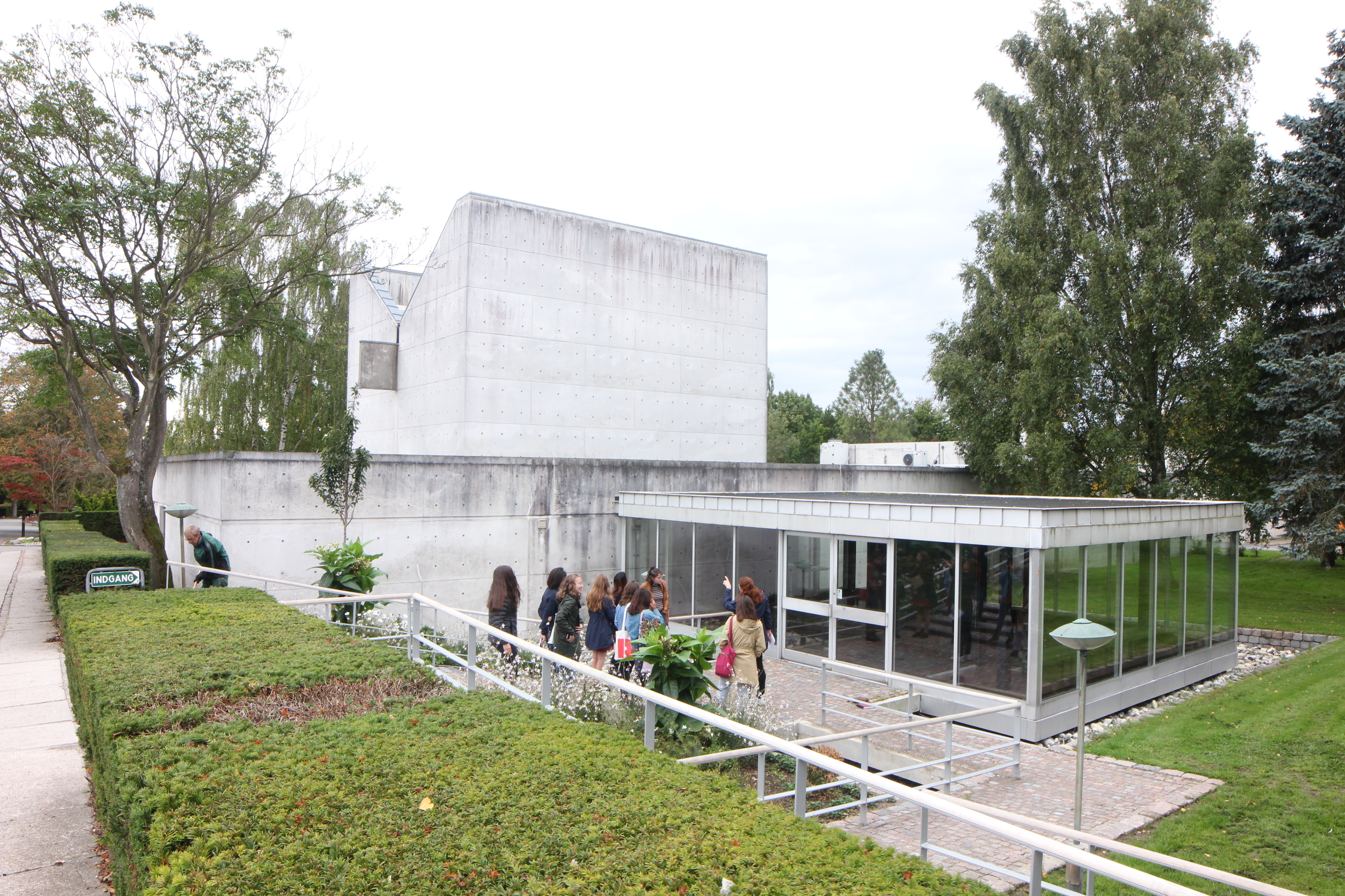
The building was all made of a light colored concrete and the entry was through a glass box on the side of the chapel.

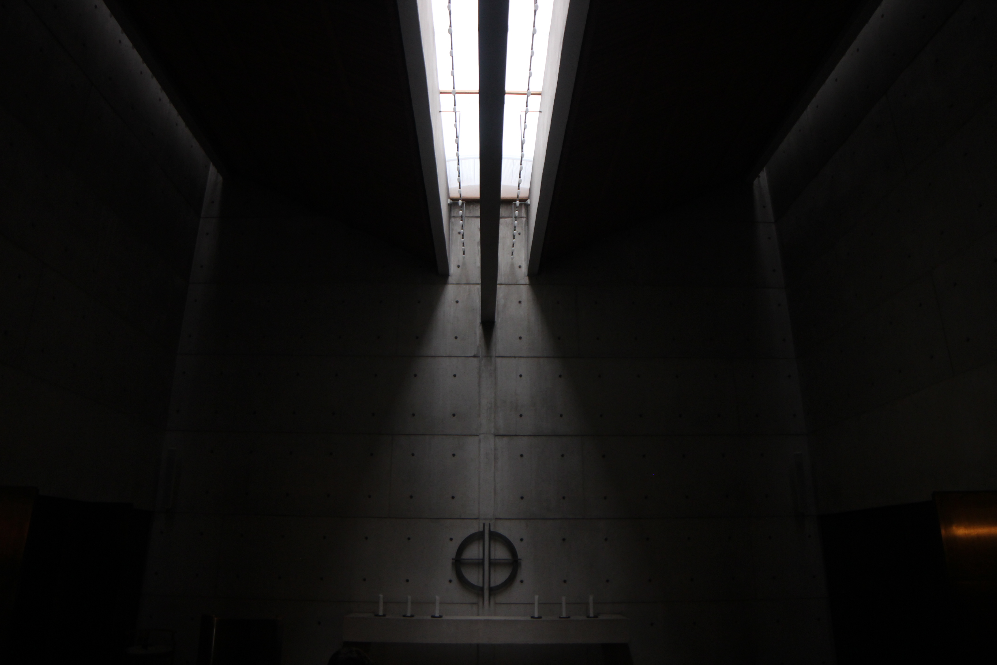
The main chapel space had a beautiful skylight in the center which created a moody, dim atmosphere of mourning and reflection while also referencing the idea of hope and light from above.
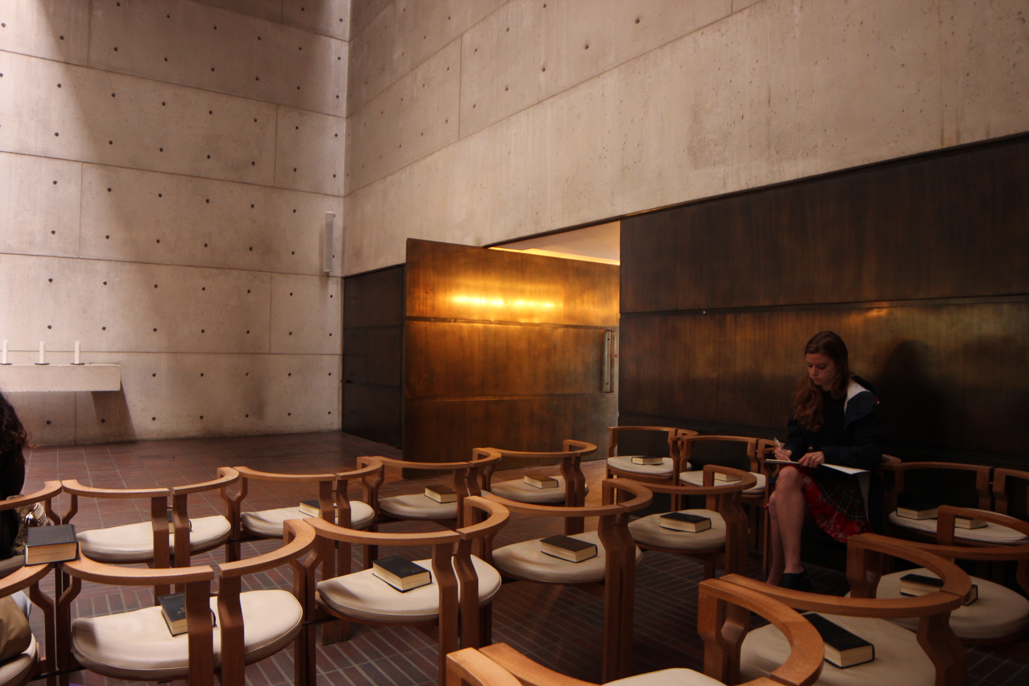
The door was a rich, warm, metal and the chairs were delicate semi-circles.
If walls could dream… they’d dream of standing under this skylight forever.
SDU Learning Center
We got to tour Southern Denmark University’s Campus Learning Center by Henning Larsen Architects. This triangular shaped building provides study space, auditoriums, offices, and more for SDU.
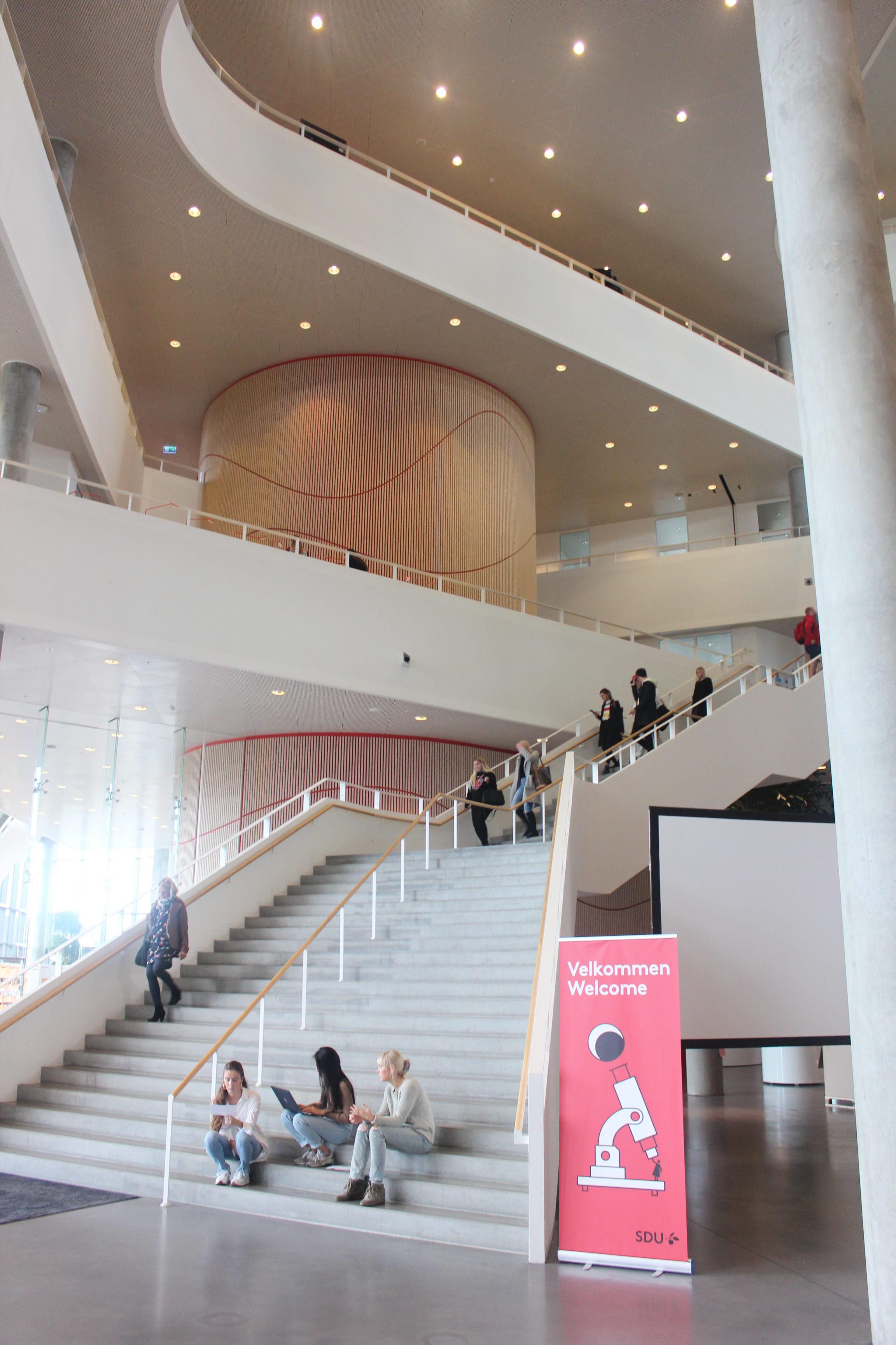
Bathrooms and fire stairs are located in three red cylinders near each point of the triangle.
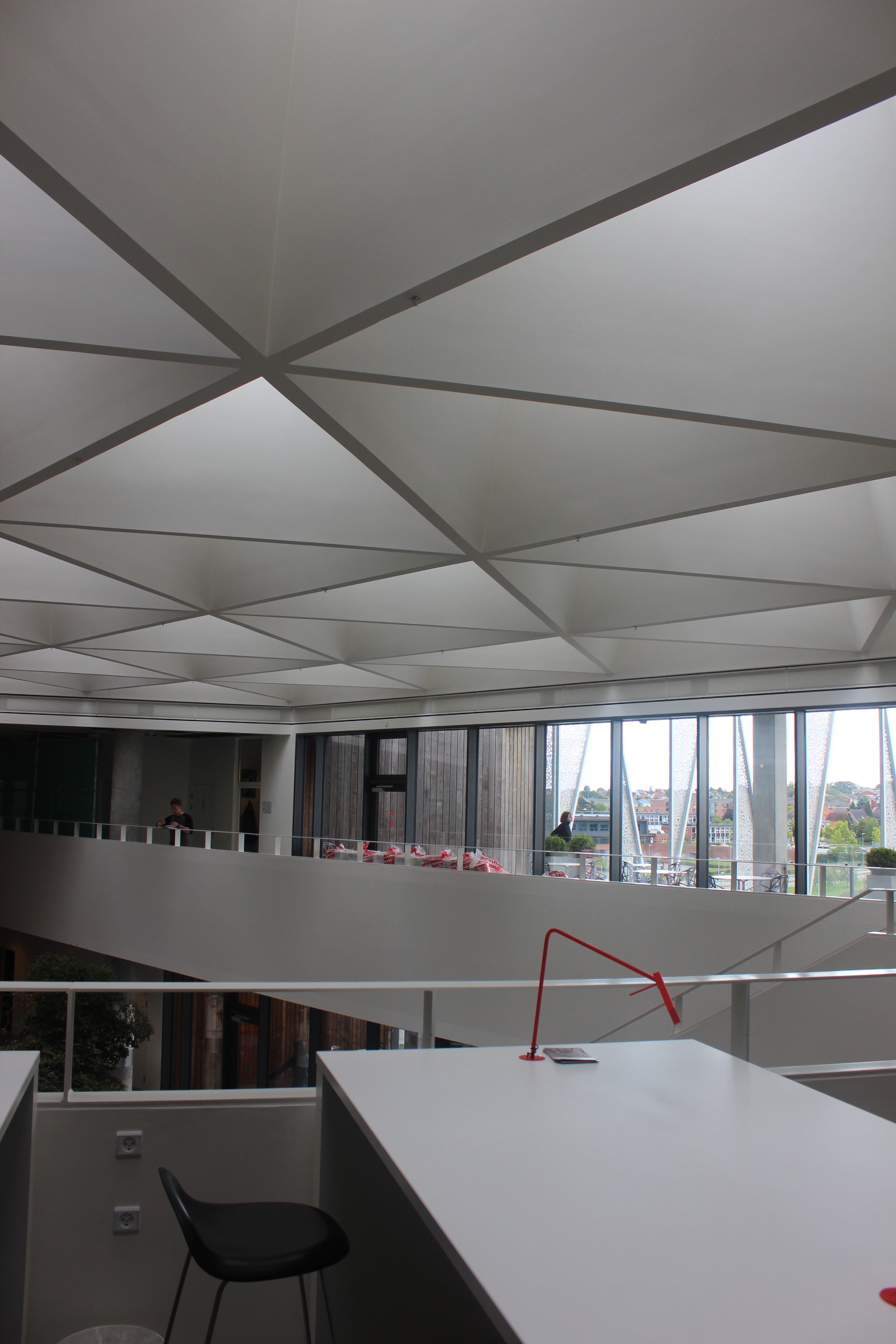
The ceiling has triangular skylights and there are patios throughout the building where students can study outside on a nice day.
If walls could dream… they’d dream of triangular buildings.
Koldinghus Museum
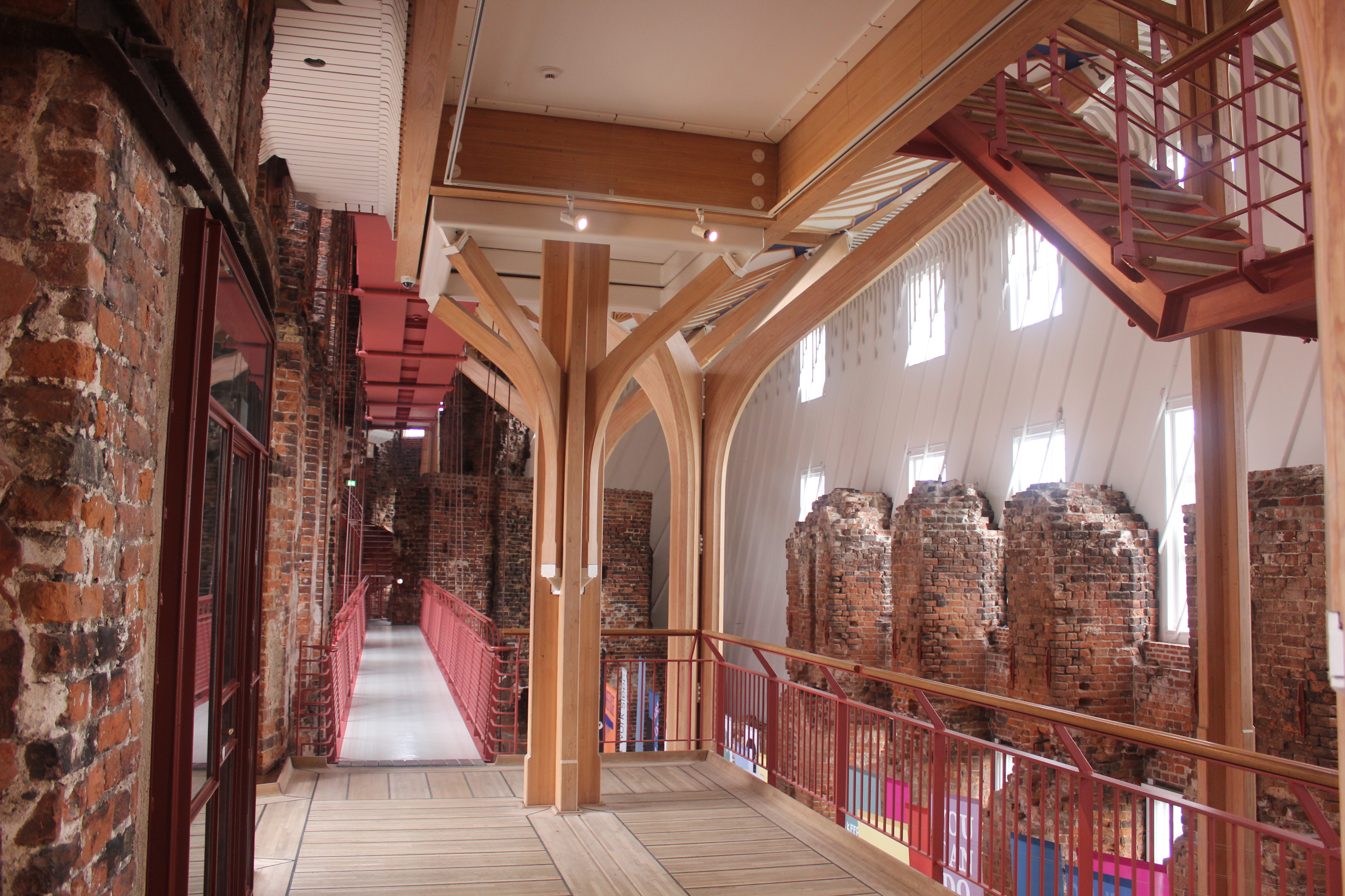
We visited the Koldinghus Museum which was an old castle that had fallen apart and was rebuilt into a museum. The architect expressed which parts of the building were new with wooden siding on the exterior and a light wood structure on the interior that seems to float inside of the brick ruins.
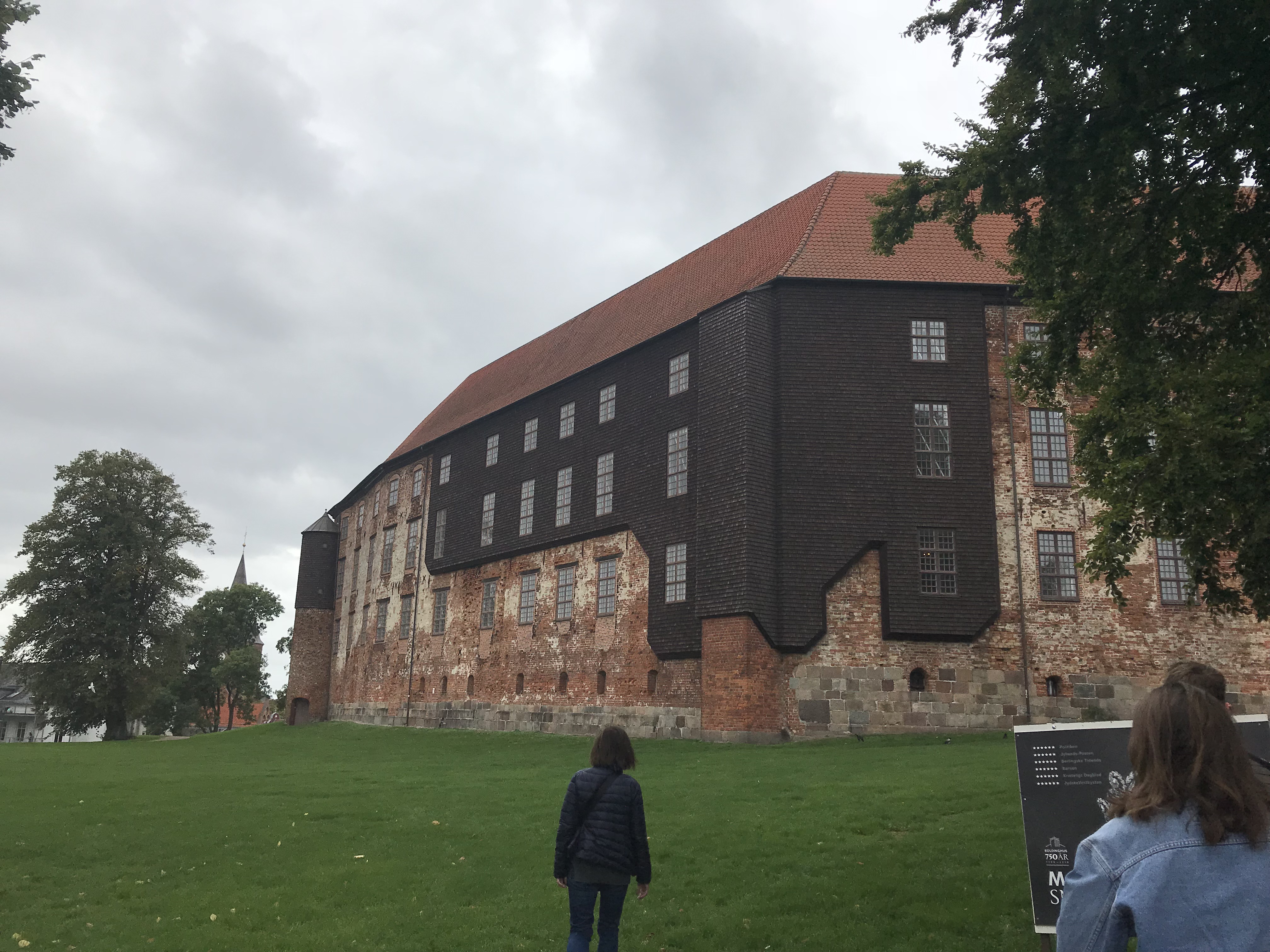
The exterior of the Koldinghus Museum.
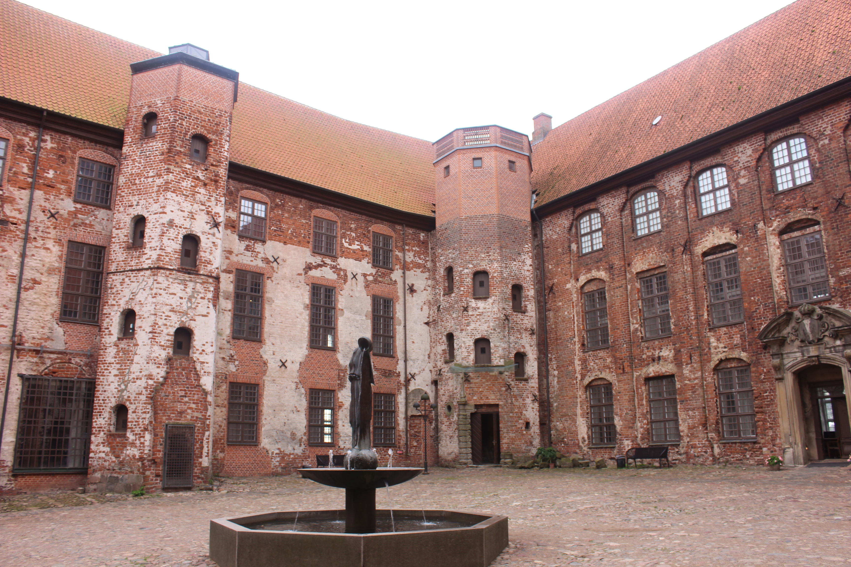 The courtyard in the center of the museum.

Inside the museum the structure seems to float around the brick ruins.
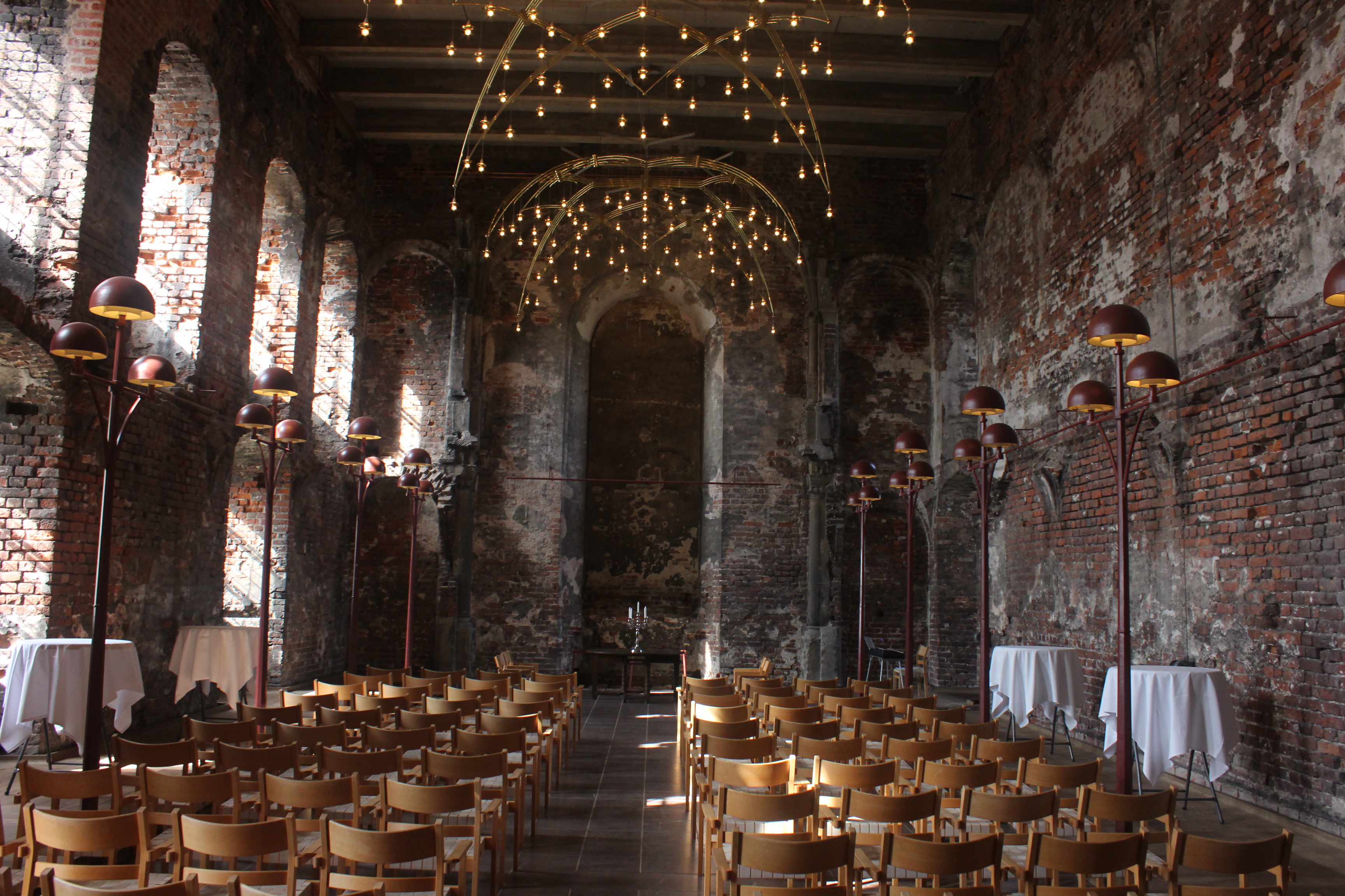
The original chapel had incredible lighting.
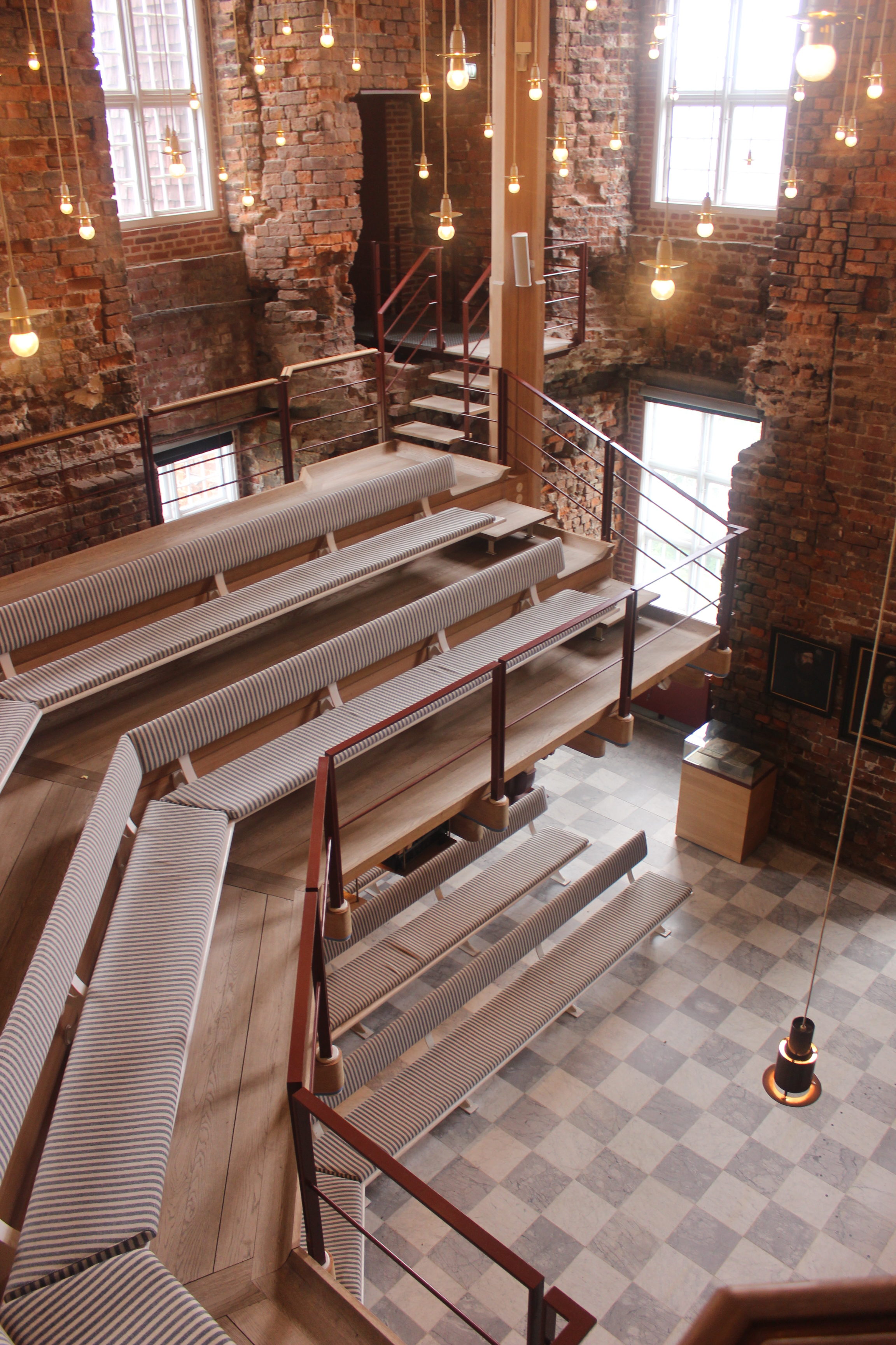
A smaller secondary chapel had a floating mezzanine and hanging lights.
If walls could dream… they’d dream of old castles turning into museums.
Trapholt Museum
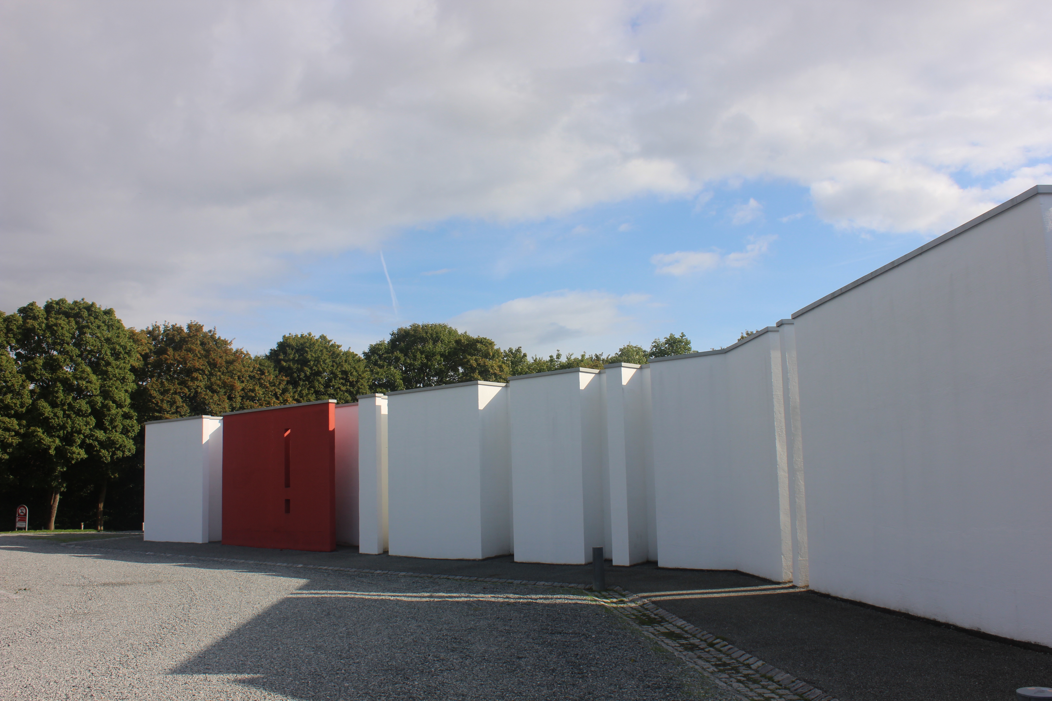
Thursday through Saturday of Core Course Week, we traveled around western Denmark. We started at the Trapholt Museum. The main element of this museum design is a long spine-like wall that all of the exhibitions branch off. The wall starts in the parking lot.
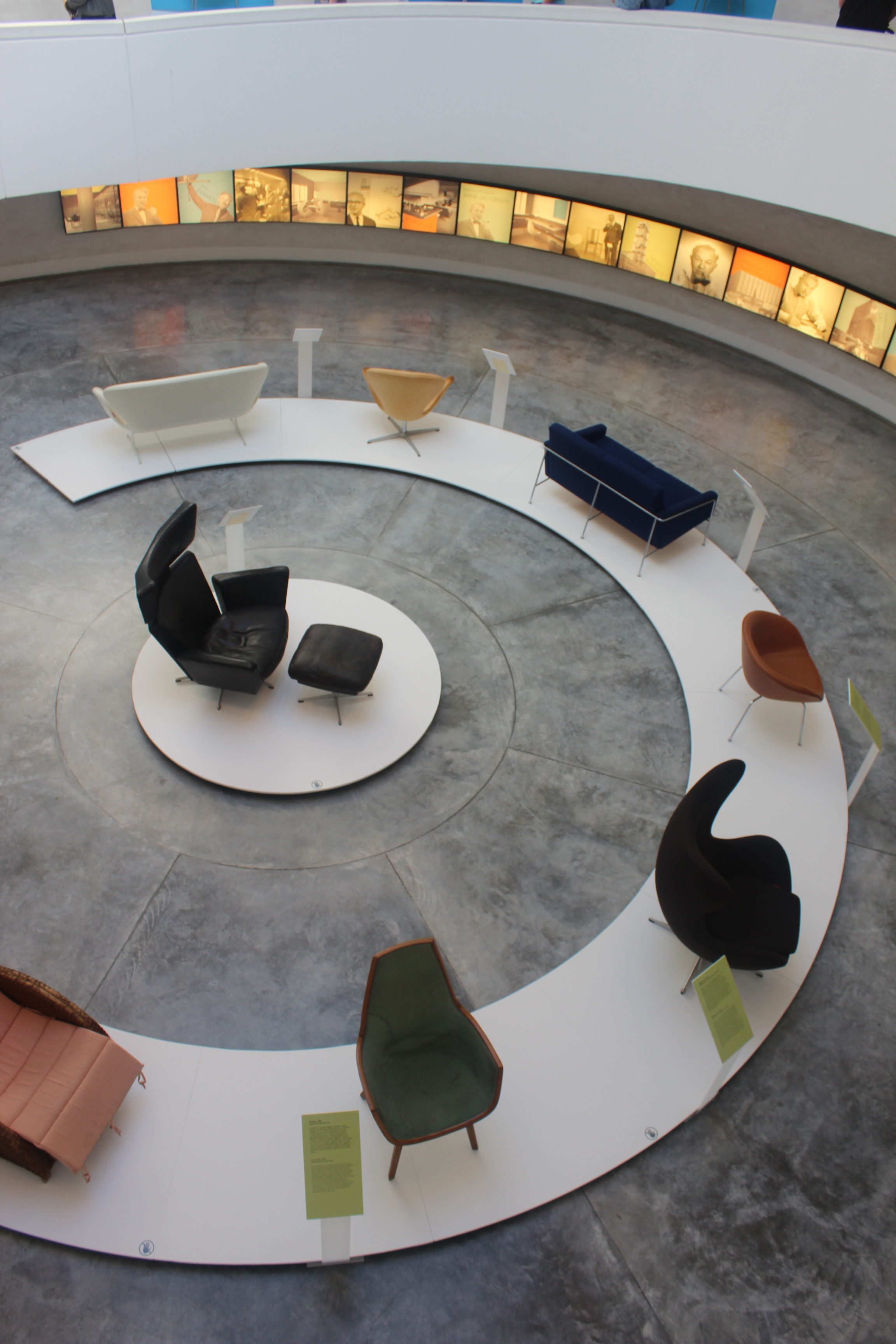
They had an exhibit about Arne Jacobsen and his furniture design which was really cool to see. Jacobsen is one of the most famous Danish designers and had a huge influence on Danish style.
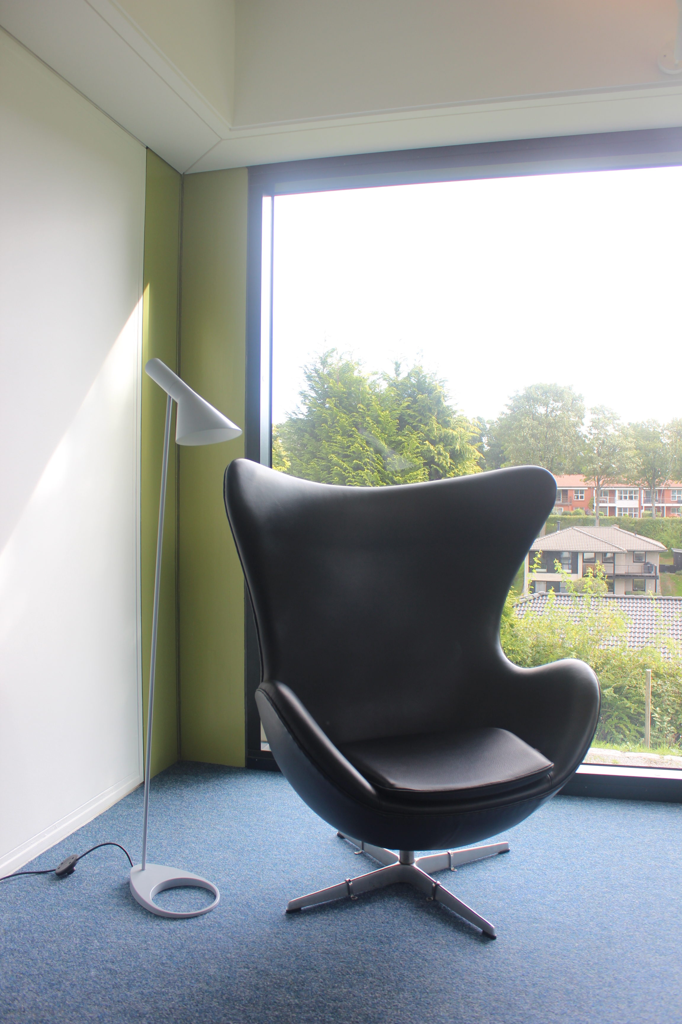
They also had a summer house that Jacobsen designed and it was furnished with his designs, including his famous “egg chair.”
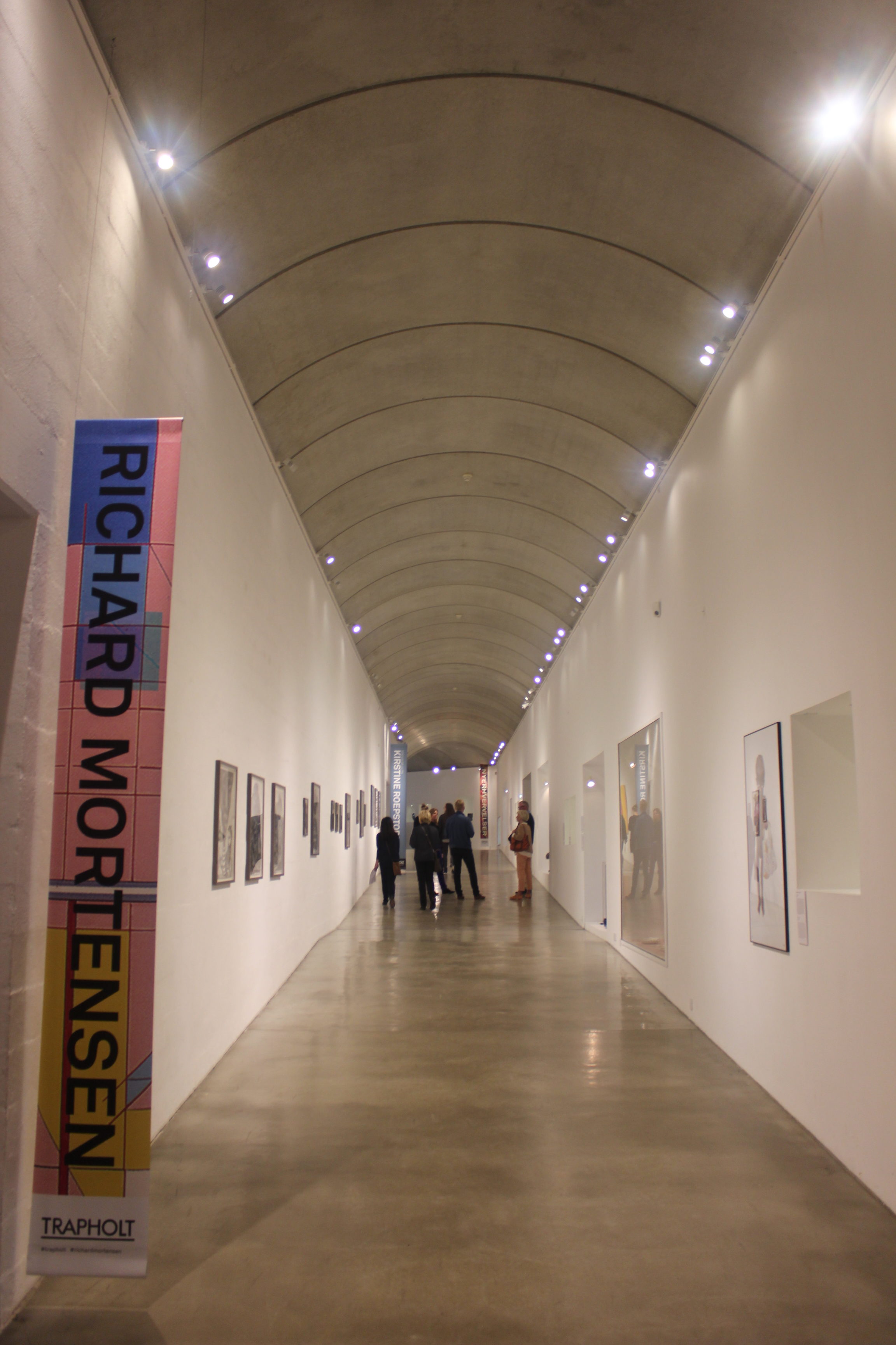
The main hallway of the museum has a beautiful arched roof. The wall continues from the parking lot, along the hallway, and ends with a cafe.
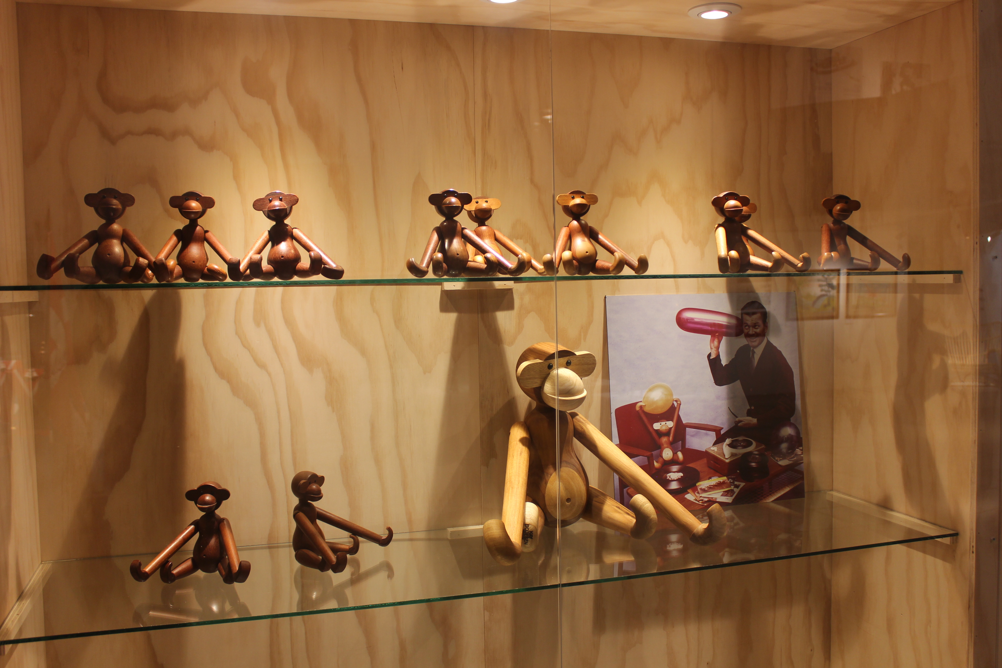
They also had an exhibit about Kay Bojesen and his toy designs. These toy monkeys are one of the most famous Danish toys and they can be found in any Danish household.

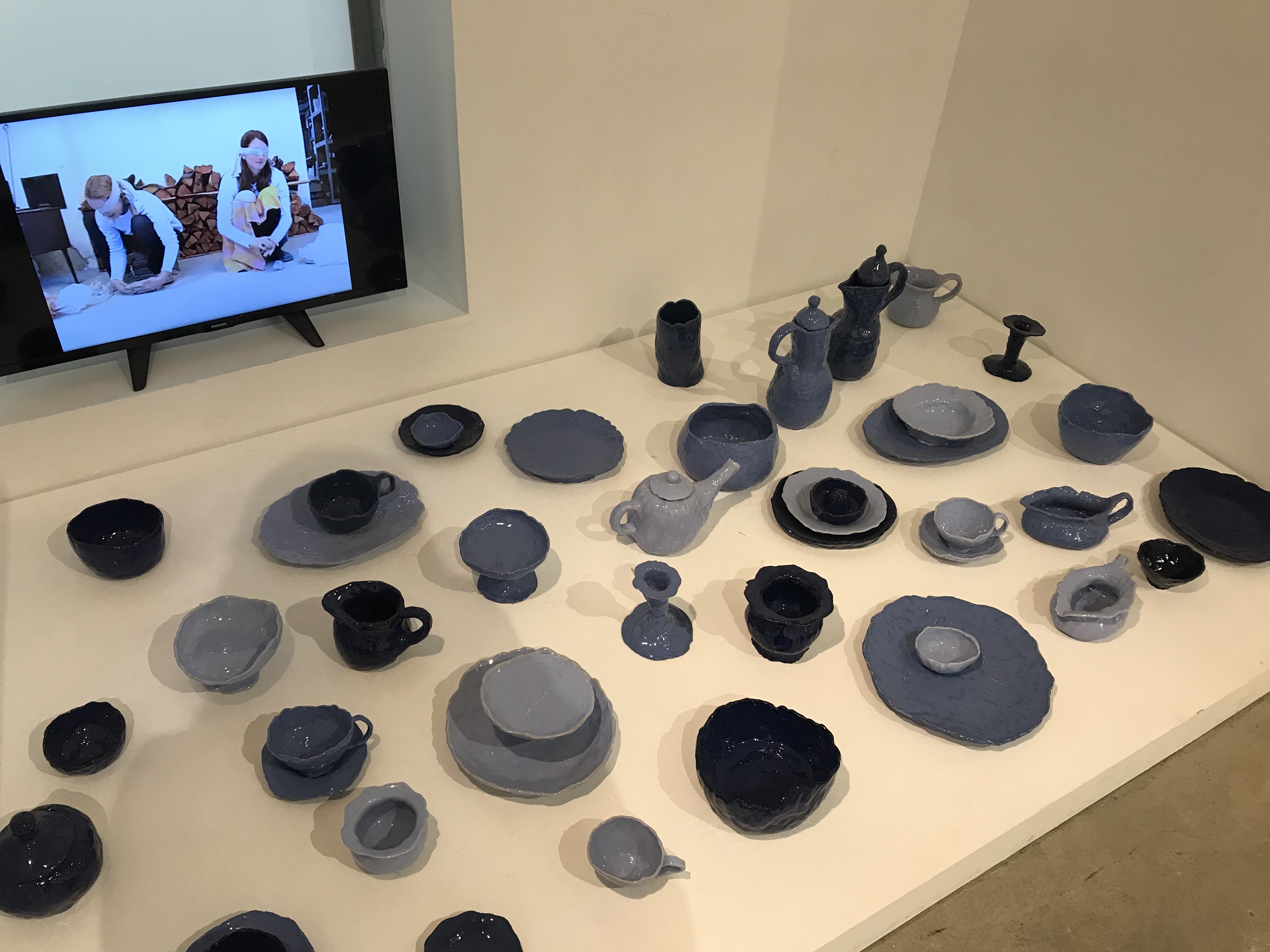
There was a tiny little exhibit about pottery that potters had made blindfolded and I thought it was so cool!
If walls could dream… they’d dream of the egg chair.
Arne Jacobsen and Tietgenkollegiet Tours
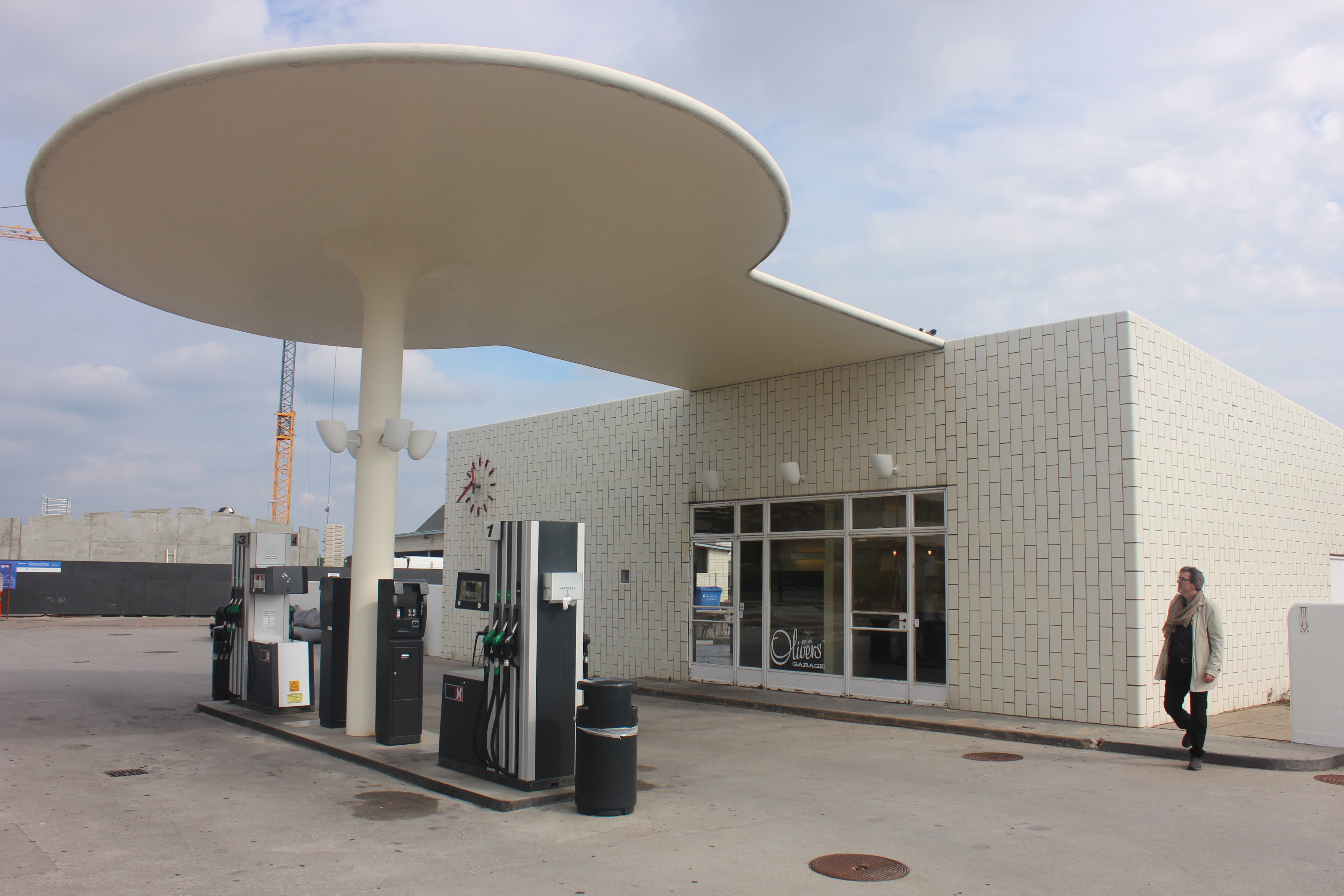
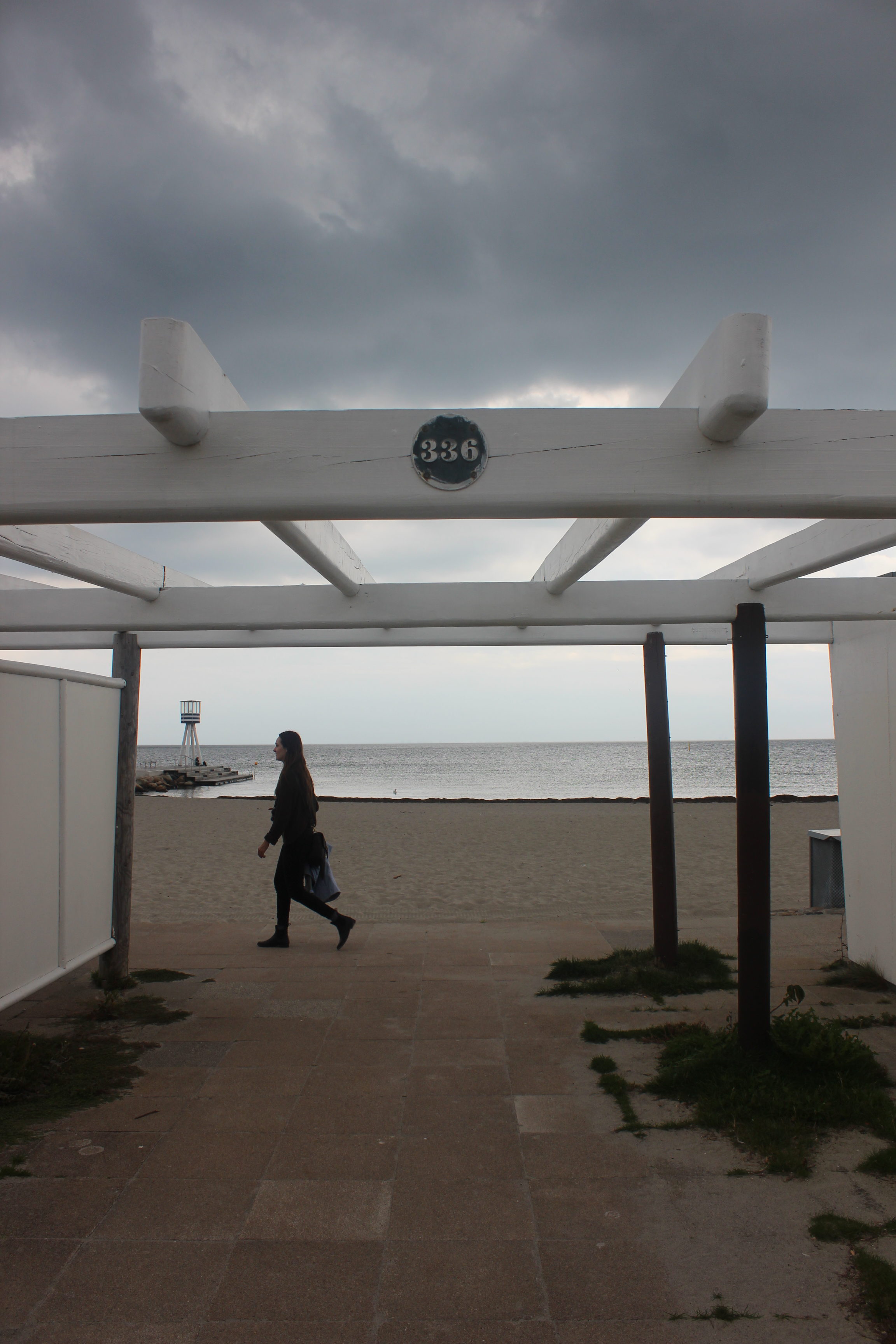
To round out our studio tours for core course week, we visited some projects by Arne Jacobsen and then got a tour of Tietgenkollegiet, one of the most popular student housing buildings in Copenhagen, for obvious reasons. We walked along the coast from Arne Jacobsen’s gas station to his beach houses. He designed everything, down to the font used for address numbers.
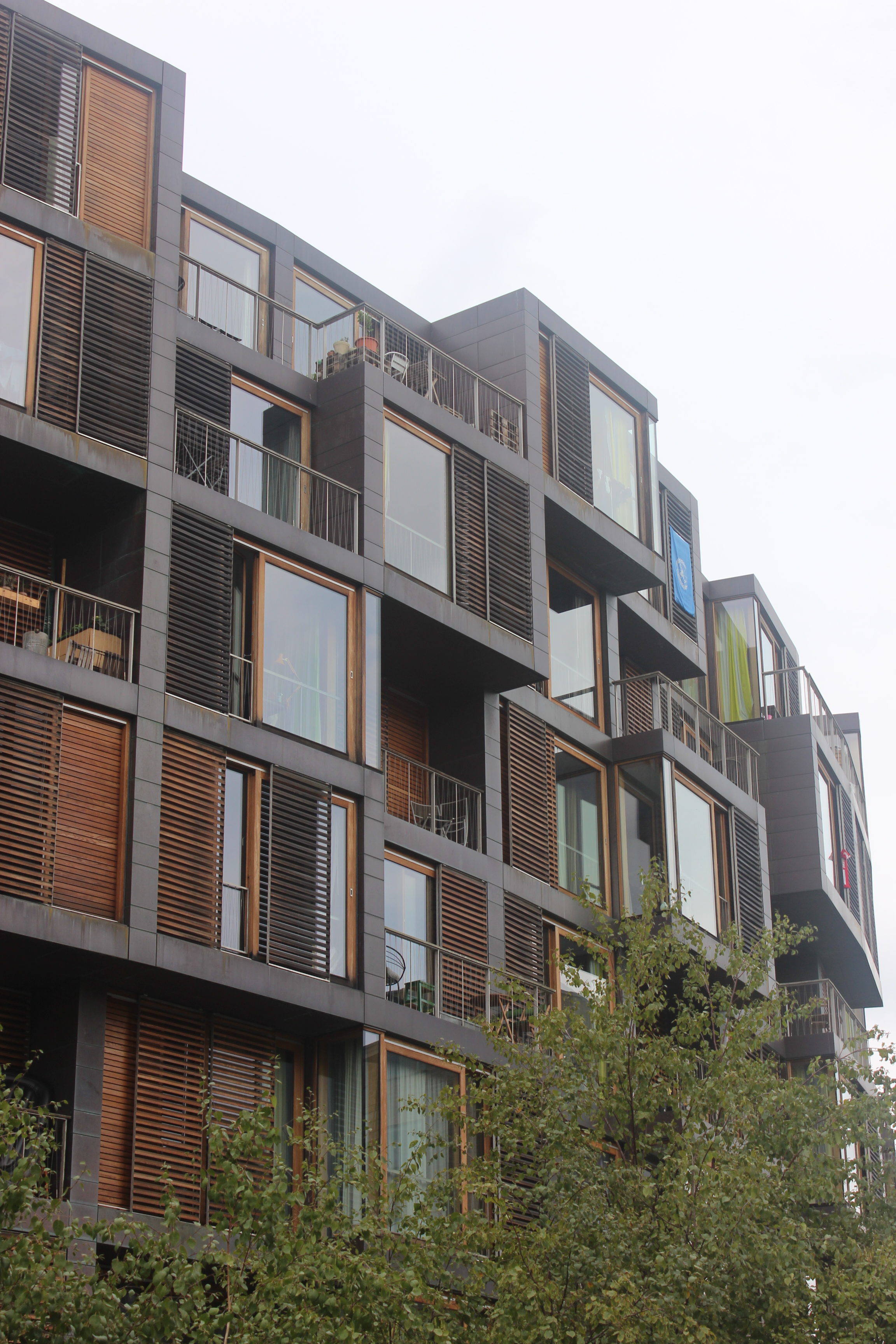
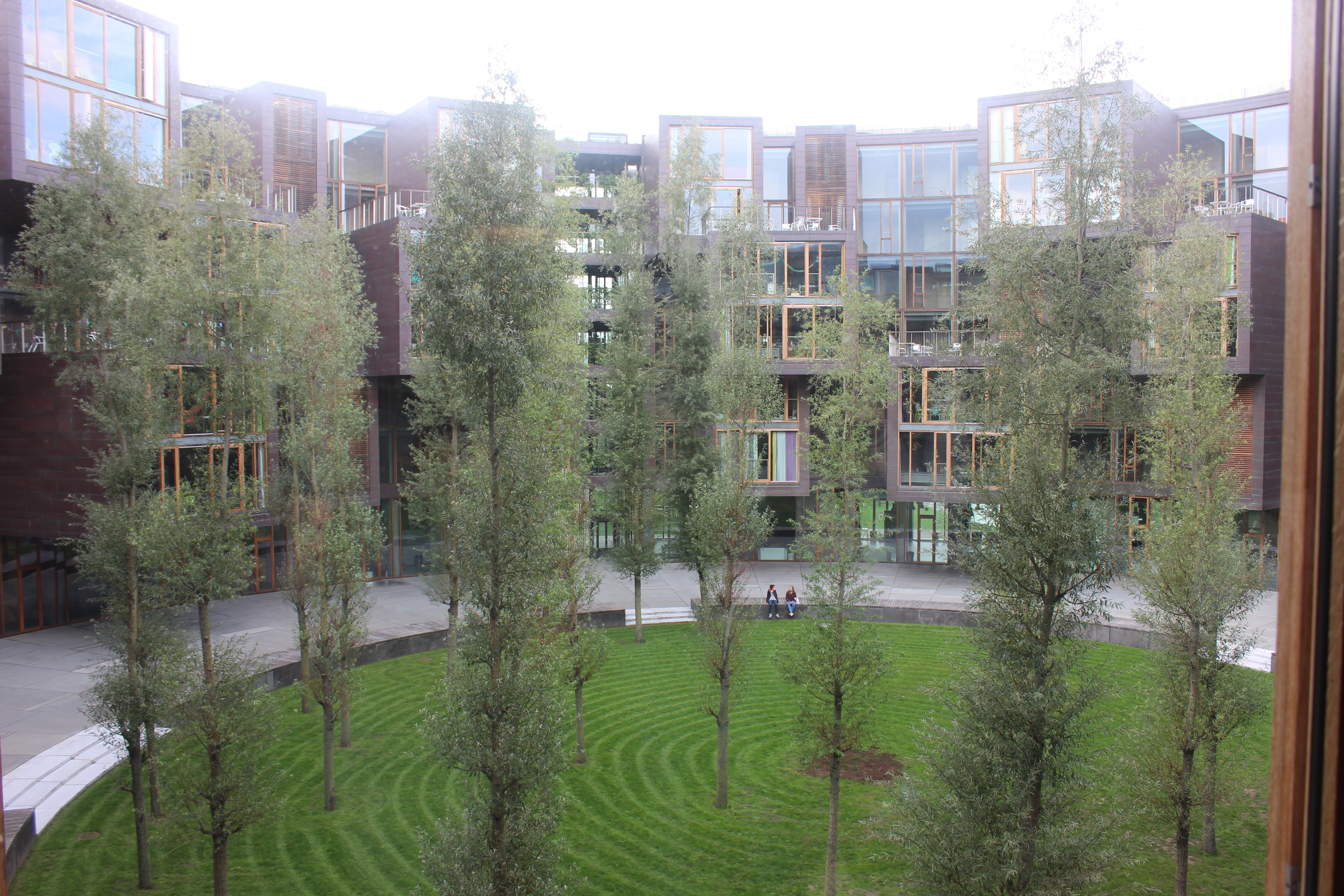
We also got a tour of the Tietgenkollegiet from a student who lives there. The building was designed by Lundgaard & Tranberg. It is a circular building, with the private rooms facing outwards and the communal spaces facing inwards so that residents can see friends across the courtyard, having dinner or hanging out, and go join them. There are also communal spaces on the ground floor. Things that are usually shoved in dim basements, such as mail, bike parking, and laundry, are given bright, colorful rooms on the ground floor.
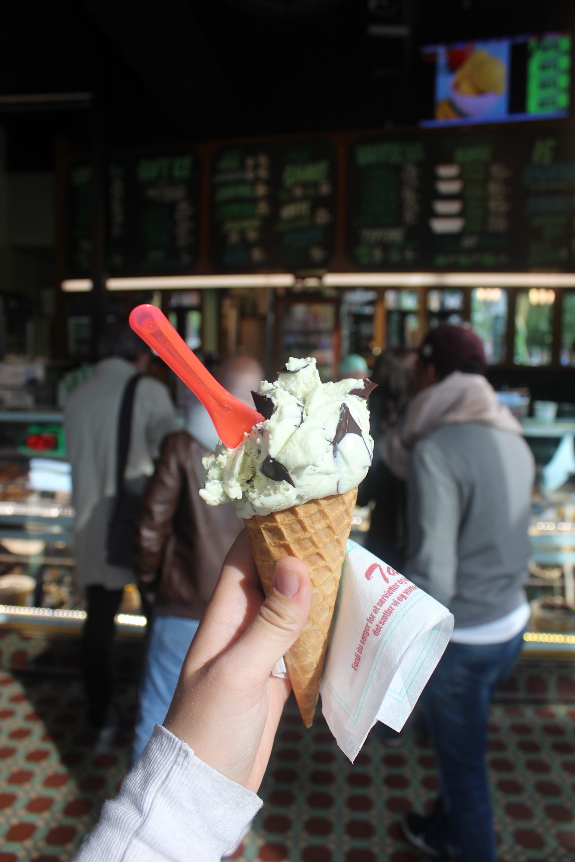
Buildings are great, but I have to admit the highlight of this tour was the icecream! I got mint chocolate chip and it had huge chips of dark chocolate in it. Delicious!
If walls could dream… they’d dream of Arne Jacobsen.
Louisiana Museum
On Tuesday, my studio and I took a trip to the Louisiana Museum by Vilhelm Wohlert and Jørgen Bo. It was so beautiful! I love how it connected with the nature and had so many windows and natural elements. The museum also has a newer wing but it was closed while we were there to set up a new exhibit.
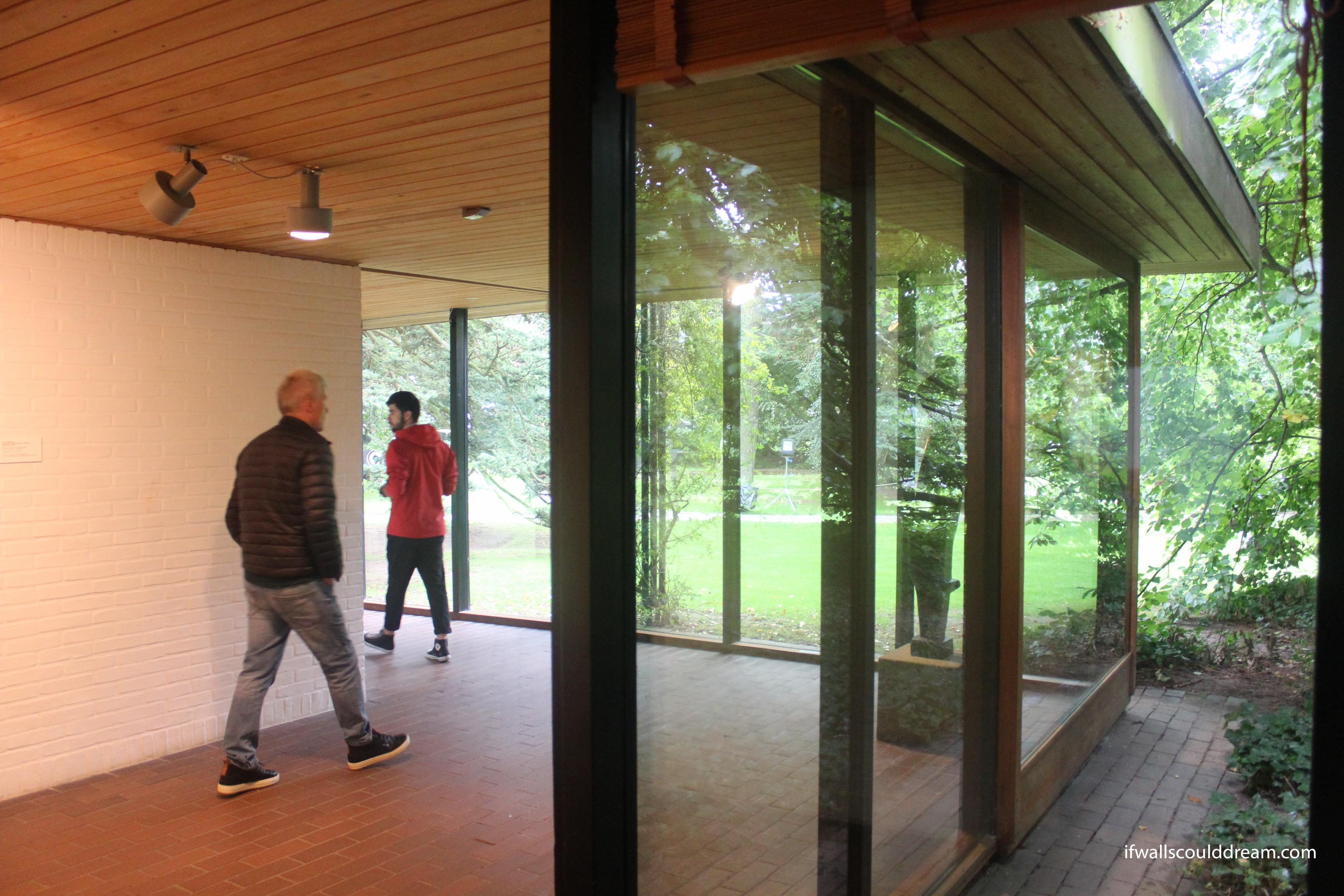
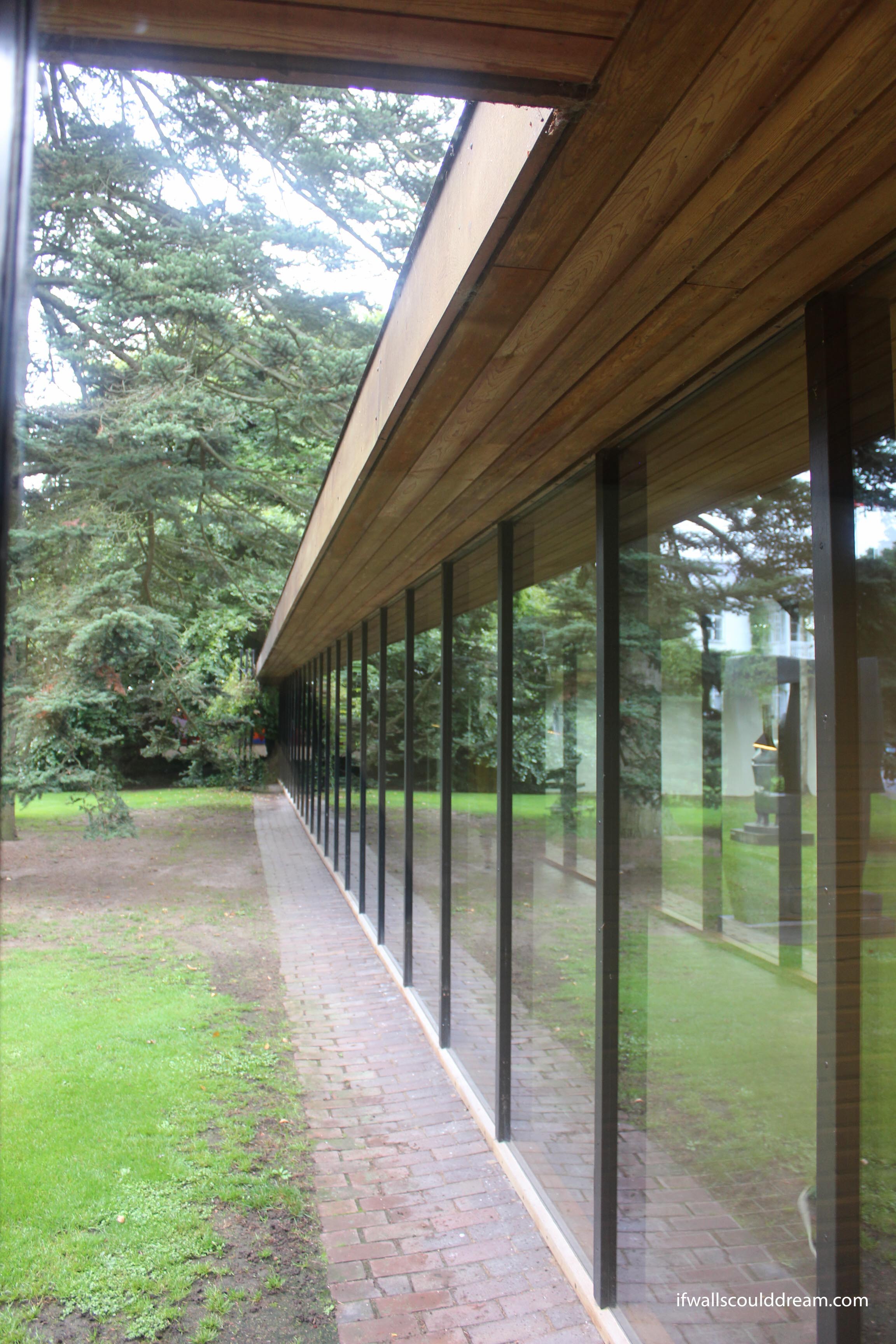
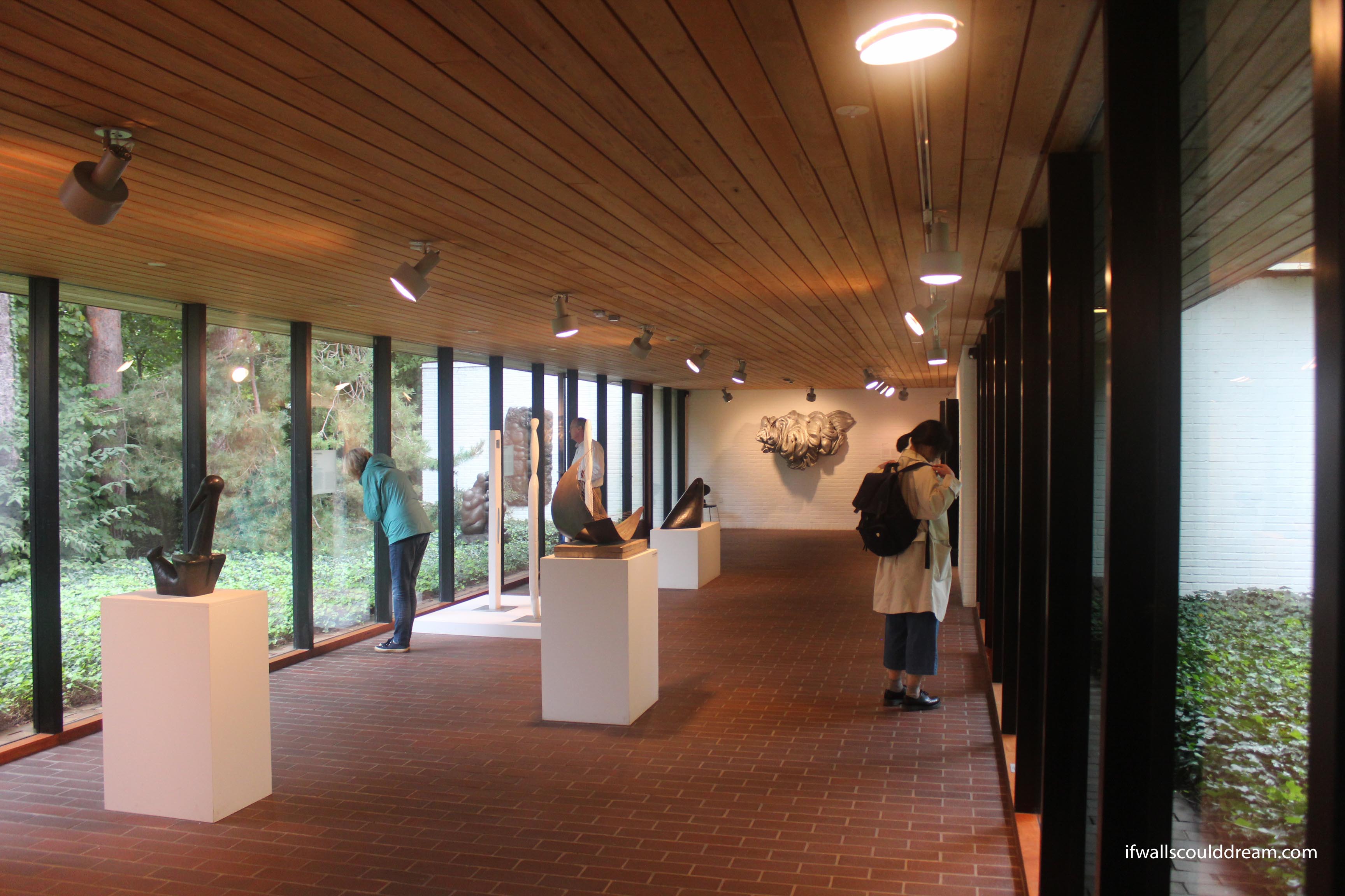
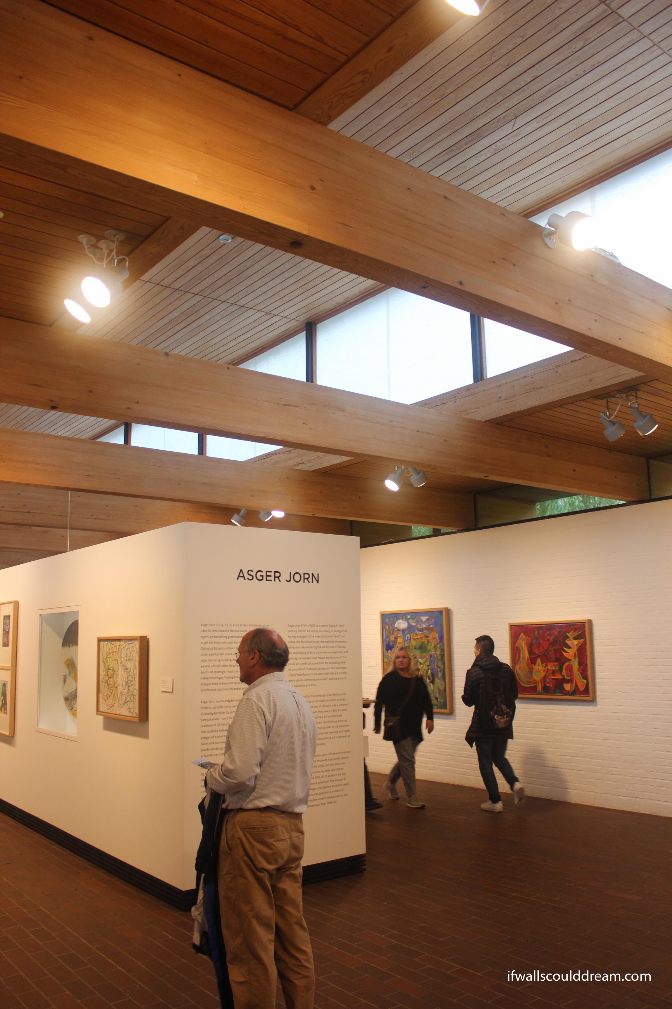

I would recommend anyone visiting Copenhagen for more than a couple days, visit the Louisiana Museum. They have a really nice cafe too with beautiful views of the coast.
If walls could dream… they’d dream of visiting the Louisiana Museum.
Bagsværd Church
Bagsværd Church was designed by Jørn Utzon. He is a Danish architect famous for designing the Sydney Opera House in Australia. I visited the Bagsværd Church with my studio last Monday and it was incredible to finally see it in real life.
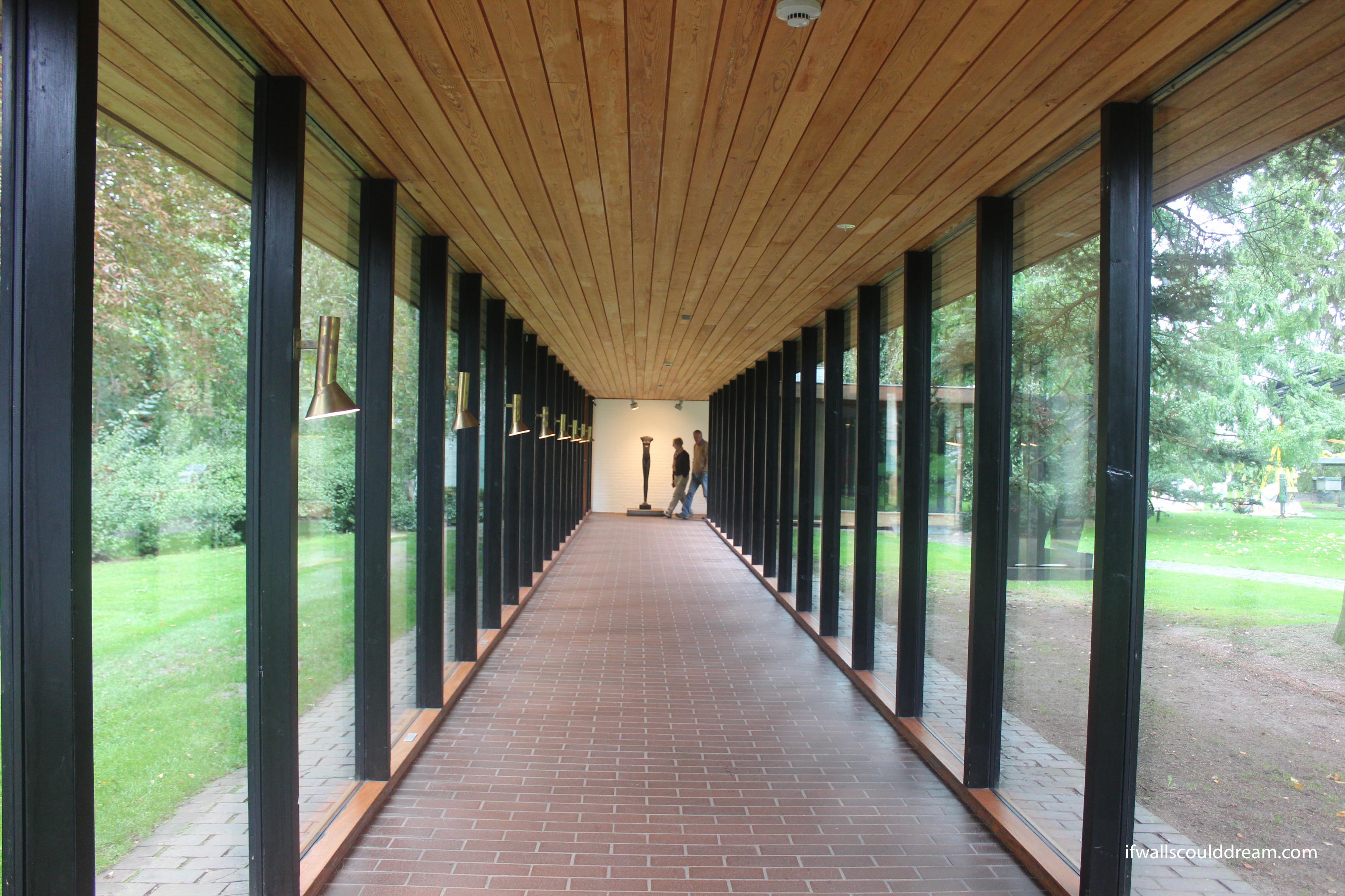
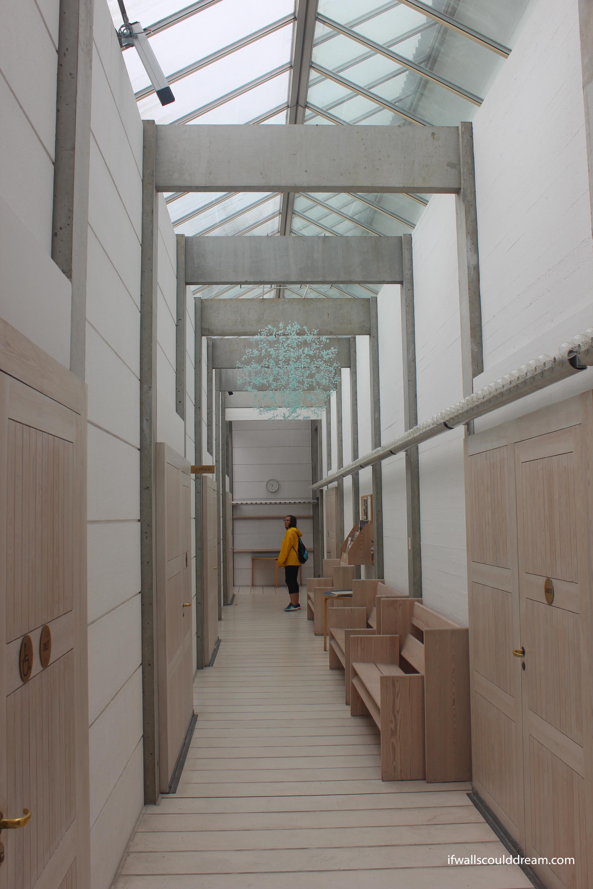
It was a rainy morning and I entered the church from the side door, so I was greeted by a sheltered yet airy hallway. It was so nice to be out of the rain but still in the natural light. You can notice from this photo the modularity of the building. The wall panels and structural columns all fit together easily and even the benches fit in the module. The doors aren’t holes in the walls but rather other panels attached to the wall panels.
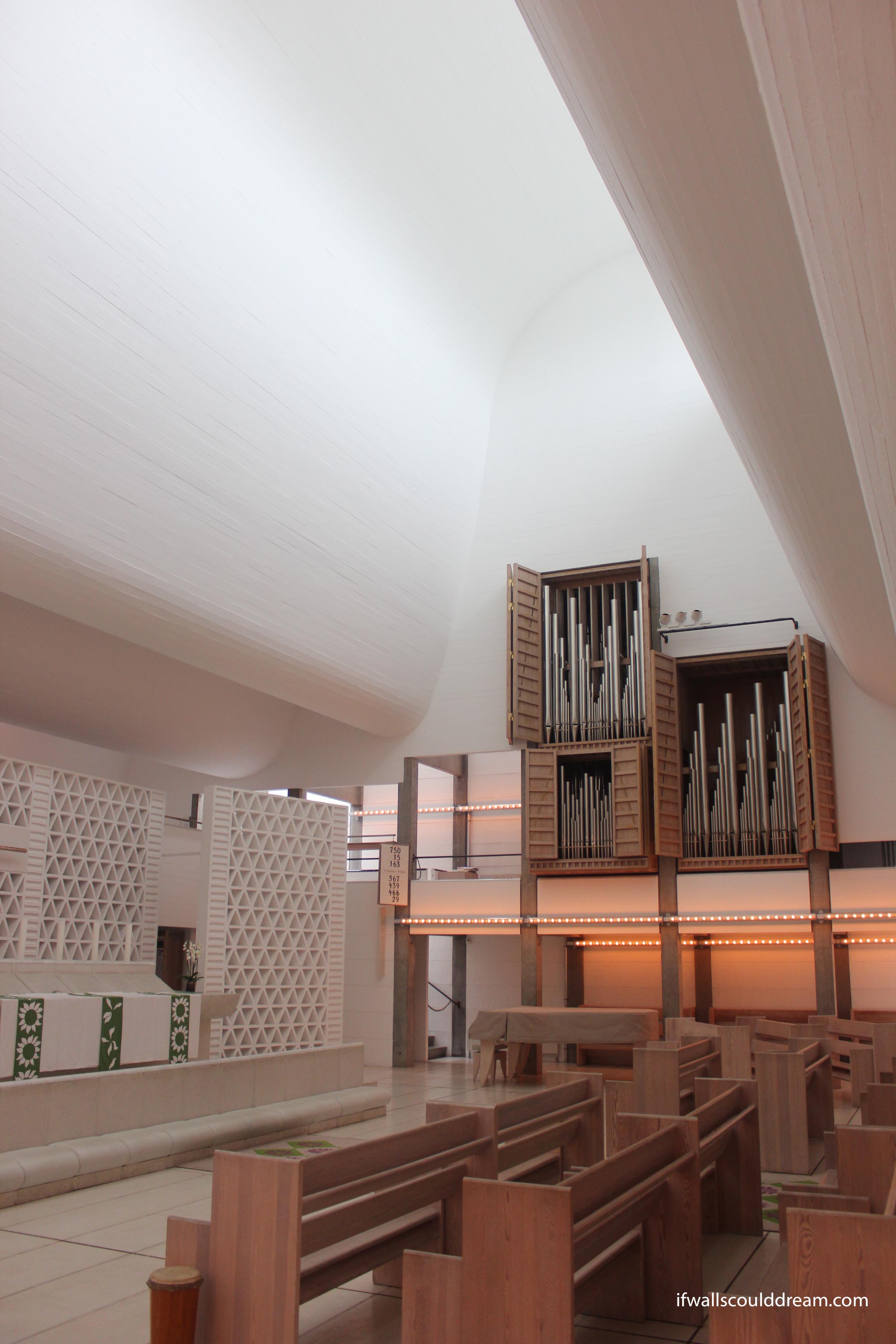
After walking through this beautiful hallway, I made my way into the main space. This has the famous Bagsværd ceiling. Utzon was inspired by clouds at the beach to make these forms but they work very well to softly reflect light into the space. It was so interesting seeing such a modular and rectangular building with such an organically shaped roof but it totally worked. Utzon uses materials very honestly and doesn’t hide how things are made. The concrete ceiling shows its wooden formwork and the concrete columns are left unpainted.
 The lighting quality of the ceiling was just incredible. Even on a slightly overcast day like this, it was well lit inside. On short winter days when services are before sunrise, they have to rely on artificial light but aside from that it works very well.
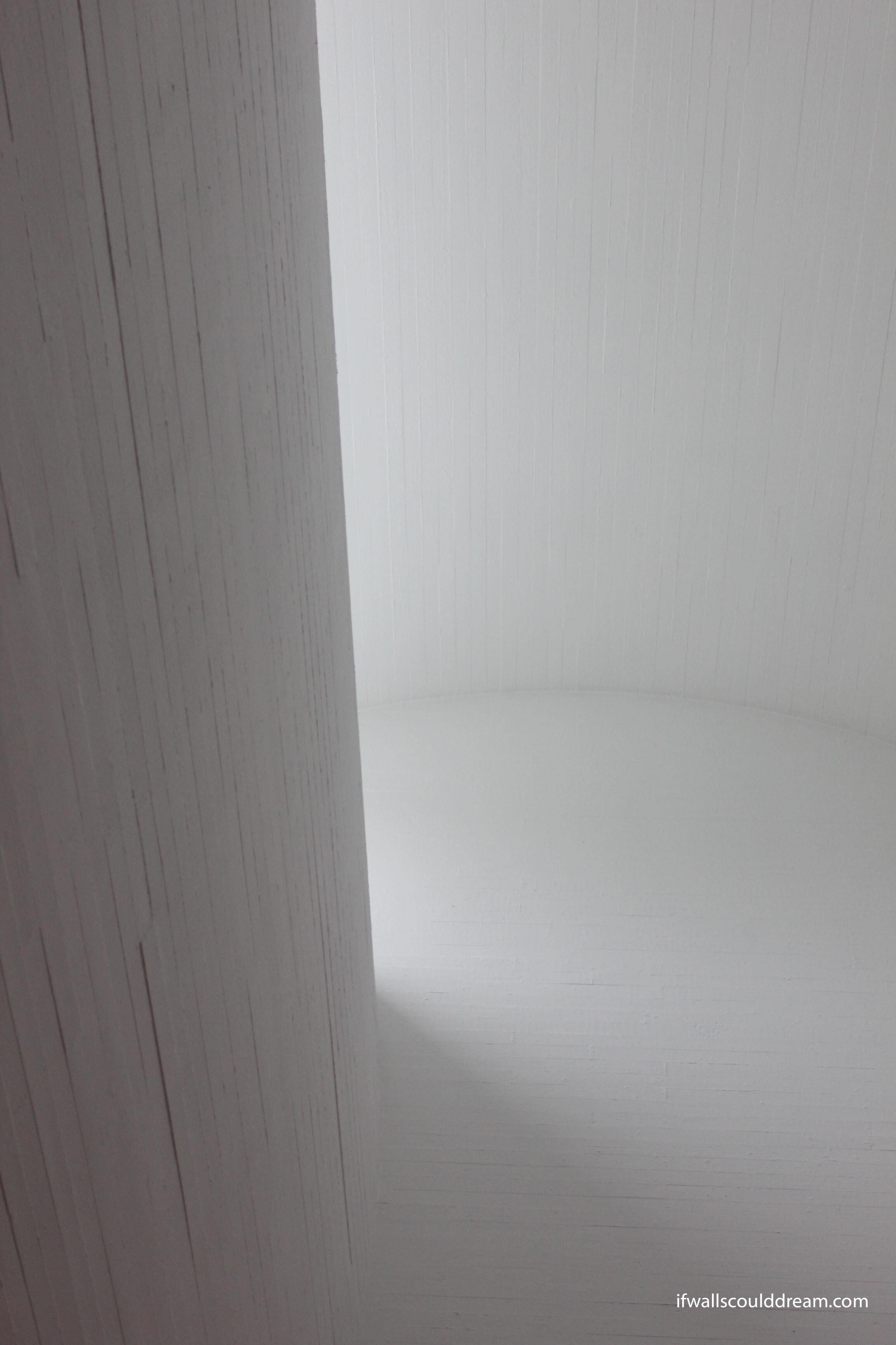
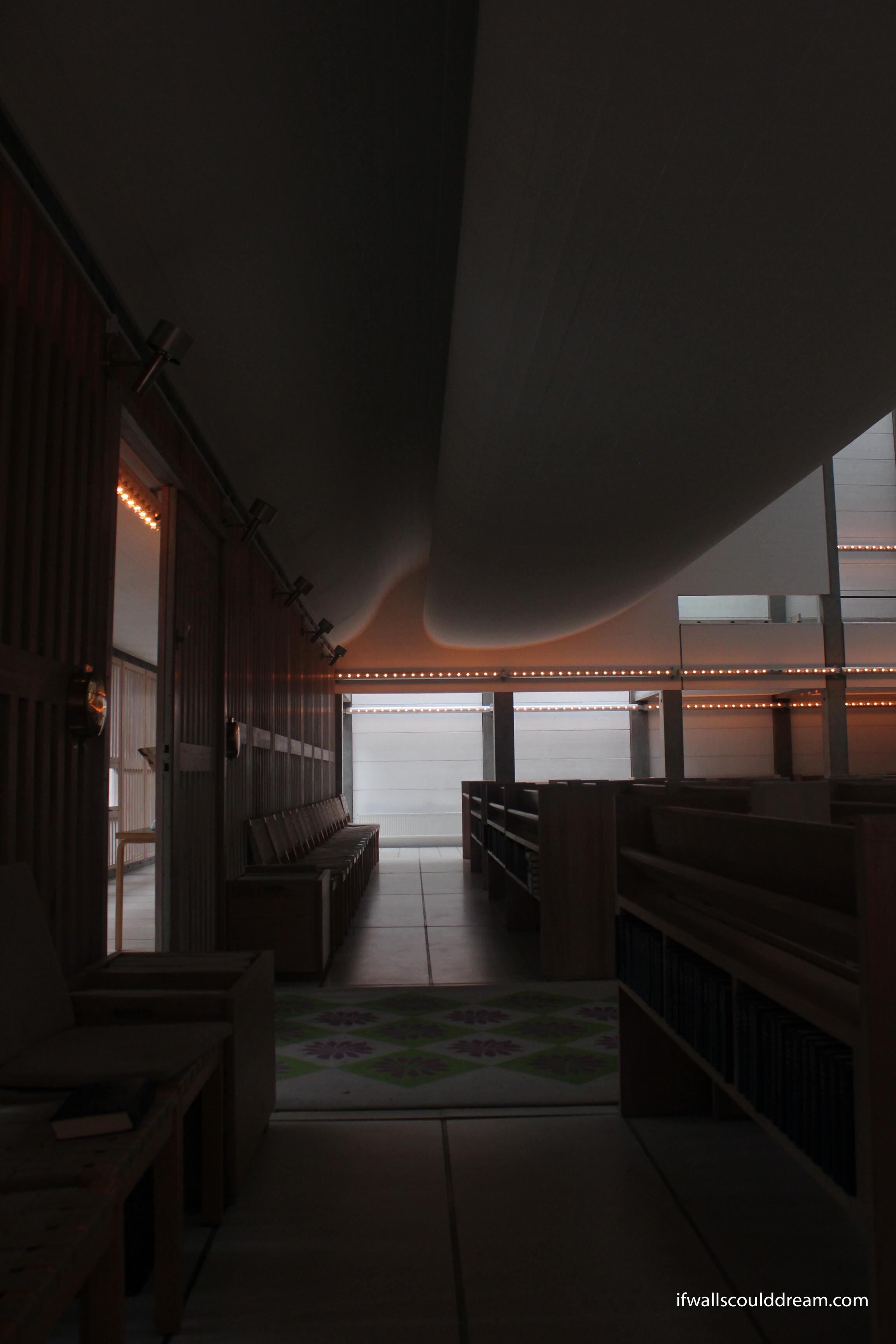
If walls could dream… they’d dream of the ceiling in Bagsværd church.
