Category Archives for Travel

Seona Reid Building by Steven Holl

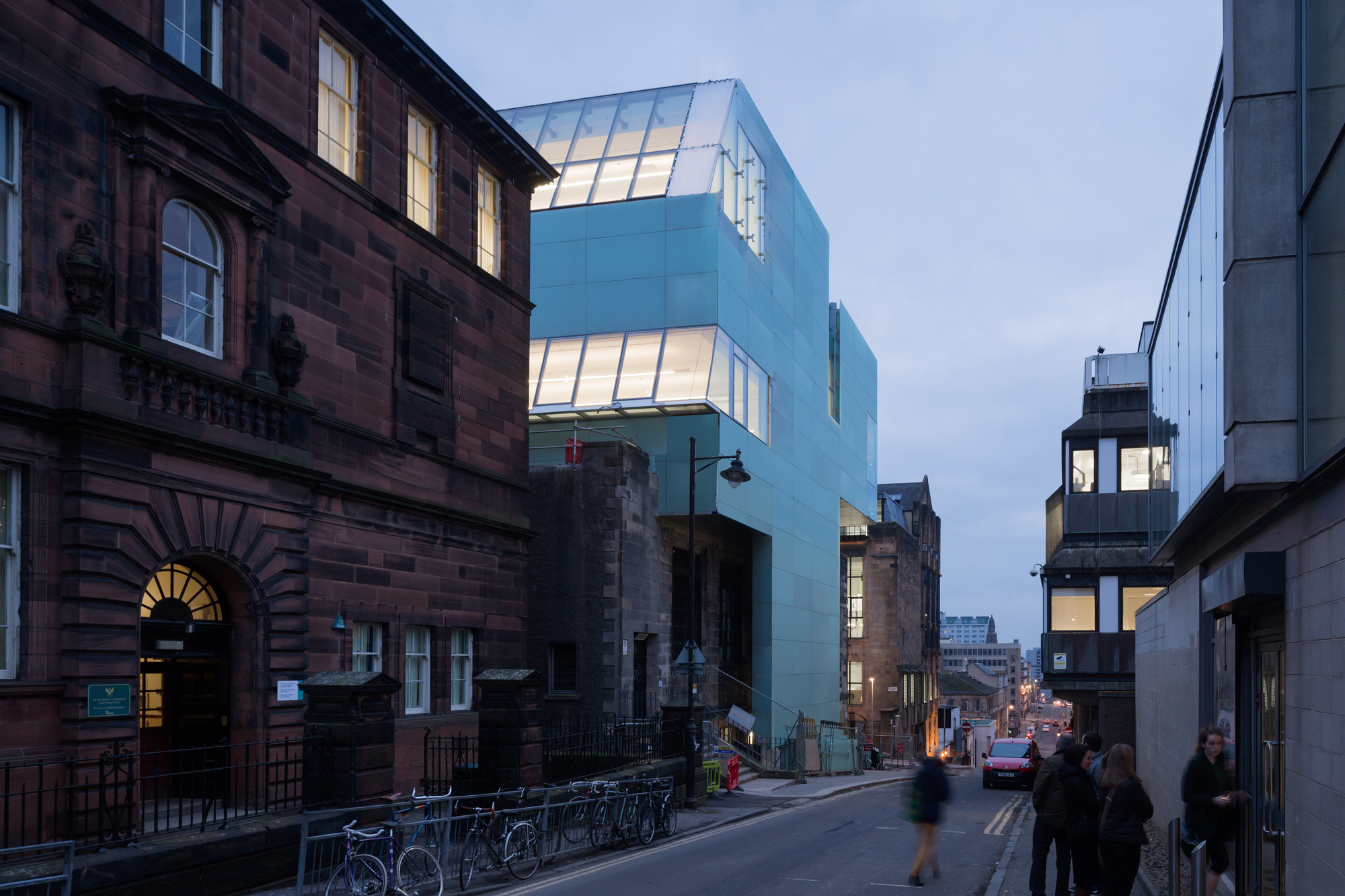
I did a research project on Steven Holl’s Glasgow School of Art Seona Reid building for school. I love how Holl uses light and watercolor to inspire his design and how it responds to the traditional buildings around it. I am excited to go visit the building when I am studying abroad. 
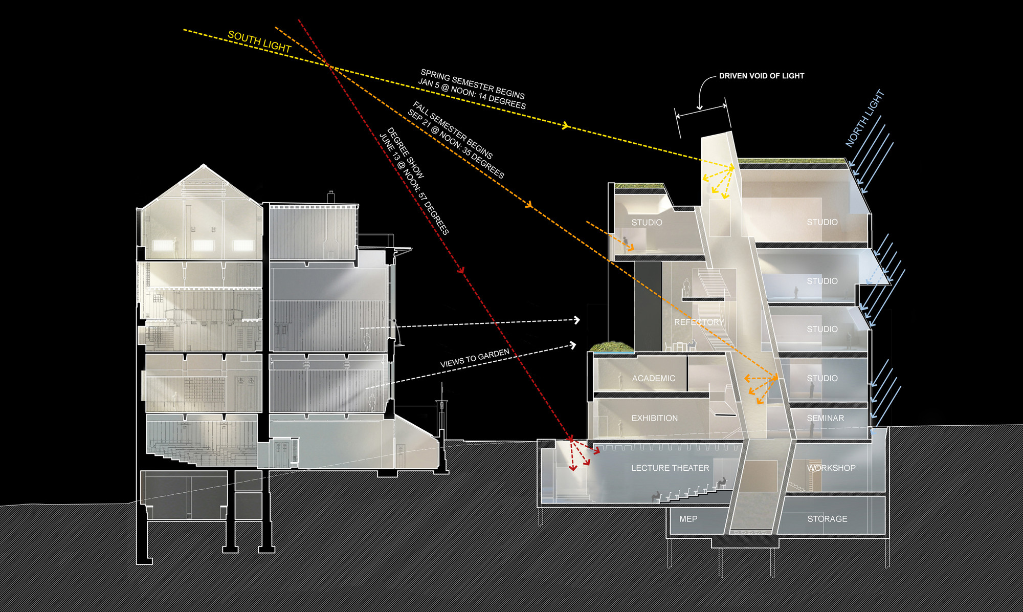
Image from ArchDaily

The most important thing about this building is its relationship with the Mackintosh building, a historic building also owned by the Glasgow School of Art, across the street. Holl was inspired by the Mackintosh, especially the way it brought light into the library. Sadly, the Mackintosh building has been severely damaged by two recent fires.
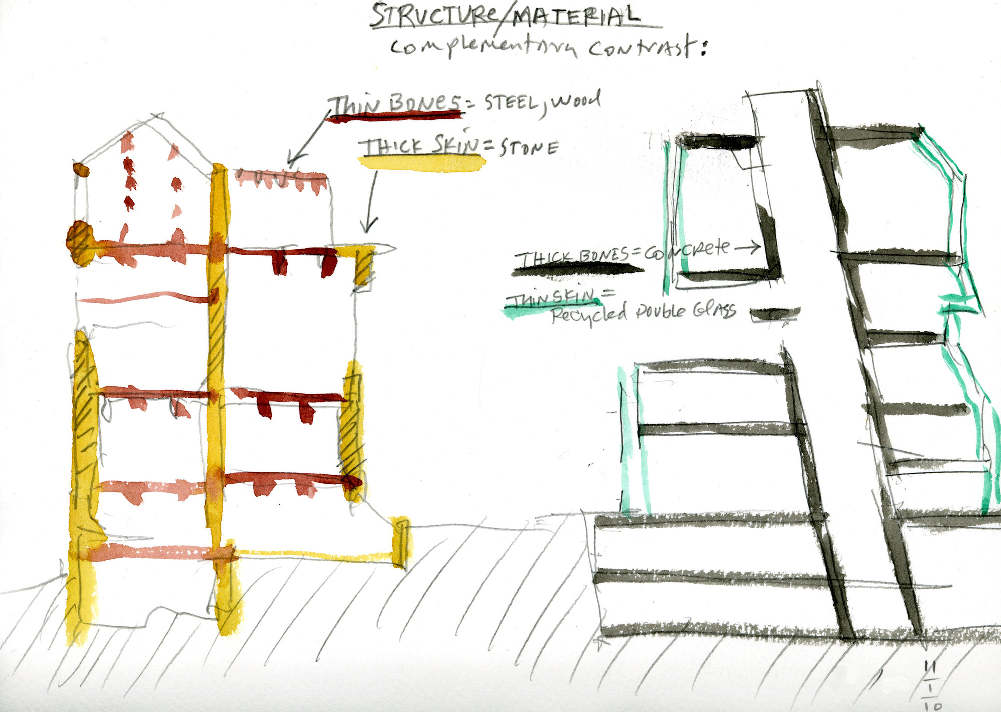
 

Watercolor by Steven Holl

The Mackintosh building has a thick, stone skin which doesn’t allow a lot of light in. Holl wanted to contrast that in his design, using a thick concrete core to hold up a thinner skin.
 

Watercolor by Steven Holl

Watercolor by Steven Holl

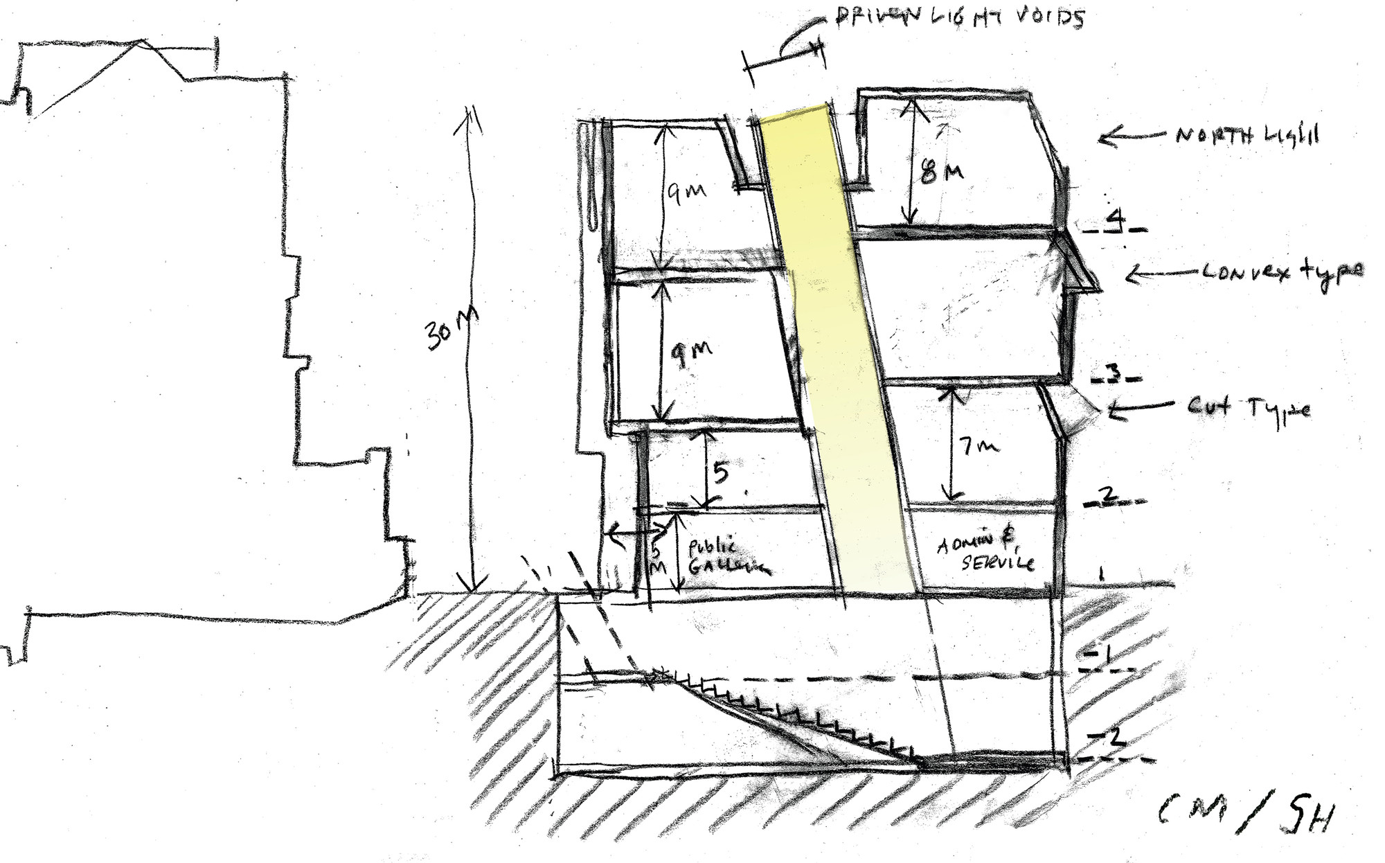
In a later sketch, Holl is thinking about the different size spaces in his building as well as different light conditions.
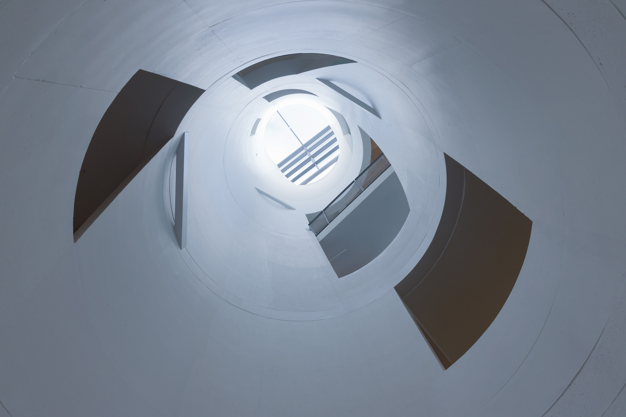
 

Image from ArchDaily

You can see in both sections above that Holl’s building has a large light tube or “driven void” as Holl likes to call it, which brings light all the way down to the basement. There are three along the length of the building. Various programs intersect the voids including studio spaces and circulation. This helps bring life to the voids and allows students to see what other students are up to.
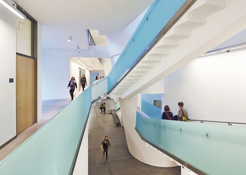
 

Image from Dezeen

The center of the building is very open, allowing students to see friends passing by.
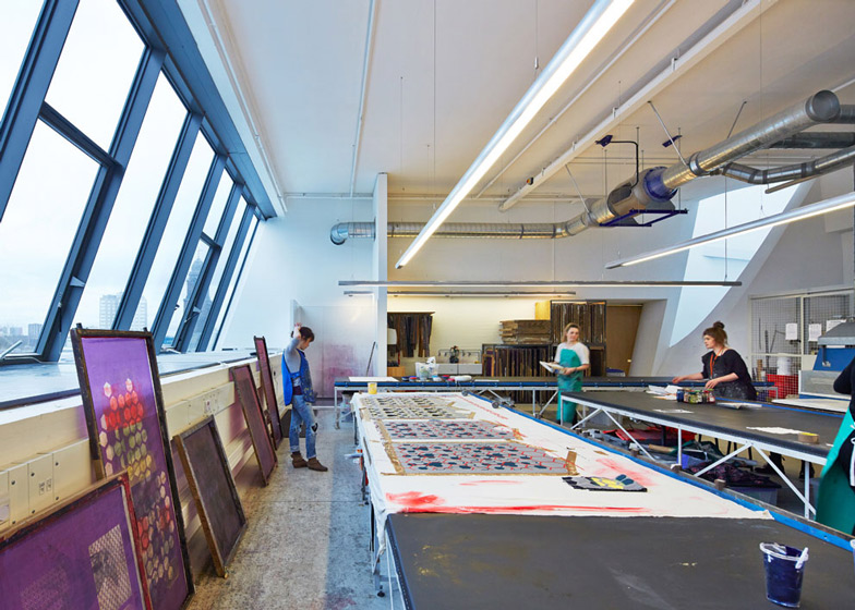
 

Image from Dezeen

The studios all have wonderful natural light and generous ceiling heights for the art students.
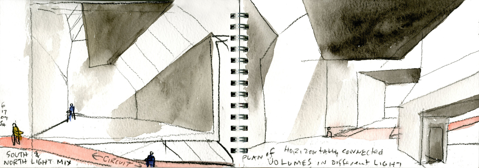
 

Watercolor by Steven Holl

Like all of his project, Holl created beautiful watercolor sketches about his concepts. Watercolor is the perfect medium for Holl to express his ideas about the quality of light in his spaces.
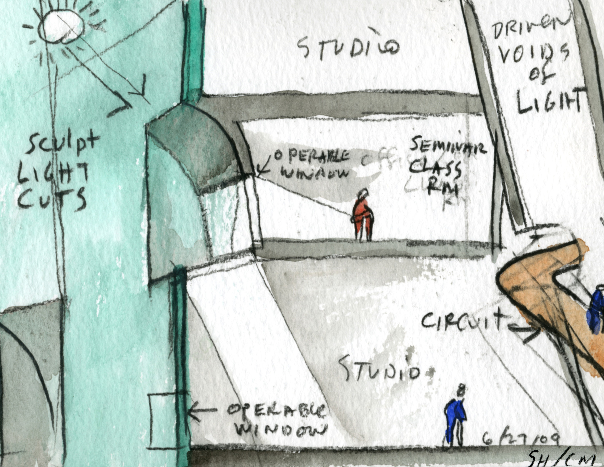
 

Watercolor by Steven Holl
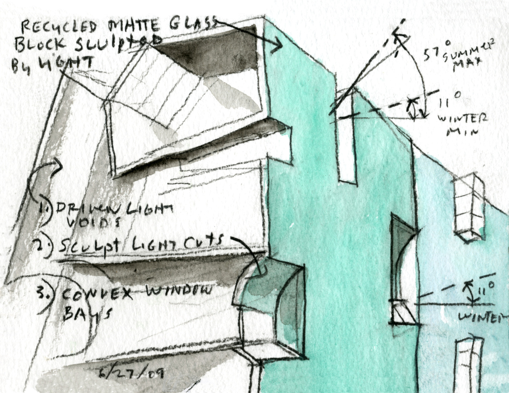
Watercolor by Steven Holl

Watercolor by Steven Holl

Watercolor by Steven Holl

After being sufficiently inspired by Steven Holl’s watercolors, my partner and I set out to make some diagrams of what we had learned about this building.
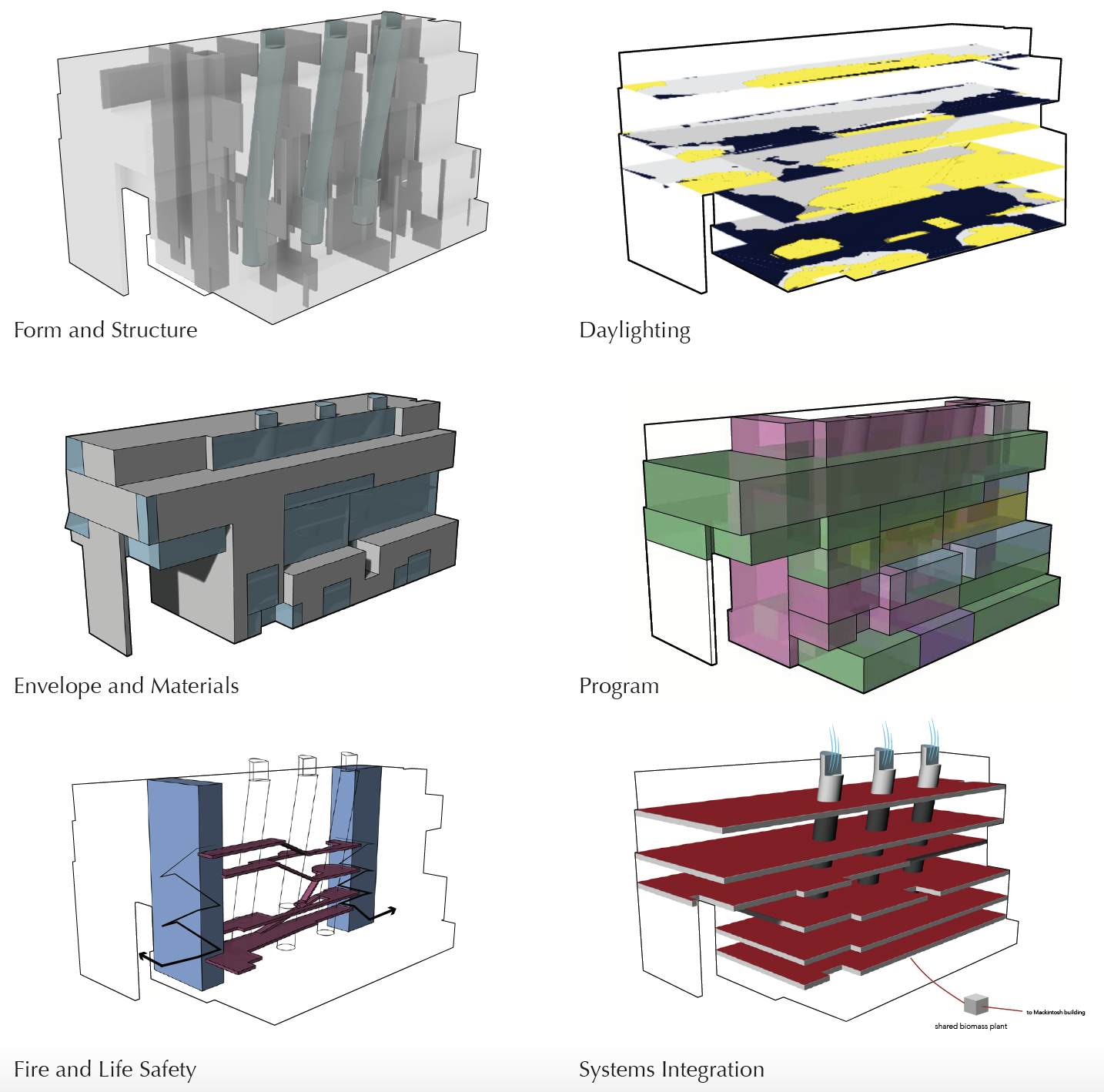
 

Glasgow School of Art Steven Holl diagram

Diagrams of the Glasgow School of Art Seona Reid Building by Steven Holl

After researching the building, my partner and I created these diagrams to understand the systems in the building and their relationships to one another.
 

Glasgow School of Art Steven Holl diagram

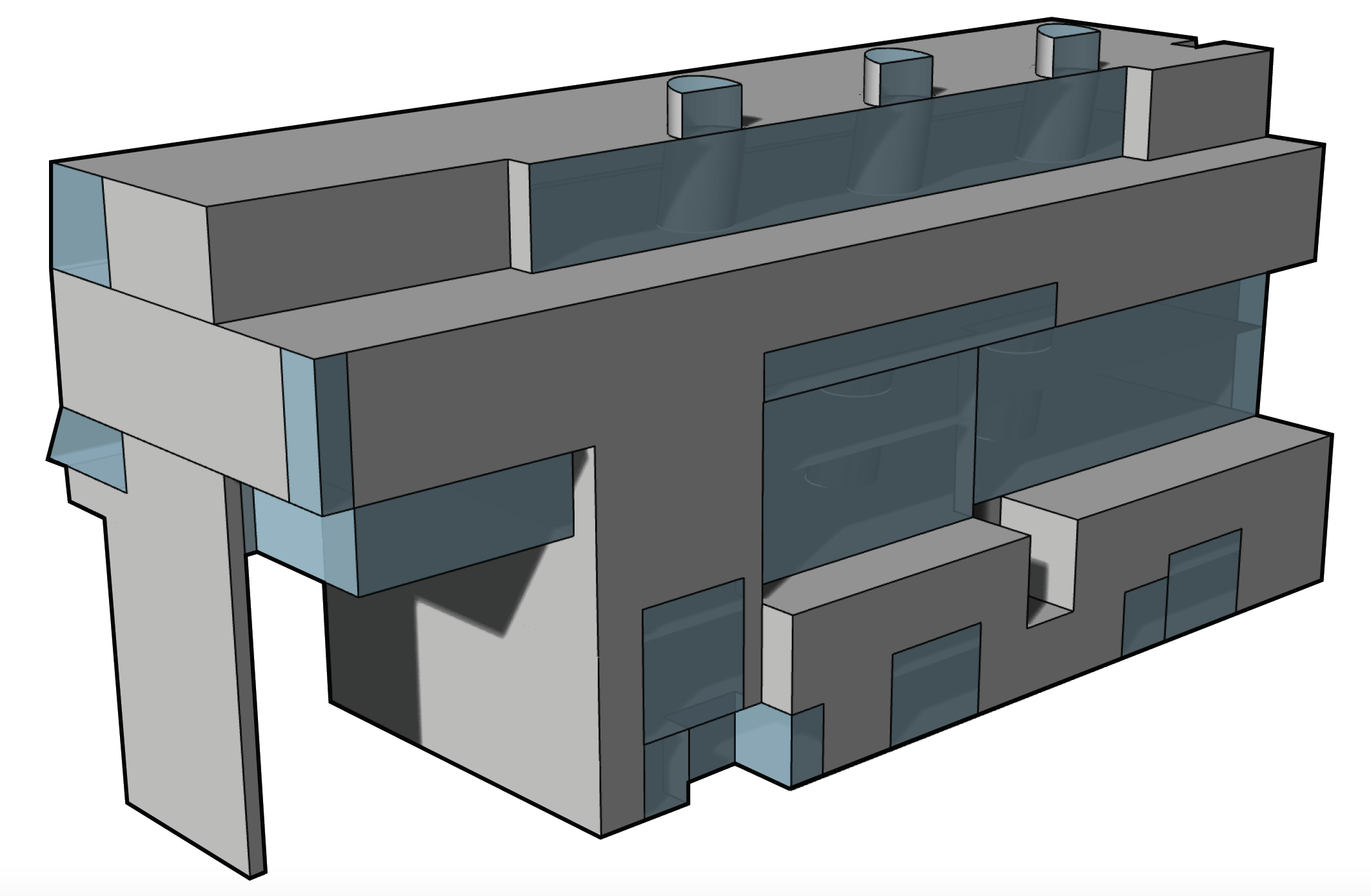
Mass/Glass diagram

During the day, the exterior of the building looks a uniform blue, almost the color of the overcast sky in Glasgow. However, at night the windows inside light up, exposing the mass/glass relationship. The fenestration is extremely thoughtful, some windows are for views of the Mackintosh, others for distinct lighting qualities.
 

Glasgow School of Art Steven Holl diagram

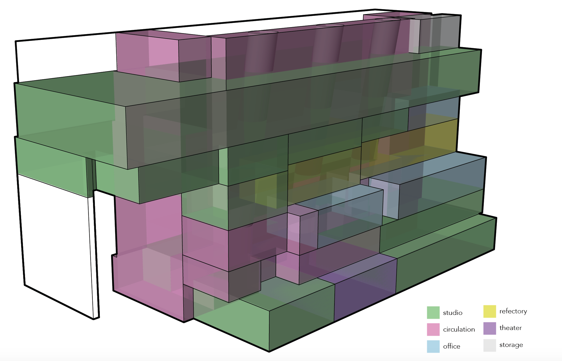
Program Diagram

The building is used primarily for studio space for the Glasgow School of Art. It also has a theater in the basement and some office spaces. The refectory on the third floor looks out at the Mackintosh building.


For more information about the Seona Reid building, check out the ArchDaily and Dezeen pages about it as well as this interview with Steven Holl Architects.


If walls could dream… they’d dream of Steven Holl’s beautiful watercolors.

Colorado Architecture

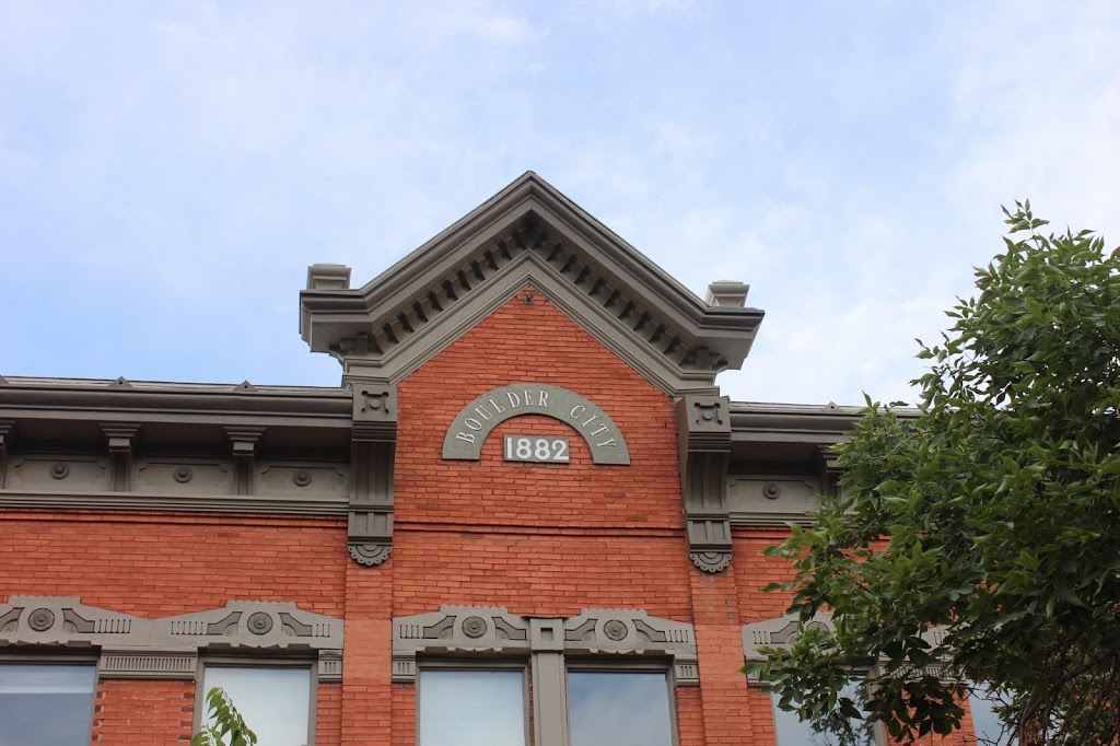
Boulder has some beautiful architecture, walking downtown Pearl Street is a must but you can see lots of cute houses just by driving around town.
Visitors Center

Old Dining Hall building

Houses on Pearl Street

Unique office building on Pearl Street

Denver has a great mix of more modern skyscrapers and smaller brick buildings with a lot of character. One of my favorite parts of the city was Larimer Square.


New York or Denver?

Beautiful modern fenestration
And of course, I had to make the pilgrimage to Libeskind’s Denver Art Museum.

The details on the outside were exquisite
and the lighting on the inside and the layering of space was breathtaking.

Another cool building in Denver is REI. It’s a historical railway building that was converted.

 
Denver had it’s fare share of unique buildings as well, including this milk-pail icecream shop (with THE BEST icecream! Totally worth the wait!) and this unique house entryway.

I ended my time in Colorado with a concert at Red Rocks Amphitheater. 
Not only are the rock formations themselves amazing, but so is the way the architects seamlessly integrated the built elements to make the venue functional.
If you look closely at the upper left you can see the Denver skyline.
The backdrop of the stage is a natural rock formation that the lighting designer can project lights on during the show to create different looks.

If walls could dream… they’d dream of being in Red Rocks.

Portland Architecture

Although Portland isn’t particularly known for its architecture,  there are still some remarkable buildings there and lots of cute houses to oogle over while you’re driving around.

A building downtown Portland.

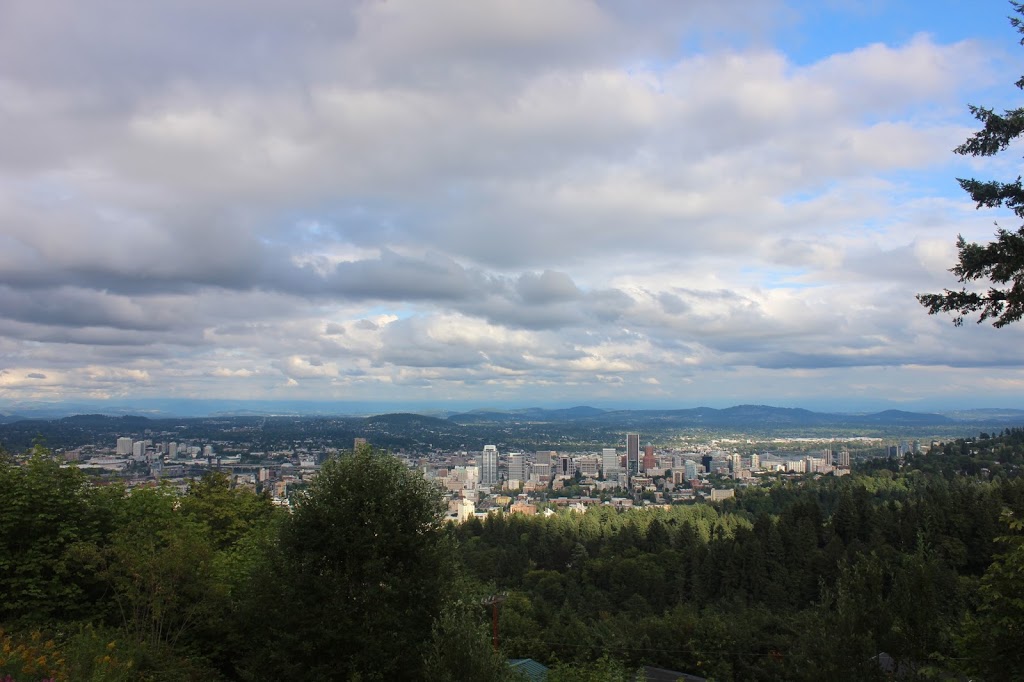
I visited the Pittock Mansion and although I didn’t get to go inside, the exterior was elegant and the view was amazing. 

So many plants! Oregon definitely is not in a drought.

What Portland lacks in buildings it makes up for in bridges!

View from the Portland Aerial Tram.
A short drive from Portland is the Mt. Angel library by Alvar Aalto – it’s a must see if you’re in the area because it’s just as beautiful, peaceful, and intricately detailed as it looks in the pictures.

If walls could dream… they’d dream of exploring a new city.

Hearst Castle

Yesterday I visited Hearst Castle for the first time. I was blown away by the estate, designed by Julia Morgan in the 1920s. The amount of detail in every aspect of the design was incredible. Every tile seemed like it was hand-selected.
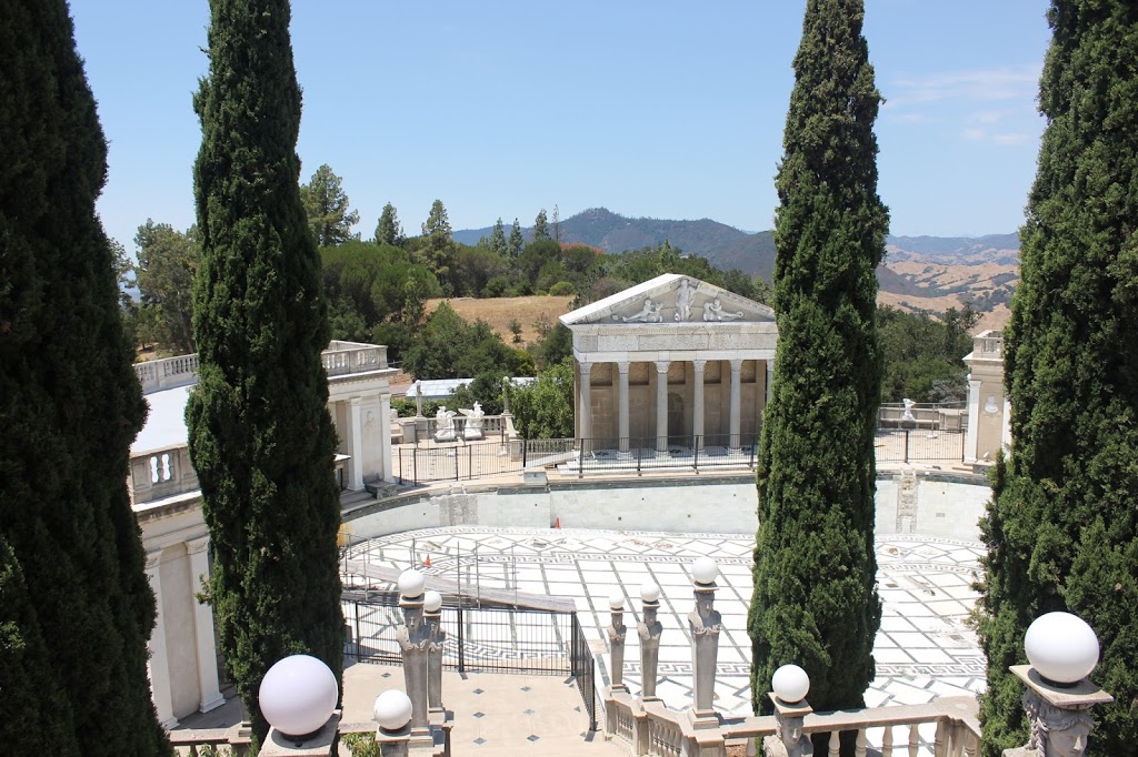
The Neptune pool was closed for renovations but it was still incredible to see. My tour guide described how Julia incorporated antique and replica sculptures into the architectural decoration.
There are a number of guest houses on the property that surround the central Casa Grande.
They all have exquisite views of the ocean and immaculate gardens.

The tile work also really impressed me. Julia Morgan is known for designing her own tiles for projects and I loved the contrast between the blue and white custom tiles and the red terra cotta tile.

This is one of the towers in the Casa Grande. The two towers peek in and out of the trees as you approach the castle.

The front facade of the Casa Grande. It has a mix of styles and looks almost like a European cathedral.

The inside is just as beautifully decorated. Hearst loved antiques and art.

My favorite room was the Roman Pool. I had seen pictures of it before but to be there in real life was magnificent. The blue tiles sparkle and the water is perfectly clear. My favorite part is the cantilevered diving platform that adds depth to the space. If you ever have a chance to visit Hearst Castle, I think you should go just to see this one room.
If walls could dream… they’d dream of traveling back in time at Hearst Castle.

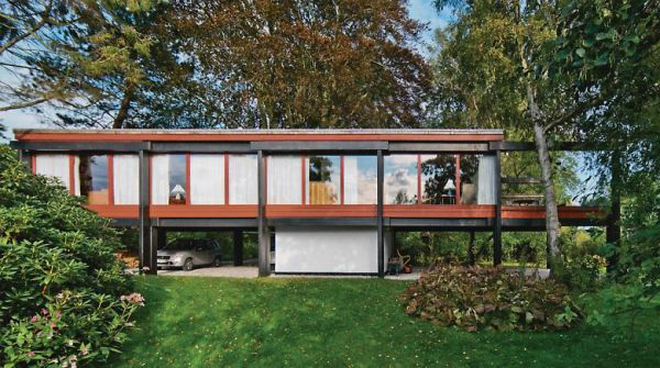
Middelboe House by Jorn Utzon

For a nice change of pace after Design Village, our next project this quarter was a research project about a house. I was assigned the Middelboe House by Jorn Utzon. Having dreamt about researching something famous like the Fisher House or the Robie House, I was a little disappointed at first by this obscure Nordic home.

However, as I researched this house I started to fall in love with it. Utzon is best known for being the architect of the Sydney Opera House (below left) and has done some remarkable work throughout his career. In this house, he really experimented with materiality and structure in a modernist grid. The columns and large glass walls are reminiscent of Mies’ Farnsworth House (below right).
Our assignment was to diagram every aspect of the house – structure, program, circulation, etc. – in order to understand it and then we presented our research to our class.
I started by looking at the program (the arrangement of the different living spaces) of the house. The diagram above simply labels each room in the house. The first floor plan is on the center left and the second floor plan is on the center right and the four elevations are arranged around them. (You can click on the diagram to see it larger and zoom in.)
This diagram color codes the outdoor, living, bedroom, and bathroom zones in the house.
And then this one gives a 3D view of the three main zones of the house: outdoor, sleeping, and living, and how they fit into each other like a puzzle.
Next, I analyzed the structure of the house. Utzon highlighted structure in his design, color coding it himself. The black elements are concrete beams and the red is the secondary wooden structure. The house was inspired by Asian construction techniques and relies on gravity instead of nails and screws to hold the house up.
This section diagram shows that black and red structure that Utzon displayed so proudly in his house.
This diagram builds on the black and red structure to categorize all of the walls in the house.
This next set of diagrams illustrates the house’s relationship to its site. It is located next to a canal in Denmark which provides a beautiful view but also a privacy concern. Utzon addressed this concern by moving the bedrooms to the back of the house, away from the river to give them privacy. He also sited the house in between the two large trees on the property for shade and added privacy.

The circulation through the house is all focused through the central stairwell and then up into the living spaces. This was my favorite diagram to make and I’m really proud of the way it turned out.

Finally, I made a collage diagram of what it would be like to be inside my house (see Mies’ collages for inspiration). I used the Rhino model I had made to get the linework for the interior perspective and then added the landscape through the windows. I chose to leave the interior white to focus on the view and the shapes that the structure makes with the windows – even though they are all rectangular openings, the perspective and the added beams create dynamic trapezoids.

All in all, this project was a good change of pace and a good way to connect the dots between a very abstract yet personal experience of a dwelling with Design Village and the more conventional yet still architecturally advanced ideas of what a house is to famous architects.

If walls could dream… they’d dream of being in a famous architect’s masterpiece.

Architecture Around Europe

After traveling around Europe this summer with my family and being inspired by all of the amazing buildings there!
eiffel tower     Eiffel Tower structure
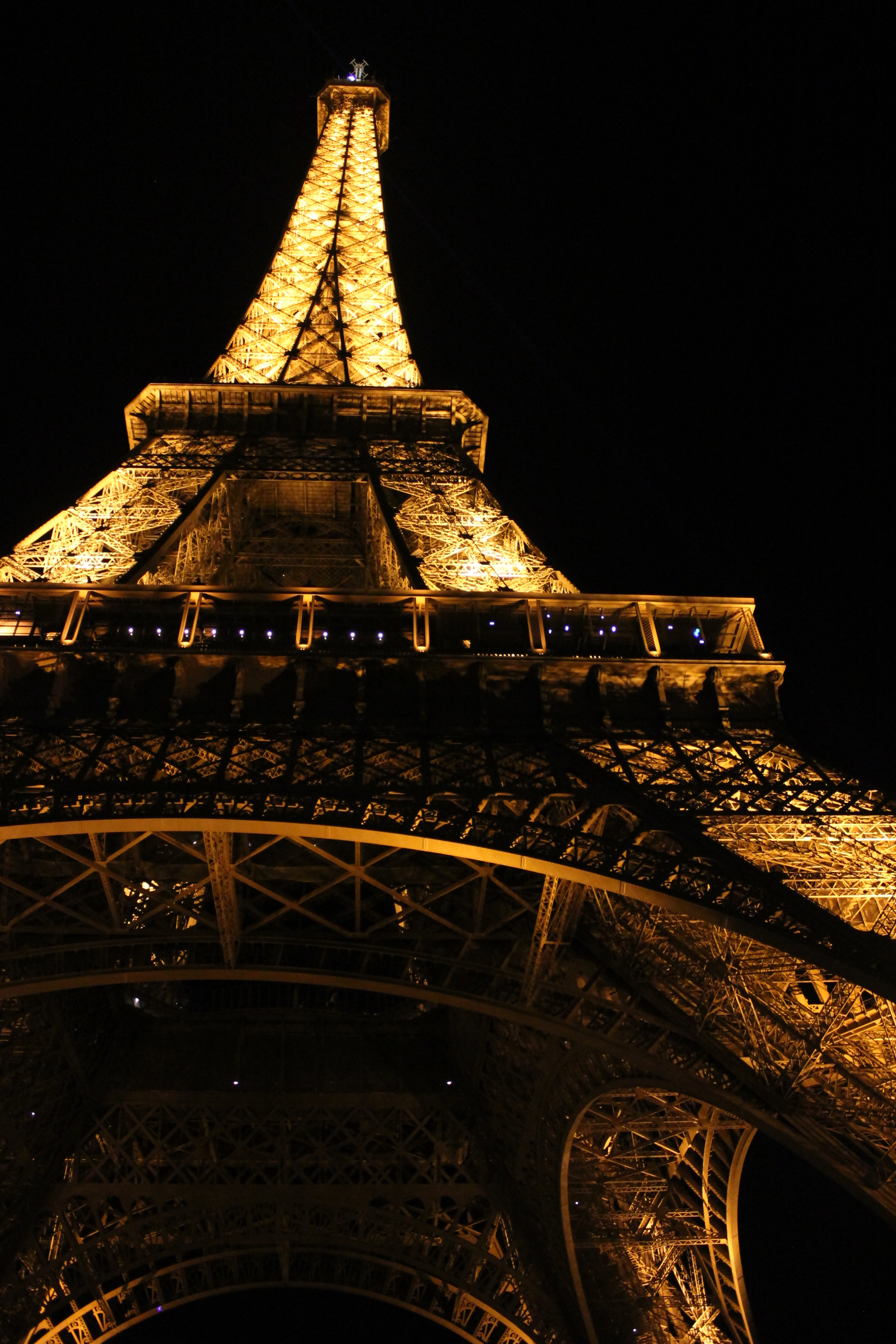
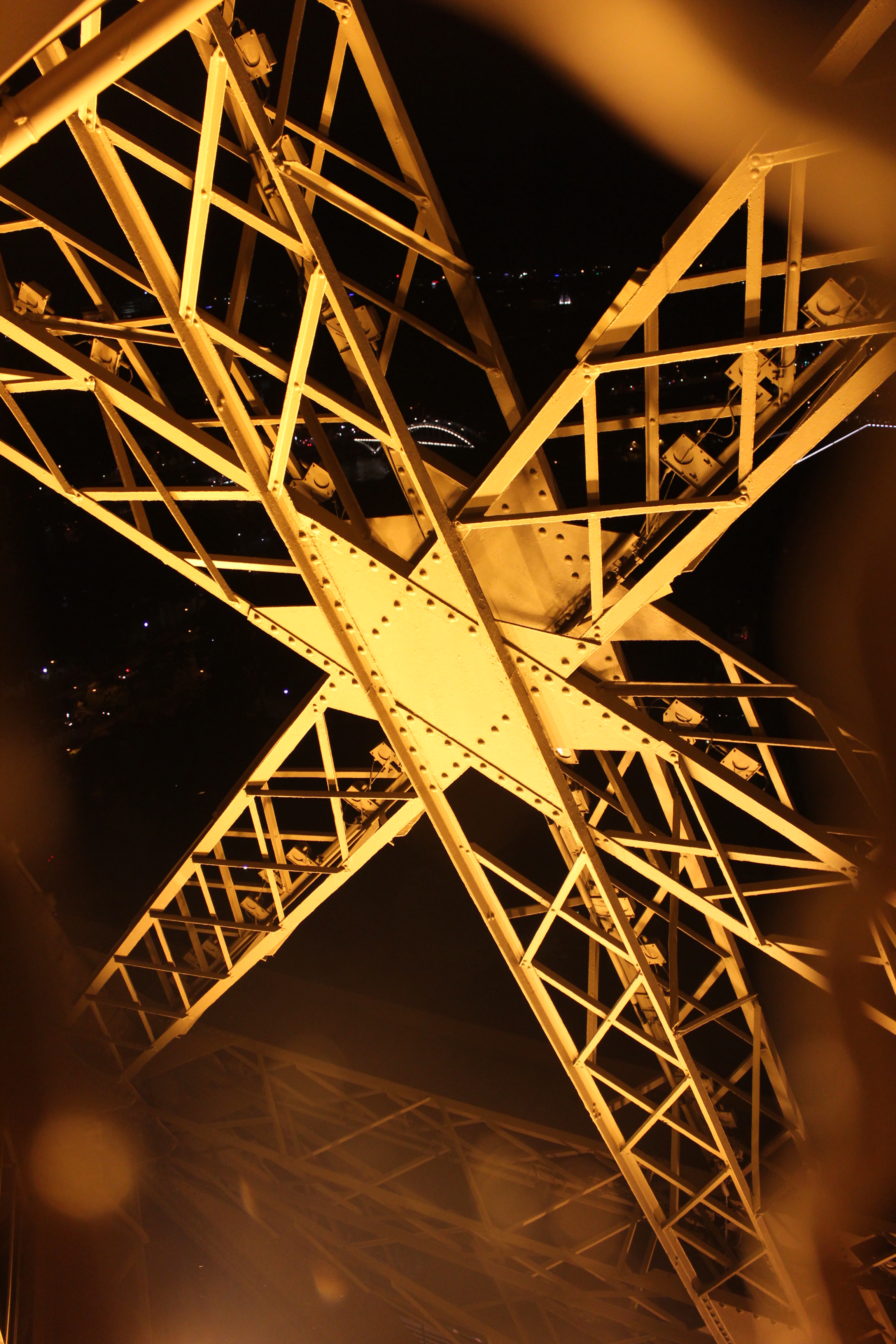
We started in Paris and got to see the Eiffel Tower, of course. We took the elevator up, explored the top, and then walked down the stairs. I would definitely recommend taking the stairs down because it is a great way to experience the structure and see it up close.
Paris Architecture Museum
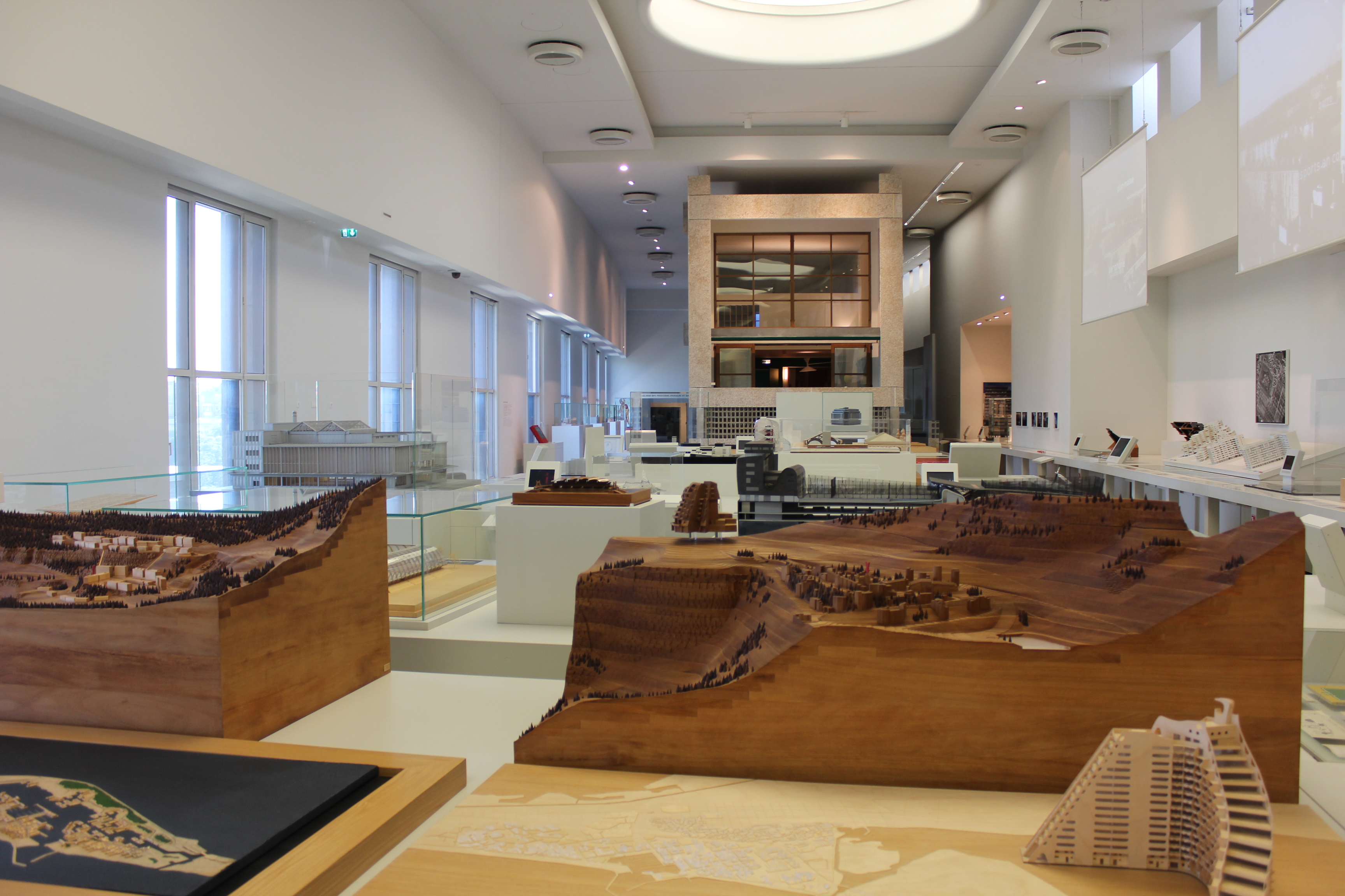
Another highlight of Paris was the architecture museum, Cité de l’Architecture et du Patrimoine. They had a bunch of famous models of buildings from all over France but my favorite was the life-size recreation of a unit from Le Corbusier’s Unite d’Habitation.
Colosseum in Rome
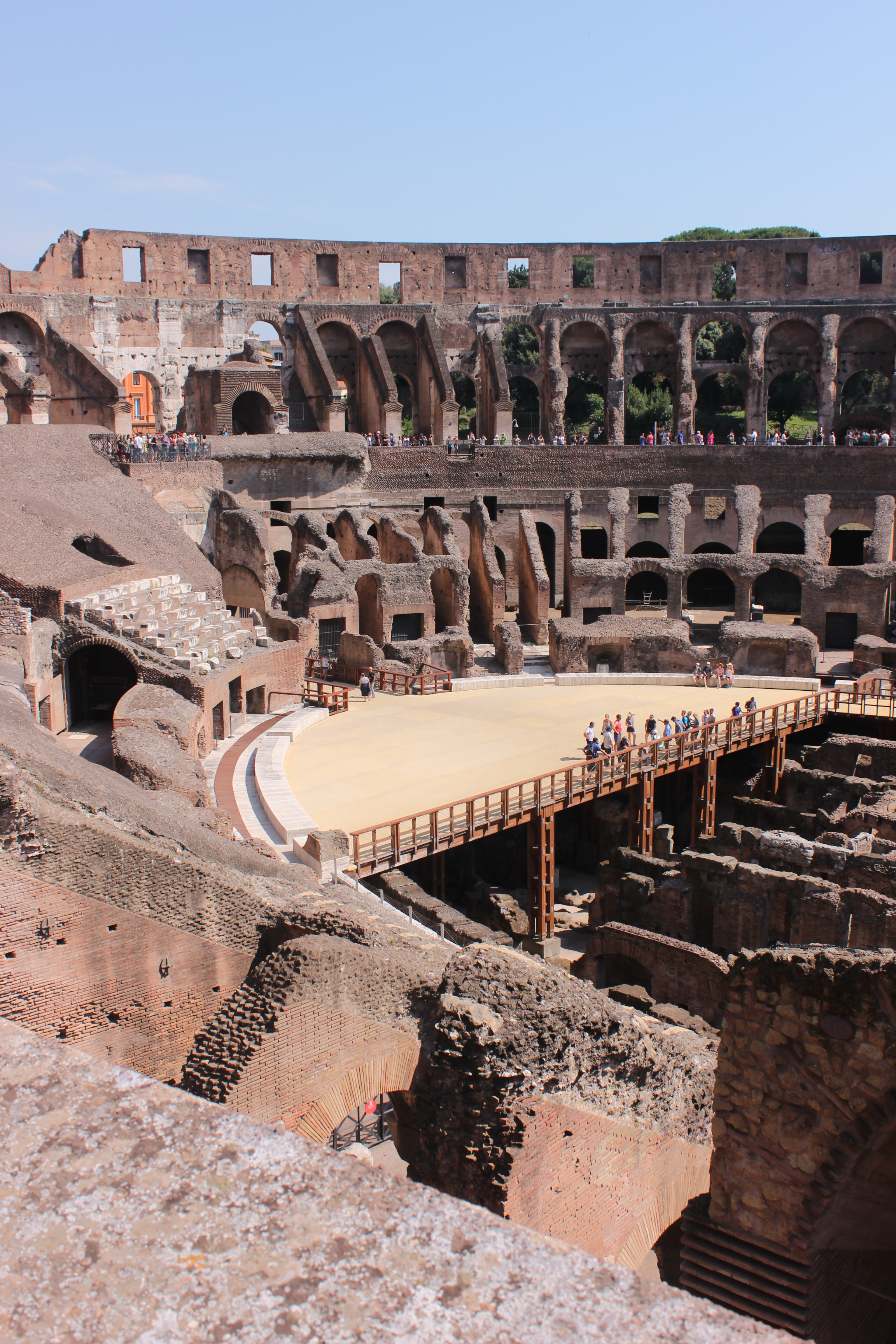
In Rome, of course we visited the Colosseum. It’s sheer size was marvelous to me, to think of the history there and how it has changed over the years.
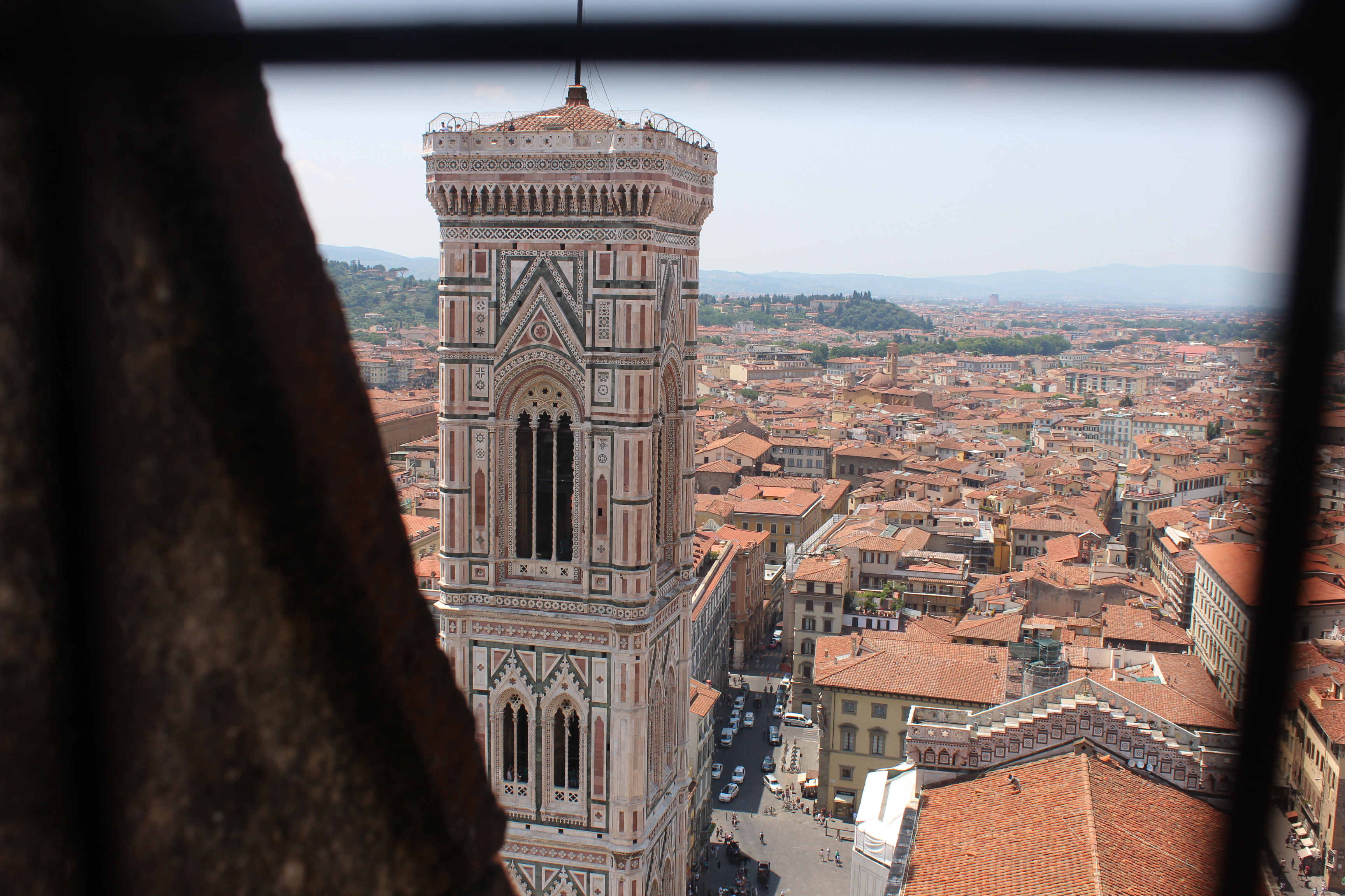
In Florence, in addition to seeing David, we visited Il Duomo. The decoration on the outside of the cathedral is so beautiful and as you climb up the inside of the dome, you get to see not only Brunelleschi’s incredible creation but also an expansive view of the red tile roofed city.
Venice, Italy
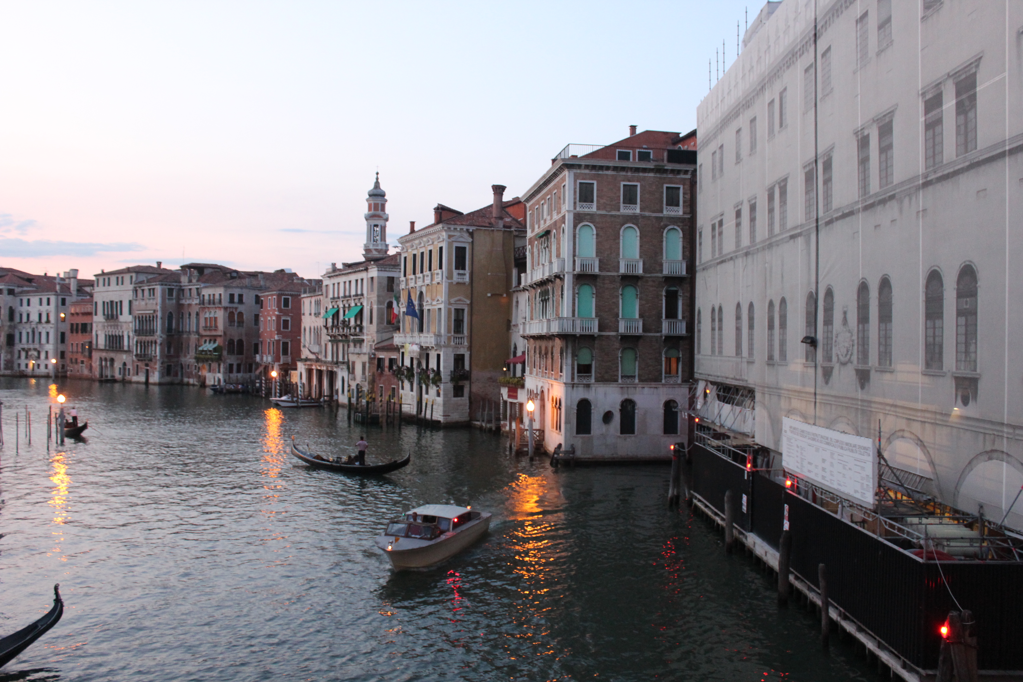
Venice was one of my favorite cities we visited. It is so walkable and unlike any other city I have ever been to because there aren’t any cars. It really transports you back in time.
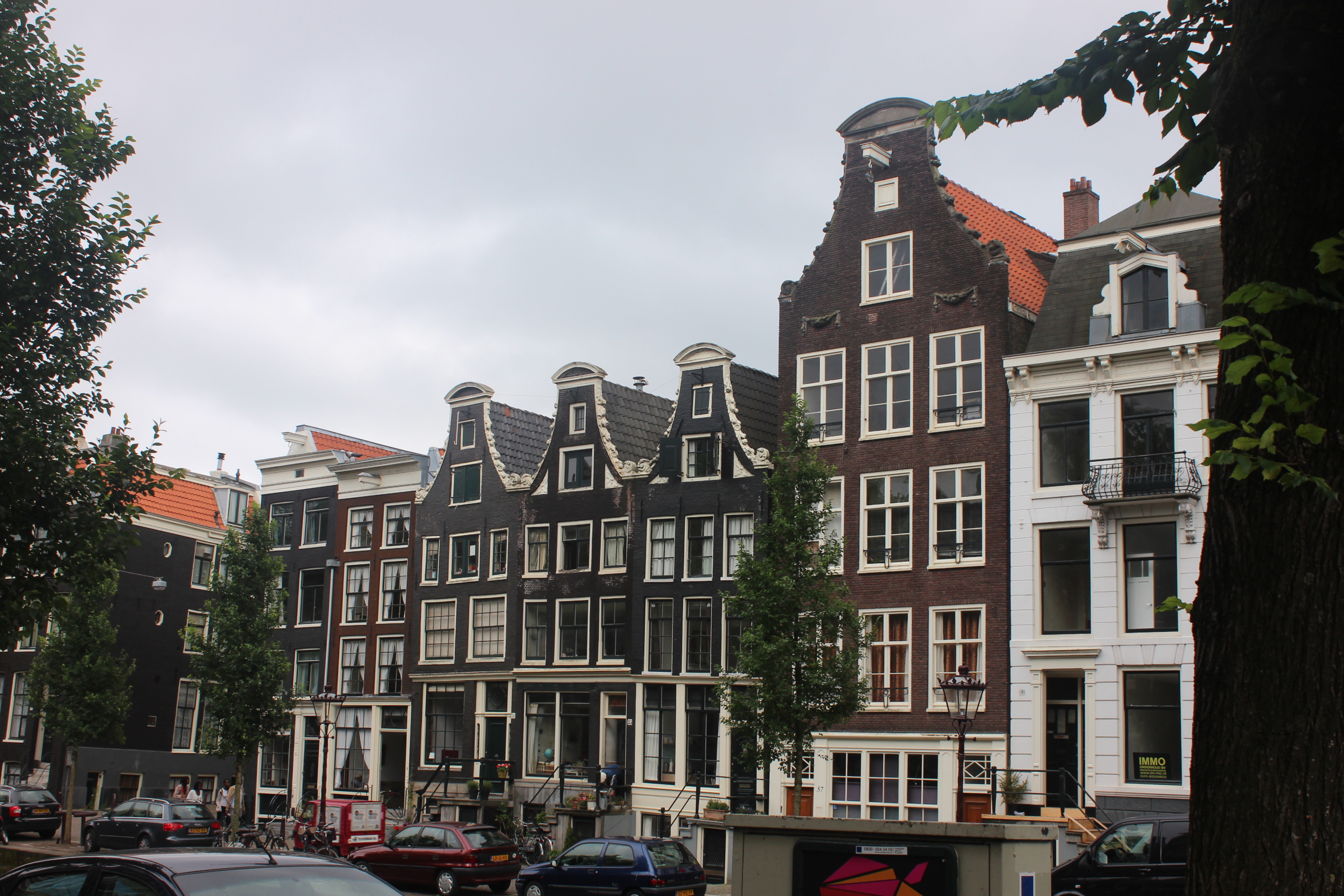
Amsterdam
Even though I was in Amsterdam for less than 24 hours, it was another highlight. I will definitely be going back. I loved the canals and the bikes. We got to tour Anne Frank’s house which was so moving. And the flower markets are beautiful.
If walls could dream… they’d dream of touring the whole world!

Visiting Cornell University: My Top 4 Things To Do

This past weekend, I visited Cornell University in Ithaca, New York. I had a wonderful time exploring the beautiful campus and learning more about their architecture program.

Here are a few tips for your own tour:

1. Visit the Johnson Museum of Art


The museum has a patio, a light-up roof, and a viewing tower.
Whether you’re more of an art-observer or an architecture-oogler…

Architectural detail of a two story floor-to-ceiling window.
you’ll love the view from the top! (And did I mention it’s free?)
Beautiful panoramic views of campus, Ithaca, and the lake.
2. Explore Ithaca!

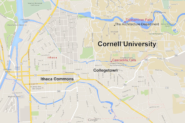
Ithaca is a rural town in the finger lakes region of New York. Cornell University is located on a hill to the northeast of town. Campus itself is divided into central campus (where all of the academic buildings are), north campus (north of the river, where freshman housing is), and west campus (down the hill on the western edge of campus, where upperclassmen housing is).
Below are two of my favorite “downtown” type places in Ithaca.

Collegetown is directly south of campus and has many great places to eat. I’d totally recommend Collegetown Bagels. Their chocolate chai blew my mind!

Collegetown
The Commons, under construction during my visit, has many more great places to eat. My favorite restaurant there was Waffle Frolic. Yes, just as the name implies, it is indeed an entire restaurant dedicated to the most delicious and inventive waffles ever.
Ithaca Commons
3. See Some Natural Beauty

To work off all the extra bagel and waffle-related calories you’ll be consuming while in Ithaca, take a walk to some waterfalls. If a “walk” in the cold New York weather sounds daunting, don’t worry. Triphammer falls can be seen from your car as well as from a footbridge literally on top of it. To get the true Cascadilla experience requires climbing stairs down into the gorge, but it’s SO worth it!
There are so many beautiful waterfalls in Ithaca, but these two are right on campus (see map above).
The top part of Triphammer Falls.

Cascadilla Falls

Cascadilla Falls
4. Get in the Classroom
Last but not least, it is important to really investigate what it means to be a student at this university. For me, that meant attending an AAP (College of Architecture, Art, and Planning) Information Session and visiting studio. The information session gave me an opportunity to ask architecture-specific questions to an admissions person and get to know the requirements and expectations of studying architecture at Cornell. Visiting studio was one of the highlights of my visit at Cornell because, as an architecture student, I will be spending the majority of my time in studio. First of all, I loved how Milstein Hall being one giant room encourages so much collaboration and community between architecture students. Second, I got to sit in on a critique and really see how intellectually Cornell approaches design.

If walls could dream… they’d dream about art, food, and waterfalls.

Ghost Towns in Northern California

Last month, while camping with my family at Lake Davis, we took a day trip to two of the best ghost towns in Northern California, Walker Mine and Lucky S Mine.

First was Walker Mine. The drive was actually quite straightforward and the site safe and easily accessible, with a great view from the top. Directions (and some great historical photos) can be found here.
At the top of the hill is the entrance to the mine, complete with railcar lines, old railcars, and outbuldings.
One of the outbuildings was full of shallow boxes scattered about like the one pictured below.

It was only after we left that we realized that they were for rock samples like these I photographed.
Below the main buildings are other concrete structures that we assume were used to process the copper.

We had lots of fun wondering what these structures could’ve been used for, from a safe distance.

I was amazed at how the ruins had partially deteriorated and revealed hints about the construction, but still left us all guessing about the function.

For example, the walls of this overgrown structure were partially constructed out of random materials, hinting that perhaps they were building and growing so fast that they had to use scrap material instead of waiting for a shipment of new materials.
From there, we headed out for Lucky S Mine, unsure if we could even find it with the vague directions we had. But by using paper maps, cell phones, our car GPS, many hours driving down dirt roads, and sharp eyes, we finally found it! (Photo credit to my dad, below)
For most of the drive, all I saw out of my window was green and brown, trees and plants, the occasional cow. The only thing man-made was the trail itself and the occasional sign (usually just a logging trail marker). I’m searching the landscape as we reach the GPS coordinates, picturing some haunted strip of overgrown buildings, when suddenly, I saw something grey and angular, definitely not a tree – a roof.

There were two cabins and two outbuildings.
I was amazed, first of all, by the fact that there were such well-built buildings here in the middle of nowhere. Then, I was amazed by the craftsmanship of the buildings, which their abandoned deterioration only exemplified. The fallen ceiling beams made you more amazed that the roof was still standing.
While amazed with this mini neighborhood, our directions promised us at least 7 buildings, one of which a 3 story hotel, so we continued our search. We continued toward the GPS coordinates and found a shed labeled “Caution: Explosives” and a steep dead end road. We assumed that we were not going towards the town, if there even was a town, and turned around. Following a small road around the cabins we found earlier, we were suddenly greeted by 3 more buildings and a number of outbuildings.

And, yes, there was a 3 story hotel!

In addition to the buildings, there were artifacts everywhere, including furniture in the houses and hotel.
My favorite was a sled.
Sadly, many of the artifacts had been used as target practice over the years.
Next to the hotel was a slanting building we assumed was a saloon or kitchen/mess hall.

Towards the end of our time at the ghost town, a truck pulled up and its driver introduced himself as a member of the family who had just purchased the land the town sits on. He was very kind in answering our questions about the town and explaining that they intended to do their best to preserve this amazing little town for generations to come.

If walls could dream… they’d dream of outliving their residents.

Map of Architecture Colleges

As all “visual people” would know, the NAAB (National Architecture Accreditation Board) list of architecture colleges is not very helpful in understanding where these schools actually are, so I created this interactive Google Maps map of all of the accredited BArch programs in the US. Now we all can easily visualize the locations of the schools as well as start to learn about the climate and the town around them to help simplify our college search.

Old Town Sacramento Street Raising

Just blocks from the urban hustle and bustle of modern Sacramento, Old Town Sacramento seems to be frozen in time. Once you finally get a parking spot, you are enchanted by railroad cars, horse-drawn carriages, and, of course, beautiful brick buildings. And though it may seem like this is the original Sacramento, that is not the case. The original Sacramento is nine feet under ground.
At the start of the Gold Rush, Sam Brannan opened a store on the Sacramento River. This waterfront location was great for business, but prone to flooding. The settlement that grew around his store became Sacramento.
Without much lumber from trees, the gold rush town of Sacramento was built out of abandoned ships, like the Eagle Theatre building. The frame was made out of wood and the walls were made out of canvas from the sails. The entire town was built like this in the early days.
The town grew and more permanent buildings were constructed. However, flooding was a big problem. In January of 1862, a huge storm plunged all of California’s Central Valley underwater. In 1862, you could sail from Sacramento to Bakersfield. However, this flood did create the rich farming soil the Central Valley is known for today as well as spur the town of Sacramento into action.
There were three camps of thought on how to save Sacramento: reroute the river, build a bigger levee, and raise the town. They all won in their own way. The river was rerouted with the help of some “volunteers” from the prison. The railroads built levees for Sacramento, with the condition that they could put their rail lines on top of them of course. But my personal favorite is the raising of the town. Hungry for more information about it, I went on the Historic Old Sacramento Underground Tour. And next time you’re in Sacramento, I’d advise you do as well.
Following our time-period-accurately-dressed tour guide Rose, wearing our not-so-time-period-accurate-headsets so we could clearly hear what she said, we headed out on our tour. We went to two different basement areas where Rose described the businesses that were originally there and how the streets were actually raised. (Pictures weren’t allowed underground, but you can find some in this document about the street raising project here
The basements had dirt floors with a wooden path to walk on and smelled very musty. You could hear the floors creak from people walking on the floor above you. It was very well maintained, though, and almost like a museum with photos and artifacts on display. The first underground space was the basement of B.F. Hastings & Co, which used to be a bank. The second space used to be three apartments.
A quick side note – ever wondered why some old buildings have giant metal shutters on their windows? Well according to my tour guide Rose, they were for if a fire were to come through town, you could lock yourself in your brick building and the fire couldn’t get to you. Which was good because most of the fire escapes are made of wood like the one on the left so you couldn’t get out during a fire anyways. Good thing you can stay out of the flames sealed up in your brick oven of a building!
When raising the streets, they started with the streets themselves, building brick walls where the sidewalk met the street on each side and filling the street area with dirt until it was level with the second floor of the buildings. The owners of the buildings then chose whether they wanted to rework their building so that the second floor was now the first floor and the first floor was now the basement, or raise their entire building to the new level of the street. Those who chose to raise their buildings hired a crew that used jacks to slowly lift the building up inch by inch, a process that took around 40 days.
The evidence of this process is all around town, if you know where to look.
This yellow three story building for example, sits next to a two story building. The two story building chose not to be raised. The three story building did. Which is evident when you look closely at its second floor windows…
…which aren’t straight.
Or take, for example, this bricked-in doorway and window (the window is a little harder to see – it’s behind the no parking pole) which are below the level of the street, indicating that the street had at one time been much lower.
The street raising project gave Old Town a very interesting horizon, both on the ground and against the sky.
All of the alleys curve downward in between streets,

and almost none of the buildings are the same height.

It even has submerged parking lots!

I love being able to look around and read a story from the buildings around me and the story of Old Town Sacramento was a particularly interesting one. While there have been many street raising projects all over the country (the one in Chicago has an amazing 99% Invisible episode about it) Sacramento is the only one in California.
If walls could dream… they’d dream of lifting entire towns inch by inch.
1 4 5 6