Category Archives for Uncategorized

Middelboe House by Jorn Utzon

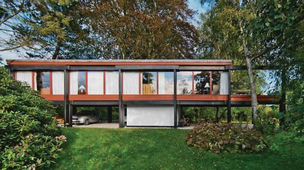
For a nice change of pace after Design Village, our next project this quarter was a research project about a house. I was assigned the Middelboe House by Jorn Utzon. Having dreamt about researching something famous like the Fisher House or the Robie House, I was a little disappointed at first by this obscure Nordic home.

However, as I researched this house I started to fall in love with it. Utzon is best known for being the architect of the Sydney Opera House (below left) and has done some remarkable work throughout his career. In this house, he really experimented with materiality and structure in a modernist grid. The columns and large glass walls are reminiscent of Mies’ Farnsworth House (below right).
Our assignment was to diagram every aspect of the house – structure, program, circulation, etc. – in order to understand it and then we presented our research to our class.
I started by looking at the program (the arrangement of the different living spaces) of the house. The diagram above simply labels each room in the house. The first floor plan is on the center left and the second floor plan is on the center right and the four elevations are arranged around them. (You can click on the diagram to see it larger and zoom in.)
This diagram color codes the outdoor, living, bedroom, and bathroom zones in the house.
And then this one gives a 3D view of the three main zones of the house: outdoor, sleeping, and living, and how they fit into each other like a puzzle.
Next, I analyzed the structure of the house. Utzon highlighted structure in his design, color coding it himself. The black elements are concrete beams and the red is the secondary wooden structure. The house was inspired by Asian construction techniques and relies on gravity instead of nails and screws to hold the house up.
This section diagram shows that black and red structure that Utzon displayed so proudly in his house.
This diagram builds on the black and red structure to categorize all of the walls in the house.
This next set of diagrams illustrates the house’s relationship to its site. It is located next to a canal in Denmark which provides a beautiful view but also a privacy concern. Utzon addressed this concern by moving the bedrooms to the back of the house, away from the river to give them privacy. He also sited the house in between the two large trees on the property for shade and added privacy.

The circulation through the house is all focused through the central stairwell and then up into the living spaces. This was my favorite diagram to make and I’m really proud of the way it turned out.

Finally, I made a collage diagram of what it would be like to be inside my house (see Mies’ collages for inspiration). I used the Rhino model I had made to get the linework for the interior perspective and then added the landscape through the windows. I chose to leave the interior white to focus on the view and the shapes that the structure makes with the windows – even though they are all rectangular openings, the perspective and the added beams create dynamic trapezoids.

All in all, this project was a good change of pace and a good way to connect the dots between a very abstract yet personal experience of a dwelling with Design Village and the more conventional yet still architecturally advanced ideas of what a house is to famous architects.

If walls could dream… they’d dream of being in a famous architect’s masterpiece.

Printing Models using Sketch Up

Playing with printing models straight from Sketch Up this morning. Here is my Frog House model.
The key is to select “Parallel Projection” under camera and then the view you would like before printing.
Then I simply cut out the printed walls and taped them together!

If walls could dream… they’d dream of printing house models!

Inhabitation

I think one of the greatest things about architecture is how universal it is. Simply because we all inhabit space, you can talk with anyone and everyone about architecture.

Before I Graduate Wall

Inspired by the public art piece Before I Die, I created a giant chalkboard wall that invites local high school students to complete the sentence “Before I graduate I want to…” with a goal or dream they have for their time in high school. The wall has spent the past month at various high schools in the area and has been filled up over and over with the goals of the students there.
I decided to construct the wall out of three wooden panels (recycled doors), with the “Before I Graduate…” title stretching across the top and “I want to________” prompts on each side.

I cut the stencils out by hand,

and then spray painted them on the recycled doors which were painted with chalkboard paint.

Then I simply screwed the doors together, added a brace across the top and some PVC chalk holders, and took it out to the schools!

The student reaction was overwhelming!

And entertaining!

Before it graduates, this wall dreams of touring the world! Or at least the county school district… And inspiring youth and community members to dream BIG!

Modular

A small modern home that utilizes the spaces between different built modules as extra rooms.


I just recently found this sketch. I had been inspired by toy building blocks and the modules they create and had wondered what it’d be like to design a structure out of toy blocks and then turn that shape into a house. Well I never got past this sketch, but when I found it again I was re-inspired,


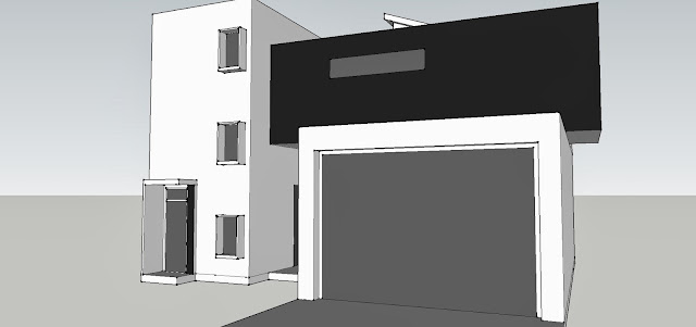
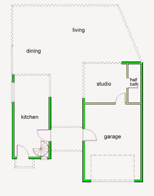
so I modeled it in SketchUp first to get the shapes right, and then I made the floorplan from that.


The first floor contains all of the “public” spaces; the kitchen, dining, and living rooms along with a studio and half bath and the garage. It’s a fairly small house at just over 1,000sqft.


This house would be in a mild climate since the back of the house opens up to the outdoors almost completely, although there would be folding doors to close the house at night or in bad weather. The main living and dining rooms are outside. The back wall also faces south, so the sun would rise from the kitchen-side of the house, warming up the bedrooms and the studio, and set on the studio-side, providing great sunset views from almost every room.


In the kitchen, there is a spiral staircase to the second floor.


The second floor contains the “private” spaces; two bedrooms and two bathrooms along with a laundry room. The guest bedroom can also serve as an office.

If walls could dream… they’d dream of toy blocks inspiring a modern home.

Anti-Pilotis House
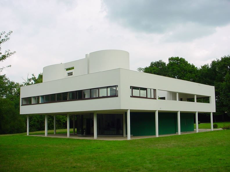
Le Corbusier’s Villa Savoye, a perfect example of pilotis

During his career, the French architect Le Corbusier came up with five points of architecture that dictated his architectural technique, one of which was the use of pilotis, making his buildings seem like they’re floating above the ground as well as allowing for a more open concept in the first floor of the building.

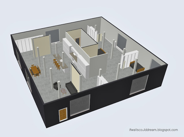
Flipping this idea inside out, however, and putting all the supporting columns back inside the building makes for an interesting challenge.

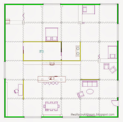
I created a 10′ wide grid in the house and then worked to use as few walls as possible to create a livable and interesting space.

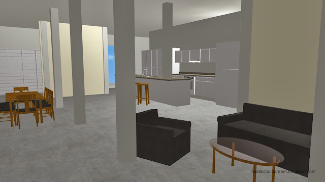
The columns not only help to make the space look much taller, but provide a sense of rhythm throughout the house.

And then you can just repeat this basic house shape again and again,

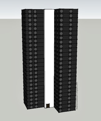
stacking them up in urban towers
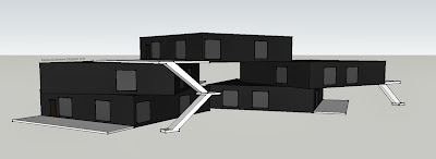
 or in modular suburban configurations.

Until you have a whole city!
It’s important to know the rules but it’s maybe even more important to know how and when to break them, and that knowledge only comes through experimentation, through taking the old norms, understanding them, and then running in the exact opposite direction just to see where that will take you.

If walls could dream… they’d do just the opposite and stay up all night.

Contrast

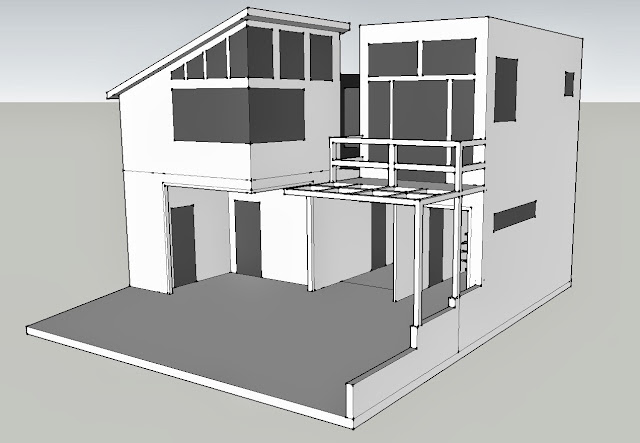
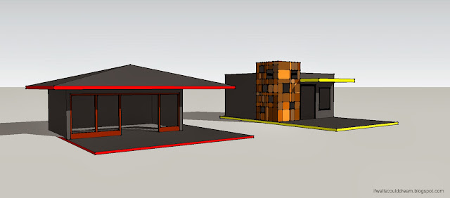
Playing around with SketchUp earlier today, I came up with these two contrasting structures.

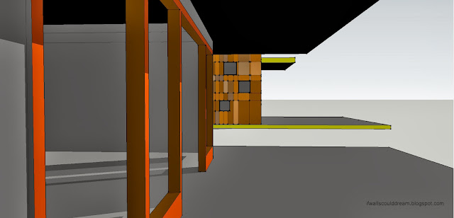
The red house is very angular and horizontal, with a dramatic roof and open front wall.

The yellow house, on the other hand is more geometric and vertical, with a rectangular cube of colorful tiles and windows.
I love how visual SketchUp is to work in, and how easy it is to create a space, and then another one right next door, and be able to move and modify them however you can imagine. I’ll definitely be playing more with it in the future!

If walls could dream… they’d dream of playing with space.

Details

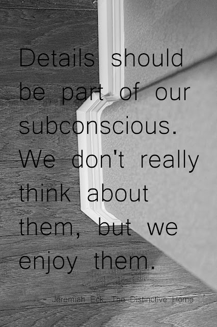
I’ve been really interested in how details in architecture affect our experience of it, ever since writing my TED Talk, and when I happened upon this quote from Jeremiah Eck’s The Distinctive Home it was just too perfect not to share! The photo in the background is one I took a couple days ago with my new camera, looking down a wall at detailed molding and textured wooden floors. Photography is a great way to notice and highlight details that you might miss otherwise.

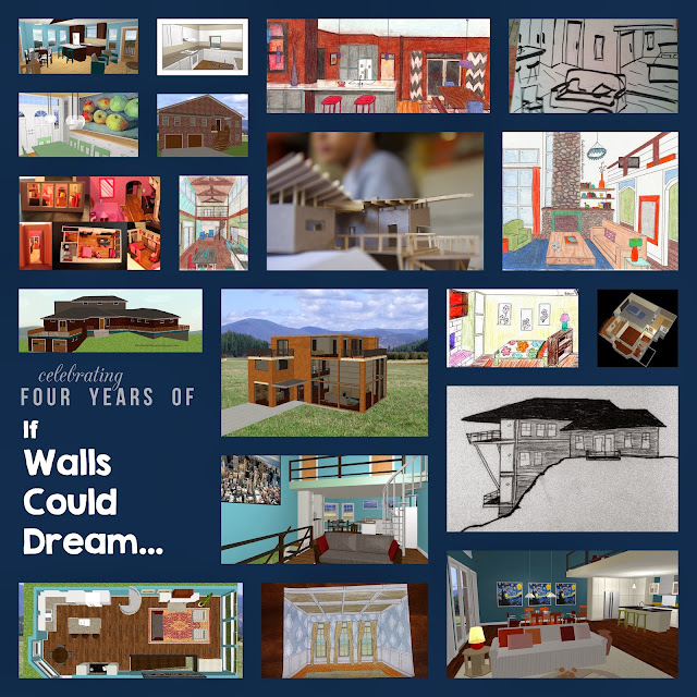
If Walls Could Dream is Four!

It seems like just yesterday I was starting this blog, yet it’s already been four years! I couldn’t be happier with how my career in architecture has grown in that time, especially this past year with Cal Poly’s Summer Career Workshop, the start-up of IWCD’s Facebook page, and my talk at TEDxYouth@GrassValley. 


Thanks for all your support and keep visiting to see what this next year will bring! 

And, as always, keep dreaming!!

Artsy Loft Inspired by a Stained Glass Window
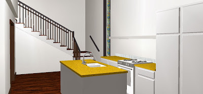
This apartment design was inspired by a stained glass window. Usually, stained glass feels very ornate and antique, but I decided to put a modern and artsy twist on it.
 
When you first enter the apartment, you’re steered either towards the living room or towards the dining room and kitchen by a large double-sided bookcase. Large windows along the living room wall flood the space with light.


The color scheme of the space (dark floors, white walls, pops of yellow and orange) mimic the feeling of a stained glass window (light, bright, slightly European, very clean, etc.)
 
Light is important in any design, but it was especially important in this one. The master bedroom wall has openings to the living room that let some of the light from that huge wall of windows in.
 
The corner dining room has an orange horizontal stripe to counteract the massive yellow painting in the living room.

As you turn the corner towards the kitchen, you discover the inspiration for the space, the stained glass window. The point of hiding the window from immediate view is to 1. create a direct sight line from the bedroom to the window and 2. to make it a little more surprising  and dramatic. The staircase in the back leads to the artist studio above the master suite.
 

From the bed in the master suite, you can see the stained glass window.
 

And from the artist studio, you can see the entire apartment, including the stained glass window.
 
 
If walls could dream… they’d dream of stained glass windows inspiring modern loft spaces.
1 2 3 16