Lone Cabin Design
 I imagine this cabin to be in a campsite. Although, it cabin isn’t much of a cabin. It’s just a bedroom and a deck. (No bathroom!) I certantly wouldn’t want to stay here. But it’s perfect for the more outdoorsey type (who don’t mind walking to the camp bathroom.) The bedroom has lots of windows (perfect for staying close to nature, but not really perfect for getting dressed in the morning.)
If walls could dream… they’d dream of camping
Blue and Brown Kitchen Design
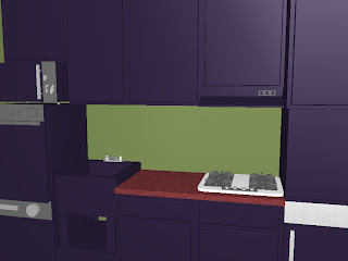
 Brown goes great with blue. Actually, brown goes great with just about anything! Brown and pink is great for a girl’s room. Brown and green is great for an earthy office. Brown and blue, though is great for every room in the the house. This is a brown and blue kitchen. There is a shelf for cerial and other frequently used items above the sink. The faucet is super modern and I designed it myself (because it is REALLY hard to draw a traditional faucet and not have it look REALLY lame, trust me i’ve tried a million and three times.) The door towards the left goes into a small pantry. The brown cieling keeps the room warm.
If walls could dream… they’d dream of blue and brown.
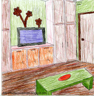
Living Room Design
Don’t you love the color scheme in this living room? I know I do!
Thanks for visiting!!!
My blog recently passed having 100 overall views!!!
Thanks for visiting!
I love to find comments on my designs (even when they point out flaws :-o)
Thanks again!!!
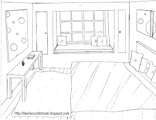
Black and White Bedroom Design
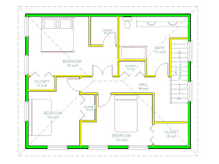
House Inspired By Wassily Kandinsky
Wassily Kandinsky was an abstract painter of the early 20th century. Wassily Kandinsky was born in Moscow in 1866. One of Wassily Kandinsky’s paintings inspired this house and you will see it throughout.
WOW house
Funky Beach Kitchen Design
 This beach kitchen definitely has a funk, with the blue and purple shelving to the right and painting to the left, with the brown patterns on the cabinet doors, with the gold ceiling, with the black floor tiles, and the HUGE view of the beach. This view is an open door in the wall directly in front of you. The countertop extends to the outside, perfect for entertaining on the beach.
 Grocery Store Bedroom Design
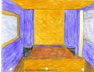 So I decided that today, I was going to draw a bedroom. I had the idea that it would be cool if the headboard matched the ceiling. So I drew my bedroom with the extra tall headboard and the mirror on the left wall and the window on the right wall. I took out my colored pencils and crayons and began coloring. As I was coloring I thought, “This is either gonna look really good, or take a sour turn at the grocery store!” Well, as sad as I am to say this, I think it took the sour turn at the grocery store. The purple on the walls reminds me of a grape or a blueberry, not a royal castle. The yellow on the headboard, footboard, and ceiling reminds me of mustard, rather than gold. I believe that this room would have turned onto “really good” road if I had kept the walls a neutral gray and made all the accents wood or golden yellow. My favorite part of this room is the mirror, which I think is on “really really good” road.
If walls could dream… sadly, they’d dream of mustard and grapes.
