Design Inspired by Design
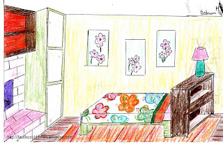
This is one of my first and favorite designs. I love the floor and rug. The fireplace makes the space extra cozy. The shelves over the fireplace serve the same purpose as a mantle would, but are less traditional. The red on the back of the shelves again adds to the coziness of the room. This is a very feminine room, with the pink fireplace and floral sheets and pictures. The walls are a light yellow, to keep the room happy and exciting. A neutral, rich, beige color would also work. Having the built-in to the right of the fireplace and the bottom of the bed the same shade of green make the room flow better. The aqua and pink lamp is really bold. Now, I think it would look better as an all orange lamp with a floral shade.
Later, I made a guest room inspired by my first design.
The furniture arrangement is the same, but the colors are more sophisticated. Notice the wonderful maple floors! I wonder if, one day, I’ll make a design inspired by this design…
If walls could dream.. they’d dream of design inspired by design.
Great Room
This is a great room (not a great room as in a room that’s really good, great room as in a combination of the kitchen, living, and dining rooms.) This great room is the 2nd floor of a 3 story house, designed to fit on a small piece of property without sacrificing too much square footage. Amazing views from the 3rd story bedrooms!
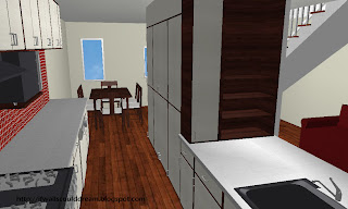 Shown in the first picture is the kitchen of the great room. The bleached wood of the cabinet door is dramatic against the darker wood of the cabinet body. The red tile backsplash adds even more drama and elegance to the room. The red is copied on the couch, towards the right of the photo. The dining room is towards the left back. You can see the staircase above the couch, to the right of the photo. The countertops are metal. They look much better in real life. You can see the oven and microwave to the far left of the photo.The wonderful maple floors continue throughout the house.
 Shown in the second picture is a great set of windows that were behind you in the first picture. The windows are offset and very modern. You can see the fridge to the far right of the photo. You can also see the sink to the bottom left.
 If walls could dream… they’d dream of offset windows, dramatic reds, and everything else in this stunning great room.
Ocean House
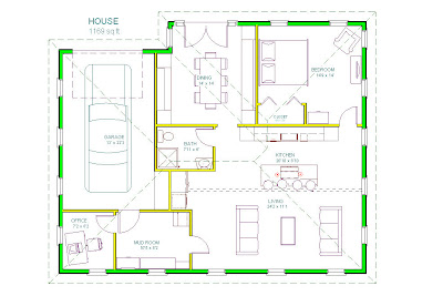
This is the Ocean House. The colors of this house are inspited by the ocean. This house is just over 1000sqft and has one bedroom, one bathroom, a formal dining room, an open kitchen and living space, a mud room, a one car garage, and an office. This house also has many windows, which let in lots of natural light.
Floorplan
Kitchen
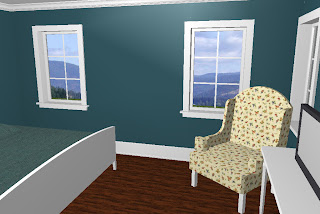
Bedroom
If walls could dream… they’d dream of the ocean.
Design Tip of the Month: January 2010
Where to place your couch versus your new flat screen.
For every 8″ of screen, your couch should be 1′ away.
So if you have a 56″ flat screen, your couch should be about 7 feet from the TV.
Green Bathroom
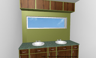
This green wall gives the otherwise plain white bathroom a large punch of color. It is the first thing you see when you walk in. The window is right at eye level so you can look out at the wonderful view while you brush your teeth. The green-and-wood thing above the windows looks like a cabinet, but it is really hiding a small design flaw.
If walls could dream… occasionally they’d have nightmares about design flaws and occasionally they’d have peaceful dreams about the genious ways to fix them!
The Blue House
This house was inspired by the color blue. Blue is everywhere in nature, from the sky to the rivers, lakes, ponds, and oceans.
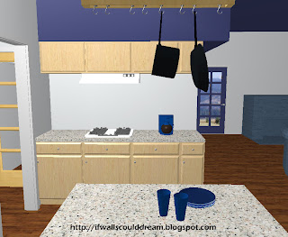 Shown in the first picture is part of the kitchen in the Blue House. You can see, off to the right, the blue fireplace and the blue front door. The ceiling is blue, so I thought it perfect for the soffit to be blue too. (For all of you people out there who have no clue what a soffit is, here is the the Wikipedia definition: The underside of a ceiling to fill the space above the kitchen cabinets.) To the left, you can see the butler’s pantry that isn’t much of a pantry, more like a hall between the kitchen and dining room.
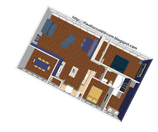 Shown in the second picture is the floorplan. The living room and breakfast nook and kitchen is the largest room, towards the top left. The master bedroom is the room with the blue bed, towards the top right. The master bath wraps around the bottom right corner. The guest room is the room with the smaller yellow/orange bed towards the bottom right. The guest bath is in the middle of the master suite and guest room. The dining room is in the bottom left corner.
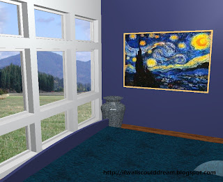 Shown in the fourth picture is the master bedroom. The windows bring in a lot of natural light, wonderful in the morning. The blue colored wall continues all the way into the connected master bathroom. The painting on the wall is Starry Starry Night by Van Gogh. I put the vase in the corner to make the room seem more “livable.”
If walls could dream… they’d dream of blue, blue, and more blue, but then they’d get sick of blue and wake up. 🙂
Loft
I love the open style of modern loft living. A staple of loft living is white walls.
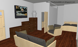
The small room you see in the back middle is the bathroom. To the right is the one and only bedroom. Behind you is the kitchen/dining room. In front is the living area. The bathroom has double sinks and the bedroom has a queen bed. Fancy for a 800 sq ft loft!
I love the dark maple floors in this house, and you will see them in many of my designs.
This design was originally a project for French class. The painting used in the TV is by Edgar Degas, depicting a woman drinking in a Parisian cafe. Edgar Degas is my favorite French painter.
The stairstep style of the dressers under the TV really accentuates the vase.
If walls could dream… they’d dream of loft living, high above the city.
Red Master Bathroom
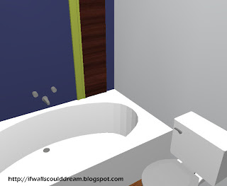
Color is a strong inspiration for design. This is a red inspired master bathroom. I love the double sinks, red wall, balcany, and clawfoot tub. How luxurious! There are dark maple floors, which are something you’ll see in a lot of my designs!
If walls could dream… they’d dream of RED.
(RED standing for Rich Elegant and Divine)
House 1
Yes, this house’s name is “House 1.” That is what I saved it under. Don’t be teasing it! Some of us have strange names too. I can’t think of any right now, but if your name was “person 1” would you want people making fun of you? I didn’t think so.
 Shown in the first picture is the entry in the center, kitchen to the left, side door and dining and living room to the right. Notice the wonderful cabinet doors. They are walnut in a white frame. They look great with the white counters, backsplash, appliances, and chunky base molding. The walnut really compliments the green wall color. Green and red are complimentary colors, which makes the walls and sofa go together. Overall, this is a very cohesive space!
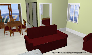 Shown in the second picture is the living in the front. The burgundy fabric really makes it pop, and works well with the wood of the kitchen and the built in entertainment center shown below. The dining room is behind towards the left. Notice the sliding glass door out to a deck and side yard. Also notice the three art pieces hanging on the wall, they are simply painted wood (the two outer with a light beige color and the middle with the wall color) and framed in dark green painted wood. In the back right of the picture is the guest bedroom. It’s a little small, but it would work great as an office!
Shown in the third picture is the kitchen. Notice the breakfast bar, white subway tile backsplash,white appliances and large sink.
Shown in the fourth picture is the entertainment center.The built-in look flows straight from the kitchen. Again you see the walnut cabinet doors that I mentioned earlier. To the left is the door to the master suite. The built-in look is continued into the master suite.
If walls could dream… they’d occasionally have nightmares of being called “wall 1”
Coming in January
Coming in January to If Walls Could Dream are some new things:
- Design Tip of the Month
- Hand-drawn rooms
OMG! I am so excited!
