Category Archives for Uncategorized

Falcon Residence

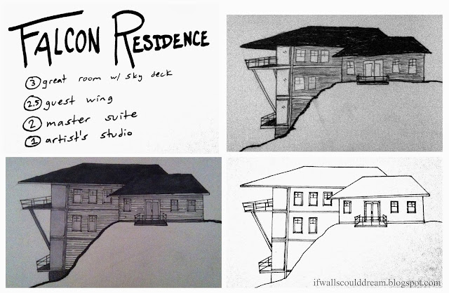
Inspired by the landscape of canyons and desert hills, I designed this house that almost looks like a bird ready to take flight from its rocky perch. The dramatic rooflines of this project help to shield the interior spaces from the hot desert sun.
 

I had sketched my idea last night (top right) and then made a more finished drawing (bottom right) this morning and colored it in with my copic markers (bottom left.) I envision the top floor to be a warm great room with expansive views of the landscape. There’s also a large deck off the top floor, nicknamed the sky deck because it seems to be floating in the sky. Half a level down and off to the side is a guest wing, complete with its own little porch for watching the sunrise. The middle level would be a private master suite, also with breathtaking views. And last but not least is the studio on the lowest level with lots of natural light and its own little deck.

If walls could dream… they’d dream of houses that could almost take flight!

Sculpture 1: Line, Shape, and Form

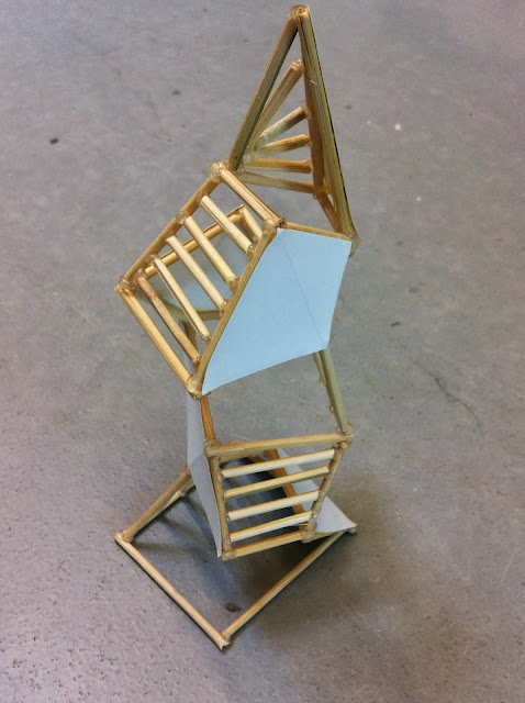
I just finished my first work for the sculpture class I’m taking. We focused on line, shape, and form in this initial project, using bamboo skewers, paper, and lots of hot glue.
 
 
I saw this first project as a time to experiment and play with the rules of design. At first, I played with interlocking hexagons, but it didn’t really amount to much.
 
I also experimented with a “looking box” idea, a plain box with layers of geometric and textural experiences inside, but that didn’t hold my attention for too long.
 
 
I finally decided that I wanted to play with form and repetition. I took the form of a cube, cut out one side, and then stretched and squished, twisted and tweaked, until it was just right. Then I built a duplicate on top of that “cube”. I used alternating horizontal and vertical sticks on one face of each of the “cubes” to define the “faces”.
 
 
After some more thought, I decided to continue playing with this piece and constructed some more levels for this structure, seemingly defying gravity, and topping it in a slender point. I also added paper to the remaining “face” on each cube.
(In case you were wondering, it’s a fairly small sculpture, about 8″ tall.)
 
These stick and paper faces help guide your eye around the piece.
 
The sticks alternate direction as you go up and culminate in a starburst design on the top triangular face.
 
 All in all, I think it was a very successful project. The use of repetition in the cube shapes and the face materials creates unity, yet the variation in size, shape, and angle of these sections gives it a playful and interesting feel.
 
 
If walls could dream… they’d be dreaming of how my next sculpture project will turn out… I know I’ll be!

Modulated Famly Home

 With over 3000 square feet and up to seven bedrooms, this house has plenty of space for the entire family. It has a modulated charm to it, with defined rooms but very open spaces, that makes it comfortable and practical for a growing family.
 
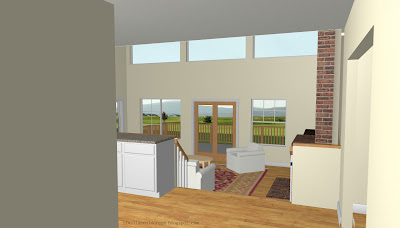
When you enter the house, you are immediately drawn into the sunken, double height living room. To your left is the staircase and the kitchen. To your right is an office and a formal dining room. Notice the large pantry off the kitchen. The kitchen is also very open to the living room.
 
 
Through the living room is a small hallway that leads to a bathroom, den or bedroom space, and the double car garage.
 
 
Moving up to the second floor, you arrive in a family room that has little openings in the wall that look out over the living room. On one side of the family room is the master suite, complete with his and hers closets and a private porch overlooking the backyard.
 
 
At the other end of the family room, and down a few steps are three more bedrooms, a large bathroom, a library area (or kids play area or workout area, whatever the family wants), and the stairwell to the studio.
 
On the third floor is the studio, private and with lots of light and great views of the backyard and surrounding land.
 
The back of the house has lots of windows and decks to take in the view.
 
 
This house’s modulated feel helps it adapt to the needs of a growing and changing family as well as give it a certain charm and personality like it was added on to over time.
 
If walls could dream… they’d dream of modulated charm.

Avocado House

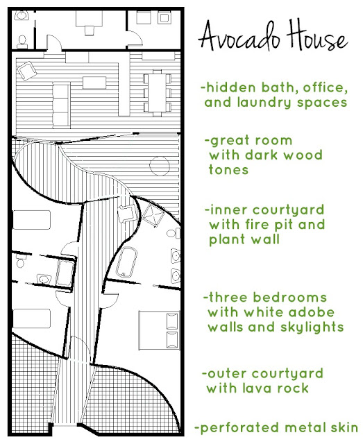
Now I’m sure that when I tell you this house is inspired by an avocado, you’ll think I’m absolutely insane. And maybe I am, but the crazy idea for this house kept me up one night and I just had to explore it. I focused on the progression of space as if you were walking into an avocado and the contrast between these different spaces; the skin, the flesh, and the pit.
 
 
  The front perforated metal wall, the skin, is separated from the bedroom area, the flesh, by a small courtyard. The sleeping area is separated from the living area, the pit, by another larger courtyard. 


In addition to drawing the floor plan of the house, I made a quick model of it out of cardboard. The site for the house would be a small city lot surrounded by high walls, so all the light comes from interior windows and skylights.  
 
 
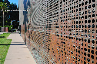
The front wall of the house is a perforated metal skin. It represents the skin of an avocado and provides protection and privacy from the exterior environment while still letting light through.


  The model itself is rectangular in shape and is sliced down the center so you can open it up to see the interior spaces.
 
After passing through the metal skin, you are in a small courtyard with black lava rock and concrete benches in geometric shapes. Then, you enter through a large frosted glass and wooden door into a white adobe hallway.
The bedrooms are off this hallway, two kids’ bedrooms to the left and the master suite to the right. They are lit primarily by huge skylights. The white adobe walls curve slightly, creating a very warm and cozy feeling in these spaces.
 
Back through the main hallway, it opens up to another larger courtyard. The white adobe curves away to the left and to the right is a huge living wall of plants, kind of like the photo below.
 
 
There’s also a fire pit and a bench along the wall.
 
 
On the other side of the courtyard is a dark, angled wall with lots of huge windows that enclose the great room.


I decided to place a courtyard here to help transition between the soft bedroom space and the hard living space. It also allows for more light to come in to the living space through the large windows.
 
 
Inside the great room, the furnishings are hard and dark with lots of natural woods. The ceiling arches downward toward the back of the space, giving it an intimate feeling even though it’s so large and open to the courtyard.  
 
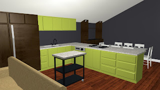
The kitchen has modern bright green cabinets and hidden appliances to make it look bigger. 
 
 
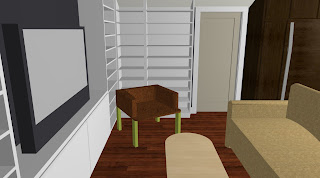
The living room has a whole wall of storage and lots of space for relaxing. 


So are you ready to move into an avocado now? Well maybe not, but I hope that you’ve been able to follow my spatial thought process in designing this house and how I’ve represented the layers of an avocado in each section of the house and then expanded the relationship between them using courtyards. When I told my grandfather about my idea for this house, he was skeptical but remarked that “you don’t need building codes to dream!”
 
If walls could dream… they’d dream of avocado houses.

Remote Flat

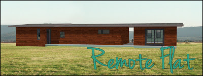
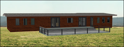
This house, or flat as its shape illustrates, makes the most of the views to the back of the property, with a huge deck and a walkway right through the house. It’s wooden exterior blends with the surrounding forest of a remote location.

This remote flat has a small footprint with only one bedroom and one bathroom. However, it makes the most of it with a large entertaining space complete with dining room. It also has a big deck to take in the gorgeous views. The added studio space could make the perfect workspace for a young artist or extra bedroom for an older couple’s grandkids.

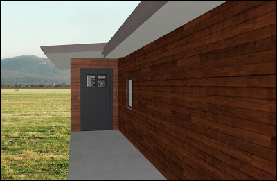
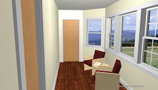
When you first walk up to the house, you’re immediately drawn to the view through the hallway next to the studio, but the entrance to the house is to the side.

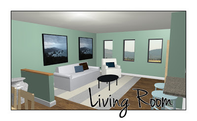
You enter to the dining room with a wall of storage to your left. The color scheme continues the natural theme with soft greens and bright whites.

The dining room opens up to the living room which has three windows along the back wall that invite you out to the backyard view.

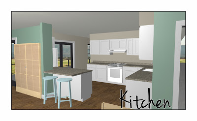
To the side is the kitchen complete with neutral tones, granite countertops, a breakfast bar, and lots of storage.

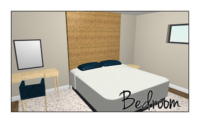
Through a hallway off the kitchen is the bedroom. Soothing neutrals and sophisticated dark blues give this bedroom a relaxing feeling. The floor-to-ceiling cork headboard makes the bed the star of the room.
 
 
And last but not least is that deck I’ve been telling you about this whole time. Accessible by doors in the living room, kitchen, bedroom, and by the hallway through the middle of the house, it’s very open. With two levels and expansive views, why would you ever want to leave?

If walls could dream… they’d dream of small flats in remote forests.

What are you dreaming of?

Family Split-Level

Designing this house was like putting together a puzzle, figuring how to fit a four bedroom house, separate office space, and guest house together in one cohesive unit. But it all worked out for the best.
Come on in!
 
This large house is built like a split-level house, with three stories, four bedrooms (plus a guest house) and two and a half bathrooms (plus a half bath in the separate office space and a full bath in the guest house).
This house would perfectly fit the lifestyle of a large family. With three bedrooms and a master suite, there’s plenty of room for everyone upstairs. The guest house is perfect for relatives or friends visiting. The great room and large deck make entertaining a breeze. The separate office space is perfect for dad’s (or mom’s) business. Additionally, there is a bonus room on the first floor and lots of storage throughout.
This house has plenty of room for work and play!


You enter the house on the second floor from a porch next to the garage.


To the side of the entry to the residence, is a small hallway to the “work” part of the house – the office!
(Also, notice how the flooring indicates which section of the house you’re in!)
 
The office is complete with its own hallway/sitting room, bathroom, and large storage closet.
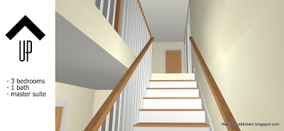
From the entry hall to the residence you can go up to the third floor.

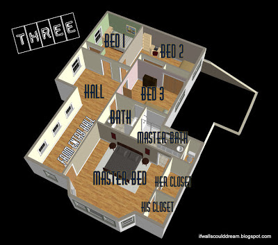
The third floor houses the bedrooms;

three bedrooms with a full bath,

and a master suite complete with bathroom as well as “his and hers” closets.
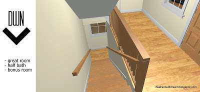
Heading down from the entry hall, you’ll arrive on the first floor of the house- the “play” section.

 To your right is the half bath and bonus room (media room, guest bedroom, play room… the possibilities are endless!) Notice the huge deck right off the great room, perfect for entertaining and taking in the magnificent view.

To your left when you come down the main staircase is the great room with a spacious sitting area and space for a family-sized dining table. The door in the back corner by the kitchen goes to the laundry/mud room which has a stairwell up to the garage (for easy grocery carryin’) and a door to the side deck.

The kitchen, complete with breakfast bar for the kids, is done in a light, European style with tall cabinets that make the most of the ceiling height.

There’s so much counter space in this kitchen that the counters even extend in front of the cabinets along the back wall – perfect for hiding countertop appliances away when they aren’t in use!
Around the back of the house is a spiral staircase to the guest house.

The guest house is complete with a kitchen, full bath, and lots of storage.

If walls could dream… they’d dream of large homes with room for work and play.

What are you dreaming about?

HGTV Star

I watched the premiere of Design Star HGTV Star yesterday and loved it! (Although I am still getting used to the new name…) I’ve watched Design Star for a couple of years now. Some of my favorite designers (David Bromstead and Emily Henderson) are former winners of the show. It’s a dream of mine to be on the show someday!

Host David Bromstad With HGTV Star Designers

The cast made a really great first impression. They have a really good variety of talents. And David’s doing a great job of hosting, as always! I love Abby’s energy and design style, although her hair threw me off at first. Anne has really good energy as well. Jeribai seems very genuine and warm. Brooks is delightfully quirky and entertaining. I really want to have him as a teacher! Oh and for a good ten minutes, I was convinced that Jessie was Taylor Swift.

Like, seriously, they look absolutely identical! Anyway, I like how they started the competition off with a bang, combining the classic “white room challenge” with the added test of displaying your personal brand.

Abby Vasek in her Finished VignetteJeribai Tascoe HGTV Star Vignette

Those white walls were dreaming big! My favorite vignettes were Abby’s boho living room inspired by ink blots and Jerabai’s sitting room branded with his initials.

Brooks Atwood's HGTV Star Vignette
Brooks took a creative approach as well. From his pink wallpaper to his quirky accessories, you really get to know his outgoing personality. Additionally, he incorporated the sense of smell into his design by leaving a card with cologne on it for the panel to sniff.
 
 
I realized that the most important aspect of these challenges is often time management, just like taking your high school SATs! For example, Jerabai didn’t give his painting enough time to dry so it dripped. Also, Anne didn’t have time to pick up her bedding herself and had to present an unfinished bed. Both these mistakes were criticized by the judges and could’ve cost these designers their chance of winning the challenge.
 
Brooks Atwood - HGTV Start Season 8


The panel only invites the most and least successful designers to the evaluation room to review their designs. Not only does this add drama for the TV audience, it adds drama for the designers. Would you rather be told early that you’re safe and know you’re not the winner of the challenge or have the possibility of being the winner but have to face evaluation? Personally, my competitive spirit draws me to the latter.
 
 
All in all, I’m excited for the new season of HGTV Star and getting to know these unique designers. I can’t wait for next week’s show!
 
Who’s your favorite designer? What did you think of the challenge? Do you agree with the panel’s decision? Leave me a comment below! And keep dreaming!


How To: Whites & Brights

The fresh cleanliness of whites mixed with the fun intigue of bright colors and the sophistication of mixed textures makes “Whites and Brights” a hot new design trend.
Tracing its roots to fashion runways, this contemporary style is perfect for any home. Just start with white walls, light floors, and neutral furniture. Add in some textured accessories such as rough wooden tables or thick woven linens. Finally, throw in bold color on doors or accent pillows.
Can’t stick to just one style? This look works seamlessly with industrial and boho touches.
Thrift stores are a great place to hunt for pieces with good bones that can be painted in a bright color, making this style easy on the wallet and easy on the planet.

          My inspiration:

1. Redsmith Dining Chair
2. Flutter Pattern Rug
3. Wake Up Call iPhone Dock
4. Purple Library by Lindsey Coral Harper
5. Finn Rocker
6. Hainsworth Chair
7. Living Room With Pops of Color
8. Paeonia Wallpaper
9. Perch Barstool
10. H2OMG Bottle

If walls could dream… they’d dream about dazzlingly colorful accents.
What are you dreaming about?

“Whites and Brights” Style Small Home


With environmentally friendly design in mind, I designed this small house to be just that. It’s just over 900sqft and has 2 bedrooms and 1 bath. This house is designed to not only help the environment in its production by using eco-friendly materials, but help the environment in its future by fostering a healthy lifestyle. It’s hallway-less floorplan creates a open, friendly feeling. Other elements, such as the partially outdoor shower and use of sliding doors, help maximize useable space.

The interior is designed in a “Whites & Brights” style, with white walls, light concrete floors, and neutral furniture. Pops of color from accessories bring the design to life, and a mix of textures add sophistication. This design style helps to incorporate industrial finishes as well as antique pieces with a clean and contemporary flare, helping to keep the house environmentally friendly. See my post on How To: Whites & Brights for more ideas. The exterior is all salvaged materials, from shipping crates to barn wood.

If walls could dream… they’d dream of a bright, eco-friendly lifestyle.
What are you dreaming of?

LHouse

I named this house after it’s shape, the letter L. But it’s kind of a sideways L, with the main living spaces along the left side. I picture this house up in the mountains, with a driveway snaking up to the side of the house and the main wall of sliding glass doors taking in the beautiful mountain view.

On the ground level is the 2 car garage and a laundry / mud room connecting it to the family room with a staircase to the main level. Also on the ground level are two bedrooms with a bathroom. Up on the main level is a great room and the master suite. The great room has a large living room with dramatic high cielings. There’s also a large kitchen and a dining area. Above the kitchen is a loft that could be used as a play room, library, sitting room, guest room, or as storage. The master suite is also large, with an attached bathroom and a walk-in closet. There’s a half bath in the hallway as well.

If walls could dream, they’d dream of beautiful mountain views.
What are you dreaming about?