Under Construction!!
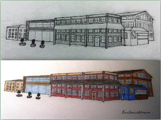
Renovated Factory Home
The Idea:
On the way to school one day, I had the idea for this house and quickly wrote it down in my phone. I said it’d be a large classic victorian house with a modern glass back.
Later, I sketched the floorplan both on my phone and on paper. I had decided to have a grand entrance hall with a dining room and bathroom to the left, and an office and guest room to the right. In the back would be the great room which would be open to the backyard and a tiered deck. Upstairs would be bedrooms and the master suite.
And as soon as I had the time I created the computer floorplan and started designing the interior.
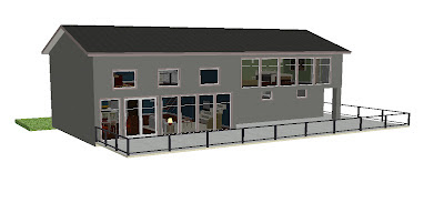
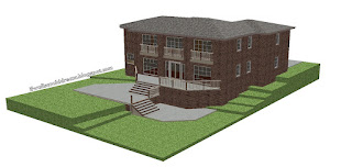
The exterior shifted a little more towards looking like an old factory building than a victorian home, but I was okay with that. Classic brick walls with orderly windows completed the look. While the three story deck and quirky green front door kept a modern feel.
The Design:
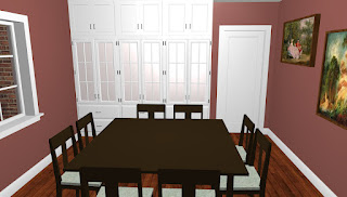
I designed the interior with a classic color scheme, straight from Sherwan William’s “Early and Late Victorian” color family. And many of the rooms were inspired by photos I found on Pinterest.
The Plan:
If walls could dream… they’d dream of simple inspiration turning into stunning home design.
Midcentury Masculine: A Modern Home Design
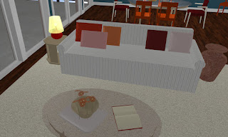 Some of my greatest ideas have began as random thoughts as I was going to bed and this house design is no exception. My idea started with the white pinstripe sofa and just exploded from there. So I frantically jotted down the important elements of the design on my phone to save them for later.
An introduction to the house:
The first floor:
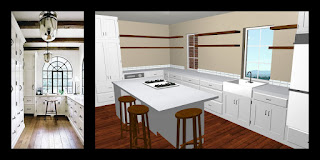
and the modern kitchen.
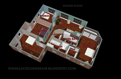
And the second floor:
Modern Floorplans
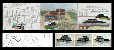
I started this floorplan on a design app on my phone. I liked it so I decided to copy it onto paper and add an exterior view.
On the first floor is the great room. The second floor has 2 bedrooms, 1 bathroom, laundry closet, and an office. The third floor has the master suite and a lounge/studio.
If walls could dream… they’d dream of three levels of beautiful floorplans.
More Prefab House Design Photos
Exterior Experiments
Stunning Prefab House Design
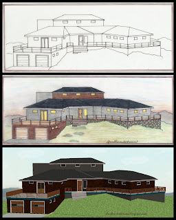
Today was just one of those days that wouldn’t have been complete without a little architecture. These are my favorite type of days. Inspired by modern prefab houses, I designed this house first on the computer and hope to soon finish the interior but the exterior was so fun that I couldn’t stand to not play around with it a little. So I printed out a picture of the 3D computer generated image and traced it. Then I used my handy dandy colored pencils to color it.
The design of this house is very dramatic yet minimal and clean. The garage is at the front of the home, at an angle to the center of the house. The landscape angles up (which by the way is extremely challenging to do on the computer software I use) to the front door. The porch wraps almost all the way around the house. On the first “basement” floor is the garage, a family room, and bedrooms. On the second “main” floor is the open great room and master suite in the angled addition to the right . The third floor is an open studio and deck space perfect for an artist. Although you can’t see it in this photo, the back of the house rests on the edge of a dramatic cliff. The main floor has a gorgeous pool and patio area. The second floor has a large deck and outdoor kitchen which opens to the pool below. The third floor also connects with the levels below. This house is truly stunning no matter which angle you look at it.
Look for interior photos soon!
If walls could dream… they’d dream of stunning and dramatic exterior design.
Beachy Seaside Room Design
I was inspired to make a room with this type of beamed ceiling from an architecture book I had. I also liked the large, dramatic windows with the bold curtains. To ground the design, I added wainscoting around the lower half of the room and a warm floor rug to balance the colors.
The first thing I designed was the view out the windows, at first it was a meadow with mountains in the background but I decided that it wasn’t working with the colors I wanted the interior to be, so I changed the mountains to an ocean and added some yellow sand. I considered leaving it like this because I liked the look of the windows so much, but I stapped a pic and continued on with my coloring.
Next, I dressed up the windows by coloring their casing and curtains. Then I tackled the ceiling. Traditionally I would’ve gone for dark brown wood beams and lighter wood ceiling, but I decided to experiment with a darker ceiling and a lighter painted beam, which I think worked quite nicely.
Another experiment in the room was the wallpaper. Originally, I was going to do plain green painted walls, but I decided since this was a beach house, I should go with something blue. Once I had a blue base up, I decided that it overpowered the view. So I decided to add a wallpaper design and the fun began. After looking online for an inspirational design for what seemed like forever, I finally came up with one out of my imagination. I used my new electronic eraser (so cool!) to lighten the oval shapes where the design would go I used a white gel pen to add the design.
Finally I colored the wood floors using colored pencils and an orange marker and then I colored the rug to look like on old Persian rug.
If walls could dream… they’d dream of beachy windows perfectly framed in a nautical seaside room.
Natural Home Exterior
I used colored pencils on most of the coloring and I used black pens for the outlining and a colored pen for the molding above the stone and below the roof.
If walls could dream… they’d be dreaming of fun new exteriors and landscapes.
Natural Wallpapered Room with Fireplace
The design for this room was simple: create a basic living room and to have fun experimenting with some new coloring techniques. In the center of the room is a warm fireplace. To one side is a mirror and a large window and to the other is a TV and a dramatic wallpapered accent wall.
The view outside is a lovely little forrest. The window is anchored by navy blue drapes. On the cabinet to the left of the fireplace is a large gold framed mirror and two large vases. The fireplace itself is made of red-yellow brick. To the right of the fireplace is a flatscreen TV and a dramatic wall of wallpaper. Once again, I had a horrible time trying to find wallpaper inspiration on the internet and ended up greating this design on my own. I colored it grey with a hint of purple. The walls are a light blue and the floor and cabinetry are light woodtones.
If walls could dream… they’d dream of pretty wallpaper in a natural living room.
