Interiors Contest is over!
Thank you to everyone who voted on my interior contest!
Congradulations to everyone who voted for the winning interior, number 2!
Come back soon for more designs and more contests!
Nautical Bedroom
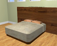
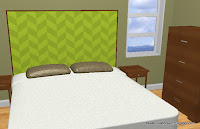
It started as just the built-ins on the left and a plain bed, but I soon realized it was destined for much more. I was inspired by a bed I found online and updated the plain bed with this headboard and foot board. Then I added the seating area and accessories.
-
Keep the walls a light neutral like tan or beige. This will be relaxing and fits in with other styles when nautical sails away.
-
Layer textures and patterns while keeping to a simple color scheme. Nautical design is very eclectic, but keep accessories light and interesting by following this rule. (And sometimes the best accessories are those that don’t cost much, so get crafty! Glue sand on the top of a thrift store find table! Glue shells on a hand-me-down mirror frame! Reupholster and paint that chair that’s been sitting in your garage for ever!)
-
Don’t overdo the blue and red. These bold colors will make your room less mature.
Interiors Contest
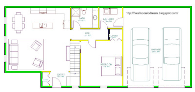
Floorplans
ferm LIVING’s clever spaces and Rue Magazine
A friend emailed me about Rue Magazine, a very inspiring and fun new e-magazine (a magazine that you view on the internet.) I fell in love with their premier issue, featuring fun articles including “shopping cart” and “rue shops: San Fransisco” and “Studio Tour: Maemae Paperie” (which I absolutely adored because I love paper arts, check out my paper arts blog, hannahmade cards!) and “It’s My Party” featuring Emily Henderson, HGTV’s newest Design Star! (My favorite show ever and not to brag or anything, but she was my favorite from the beginning!) but one of the best things this magazine did was introduce me to the amazing company, ferm LIVING and from there I found there inspirational blog, ferm LIVING’s clever spaces.
So stay tuned for some ferm-inspired designs! YAY
1,000!
Thank you all so much for visiting! This blog has passed 1,000 visitors!
Modern Inspiration
My “Clerestory house”
Most people would just about shrivel up and die if you asked them to define (or even pronounce) “clerestory” And just yesterday I would have been one of those people.
Coffee Kitchen
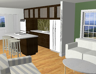
This is a series of photos marking the changes in this builder-grade kitchen when becoming a magnificent kitchen. (The pictures of the actual steps aren’t exactly in order)
My inspiration for this kitchen re-design was a ‘coffee’ brown color. It was painted on the walls and the other elements followed it’s path. The accent color is red. It’s picked up in the backsplash and the accessories. There are also flecks of red in the countertop.
Without ripping down any walls or even cabinets (the cabinets were painted), a room can change it’s mood. With a little virtual elbow grease, this kitchen went from ‘just moved in’ to ‘just moved up.’
By just taking a few of these steps, you could change the mood of the room. Lighting is always a key element of a room’s mood and by updating your lighting, you update your mood. Paint is important because color is known for creating atmospheres. Like red has the reputation of making you hungry (good in a kitchen, unless you don’t want to have to cook…) And if we’re talking for staging a home for sale, then accessorizing (and staying clean) is a must.
To view the picture larger, just click on it.
If walls could dream… they’d dream of simple kitchen style.
Julia Child’s Kitchen
-
The blue and green color scheme was chosen by Paul, Julia’s husband, in 1961.
-
Sixteen baking sheets wee stored vertically in slots next to the dishwasher.
-
The kitchen overlooked Irving Street in Cambridge, Massachusetts.
-
The kitchen measures 14 by 20 feet.
-
She was born on August 15th, 1912 as the eldest of three children.
-
She was a government inteligents agent for the Office of Strategic Services
-
She and her husband, Paul Child, met through the OSS.
-
Julia attended the Cordon Bleu cooking school in France.
-
She and two friends created the cooking school l’Ecole de Trois Gourmandes (The school of the three gourmandes)
-
A cookbook she made with these friends lead to her TV show, The French Chef.
-
She won an Emmy award in 1966.
